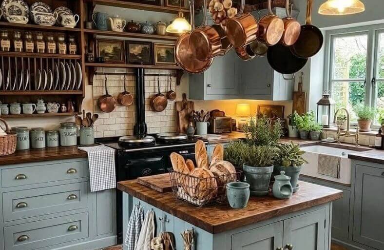
Blue grey paint colors occupy a uniquely sophisticated position in the kitchen color spectrum, combining the calm, airy quality of blue with the grounded neutrality of grey to produce shades that feel simultaneously fresh and quietly timeless.
This beautifully balanced color family has become one of the most popular choices for modern kitchen decorating, and it’s easy to understand why, blue grey pairs effortlessly with white cabinetry, natural wood tones, marble countertops, and both warm and cool metal finishes, making it one of the most versatile backgrounds a kitchen can have.
These beautiful blue grey paint colors will inspire you to find the perfect shade for a kitchen that feels polished, fresh, and genuinely inviting every single day.
Technical Specification Matrix for Architectural Paint Selections
The table below provides technical data for twelve prominent blue-gray paint formulations produced by leading manufacturers, including Benjamin Moore, Sherwin-Williams, Farrow & Ball, Behr, and Clare.
| Manufacturer | Color Name | Color Code | LRV | Primary Undertone | Recommended Architectural Application |
|---|---|---|---|---|---|
| Benjamin Moore | Boothbay Gray | HC-165 | 43.26 | Muted Green-Blue | Perimeter Cabinets & Millwork Trim |
| Benjamin Moore | Smoke | 2122-40 | 57.19 | Soft Sky Blue | Small Kitchen Walls & Upper Cabinetry |
| Benjamin Moore | Quiet Moments | 1563 | 60.73 | Pale Slate-Green | Open-Concept Walls & Coastal Kitchens |
| Benjamin Moore | Mount Saint Anne | 1565 | 41.90 | Refined Slate Blue | Central Islands & Built-In Pantries |
| Sherwin-Williams | Stardew | SW 9138 | 43.00 | Muted Foggy Blue | Transitional Cabinetry & Millwork |
| Sherwin-Williams | Slate Tile | SW 7624 | 15.00 | Cool Slate Gray | Lower Base Cabinets & Dark Feature Islands |
| Farrow & Ball | De Nimes | No. 299 | 19.27 | Grounded Denim Blue | Cottagecore Cabinets & Built-In Units |
| Farrow & Ball | Selvedge | No. 306 | 54.00 | Soft Woven Blue | Low-Light Kitchen Walls & Millwork |
| Farrow & Ball | Stiffkey Blue | No. 281 | 6.00 | Deep Slate-Violet | Color-Drenched Pantries & Statement Islands |
| Behr | Adirondack Blue | N480-5 | 23.00 | Smoky Mountain Blue | Craftsman Millwork & Rustic Kitchens |
| Behr | English Channel | PPU14-19 | 11.00 | Oceanic Plum-Navy | Modern Statement Islands & Accent Walls |
| Clare | Good Jeans | PNT100-LT-38 | 36.00 | Casual Blue-Green | Contemporary Islands & Farmhouse Accents |
Benjamin Moore Boothbay Gray (HC-165)
Benjamin Moore Boothbay Gray (HC-165) is a low-chroma gray infused with cool green-blue undertones, offering timeless versatility across traditional and contemporary kitchen architectures.
Formulated with a Light Reflectance Value of 43.26, this color maintains a stable visual presence without overpowering surrounding design elements.
Under morning daylight, its cool green-blue facets emerge to create a fresh, coastal aesthetic, whereas warm afternoon sun or artificial lighting softens the finish into a subdued, elegant gray.
Within culinary environments, Boothbay Gray serves as an exceptional finish for full cabinetry runs or focal-point islands.
It coordinates seamlessly with white oak flooring, honed Carrara marble countertops, and polished nickel hardware.
The color absorbs enough ambient light to provide structural definition while reflecting sufficient illumination to keep small-to-medium kitchens feeling open.
Benjamin Moore Smoke (2122-40)
Benjamin Moore Smoke (2122-40) is an airy, light-diffusing blue-gray defined by a Light Reflectance Value of 57.19.
The elevated reflectance index allows this hue to bounce natural and artificial light effectively across kitchen surfaces, visually enlarging compact kitchen footprints.
Smoke features subtle sky-blue undertones anchored by a soft gray base, eliminating any starkness while preventing the blue from appearing overly saturated.
In residential kitchen design, this formulation excels when applied to perimeter walls paired with off-white cabinetry or used on upper cabinets to create a weightless visual sensation.
It establishes an inviting atmosphere when combined with crisp white quartz countertops, white Zellige tile backsplashes, and brushed brass or chrome hardware.
The high reflectivity helps soften dark architectural corners without sacrificing chromatic depth.
Benjamin Moore Quiet Moments (1563)
Benjamin Moore Quiet Moments (1563) exhibits a Light Reflectance Value of 60.73, delivering an ethereal mix of pale blue, soft gray, and a gentle hint of green.
This balanced chromatic blend creates a serene, restorative atmosphere reminiscent of early morning mist.
The subtle green component stabilizes the cool blue undertones, preventing the color from feeling icy in cold north-facing daylight.
In kitchen applications, Quiet Moments is frequently specified for open-concept layouts where culinary spaces blend into dining areas.
It pairs harmoniously with natural wood tones, honed quartzite, soapstone countertops, and unlacquered brass fittings.
Its elevated light reflectance makes it a primary choice for expanding smaller spaces, providing an organic neutral backdrop that highlights surrounding architectural millwork.
Benjamin Moore Mount Saint Anne (1565)
Benjamin Moore Mount Saint Anne (1565) is a mid-tone blue-gray with a Light Reflectance Value of 41.90.
Positioning itself in the medium depth range, Mount Saint Anne provides a grounded architectural anchor without absorbing excessive light.
The blue undertones are primary yet refined by a dusty slate cast, conferring a classic, enduring character. In kitchen design, this shade works remarkably well on full cabinetry runs, pantry doors, or central islands.
It complements warm white wall trims, dark bronze hardware, natural butcher block, and white marble with gray veining.
The mid-tone depth establishes clear spatial boundaries, offering an ideal contrast when paired with lighter perimeter surfaces.
Sherwin-Williams Stardew (SW 9138)
Sherwin-Williams Stardew (SW 9138) is a muted slate blue featuring a Light Reflectance Value of 43.00.
Formulated with balanced warm and cool undertones, Stardew adapts fluidly to shifting ambient lighting conditions.
Bright southern light brings forth its tranquil blue character, while northern exposure or warm artificial bulb light accentuates its soft gray foundation.
Within culinary spaces, Stardew serves as a sophisticated neutral for transitional cabinetry, island structures, or built-in pantry units.
It pairs exceptionally well with medium oak wood stains, polished nickel hardware, white subway tile backsplashes, and warm off-white trim shades like Greek Villa or Pure White.
The muted saturation ensures long-term visual comfort without color fatigue.
Sherwin-Williams Slate Tile (SW 7624)
Sherwin-Williams Slate Tile (SW 7624) is a deep, cool gray with pronounced blue undertones, defined by a Light Reflectance Value of 15.00.
This low-reflectance value places it in the dark color tier, absorbing light to create architectural contrast and grounded intimacy.
Slate Tile provides a bold backdrop that emphasizes warm metallic finishes, such as brushed gold, copper, and unlacquered brass.
In kitchen applications, it is most effectively deployed on lower base cabinets or large central islands to establish visual mass beneath lighter upper walls.
It pairs seamlessly with crisp white quartz countertops, light oak flooring, and gray-veined marble, serving as an anchor in modern industrial or transitional kitchen configurations.
Farrow & Ball De Nimes (No. 299)
Farrow & Ball De Nimes (No. 299) is a grounded blue-gray inspired by traditional French denim, characterized by a Light Reflectance Value of 19.27.
Richly pigmented, De Nimes delivers remarkable chromatic depth that reacts dynamically to natural light shifts.
Its blue foundation is balanced by gray and hidden green undertones, imparting an authentic, lived-in feel suitable for cottagecore, regency, and contemporary styles.
In kitchen design, De Nimes is an ideal selection for full cabinetry runs, island units, and built-in pantries.
It pairs elegantly with honed Calacatta marble, dark walnut accents, unlacquered brass hardware, and checkerboard stone flooring, providing a sophisticated backdrop that feels both historic and current.
Farrow & Ball Selvedge (No. 306)
Farrow & Ball Selvedge (No. 306) is a lighter, warmer interpretation of denim blue, featuring a Light Reflectance Value of 54.00.
Named after the shuttle-loom woven edges of high-grade denim, Selvedge is designed to bring a cozy, friendly atmosphere to spaces with limited natural light.
Its high gray content prevents the blue from feeling stark, making it a reliable neutral for kitchen walls, breakfast nooks, and full millwork.
Selvedge performs exceptionally well in low-light environments where darker blues might feel overly gloomy.
It pairs harmoniously with warm white trim, light oak flooring, woven linen window treatments, and white ceramic tile backsplashes.
Farrow & Ball Stiffkey Blue (No. 281)
Farrow & Ball Stiffkey Blue (No. 281) is a dark, dramatic navy with a distinct slate-violet cast, characterized by a low Light Reflectance Value of 6.00.
Named after the mud flats of the Norfolk coast, Stiffkey Blue absorbs light to create an enveloping, luxurious atmosphere.
In low-light conditions or under warm artificial evening lamps, the blue shifts into a smoky, romantic slate tone.
Within kitchen architecture, Stiffkey Blue excels when used for full color-drenching in butler’s pantries, or as an accent color for kitchen islands and lower cabinets.
It forms a high-contrast pairing with bright white marble countertops, polished nickel fixtures, and warm brass sconce lighting.
Behr Adirondack Blue (N480-5)
Behr Adirondack Blue (N480-5) is a cool, mountain-mist shade of blue featuring a soft gray veil, a Light Reflectance Value of 23.00.
Inspired by the Adirondack mountain range, this color combines pastel softness with substantial visual depth.
The heavy gray undertone prevents the blue from appearing overly bright, maintaining a stately and calm presence.
In kitchen design, Adirondack Blue is well-suited for craftsman cabinetry, rustic wood paneling, and perimeter walls.
It pairs effortlessly with soapstone countertops, white ceramic apron sinks, handmade zellige backsplashes, and satin brass drawer pulls.
Its moderate reflectance provides a cool, refreshing backdrop in well-lit kitchen spaces.
Behr English Channel (PPU14-19)
Behr English Channel (PPU14-19) is a deep navy blue imbued with subtle dusky plum and gray undertones, featuring a Light Reflectance Value of 11.00.
Designed as a sophisticated alternative to standard naval shades, English Channel conveys oceanic depth and quiet luxury.
The plum shadow prevents the cool blue from appearing flat under artificial lighting, maintaining visual intrigue throughout the day.
In kitchen environments, this dark formulation acts as an architectural anchor when applied to central islands, lower base cabinets, or feature walls.
It contrasts strikingly against crisp white upper walls, polished quartz countertops, light oak hardwood flooring, and warm gold or brass hardware fittings.
Clare Good Jeans (PNT100-LT-38)
Clare Good Jeans (PNT100-LT-38) is a versatile mid-tone blue-gray with cool blue-green undertones, featuring a Light Reflectance Value of 36.00.
Inspired by the casual comfort of classic denim, Good Jeans balances color saturation with neutral grounding.
The paint shifts subtly across daylight conditions, exhibiting a crisp gray-blue cast in morning sun and a warm denim tone under evening indoor lighting.
Within kitchen interiors, Good Jeans is an ideal choice for kitchen islands, built-in breakfast hutch cabinetry, or full perimeter millwork.
It integrates seamlessly with warm wood butcher block counters, terrazzo tiles, brushed brass hardware, and woven natural fiber accents.
Material Pairing and Spatial Optimization Matrix
To ensure cohesive integration within architectural kitchen designs, paint selection must align with countertop materials, hardware finishes, and natural daylight orientation.
The following table outlines optimal design pairings based on technical undertones and reflectance values.
| Paint Shade | Primary Undertone | Optimal Countertop Pairing | Hardware Finish | Natural Light Suitability |
|---|---|---|---|---|
| Benjamin Moore Boothbay Gray | Muted Green-Blue | Honed Carrara Marble / White Quartz | Polished Nickel / Brushed Brass | All Exposures; neutralizes warm light |
| Benjamin Moore Smoke | Soft Sky Blue | White Marble / Light Ash Wood | Chrome / Crystal Glass | North & East; brightens cool shadow |
| Benjamin Moore Quiet Moments | Pale Slate-Green | Honed Calacatta Quartzite / Soapstone | Unlacquered Brass / Oil-Rubbed Bronze | South & West; enhances warm glow |
| Benjamin Moore Mount Saint Anne | Refined Slate Blue | White Granite / Butcher Block | Aged Bronze / Black Iron | South & East; stabilizes mid-tones |
| Sherwin-Williams Stardew | Muted Foggy Blue | Statuary Marble / Medium Oak | Satin Brass / Polished Nickel | All Exposures; shifts dynamically |
| Sherwin-Williams Slate Tile | Cool Slate Gray | Bright White Quartz / Concrete | Brushed Gold / Chrome | South & West; handles low LRV absorbency |
| Farrow & Ball De Nimes | Grounded Denim Blue | Honed Calacatta / Dark Walnut | Aged Brass / Antique Copper | South & West; deepens historic richness |
| Farrow & Ball Selvedge | Soft Woven Blue | Butcher Block / White Zellige | Matte Black / Chrome | North & East; counteracts dim light |
| Farrow & Ball Stiffkey Blue | Deep Slate-Violet | Soapstone / White Carrara | Polished Nickel / Unlacquered Brass | South-Facing or Enclosed Windowless |
| Behr Adirondack Blue | Smoky Mountain Blue | Soapstone / White Granite | Satin Brass / Black Steel | All Exposures; soft mountain tone |
| Behr English Channel | Oceanic Plum-Navy | White Solid Surface / Light Oak | Antique Brass / Chrome | South & West; absorbs bright wash |
| Clare Good Jeans | Casual Blue-Green | Butcher Block / Terrazzo | Brushed Brass / Woven Rattan | East & South; highlights blue-green |
Strategic Recommendations for Architectural Paint Implementation
Implementation of blue-gray paint formulations in residential kitchens requires systematic evaluation protocols to prevent unwanted chromatic shifts.
Specifiers must evaluate paint formulations in situ using large peel-and-stick swatches or painted drywall boards positioned directly against proposed stone countertops, wood flooring, and cabinetry trim.
Color performance should be reviewed across four distinct illumination periods: morning light, midday overhead sun, late afternoon low-angle sun, and artificial evening lighting calibrated between 2700K and 3000K color temperature.
Spatial layout dictates LRV selection. Compact kitchens with restricted glazing benefit from higher-LRV options such as Benjamin Moore Smoke or Quiet Moments to maximize light reflection across upper cabinetry and walls.
Conversely, expansive, open-concept kitchens or dedicated butler’s pantries accommodate low-LRV anchor shades like Farrow & Ball Stiffkey Blue or Sherwin-Williams Slate Tile on base cabinetry or central islands, establishing visual weight and spatial definition.
Sheen selection dictates both durability and undertone expression.
Flat and eggshell sheens absorb light, muting cool blue-gray undertones into soft neutrals suited for perimeter wall surfaces.
Satin and semi-gloss finishes, recommended for cabinetry and millwork, reflect light dynamically to accentuate blue undertones while providing essential scrubbability and moisture resistance required in high-traffic culinary environments.