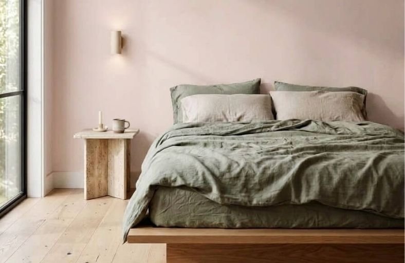
Pastel paint colors have a timeless, gentle appeal that makes any room feel immediately lighter, softer, and more welcoming without the visual commitment of a bolder, more saturated shade.
Their soft, airy quality allows them to introduce color into a space in the most approachable way possible, enough tonal presence to feel intentional and decorative, yet light enough to maintain the openness and luminosity that most homeowners want from their walls.
From the softest blush pink and barely-there lavender to gentle mint green and pale sky blue, the pastel palette offers a wide range of beautiful options for every room and every personal style.
These beautiful pastel paint colors will inspire you to bring softness, warmth, and gentle color into your home beautifully.
| Reflectivity Tier | LRV Range | Architectural Effect | Representative Color Examples |
|---|---|---|---|
| Saturated Mid-Pastels | 60.00 – 65.00 | Grounded tone with visible color depth; defines spatial boundaries while maintaining light reflection. | Benjamin Moore Palladian Blue (61.17) Farrow & Ball Peignoir (60.30) Sherwin-Williams Sea Salt (63.00) |
| Balanced Light Pastels | 66.00 – 75.00 | Optimal balance of color identity and illumination; visually expands room dimensions. | Behr Breezeway (66.00) Farrow & Ball Calamine (66.01) Behr Brook Green (68.00) Sherwin-Williams Window Pane (71.26) Farrow & Ball Borrowed Light (~75.00) |
| High-Reflectance Whispers | 76.00 – 95.00 | Near-white luminous washes; maximizes light bounce in dim or compact interior spaces. | Benjamin Moore First Light (75.86) Valspar Mint Hint (86.82) Valspar Free Mint (94.34) |
The following table synthesizes eleven architectural-grade pastel paint colors from industry-leading manufacturers, detailing their exact technical parameters, undertones, and primary design applications.
Technical Specifications of Recommended Pastel Paint Colors
| Manufacturer | Paint Color Name | Color Code / ID | LRV | Primary Undertones | Recommended Design Pairing |
|---|---|---|---|---|---|
| Benjamin Moore | First Light | 2102-70 | 75.86 | Blush Pink, Soft Beige, Cool Grey | Chantilly Lace, Hale Navy, Walnut |
| Sherwin-Williams | Sea Salt | SW 6204 | 63.00 | Muted Green, Cool Blue, Grey | Pure White, Natural Oak, Brass |
| Behr | Breezeway | MQ3-21 | 66.00 | Sea-Glass Green, Cool Blue | Ultra Pure White, Espresso Wood, Linen |
| Benjamin Moore | Palladian Blue | HC-144 | 61.17 | Airy Sky Blue, Soft Green, Grey | Simply White, Warm Teak, Marble |
| Sherwin-Williams | Window Pane | SW 6210 | 71.26 | Pale Green-Blue, Watery Grey | High Reflective White, Pale Ash, Silver |
| Farrow & Ball | Peignoir | No. 286 | 60.30 | Muted Dusty Rose, Heavy Mauve-Grey | Strong White, Chelsea Gray, Brass |
| Farrow & Ball | Calamine | No. 230 | 66.01 | Delicate Blush Pink, Soft Grey | All White, Sage Green, Rattan |
| Farrow & Ball | Borrowed Light | No. 235 | ~75.00 | Illuminating Sky Blue, Cool White | Pointing White, Navy Blue, Honey Oak |
| Valspar | Mint Hint | 6004-9A | 86.82 | Ultra-Light Mint, Ice Blue | Bright White Shaker, Polished Nickel |
| Behr | Brook Green | N410-2 | 68.00 | Minty Sage, Smoky Blue-Grey | Crisp White Trim, Matte Black, Cedar |
| Valspar | Free Mint | F60-5A | 94.34 | Whisper-Light Mint Green | Blonde Timber, Soft Terrazzo, Gold |
Benjamin Moore First Light 2102-7
Benjamin Moore First Light 2102-70 represents a modern shift toward warm, optimistic neutrals.
Serving as a sophisticated alternative to traditional beige or stark white, this soft blush pink contains a balanced grey-beige undertone that prevents the hue from reading overly saccharine.
With a high Light Reflectance Value of 75.86, it maximizes natural luminescence in east- or south-facing living areas while maintaining a tranquil ambiance.
Architectural elements such as crisp white trim or dark wood flooring provide grounding contrast against its delicate flush.
In primary suites, dining rooms, or formal parlors, First Light pairs seamlessly with mid-tone greiges, deep navy accents, and brushed brass hardware, offering an airy foundation that flatters ambient evening lighting and varied interior textiles.
Sherwin-Williams Sea Salt SW 6204
Sherwin-Williams Sea Salt SW 6204 is a renowned chameleon tone in coastal and transitional interior design.
Positioned perfectly between sage green and cool blue-grey, this low-chroma pastel exhibits an LRV of 63.00, allowing it to adapt dynamically to shifting natural light.
Under northern exposure, the blue-grey undertones surface to create a cool, spa-like atmosphere, whereas southern sun exposure draws out a soft, muted green.
This versatile shade provides an effortless backdrop for natural oak cabinetry, woven rattan textures, and warm linen upholstery.
Designers routinely specify Sea Salt for open-plan living rooms, primary bathrooms, and sunrooms where visual serenity and fluid connection to exterior garden foliage are paramount.
Behr Breezeway MQ3-21
Named Behr’s 2022 Color of the Year, Breezeway MQ3-21 evokes the soothing translucency of polished sea glass.
Featuring a Light Reflectance Value of 66.00, this gentle blue-green hue offers a vibrant yet grounded alternative to pale grey or off-white wall finishes.
Its subtle grey foundation stabilizes the green-blue bias, keeping the paint visually restrained across large vertical expanses.
Breezeway excels in home offices, coastal dining spaces, and sun-lit bedrooms, where it fosters mental clarity and quiet focus.
When paired with crisp white crown molding, dark espresso furniture, or warm brass accents, the color delivers a refreshed architectural presence that visually expands compact residential interiors.
Benjamin Moore Palladian Blue HC-144
Benjamin Moore Palladian Blue HC-144 is a classic historic shade that harmonizes sky blue with a soft green undercurrent.
Balanced by a light touch of grey, its LRV of 61.17 provides medium-light reflectivity that shifts according to the time of day.
In rooms receiving direct southern light, the warm green undertones become luminous, while morning light highlights its cool sky-blue essence.
Palladian Blue is exceptionally effective in primary suites, spa-inspired bathrooms, and formal living areas.
It coordinates seamlessly with off-white trim like Chantilly Lace, warm teak wood floors, and polished marble details, establishing a refined, relaxed environment.
Sherwin-Williams Window Pane SW 6210
Sherwin-Williams Window Pane SW 6210 is an ethereal, pale green-blue pastel designed to maximize spatial openness.
With an LRV of 71.26, this high-reflectance paint shade floods interior rooms with a watery clarity without appearing cold.
Window Pane features a delicate blend of whisper-light green and ice blue, anchored by grey to soften visual intensity.
It is particularly well-suited for entryways, compact bedrooms, and windowless hallways where natural light is scarce.
Pairing Window Pane with crisp white architectural millwork, pale ash wood flooring, and brushed silver or matte black hardware produces a clean, contemporary aesthetic that feels endlessly expansive.
Farrow & Ball Peignoir No. 286
Farrow & Ball Peignoir No. 286 takes inspiration from the romantic elegance of vintage chiffon gowns.
This sophisticated muted pink combines blush undertones with a heavy grey cast, yielding a complex dusty mauve.
With an LRV of 60.30, Peignoir shifts dramatically depending on lighting, reading as a soft pinkish grey in dim light and revealing rose notes under warm sunlight.
It provides a mature, grounded alternative to traditional pinks, making it ideal for primary bedrooms, formal dining rooms, and historic hallways.
Designers pair Peignoir with deep charcoal accents, rich walnut furniture, and marble surfaces to create a Parisian-inspired sanctuary.
Farrow & Ball Calamine No. 230
Named after the classic soothing lotion, Farrow & Ball Calamine No. 230 is a delicate pink infused with grey to tone down sweetness.
With an LRV of 66.01, this light-reflecting pastel reads as a fresh, airy blush in well-lit rooms while imparting an enveloping warmth in smaller spaces.
Calamine creates a poetic atmosphere in nurseries, guest bedrooms, and high-ceilinged living rooms.
Its chalky matte finish interacts gracefully with natural materials such as rattan, travertine, washed sage linens, and antique brass fixtures, establishing a warm minimalist ambient setting that feels timeless and comforting.
Farrow & Ball Borrowed Light No. 235
Farrow & Ball Borrowed Light No. 235 is a pale sky blue named after the architectural practice of bringing light into dark inner spaces.
Exhibiting a soft, airy tone with high light reflectivity (~75.00 LRV), this pastel paint shade evokes clear morning skies.
Its subtle, cool undertones brighten dim hallways, ceiling planes, and north-facing bedrooms without feeling stark or clinical.
Borrowed Light pairs beautifully with crisp white trims, navy accent joinery, and warm honey oak flooring.
Applied across living room walls or coffered ceilings, it imbues residential spaces with a sense of gentle breezes and open vertical perspective.
Valspar Mint Hint 6004-9A
Valspar Mint Hint 6004-9A is an exceptionally light, refreshing mint pastel with a Light Reflectance Value of 86.82.
Near white in overall brightness, this color reveals its delicate blue-green tint upon closer inspection, making it an ideal choice for color-cautious homeowners.
Mint Hint neutralizes harsh artificial lighting and enhances spatial perception in compact bathrooms, kitchens, and laundry rooms.
The color pairs effortlessly with white shaker cabinetry, marble countertops, polished nickel hardware, and light ash flooring.
Its high-reflectance profile brings an enduring sense of botanical freshness and restorative light into modern utility and living areas.
Behr Brook Green N410-2
Behr Brook Green N410-2 is a versatile sage-tinted pastel that blends a mint green base with a smoky blue-grey overtone.
Holding an LRV of 68.00, this nature-inspired hue brings the tranquil feel of the outdoors into contemporary residential interiors.
Under cool northern light, Brook Green leans slightly blue and foggy, whereas direct sun brings out a creamy green character.
Brook Green is highly effective in kitchen cabinetry, modern farmhouse dining rooms, and serene bedrooms.
When combined with matte black ironwork, natural wood tones, and soft white trim, it yields a grounded, organic aesthetic that balances modern style with subtle color depth.
Valspar Free Mint F60-5A
Valspar Free Mint F60-5A represents the extreme light end of the pastel paint spectrum, boasting an extraordinary LRV of 94.34.
This whisper-light color operates almost like a tinted off-white, infusing interior walls with a faint, cool mint glow under bright sunlight.
Free Mint eliminates the harshness of standard sterile white paint while bouncing almost all visible ambient light throughout the space.
It is an exceptional selection for small home offices, nursery ceilings, and windowless hallways seeking visual expansion.
Designers pair Free Mint with blonde timber furniture, pastel accent textiles, and subtle brass accents to curate an airy, uplifting interior.
Strategic Principles for Pastels in Interior Architecture
Illuminative Behavior Across Orientations
The successful deployment of pastel wall colors requires calculating the orientation of natural light sources.
Light quality shifts dramatically across geographical facades, altering how low-chroma paint pigments render on vertical surfaces.
| Facade Orientation | Natural Lighting Characteristics | Color Rendering Effect | Recommended Pastel Undertones |
|---|---|---|---|
| North-Facing | Cool, indirect, slightly blue light throughout the day. | Dulls cool shades; brings out grey or icy undertones. | Warm blushes, delicate pinks, and warm beige-pinks (e.g., Farrow & Ball Calamine, BM First Light). |
| South-Facing | Intense, warm golden sunlight from morning through afternoon. | Intensifies warmth; can oversaturate pinks or yellow-based pastels. | Cool green-blues, soft sage, and watery sky blues (e.g., SW Sea Salt, BM Palladian Blue). |
| East-Facing | Bright, warm morning sunlight followed by cool afternoon shade. | Renders hues warmly early in the day; casts cool shadows later. | Balanced sea-glass greens and clear light blues (e.g., Behr Breezeway, SW Window Pane). |
| West-Facing | Cool morning illumination giving way to intense golden-orange evening light. | Heightens yellow, red, and orange tones in late afternoon. | Muted mauve-greys and smoky soft sage (e.g., Farrow & Ball Peignoir, Behr Brook Green). |
Sheen Selection and Material Pairings
The visual impact of pastel paint is heavily influenced by the chosen sheen and adjacent interior materials.
Higher sheens (satin, semi-gloss) reflect light directly, which can accentuate yellow or pink undertones and highlight wall imperfections.
Conversely, flat or eggshell finishes absorb specular glare, dispersing light uniformly to give pastels a soft, velvety texture.
For trim, millwork, and doors, pairing pastels with bright whites (such as Benjamin Moore Chantilly Lace OC-65 or Behr Ultra Pure White) creates crisp architectural framing.
Alternatively, employing “color drenching”, painting walls, trim, baseboards, and ceiling in the same pastel shade using varied sheens, modernizes the space, blurs room boundaries, and visually elevates low ceilings.
When paired with natural wood finishes (like white oak, teak, or walnut), stone surfaces (such as travertine or Carrara marble), and warm metal hardware (brushed brass, unlacquered bronze), pastel wall colors deliver a mature, layered aesthetic suitable for contemporary American homes.