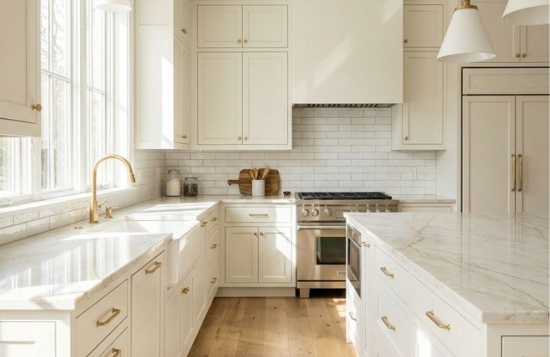
Achieving architectural harmony in a luxury kitchen remodel requires a calculated balance between natural textures and structural color selections.
Taj Mahal quartzite, a premium natural stone imported from Brazil, serves as a benchmark material for high-end countertops due to its marble-like beauty and superior durability.
Characterized by its soft ivory base and delicate veins of gold, beige, and taupe, this stone features an inherently warm profile, making the selection of paint colors a critical step in the design process.
Stark, cool whites make the quartzite appear muddy or yellow, whereas overly matched beiges result in a monotonous and flat appearance.
Consequently, architectural professionals rely on a curated spectrum of warm off-whites, balanced greiges, and sophisticated accent tones to unlock the full visual depth of the stone.
Material Characteristics and Color Profile of Taj Mahal Quartzite
Understanding the geologic and aesthetic profile of Taj Mahal quartzite is essential before executing a color-matching strategy.
Formed from sandstone subjected to immense heat and pressure, quartzite possesses a crystalline structure that yields exceptional hardness and resilience, surpassing even granite.
Unlike marble, which is highly susceptible to acid etching and scratching, quartzite offers a non-combustible, heat-resistant, and UV-resistant surface suitable for demanding culinary spaces.
However, because it is a natural, porous stone, it requires sealing every six to twelve months to defend against absorption of acidic staining agents like red wine and tomato sauce.
Aesthetically, Taj Mahal quartzite mimics the classic luxury of Calacatta marble but presents a significantly warmer palette. The stone exhibits a layered composition:
Base Field: A soft, luminous background ranging from creamy white to pale alabaster and ivory.
Veining: Dynamic, non-linear striations containing muted taupe, warm gray, sandy beige, and delicate wispy gold.
Underlying Undertones: A consistent warmth characterized by orange-amber or soft pink-beige influences that shift based on lighting conditions.
The stone exhibits notable block-to-block variation. Some slabs display highly pronounced gold and amber veins, while others lean toward cool-toned taupes and grays, resembling its geological neighbors like Perla Venata.
This variation underscores the necessity of selecting paint colors that coordinate with the specific slab installed.
Technical Comparison of Selected Benjamin Moore Colors
The following comparative table outlines the technical specifications of seven selected Benjamin Moore paint colors.
The Light Reflectance Value ($LRV$) represents the percentage of light reflected by the paint on a scale of 0% (absolute black) to 100% (pure white).
| Paint Color Name | Color Code | HEX Code | LRV | Dominant Undertones | Recommended Kitchen Application |
|---|---|---|---|---|---|
| White Dove | OC-17 | #efeee5 | 83.16% | Soft Gray-Yellow, Creamy | Perimeter Cabinetry, Trim, Ceilings |
| Swiss Coffee | OC-45 | #eeece1 | 81.91% | Rich Cream, Yellow-Beige | Traditional Cabinetry, Cozy Walls |
| Edgecomb Gray | HC-173 | #d9d0c1 | 63.88% | Warm Taupe, Gray-Beige | Open-Concept Walls, Transitional Cabinets |
| Pale Oak | OC-20 | #ddd9ce | 68.64% | Soft Greige, Pink-Beige | Flat-Panel Cabinetry, Serene Walls |
| Revere Pewter | HC-172 | #c9c2b6 | 55.51% | Muted Gray-Beige, Soft Green | Contrast Islands, Lower Base Cabinets |
| Dove Wing | OC-18 | #e9e6db | 77.52% | Soft Gray, Pale Warm Beige | Transitional Cabinets, Light-Bouncing Walls |
| Hale Navy | HC-154 | #434b56 | 6.30% | Deep Maritime Blue, Gray-Blue | Accent Islands, Dramatic Base Cabinets |
1. Benjamin Moore White Dove (OC-17)
Benjamin Moore White Dove OC-17 is widely recognized in interior design as a versatile, warm off-white that avoids both clinical starkness and excessive yellow undertones.
Boasting a high Light Reflectance Value of 83.16%, this color reflects substantial light, creating an open and airy feel in high-traffic spaces such as kitchens.
The soft, creamy undertones of White Dove harmonize with the creamy white or light ivory background of Taj Mahal quartzite.
This pairing allows the delicate gold and taupe veining of the stone to serve as the visual centerpiece.
Because of its subtle gray-white composition, White Dove maintains its clean appearance even under the cool daylight of north-facing rooms.
Architectural professionals frequently specify this color for perimeter cabinetry, trim, and ceilings to ensure visual continuity throughout open floor plans.
When coordinated with warm oak flooring and unlacquered brass hardware, this neutral establishes a refined, transitional aesthetic.
2. Benjamin Moore Swiss Coffee (OC-45)
Benjamin Moore Swiss Coffee OC-45 represents a richer, creamier white that introduces organic warmth to residential interiors.
With an LRV of approximately 81.91%, it delivers a soft, welcoming atmosphere that softens the hard, geometric surfaces of large kitchens.
The prominent yellow, cream, and beige undertones of Swiss Coffee make it an exceptional partner for Taj Mahal quartzite slabs characterized by heavy amber and gold veining.
Unlike cool or stark whites, which can clash with the natural warmth of the stone, Swiss Coffee complements the quartzite’s earthy elements without competing for attention.
This color is highly recommended for traditional or cottage-style cabinetry, where a cozy and classic look is desired.
When applied to kitchen walls or main cabinetry, Swiss Coffee pairs beautifully with other natural materials like exposed red brick, rustic fieldstone, and warm wood flooring, establishing a cohesive, biophilic kitchen design.
3. Benjamin Moore Edgecomb Gray (HC-173)
Edgecomb Gray HC-173 is a highly adaptable, light warm gray-beige, often classified as a classic greige or soft taupe.
Having an LRV of 63.88%, it resides in the lighter mid-range, offering a soft, grounded presence that is neither too heavy nor too bright.
The organic beige and taupe undertones of Edgecomb Gray align with the natural marbling found in Taj Mahal quartzite.
This coordination brings out the stone’s delicate veins while introducing subtle contrast when applied to kitchen walls or cabinetry.
Edgecomb Gray acts as a versatile bridge in open-concept homes, helping spaces flow together smoothly.
In north-facing kitchens, the color may reveal a very faint green undertone, whereas south-facing light emphasizes its comforting, warm beige character.
This color is best utilized on perimeter walls or as an accent island color alongside white trim, mid-tone oak floors, and aged brass fixtures.
4. Benjamin Moore Pale Oak (OC-20)
Benjamin Moore Pale Oak OC-20 is a soft, graceful neutral that captures the quiet majesty of natural white oak.
With an LRV of approximately 68.64%, it is slightly lighter than Edgecomb Gray, making it a highly desirable choice for bright, open-concept kitchens.
Pale Oak belongs to the yellow hue family near the yellow-red border, giving it a unique ability to shift dynamically based on surrounding finishes and light sources.
In balanced, natural daylight, it reads as a warm gray-beige, matching the soft taupe and light beige striations of Taj Mahal quartzite.
In certain lighting conditions, it can exhibit delicate peachy-pink overtones or a subtle lavender warmth.
This color is suited for kitchen walls, modern flat-panel cabinetry, or open shelving backdrops, where a soft, unpretentious backdrop is required.
Pale Oak pairs with crisp white trims, natural wood finishes, and unlacquered brass accents.
5. Benjamin Moore Revere Pewter (HC-172)
Revere Pewter HC-172 is a classic, medium-light greige that serves as a benchmark neutral in high-end kitchen design.
Registering an LRV of 55.51%, it provides distinct depth and structural contrast without making the kitchen feel dark or confined.
The balanced composition of gray and beige notes in Revere Pewter makes it an adaptive chameleon color.
Under cool northern light, its gray base and soft green undertones become more apparent, while warm southern light brings forward its rich, rustic beige notes.
When combined with Taj Mahal quartzite, Revere Pewter echoes the stone’s darker gray-taupe veining, grounding the kitchen’s palette.
This color is a favored selection for kitchen islands, lower base cabinetry, or dramatic accent walls. When framed by crisp white trim and warm wood flooring, Revere Pewter creates a cozy, highly sophisticated culinary space.
6. Benjamin Moore Dove Wing (OC-18)
Benjamin Moore Dove Wing OC-18 is an elegant off-white characterized by delicate gray notes and warm, pale beige undertones.
With an LRV of 77.52%, it reflects an abundance of light, allowing smaller or medium-sized kitchens to feel bright, open, and serene.
Dove Wing acts as a softer, more inviting alternative to stark white cabinetry, preventing the cold, institutional feeling that cool whites can generate.
This color interacts with the creamy background and subtle taupe veining of Taj Mahal quartzite.
Because of its unique formulation, Dove Wing hides minor scuffs and marks more effectively than pure white paints, making it practical for high-traffic kitchen cabinets and busy open floor plans.
When paired with dark wood flooring or polished brass hardware, Dove Wing establishes a balanced, high-end transitional look that successfully unites contemporary and classic design elements.
7. Benjamin Moore Hale Navy (HC-154)
Benjamin Moore Hale Navy HC-154 is a deeply saturated navy blue that brings bold, sophisticated contrast to luxury kitchen designs.
Registering a low LRV of 6.30%, this historical color has a muted, velvety gray cast that prevents it from looking harsh or like a flat black.
Under natural light, Hale Navy displays its classic, rich maritime blue undertones, establishing a sense of stability and drama.
This dramatic color is recommended for lower base cabinets or central kitchen islands.
When crowned with a polished Taj Mahal quartzite countertop, the dark blue background accentuates the stone’s soft white background and pulls its golden and taupe veining forward.
Hale Navy coordinates with warm wood tones, polished brass or gold hardware, and warm off-white walls, resulting in a balanced, high-contrast culinary masterpiece.
Lighting and Orientation
Achieving structural color harmony requires evaluating how light sources interact with the paint’s pigments and the quartzite’s crystalline minerals. The color temperature of light bulbs, measured in Kelvins ($K$), alters the spatial perception of both the cabinets and the countertops.
Low Color Temperature (2700K–3000K): Generates a warm, yellow light that emphasizes the gold and beige undertones of Taj Mahal quartzite and makes warm whites like Swiss Coffee and Dove Wing read as soft and comforting.
High Color Temperature (4000K–5000K+): Emits a cool, blue-white light that accentuates the gray-blue veining of the stone but can make warm whites appear flat or yellowed by contrast.
The orientation of the kitchen’s windows also dictates color selection, as represented in the spatial matrix below:
| Room Orientation | Natural Light Quality | Paint Reaction Trends | Recommended Solution |
| North-Facing | Cool, bluish, shadow-heavy daylight | Accentuates cool gray bases; can make off-whites appear dingy | Swiss Coffee (OC-45) or Dove Wing (OC-18) to inject necessary warmth |
| South-Facing | Warm, intense, golden afternoon sun | Amplifies yellow and gold undertones, potentially washed-out | Edgecomb Gray (HC-173) or Revere Pewter (HC-172) to ground the warmth |
| East-Facing | Bright, yellow morning light; cool afternoon shade | Shifts from warm and vibrant in the morning to cool in the evening | White Dove (OC-17) or Pale Oak (OC-20) for balanced, all-day neutrality |
| West-Facing | Cool morning light; intense, orange evening light | Strong warm shift late in the day; can over-saturate beiges | Edgecomb Gray (HC-173) or Dove Wing (OC-18) to maintain structural clarity |
Styling Taj Mahal Quartzite
To elevate a kitchen featuring Taj Mahal quartzite, architectural designers utilize specific material pairings and accent elements that highlight the stone’s geological history.
1. Hardware and Fixture Finishes
To maximize the visual impact of Taj Mahal’s delicate gold and taupe veining, select metallic hardware that complements these warm tones.
Unlacquered Brass and Aged Gold: These finishes directly coordinate with the wispy gold veins of the stone, bringing a touch of historic elegance and warmth.
Matte Black and Antique Bronze: Perfect for transitional and modern farmhouse kitchens, these metals offer grounded graphic contrast against warm neutrals like Edgecomb Gray and Pale Oak.
Polished Nickel: A warmer alternative to chrome, polished nickel reflects light beautifully and harmonizes with the soft gray-taupe elements of the stone.
2. Cabinetry and Wood Tones
Natural wood elements are highly effective in bringing out the organic depth of Taj Mahal quartzite.
White Oak and Blonde Wood: Combining blonde oak cabinetry with the warm cream background of Taj Mahal quartzite creates a light, airy, and textured Scandinavian or coastal style.
Walnut and Dark Oak: For high-contrast traditional or transitional designs, rich walnut wood on lower cabinetry or a central island provides a striking frame that emphasizes the stone’s luminosity.
3. Tuscan Update and Warm Alternatives
For kitchens retaining older design elements, such as travertine flooring or stone fireplaces with green-beige undertones, the use of standard gray paint is highly discouraged.
Instead, classic, earthy tans like Benjamin Moore Manchester Tan (HC-81) can be deployed.
Manchester Tan is a neutral beige that is neither too yellow nor too pink, serving as a reliable structural bridge that ties together warm travertine floors, green-gray stone fireplaces, and the organic warmth of Taj Mahal quartzite.