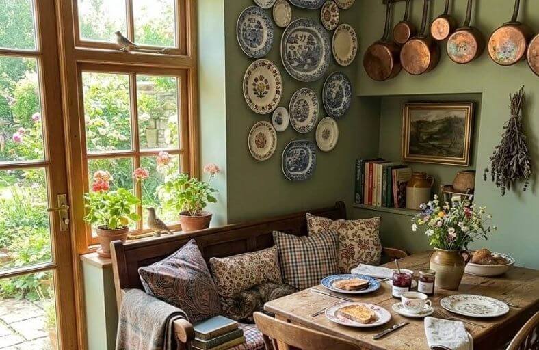
Real estate professionals consistently rank fresh paint as one of the top pre-sale improvements a homeowner can make.
The specific colors chosen matter enormously in determining how buyers respond to a property during showings and open houses.
Colors that feel too personal, too bold, or too dated can cause buyers to mentally add repainting to their list of required updates, directly reducing their willingness to offer full price.
The goal is to choose colors that feel neutral without being boring, warm without being imposing, and contemporary without being trendy.
These beautiful paint colors represent the most effective and broadly appealing options for presenting your home in its very best light during the selling process.
Analytical Comparison of East-Facing Architectural Paint Formulas
Selecting paint formulations for eastern light requires evaluating LRV alongside exact RGB profiles to predict how pigments respond to warm morning rays versus cool afternoon shade.
| Brand | Paint Name & Number | LRV | Primary Undertone | Optimal Architectural Application |
|---|---|---|---|---|
| Benjamin Moore | Pale Oak (OC-20) | 69 | Warm Greige / Yellow-Red | Open Living Areas, Transitional Foyers |
| Sherwin Williams | Alabaster (SW 7008) | 82 | Warm Cream / Soft Beige | Rustic Kitchens, Living Rooms, Shiplap |
| Sherwin Williams | Pure White (SW 7005) | 84 | Balanced Soft Gray-White | Contemporary Interiors, Trim, Cabinets |
| Sherwin Williams | Sea Salt (SW 6204) | 63 | Muted Blue-Green-Gray | Spa Bathrooms, Serene Master Bedrooms |
| Benjamin Moore | White Dove (OC-17) | 83 | Luminous Creamy Greige | Whole-House Walls, Traditional Millwork |
| Sherwin Williams | Agreeable Gray (SW 7029) | 60 | Warm Taupe / Greige | Transition Spaces, Kitchen Wall Planes |
| Sherwin Williams | Rainwashed (SW 6211) | 59 | Soft Blue-Green | Tranquil Bedrooms, Home Offices |
| Farrow & Ball | Breakfast Room Green (No. 81) | 38 | Cheerful Mid-Tone Green | Morning Breakfast Nooks, Dining Rooms |
| Benjamin Moore | Cloud White (OC-130) | 85 | Soft Cream / Gentle Yellow | Darker East Rooms, Kitchen Cabinetry |
| Farrow & Ball | Teresa’s Green (No. 236) | 60 | Refreshing Aqua / Blue Base | Afternoon Reading Dens, Guest Baths |
| Sherwin Williams | Repose Gray (SW 7015) | 58 | Cool-Neutral Gray | Modern Living Rooms, High-Sun Spaces |
| Benjamin Moore | Hale Navy (HC-154) | 6 | Deep Slate Navy | Moody Evening Libraries, Accent Walls |
| Farrow & Ball | Pink Ground (No. 208) | 65 | Soft Earthy Pink / Yellow-Red | Uplifting Bedrooms, Warm Sitting Rooms |
Benjamin Moore Pale Oak (OC-20)
Benjamin Moore Pale Oak (OC-20) is a versatile greige with a Light Reflectance Value (LRV) of 69.
Belonging to the yellow-red hue family, Pale Oak adapts fluidly to the chromatic swings of eastern light exposures.
In early morning sun, it emits a soft, welcoming warm-gray ambiance that prevents expansive wall planes from feeling sterile or clinical.
As sunlight shifts westward in the afternoon, its balanced gray and beige composition keeps the room from casting cool purple or dirty undertones, maintaining a refined off-white appearance.
This reliable chameleon quality makes Pale Oak an optimal specification for open-concept living areas, transitional foyers, and master bedrooms requiring visual continuity.
It pairs harmoniously with crisp white millwork, natural oak flooring, and unlacquered brass hardware.
Sherwin Williams Alabaster (SW 7008)
Sherwin Williams Alabaster (SW 7008) is an iconic warm off-white featuring an LRV of 82.
Formulated with a subtle beige-cream base and a gentle yellow undertone, Alabaster is engineered to counteract the flat, shadowy light typical of eastern afternoons.
While stark cool whites tend to read dingy or gray when direct sunlight recedes, Alabaster provides continuous visual warmth and luminosity.
During sunrise, morning rays gently enhance its cozy creaminess without pushing it into a harsh sallow range.
It excels in rustic, traditional, and modern farmhouse settings, particularly on shiplap accenting, kitchen cabinetry, and expansive living room walls.
Combining Alabaster with warm architectural elements, such as reclaimed timber beams, travertine tile, and warm bronze fixtures, anchors its cozy aesthetic.
Sherwin Williams Pure White (SW 7005)
Sherwin Williams Pure White (SW 7005) provides a clean, modern off-white aesthetic with an LRV of 84.
Containing a faint gray undertone with a whisper of warmth, Pure White delivers visual brightness without crossing into clinical coldness.
In east-facing rooms, its neutral foundation absorbs golden early morning daylight without shifting overly yellow, while maintaining a luminous, balanced atmosphere during dimmer afternoon hours.
Pure White serves as an ideal baseline color for contemporary interiors, trimwork, ceilings, and architectural cabinetry.
Its adaptability allows it to coordinate with a wide spectrum of interior materials, from dark slate and cool marble to warm hardwood floors.
Sherwin Williams Sea Salt (SW 6204)
Sherwin Williams Sea Salt (SW 6204) is a muted blue-green-gray neutral with an LRV of 63.
Renowned for its transformative visual qualities, Sea Salt reacts dynamically to the shifting daylight spectrum of east-facing spaces.
During early morning hours, golden rays bring out its soft green undertones, infusing the space with organic warmth.
As the sun passes midday, the cooler indirect light highlights its serene blue-gray depth, preventing the walls from appearing washed out or flat.
This dynamic hue is a top specification for spa-inspired bathrooms, calm primary suites, and coastal living rooms.
It pairs gracefully with off-white trim, natural rattan, light ash wood, and polished nickel hardware to establish a restorative, peaceful environment.
Benjamin Moore White Dove (OC-17)
Benjamin Moore White Dove (OC-17) is an industry-favorite off-white featuring an LRV of 83.
Characterized by a soft greige base with light creamy undertones, White Dove strikes an elegant equilibrium between warmth and clarity.
In eastern exposures, it catches morning sunlight with a soft glow that energizes dining areas and living spaces.
When afternoon shadow settles, its underlying greige prevents cool ambient daylight from draining the room’s vitality.
White Dove is an extraordinary choice for full-room color drenching, architectural trim, detailed millwork, and open floor plans.
It coordinates seamlessly with natural stone fireplaces, warm oak floors, and textured neutral upholstery.
Sherwin Williams Agreeable Gray (SW 7029)
Sherwin Williams Agreeable Gray (SW 7029) is an iconic warm greige boasting an LRV of 60.
Formulated with a balanced mixture of gray and beige with subtle taupe undertones, Agreeable Gray maintains chromatic stability across changing light conditions.
In east-facing rooms, it softens the intense brightness of early sun while supplying enough depth to withstand shadowy afternoon hours without appearing muddy or dingy.
Widely specified for open floor plans, living rooms, and hallways, it acts as a reliable bridge between warm and cool interior elements.
Agreeable Gray pairs effortlessly with white trim, dark espresso wood finishes, and rich navy or olive accents.
Sherwin Williams Rainwashed (SW 6211)
Sherwin Williams Rainwashed (SW 6211) is a serene blue-green shade with gray undertones, possessing an LRV of 59.
Engineered with sufficient chromatic richness to hold its depth, Rainwashed avoids the dreary look that grays often suffer in afternoon shade.
During early morning hours, it exhibits a light blue character infused with subtle green warmth.
As direct sunlight shifts, its cool undertones come forward, creating a serene, tranquil sanctuary suitable for bedrooms, nurseries, and home offices.
Rainwashed harmonizes beautifully with bright white trim, soft linen drapery, pale oak furniture, and matte black lighting fixtures.
Farrow & Ball Breakfast Room Green (No. 81)
Farrow & Ball Breakfast Room Green (No. 81) is a lively, mid-tone botanical green featuring an LRV of 38.
Historical east-facing morning rooms inspired this hue, which is specifically formulated to maximize early sunlight.
Its cheerful yellow-green undertones reflect morning rays with optimism, filling kitchens and breakfast spaces with natural energy.
Unlike lighter pastels that lose definition in afternoon shade, the rich pigmentation of Breakfast Room Green maintains an inviting warmth after direct sun recedes.
It makes a striking statement when paired with natural walnut cabinetry, antiqued brass fittings, botanical artwork, and stone flooring.
Benjamin Moore Cloud White (OC-130)
Benjamin Moore Cloud White (OC-130) is a classic creamy off-white featuring an LRV of 85.
Formulated with a gentle yellow undertone, Cloud White delivers the necessary warmth to balance the cool, flat natural light of eastern afternoons.
In morning sun, it reads as a soft off-white without leaning overly yellow.
By mid-afternoon, when eastern spaces lose direct illumination, Cloud White’s creamy backdrop preserves a bright, inviting atmosphere.
It is particularly effective in rooms with smaller windows or shadowed views.
Designers frequently use Cloud White for kitchen cabinetry, ceilings, and main living areas paired with warm woods and brass accents.
Farrow & Ball Teresa’s Green (No. 236)
Farrow & Ball Teresa’s Green (No. 236) is a delicate aqua shade with a pale blue base and soft green undertones, possessing an LRV of 60.
Specifically suited for eastern light variations, Teresa’s Green offers a fresh ambiance during morning hours.
In cool afternoon shade, its blue base emerges, creating a therapeutic atmosphere that keeps spaces feeling serene rather than cold.
This gentle character makes Teresa’s Green an excellent selection for bedrooms, reading nooks, and guest suites.
It pairs effortlessly with soft white trim, warm coral or buttery yellow textiles, and light ash wood furnishings.
Sherwin Williams Repose Gray (SW 7015)
Sherwin Williams Repose Gray (SW 7015) is a versatile cool-neutral gray with an LRV of 58.
Formulated with subtle green and taupe undertones, Repose Gray is designed to absorb high-intensity early sunlight without skewing overly yellow.
In east-facing rooms, it grounds early golden morning light, maintaining a crisp architectural backdrop.
As the room shifts into afternoon shade, its balanced undertones prevent the color from appearing flat or muddy.
Repose Gray is ideal for modern living rooms, open hallways, and home offices.
It pairs exceptionally well with crisp white trim, black metal accents, and rich cognac leather furniture.
Benjamin Moore Hale Navy (HC-154)
Benjamin Moore Hale Navy (HC-154) is a deeply saturated navy blue featuring an LRV of 6.
Possessing rich slate-blue undertones, Hale Navy embraces the natural lighting dynamics of east-facing rooms used primarily in the afternoon or evening.
Rather than attempting to compensate for lost daylight, this moody shade creates a cozy, cocooning environment as natural light recedes.
During morning hours, direct sunlight highlights its blue depth and clean architectural shadow lines.
Hale Navy is an ideal choice for formal dining rooms, executive libraries, accent walls, and primary bedrooms.
It produces striking contrast when paired with bright white trim, brass fixtures, and warm wood tones.
Farrow & Ball Pink Ground (No. 208)
Farrow & Ball Pink Ground (No. 208) is a muted blush pink grounded by warm, earthy yellow-red undertones, with an LRV of 65.
Formulated to avoid the unwanted cool lilac shift that can affect cooler pinks in afternoon shade, Pink Ground provides glowing warmth in eastern exposures.
Direct morning sunlight enhances its subtle golden notes, creating an uplifting morning space.
As natural light transitions to cooler afternoon shadows, Pink Ground softens into a dusty nude tone that retains visual warmth.
It works exceptionally well in bedrooms, sitting rooms, and nurseries, pairing beautifully with stony browns, soft white trims, and muted green accents.
Strategic Decorating and Material Pairing Principles
Counteracting the Afternoon Lighting Drop
Because eastern daylight levels drop significantly past midday, relying entirely on wall paint to sustain visual warmth can lead to incomplete results.
Interior architectural elements must be intentionally layered to support the wall color during flat shadow hours.
Tactile material integration serves as a primary countermeasure.
Incorporating organic textures, such as unlacquered brass hardware, warm oak or walnut flooring, natural rattan, terracotta, and cognac leather, injects permanent thermal warmth into the environment.
These organic surfaces absorb cool afternoon shadows and reflect soft amber light back into the space.
Artificial lighting calibration represents another vital design consideration.
To compensate for early sunset shadowing, lighting plans should utilize 2700K to 3000K warm LED bulbs.
Cooler light sources exceeding 4000K exaggerate the flat blue quality of afternoon eastern light, causing greiges and warm whites to read sterile, dull, or muddy.
Furthermore, strategic accent placement provides visual balance.
Integrating warm accent tones, such as ochre yellow, soft coral, rust, or rich forest green, in textiles, throw pillows, and artwork prevents cool-toned walls (such as SW Sea Salt or SW Rainwashed) from feeling overly cold when direct sunlight recedes.
Managing Dual-Exposure Spaces
When an east-facing room includes secondary window openings on adjacent walls, the dominant orientation dictates the overarching color specification.
| Combined Exposure Profile | Primary Lighting Trait | Design Strategy & Recommended Palette |
|---|---|---|
| East + North Exposure | Low overall light volume; cool afternoon shade dominates. | Prioritize warm neutrals with creamy yellow/red bases (e.g., BM Cloud White, SW Alabaster) to prevent shadow muddying. |
| East + South Exposure | High morning intensity coupled with warm southern wash all afternoon. | Utilize balanced greiges or soft cool hues (e.g., SW Agreeable Gray, SW Sea Salt) to absorb excess thermal heat. |
| East + West Exposure | Intense morning gold, dark midday drop, brilliant sunset hour. | Select stable, mid-chroma hues (e.g., BM Pale Oak, SW Repose Gray) that modulate between extreme warm peaks. |
Technical Summary and Architectural Recommendations
Selecting the ideal paint color for an east-facing space depends heavily on the room’s primary schedule of occupancy.
For spaces utilized predominantly during early morning hours, such as breakfast nooks, morning kitchens, and primary bathrooms, colors that celebrate direct solar warmth, such as Farrow & Ball Breakfast Room Green or Sherwin Williams Alabaster, optimize the natural golden light.
Conversely, for spaces occupied during late afternoon or evening hours, such as living rooms, home offices, and master bedrooms, designers should either embrace cool, tranquil undertones that stabilize flat daylight (e.g., Sherwin Williams Sea Salt, Farrow & Ball Teresa’s Green) or commit to deeply saturated, cocooning shades (e.g., Benjamin Moore Hale Navy).
Testing physical paint swatches on large sample boards positioned across multiple wall planes remains an indispensable step to evaluate how undertones evolve from the early morning golden wash to late-afternoon ambient shade.