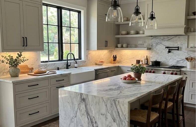
Selecting the perfect paint color to complement Carrara marble in a luxury kitchen requires a deep understanding of light reflectance and undertones.
Originating from the quarries of Tuscany, Italy, Carrara marble is celebrated for its luminous white background and soft, feathery gray veining.
However, because it is a natural stone, its appearance is highly sensitive to surrounding colors. A paint that is too warm can make the marble look yellow or muddy, while an overly cool paint can render the kitchen clinical and sterile.
To achieve a balanced and cohesive design, you must carefully evaluate the mineral properties of their marble alongside the light reflectance value (LRV) and undertones of their chosen paint.
The following guide analyzes seven exceptional Sherwin-Williams paint colors that harmonize beautifully with Carrara marble, providing exact color specifications and tailored design strategies for high-end culinary spaces.
Before diving into each color, the table below provides a quick reference for their technical attributes:
| Paint Color | SW Code | HEX Code | LRV | Primary Undertones | Best-Matched Carrara Type |
| Extra White | SW 7006 | #eeefea | 86 | Cool blue | Bianco Carrara CD |
| Pure White | SW 7005 | #edece6 | 84 | Soft gray, passive yellow | Bianco Carrara C |
| Repose Gray | SW 7015 | #ccc9c0 | 58 | Greige, violet-blue | Carrara Venato |
| Passive | SW 7064 | #cbccc9 | 60 | Cool blue-gray | Carrara Ordinario |
| Naval | SW 6244 | #2f3d4c | 4 | Deep indigo | Classic Bianco Carrara |
| Sea Salt | SW 6204 | #cdd2ca | 63 | Muted sage, blue-gray | Blue-green veined slabs |
| Iron Ore | SW 7069 | #434341 | 6 | Graphite charcoal, green-gray | Bardiglio Carrara |
1. Sherwin-Williams Extra White (SW 7006)
Sherwin-Williams Extra White (SW 7006) is a brilliant, crisp white with an exceptionally high Light Reflectance Value (LRV) of 86.
Infused with subtle, cool blue undertones, this paint color acts as a luminous backdrop that amplifies the natural brightness of a kitchen.
When paired with Bianco Carrara CD marble, which inherently features a cooler, slightly blue-gray base, Extra White creates a highly modern, seamless transition. The cool blue undertones in the paint perfectly mirror the cool gray veins of the stone, preventing any awkward yellow cast.
This pristine white is best utilized on flat-panel cabinets or clean kitchen trim to foster a Scandi-minimalist or ultra-contemporary culinary environment. Avoid pairing it with warm rustic woods, as this contrast can make the white appear too clinical or unfinished.
2. Sherwin-Williams Pure White (SW 7005)
Sherwin-Williams Pure White (SW 7005) is a highly versatile, softer white registering an LRV of 84. Unlike starker whites, SW Pure White contains a delicate blend of soft gray and a very passive hint of yellow.
This unique formulation keeps the paint bright and clean without ever feeling sterile, making it a favorite for transitional kitchen cabinets.
Pure White pairs beautifully with Bianco Carrara C marble, which features a warmer, softer white background and delicate gray veining.
The passive yellow undertone in Pure White subtly complements the stone’s warm background, while the gray undertone ties into the marble’s feathery veins. In north-facing kitchens, the cool natural light may initially pull out a blue-gray cast.
However, integrating warm brass hardware or light oak flooring will stabilize these tones, creating an exceptionally balanced, inviting atmosphere.
3. Sherwin-Williams Repose Gray (SW 7015)
Sherwin-Williams Repose Gray (SW 7015) is a celebrated light greige with a Light Reflectance Value of 58.
This complex, chameleonic neutral features a balanced mix of gray and beige, layered with subtle violet-blue and brown undertones. Repose Gray is highly responsive to its environment.
In kitchens with cool, northern daylight, its violet-blue undertones emerge, while south-facing light coaxes out its warm beige and taupe qualities.
It acts as a stunning companion to Carrara Venato marble, a variety prized for its dramatic, flowing gray-violet veins.
The violet-blue tendencies of Repose Gray effortlessly highlight these rich, dark veins, grounding the kitchen with structural definition and understated luxury.
To maximize its cozy, sophisticated appeal, pair Repose Gray cabinetry with dark wood floors, matte black cabinet hardware, and warm LED accent lighting.
4. Sherwin-Williams Passive (SW 7064)
Sherwin-Williams Passive (SW 7064) is a crisp, light gray with an LRV of 60, offering a peaceful, modern aesthetic.
Unlike warm-toned greiges, Passive is characterized by cool, silvery blue undertones that give it a clean, tranquil presence.
It pairs flawlessly with Carrara Ordinario marble, which features a balanced, mid-range gray tone that beautifully mirrors the blue-gray undertones of the paint.
This cool gray keeps the kitchen looking airy and structured, particularly in spaces with abundant natural daylight.
To prevent the cool, silvery tones of Passive from feeling too icy, designers recommend pairing it with crisp white trim, such as SW Pure White, to create a fresh, layered effect.
This color is ideal for sleek contemporary cabinetry, lending a soft, velvety depth that highlights the natural elegance of the marble countertops.
5. Sherwin-Williams Naval (SW 6244)
Sherwin-Williams Naval (SW 6244) is a deep, luxurious navy blue that registers an LRV of 4, absorbing light to create a grounding, intimate atmosphere. Saturated with cool gray-green and indigo undertones, Naval is widely considered a “new neutral” that injects dramatic elegance into high-end kitchens.
When paired with classic Bianco Carrara marble, Naval creates an iconic, high-contrast pairing. The clean, white field of the marble pops vividly against the deep indigo cabinetry, while the stone’s delicate gray veins bridge the contrast between the dark paint and lighter walls.
Naval is a magnificent choice for kitchen islands, wet bars, or statement range hoods. When accented with brushed brass, gold, or copper hardware, it creates a striking, nautical-inspired luxury aesthetic that feels both timeless and structurally bold.
6. Sherwin-Williams Sea Salt (SW 6204)
Sherwin-Williams Sea Salt (SW 6204) is a tranquil, muted green with an LRV of 63, blending gray, green, and blue to evoke a calming, spa-like ambiance.
Sea Salt is a true chameleon; in bright daylight, its fresh green tones dominate, while evening lighting draws out its cool, blue-gray side.
Slabs of Carrara marble that exhibit subtle, organic blue or green mineral undertones are exceptionally well-suited for this color.
Applying Sea Salt to kitchen cabinetry or wainscoting beautifully complements the marble’s natural veining, creating an organic, coastal-inspired palette. It harmonizes effortlessly with light oak or maple flooring, soft white moldings, and black metal hardware.
This soothing color brings character to the space without forcing itself into the spotlight, making it perfect for a modern farmhouse aesthetic.
7. Sherwin-Williams Iron Ore (SW 7069)
Sherwin-Williams Iron Ore (SW 7069) is a deep, velvety charcoal-black with an LRV of 6, offering an organic softness that stark blacks lack.
Rather than presenting as a flat black, Iron Ore is saturated with subtle green, gray, and brown undertones, making it a warm and grounded choice.
When integrated into a kitchen with Carrara marble, Iron Ore delivers an arresting, high-contrast framing effect.
The rich charcoal surfaces emphasize the white field of the marble and draw out the cool, dark graphite veining of the stone.
This bold combination works dramatically on lower cabinetry, range hood covers, or architectural island bases.
Accenting Iron Ore with warm metals like brass, gold, or copper adds a layer of ultimate luxury, reflecting beautifully against the dark, matte backdrop.