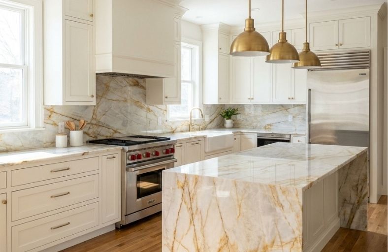
The precise architectural pairing of natural stone surfaces with interior coatings represents a critical checkpoint in high-end residential design.
Quarried in Brazil, Taj Mahal quartzite has gained legendary status due to its unique combination of marble-like translucency and superior metamorphic durability.
The stone’s chromatic signature is defined by a soft ivory or creamy white background layered with warm, organic veining that ranges from amber-gold and brownish-orange to taupe, beige, and warm gray.
Because Taj Mahal is characterized by this complex, inherent warmth, it rarely coordinates with cool, stark, or clinical white paints, which make the stone appear yellow or dirty by comparison.
You must strategically select architectural paint colors that mirror or subtly contrast the stone’s undertones without distracting from its delicate patterns.
Comparative Profile of Selected Coatings
To establish a baseline for spatial design, the selected Sherwin-Williams colors have been categorized across a spectrum of light warm whites, balanced greiges, and deep grounding contrast tones.
| Paint Color | Manufacturer Code | Exact HEX Code | Light Reflectance Value (LRV) | Chromatic Undertone Classification | Recommended Kitchen Application | Coordinating Wood & Metal Finishes |
| Alabaster | SW 7008 | #EDEAE0 | 82.215% | Soft Warm White / Cream | Perimeter Cabinets, Walls, Ceilings | White Oak, Aged Brass |
| Shoji White | SW 7042 | #E6DFD3 | 74.345% | Warm White / Light Greige | Perimeter Cabinets, Accent Walls | Blonde Woods, Matte Black |
| Accessible Beige | SW 7036 | #D1C7B8 | 57.67% | Gray-Beige / Warm Greige | Cabinets, Built-ins, Kitchen Islands | Dark Walnut, Polished Nickel |
| Agreeable Gray | SW 7029 | #D1CBC1 | 60.85% | Warm Gray with Beige Base | Open-Concept Walls, Accent Islands | Warm Hardwoods, Brushed Brass |
| Repose Gray | SW 7015 | #CCC9C0 | 58.13% | Warm Gray / Muted Taupe | Modern Cabinetry, Accent Areas | Stainless Steel, Aged Bronze |
| Sea Salt | SW 6204 | #CDD2CA | 63.04% | Muted Green-Blue Gray | Island Cabinets, Wet Bar Accent | Reclaimed Wood, Warm Gold |
| Urbane Bronze | SW 7048 | #54504A | 8.121% | Deep Charcoal-Brown / Bronze | Kitchen Island, Lower Cabinetry | Brushed Brass, Natural Slate |
1. Sherwin-Williams Alabaster (SW 7008)
Sherwin-Williams Alabaster SW 7008 is an industry-standard warm off-white that delivers brightness without sacrificing cozy elegance.
With a Light Reflectance Value of 82.215%, Alabaster acts as a highly reflective neutral that avoids the cold, clinical glare of true whites.
This cream-based white harmonizes beautifully with the soft ivory background of Taj Mahal quartzite.
Rather than clashing with the stone’s warm character, Alabaster reflects natural light to illuminate the delicate amber-gold and soft beige veining. It is highly recommended for perimeter cabinets, trim, and ceilings.
2. Sherwin-Williams Shoji White (SW 7042)
Sherwin-Williams Shoji White SW 7042 is a sophisticated, warm white that borders on a very light greige.
Operating at a Light Reflectance Value of 74.345%, this shade provides a cozy, soft atmosphere that makes it a highly versatile wall and cabinet option.
Shoji White sits in a neutral zone between white, gray, and warm beige, meaning that no single tone dominates its appearance.
This unique property allows it to coordinate effortlessly with the taupe-beige marbling and sandy undertones found in various Taj Mahal slabs. It is especially favored in modern farmhouse and minimalist kitchens.
3. Sherwin-Williams Accessible Beige (SW 7036)
Sherwin-Williams Accessible Beige SW 7036 is a quiet, warm neutral that features subtle gray undertones, preventing it from appearing overly yellow or muddy.
With an LRV of 57.67%, it sits in a medium-light range, offering sufficient visual depth to create a snug, inviting atmosphere.
This color coordinates seamlessly with the warm tan, brown, and golden-beige veining of Taj Mahal quartzite.
Accessible Beige is frequently selected for lower cabinets, kitchen islands, or accent built-ins to anchor the kitchen while maintaining a light, cohesive aesthetic.
4. Sherwin-Williams Agreeable Gray (SW 7029)
Sherwin-Williams Agreeable Gray SW 7029 is a celebrated warm gray with soft beige undertones.
Having an LRV of 60.85%, it functions as a highly adaptable background neutral that brightens open-concept kitchen spaces while remaining grounded.
The yellow-based hue family origin of Agreeable Gray allows it to pair beautifully with both the warm gold and cooler gray veining present in Taj Mahal quartzite.
It bridges the gap between different cabinetry finishes, making it an excellent wall color to tie together wood islands and painted perimeter cabinets.
5. Sherwin-Williams Repose Gray (SW 7015)
Sherwin-Williams Repose Gray SW 7015 is a balanced, light-to-medium gray with an LRV of 58.13%.
It contains subtle undertones of beige and brown, which keep it from reading as cold or icy under varied lighting.
Under balanced lighting, Repose Gray reads as a soft, neutral warm gray that highlights the soft gray accents and taupe-greige layers within Taj Mahal quartzite slabs.
It is widely recommended for contemporary kitchen cabinetry, where it delivers clean lines and modern elegance without competing against the natural veining of the stone.
6. Sherwin-Williams Sea Salt (SW 6204)
Sherwin-Williams Sea Salt SW 6204 is a soothing, muted green-blue-gray with an LRV of 63.04%, making it a highly reflective light-toned option.
Rather than blending into the stone’s background, Sea Salt acts as a complementary organic hue that emphasizes the natural, earthy character of Taj Mahal quartzite.
The cool green-gray base contrasts subtly with the warm amber and gold veining in the quartzite, creating a serene, spa-like atmosphere. It is an exceptional choice for a kitchen island or accent cabinetry in coastal designs.
7. Sherwin-Williams Urbane Bronze (SW 7048)
Sherwin-Williams Urbane Bronze SW 7048 is a rich, warm charcoal-brown that functions as a grounding dark neutral.
With an LRV of 8.121%, it absorbs substantial light, delivering dramatic, high-end contrast. Under balanced lighting, its bronze and brown undertones prevent it from feeling sterile.
When paired with Taj Mahal quartzite, Urbane Bronze serves as a strong visual anchor that highlights the luminous, creamy background of the stone.
It is highly recommended for lower cabinets, deep kitchen islands, or walk-in butler’s pantries.
Chromatic Dynamics, Spatial Lighting, and Material Integration
The interaction between Taj Mahal quartzite and interior wall coatings is governed by several secondary and tertiary design principles.
A common error in luxury kitchen specifications is the selection of stark, cool whites such as Sherwin-Williams Extra White (SW 7006) or Pure White (SW 7005) for cabinetry.
Because Taj Mahal contains natural, warm minerals, pairing it with high-reflectance, cool-toned white paints causes a sharp chromatic clash.
The stark background forces the soft cream base of the quartzite to appear yellow, while the golden veining can look detached or muddy.
Opting for warm whites with controlled chroma, such as Alabaster, avoids this issue by reflecting the stone’s creamy essence.
Furthermore, color selection cannot be approached statically due to the high slab-by-slab variability of natural quartzite.
Slabs quarried from different blocks can display varying distributions of minerals; some showcase a dominant, neutral greige background with minimal golden veining, while others feature dense, amber-orange marbling.
A warm greige like Shoji White or a balanced gray like Repose Gray acts as an stabilizing agent.
These colors are capable of absorbing and reflecting the shifting balance of warm and cool tones within the stone.
Spatial lighting acts as a dynamic catalyst in this relationship. Natural eastern or southern light, which is inherently warm, enhances the golden-brown veins of the quartzite, allowing beige tones to take center stage.
Conversely, north-facing light or cool LED fixtures (4000K) emphasize the gray and taupe-greige layers of the stone.
If a kitchen features cool LED light, a paint selection with a balanced gray base like Repose Gray or Agreeable Gray ensures that the cabinetry does not appear uninvitingly cool or detached from the stone.
Design Guidelines for Sheens, Finishes, and Architectural Verification
Achieving a professional-grade installation requires the strategic application of different sheens and paint finishes. The visual interest of a luxury kitchen relies heavily on subtle contrasts in texture.
Wall Coatings: Applying a matte or eggshell finish on the kitchen walls softly diffuses light across the room. This low-reflection surface allows the polished or honed face of the Taj Mahal quartzite backsplash to remain the focal point of the space.
Cabinetry and Trim: For kitchen cabinets and moldings, designers recommend a satin or semi-gloss finish. Cabinet doors are subject to high wear, oil exposure, and frequent cleaning; flat or matte paints show fingerprints and are difficult to maintain. A satin sheen provides the necessary durability while softly bouncing light to trace the relief of shaker panels or custom trim work.
Coordinating Architectural Elements: To resolve the anxiety of matching different whites, designers frequently utilize a single color, such as Sherwin-Williams Alabaster, across both walls and trim. By shifting sheens, using eggshell on the walls and a semi-gloss on the cabinets, the paint naturally responds to light and shadow, creating a sophisticated, multi-dimensional monochromatic environment.