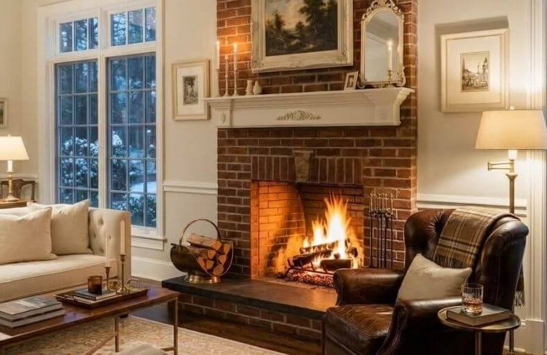
The integration of a natural red brick fireplace within modern residential interiors presents a sophisticated challenge in applied color theory and architectural design.
Brick is rarely a uniform primary red; rather, it is an intricate composite of maroon, rust, terracotta, and deep charcoal shades.
This natural complexity is further influenced by the surrounding mortar lines, which can exhibit green, warm violet, gray, or sandy beige undertones.
Consequently, selecting a wall paint to coordinate with a red brick fireplace requires a nuanced understanding of color interactions.
Selecting an incorrect hue can result in a discordant environment where the walls clash with the hearth, while the correct palette elevates the masonry into a commanding architectural focal point.
Categorized Specifications of Selected Accent Colors
The following table provides the precise technical specifications for eleven curated paint colors from leading manufacturers. These colors represent a balanced spectrum ranging from warm off-whites to deep, dramatic neutral anchors.
| Brand | Paint Color Name | Color Code | Light Reflective Value (LRV) | Color Family / Key Characteristic |
|---|---|---|---|---|
| Benjamin Moore | White Dove | OC-17 | 85% | Soft Warm Off-White |
| Sherwin Williams | Alabaster | SW 7008 | 82% | Creamy Warm White |
| Benjamin Moore | Swiss Coffee | OC-45 | 82% | Rich Cozy White |
| Benjamin Moore | Revere Pewter | HC-172 | 55% | Grounded Warm Greige |
| Sherwin Williams | Agreeable Gray | SW 7029 | 60% | Versatile Warm Greige |
| Benjamin Moore | Pale Oak | OC-20 | 69% | Ultra-Light Warm Greige |
| Sherwin Williams | Pewter Green | SW 6208 | 12% | Cool Deep Forest Green |
| Benjamin Moore | Saybrook Sage | HC-114 | 45% | Balanced Historic Sage Green |
| Benjamin Moore | Hale Navy | HC-154 | 8% | Deep Sophisticated Navy Blue |
| Sherwin Williams | Iron Ore | SW 7069 | 6% | Soft Warm Charcoal |
| Sherwin Williams | Tricorn Black | SW 6258 | 3% | True Neutral Accent Black |
Benjamin Moore White Dove OC-17
This classic, softly shaded warm off-white provides a clean and luminous backdrop for a red brick fireplace without the starkness of a pure, cool white.
Boasting a high Light Reflectance Value of approximately 85, White Dove softly reflects light while its gentle yellow-gray undertone harmonizes with the earthy elements of natural brick.
It is widely considered by design professionals as a reliable option for trim, moldings, and surrounding walls because it establishes a subtle contrast that allows the natural variations of the brickwork to take center stage without competing for dominance.
The slight gray-yellow shading prevents the color from appearing sterile under cool northern light, while maintaining its calm, bright identity in south-facing rooms.
When paired with a red brick hearth, it highlights the darker charcoal flecks or soot stains within the brick pattern, integrating the fireplace seamlessly into a polished, transitional, or modern farmhouse aesthetic.
Sherwin Williams Alabaster SW 7008
Sherwin Williams Alabaster is a renowned creamy white that excels at bridging the gap between clean modernism and cozy traditionalism.
With an LRV of 82, it is slightly more shaded and fractionally warmer than a standard bright white, offering a peaceful, resting quality on the walls.
The yellow hue family heritage of Alabaster prevents it from clashing with the inherent warmth of red or terracotta bricks. Instead, it creates an inviting, soft-contrast envelope that accentuates the industrial or rustic texture of a masonry hearth.
It pairs exceptionally well with secondary elements in a living room, such as warm wood mantels, aged brass hardware, and natural fiber rugs.
Avoiding cool, icy white paints near a warm brick fireplace is crucial, as starkness can cause the wall to feel detached; Alabaster completely mitigates this risk by delivering a stable, quiet warmth that nurtures the hearth’s natural character.
Benjamin Moore Swiss Coffee OC-45
Beloved for its sophisticated and comforting ambiance, Benjamin Moore Swiss Coffee is an elegant off-white characterized by a soft, warm undertone.
Operating at an LRV of 82, Swiss Coffee acts as an ideal canvas, breathing life and brightness into a room while retaining a rich, tactile warmth.
This color is particularly effective in spaces featuring aged, historic, or multi-toned red bricks, as its slight yellow-green undertone matches the organic, sun-bleached qualities of natural mortar.
The paint adapts smoothly to various lighting conditions, reading as a clean, bright neutral under strong daylight and softening into a creamy, candle-lit glow during the evening.
Applying Swiss Coffee to walls surrounding a red brick fireplace minimizes visual tension, facilitating a cozy, cohesive transition between the masonry focal point and the broader living area.
It functions beautifully when contrasted with dark iron or black metal fireplace inserts.
Benjamin Moore Revere Pewter HC-172
As an iconic and highly versatile neutral, Benjamin Moore Revere Pewter occupies the transition point between warm gray and beige, often described as a classic greige.
Its LRV of approximately 55 places it in the light-to-medium depth range, allowing it to bring a grounded, structured feel to a living room without overwhelming the space.
Revere Pewter is particularly successful next to red brick fireplaces because its underlying soft green and beige undertones naturally mimic the color of traditional masonry mortar.
This shared undertone allows the wall color to bridge into the fireplace, softening the overall visual impact of bold red or orange bricks.
In spaces where the brick has a highly rustic or weathered appearance, Revere Pewter draws out the neutral, muddy grays embedded within the clay.
The result is a highly cohesive, timeless aesthetic that works across both historical and contemporary architectural styles.
Sherwin Williams Agreeable Gray SW 7029
Sherwin Williams Agreeable Gray is a universally celebrated neutral that belongs to the yellow hue family, placing it firmly in the warm greige category.
Sitting at an LRV of 60, it possesses a quiet, ethereal presence that delivers just enough contrast against a red brick fireplace to make the masonry pop while avoiding any starkness.
Its low chroma gives it a highly subdued, sophisticated personality that coordinates seamlessly with natural materials like oak mantels, stone tiles, and woven window shades.
Designers frequently choose Agreeable Gray for open-concept areas containing a central fireplace because its warm bias prevents it from looking icy or shifting blue, even in challenging northern exposures.
It provides a soft, relaxing backdrop that allows the inherent rust, maroon, and brown tones of the fireplace to feel thoroughly integrated rather than isolated.
Benjamin Moore Pale Oak OC-20
Benjamin Moore Pale Oak is an ultra-light warm greige that perfectly occupies the narrow territory between a rich off-white and a true mid-tone greige.
With an LRV of approximately 69, Pale Oak provides a soft, elegant wash of color that feels incredibly spacious and airy.
It is highly recommended for interiors featuring prominent red brick fireplaces because it exhibits a subtle warm cast with a minimal yellow or pink pull, preventing it from clashing with the brick’s complex undertones.
In spaces with abundant natural light, Pale Oak reads as a soft, luminous white, while in dimmer settings it reveals its quiet, gray-tan depth.
This light behavior allows the brick fireplace to stand out as a warm, striking focal point without making the surrounding room feel dark or traditional.
It is an exceptional choice for modern farmhouse or transitional interiors where a delicate balance of clean lines and rustic elements is desired.
Sherwin Williams Pewter Green SW 6208
For designers seeking a bold, nature-inspired palette, Sherwin Williams Pewter Green is a stunning, dark sage-green that brings down-to-earth elegance to any room with a brick fireplace.
Because green sits opposite red on the color wheel, Pewter Green acts as a direct complementary contrast, making the warm tones of the red brick incredibly vibrant and rich.
Boasting a low LRV of 12, this deep, muted green-gray has a restrained olive undertone that keeps it quiet rather than vivid, ensuring it feels sophisticated rather than theatrical.
The heavy saturation grounds the fireplace, turning the entire wall into an artistic, moody accent.
Pewter Green is highly responsive to lighting: under bright daylight, its organic, forest-like tones emerge, while in evening lamplight, it softens into a rich charcoal-green that amplifies the cozy warmth of a burning hearth.
It pairs exquisitely with natural wood mantels and matte black iron inserts.
Benjamin Moore Saybrook Sage HC-114
Part of Benjamin Moore’s celebrated Historic Collection, Saybrook Sage is a classic, mid-tone gray-green that offers a softer, more traditional alternative to deeper greens.
With an LRV of 45, it provides a balanced, medium-depth presence on the walls.
Because red and green are complementary colors, pairing Saybrook Sage with a red brick fireplace creates an immediate and visually satisfying contrast that naturally enhances the warmth of the clay.
The inclusion of heavy gray undertones within Saybrook Sage prevents the combination from looking overly festive or resembling a holiday theme.
Instead, it yields a serene, earth-toned sanctuary that feels deeply rooted in nature.
This shade is particularly effective at coordinating with the green or warm gray undertones frequently found in fireplace mortar lines.
It beautifully accommodates traditional decor, antiqued wood finishes, and vintage brass accents surrounding the hearth.
Benjamin Moore Hale Navy HC-154
Benjamin Moore Hale Navy is a deeply saturated, moody navy blue that delivers an unparalleled level of sophisticated elegance.
Blue and red are classic contrasting colors, and when paired together, they create a dynamic, multi-dimensional aesthetic that is particularly striking if the fireplace brick has orange or rust undertones.
With a very low LRV of approximately 8, Hale Navy acts as a dark, dramatic backdrop that makes the warm, textured surface of the fireplace stand out with sculptural intensity.
The heavy gray undertones in Hale Navy prevent the blue from reading as too primary or childish; instead, it behaves as a complex, sophisticated neutral.
This dark, cool color is highly effective in large rooms or library-style spaces where a cozy, enveloping atmosphere is desired.
It grounds the fireplace beautifully, pulling out the deep charcoal accents within the brick and creating a stunning focal point.
Sherwin Williams Iron Ore SW 7069
Sherwin Williams Iron Ore is a rich, warm charcoal that sits on the cusp of black, providing a softer and more nuanced alternative to a true, stark black.
Boasting a low LRV of 6, it delivers an incredibly sophisticated, moody backdrop that complements the rustic, earthy textures of red brick.
Because it contains subtle warm, brown-gray undertones, Iron Ore coordinates naturally with the heat of the fireplace rather than creating a sterile contrast.
It works exceptionally well by pulling out the natural gray and black soot-like flecks embedded within the red brick, which integrates the brickwork into the surrounding wall structure rather than isolating it.
When paired with warm metals like brass or gold-toned mantel decor, Iron Ore creates a luxurious, modern-industrial look.
It serves as a powerful statement color, bringing architectural depth and a contemporary edge to traditional brick fireplaces.
Sherwin Williams Tricorn Black SW 6258
As one of the truest, most neutral variations of black available, Sherwin Williams Tricorn Black is an outstanding choice for creating a high-contrast, modern aesthetic.
Lacking any dominant undertones, Tricorn Black has an extremely low LRV of 3, meaning it absorbs almost all visible light and acts as a pure, dramatic anchor for the room.
When painted on walls surrounding a red brick fireplace, it creates an intense, graphic frame that highlights the structural geometry of the fireplace.
This bold pairing draws immediate attention to the rich, warm red and orange tones of the brick while seamlessly blending with black iron fireplace inserts or dark slate hearths.
Rather than clashing, the neutral quality of Tricorn Black harmonizes with any secondary colors present in the brick or mortar.
It is a highly favored selection for contemporary, industrial, or mid-century modern design styles.
Systematic Design Principles and Light Interactions
The ultimate success of an interior color palette involving a red brick fireplace depends heavily on two critical physical factors: color chemistry and spatial lighting dynamics.
Because red brick is a highly textured and warm-toned masonry product, the paint applied to the surrounding walls acts as a visual lens, shifting how the human eye registers the color temperature of the clay.
Color Dynamics and Contrast Formulas
The primary visual rule when dealing with brick is that cool colors on the walls will contrast with and amplify the warm red tones of the brick, whereas warm neutrals on the walls will absorb and soften them.
Selecting a cool-toned paint with blue or green undertones makes the fireplace appear brighter and more primary in color.
Conversely, selecting a warm, earthy neutral in the greige, beige, or taupe families yields a cohesive, blended transition that downplays the intensity of the fireplace.
The Mortar Joint as a Tonal Mediator
A critical, often-neglected element of color matching is the mortar surrounding the bricks.
Mortar lines represent a secondary color that naturally breaks up the redness of the fireplace.
If the mortar possesses a violet-gray, sandy-beige, or charcoal cast, selecting a wall color that aligns with that specific undertone produces a highly integrated design.
For instance, pairing Benjamin Moore Revere Pewter with a fireplace containing gray-beige mortar creates a seamless visual flow that softens the heavy boundary lines of the brick structure.
Light Refraction and Directional Orientation
Light Reflective Value (LRV) dictates how much light a paint color absorbs or reflects.
In a room with limited natural light, painting the walls with highly reflective colors like Benjamin Moore White Dove (LRV 85) expands the space, allowing the fireplace to stand out as a clean, bright architectural feature. However, the orientation of windows dramatically impacts color presentation:
- Northern Exposure: Natural light from the north is flat and cool, with blue undertones. This cool light can cause cool gray paints to appear icy or sterile. In these spaces, warm whites like Sherwin Williams Alabaster or Benjamin Moore Swiss Coffee are essential to maintain an inviting, cozy atmosphere around the hearth.
- Southern Exposure: Southern light is warm and intense throughout the day. Under these conditions, very light off-whites can easily blow out, reading as flat or blindingly bright. Utilizing a mid-tone neutral like Sherwin Williams Agreeable Gray or Benjamin Moore Pale Oak anchors the wall, retaining a structured and refined presence.
- Eastern Exposure: Cool in the afternoon but bathed in golden morning light, eastern rooms are highly dynamic. A balanced neutral like Benjamin Moore Revere Pewter handles these transitions smoothly, shifting from a clean gray in the evening to a warm, sandy greige in the morning.
- Western Exposure: Western light is soft in the morning but turns into a highly saturated orange-gold during the late afternoon. This intense warmth can over-saturate beiges, causing them to appear yellow. Grounding the walls with a deep, cool tone such as Benjamin Moore Hale Navy or a soft warm charcoal like Sherwin Williams Iron Ore controls the late-afternoon glare while framing the hearth in a rich, velvety shadow.
Strategic Recommendations for Implementation
To ensure a successful execution, the following structured process is recommended before purchasing final paint materials:
- Analyze the Color Temperature of the Brickwork: Determine if the bricks lean primarily toward warm orange-red, neutral brown-red, or cool burgundy-violet.
- Inspect the Mortar Undertones: Identify the subtle gray, green, tan, or white tones present in the mortar joints to find a matching bridge color.
- Evaluate Room Flooring and Wood Trim: Ensure the chosen wall paint coordinates with the wood species of the mantel, the flooring (warm oak vs. cool tile), and any built-in cabinetry.
- Utilize Peel-and-Stick Swatches: Apply large, non-damaging paint samples directly next to the brick fireplace.
- Observe Color Shifts Over 24 Hours: View the swatches during morning light, afternoon sun, and evening lamplight to confirm the paint maintains its intended character across all conditions.