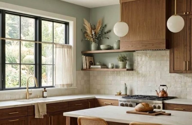
The strategic pairing of paint colors with stained wood cabinetry remains one of the most critical decisions in high-end residential kitchen design.
Stained wood cabinetry, particularly in rich brown tones, introduces a heavy, grounding physical presence that dictates the visual volume of a kitchen.
Selecting an inappropriate wall color can lead to severe aesthetic misalignment: cold, bluish grays can flatten warm timber tones into a muddy, dull finish, while over-saturated creams can result in a dated, yellowed aesthetic.
In contrast, a well-calibrated wall color enhances the complex undertones of stained wood, reflects natural light to counteract the visual weight of the cabinets, and establishes an intentional, modern, or classic atmosphere.
Technical Comparison of Selected Premium Paint Hues
The following structured data presents eleven highly precise, designer-approved paint colors from renowned manufacturers, matched with their exact hexadecimal codes, light reflectance values, dominant undertones, and recommended cabinetry wood pairings.
| Brand | Color Name | Code | LRV (%) | Dominant Undertones | Ideal Cabinet Companion |
| Benjamin Moore | Swiss Coffee | OC-45 | 81.91 | Cream, yellow, gray | Dark Espresso, Oak |
| Benjamin Moore | White Dove | OC-17 | 83.16 | Yellow, soft gray | Cherry, Mahogany |
| Sherwin-Williams | Alabaster | SW 7008 | 82.0 | Creamy, soft yellow | Dark Espresso, Walnut |
| Sherwin-Williams | Agreeable Gray | SW 7029 | 60.0 | Warm beige, yellow-red | Walnut, Honey Oak |
| Benjamin Moore | Revere Pewter | HC-172 | 55.05 | Warm gray, beige, green | Walnut, Dark Espresso |
| Sherwin-Williams | Sea Salt | SW 6204 | 63.0 | Muted green, gray-blue | Honey Oak, Pine |
| Benjamin Moore | October Mist | 1495 | 46.54 | Sage green, silver-gray | Walnut, Maple |
| Sherwin-Williams | Pewter Green | SW 6208 | 12.0 | Dark moss green, gray | Cherry, Warm Oak |
| Benjamin Moore | Hale Navy | HC-154 | 8.36 | Deep navy blue, gray | Cherry, Chestnut |
| Behr | Cracked Pepper | PPU18-01 | 8.0 | Charcoal-black, blue-gray | Walnut, Light Oak |
| Farrow & Ball | Setting Plaster | No. 231 | 54.0 | Dusty pink, yellow, beige | Espresso, Dark Walnut |
Benjamin Moore Swiss Coffee OC-45
Benjamin Moore Swiss Coffee OC-45 represents a highly reliable warm off-white, prized for its classic balance of creaminess and brightness.
This light-reflective paint color sits comfortably at an LRV of 81.91, indicating its ability to expand a kitchen space visually and prevent dark brown cabinetry from feeling too heavy or closed in.
The color contains complex yellow-creamy undertones softened by subtle gray-green notes.
Under cool, north-facing daylight, the soft gray pigments emerge to keep the color from turning overly buttery, while warm, south-facing sun highlights its comforting, inviting character.
Swiss Coffee coordinates beautifully with dark espresso-stained wood, creating a striking contrast when paired with natural stone countertops and gold or brass hardware.
It establishes a sophisticated, clean backdrop that accentuates the organic textures of wood grains without appearing clinical or stark.
Benjamin Moore White Dove OC-17
Benjamin Moore White Dove OC-17 is a universally favored warm white that avoids the harsh, blinding properties of pure white paints.
With an LRV of 83.16, this light and luminous shade provides exceptional reflection, which helps to brighten kitchens dominated by heavy cherry, red-brown, or chocolate-toned cabinetry.
Its unique color profile contains soft yellow undertones balanced by a gentle gray shade, yielding a warm finish that reads as sunlight filtered through clean linen.
This neutral warmth remains highly consistent under varying light sources, resisting the yellowing or muddy transitions typical of more sensitive warm whites.
White Dove excels as a wall and trim color, offering a soft contrast that flatters wood finishes and coordinates seamlessly with neutral stone countertops.
It bridges the gap between traditional cozy warmth and clean modern aesthetics.
Sherwin-Williams Alabaster SW 7008
Sherwin-Williams Alabaster SW 7008 delivers a peaceful, warm white with an LRV of 82.
This highly popular color provides a soft, warm, and balanced backdrop that coordinates beautifully with dark brown and espresso cabinetry.
Belonging to the yellow hue family, Alabaster provides a cozy, lived-in feel without shifting into an overly yellow or cream-colored zone.
It maintains its soft character under intense natural light and holds its clean warmth in shadowed areas.
This makes it a preferred option for modern farmhouse and craftsman designs, where it acts as a soft, neutral anchor.
When paired with stained wood cabinetry, natural stone countertops, and dark metals, Alabaster balances the physical weight of the kitchen.
It establishes a harmonious, low-stress environment that remains clean, bright, and timeless.
Sherwin-Williams Agreeable Gray SW 7029
Sherwin-Williams Agreeable Gray SW 7029 is a highly versatile, warm-leaning greige that serves as an excellent neutral bridge in kitchens with brown cabinetry.
Featuring an LRV of 60, this light-to-medium paint color possesses enough depth to feel grounded without darkening a room.
Its warm beige and yellow-red undertones prevent it from reading as cold, blue, or sterile, a common risk when pairing cool grays with warm wood tones.
Agreeable Gray coordinates exceptionally well with walnut and honey-oak cabinetry, establishing a medium-contrast aesthetic that feels balanced and modern.
Under daylight-spectrum LED lighting or warm natural light, it maintains its soft, balanced character, adapting seamlessly to neighboring surfaces.
Pairing it with clean white countertops and black fixtures sharpens its gray tones, creating an elegant, contemporary kitchen workspace.
Benjamin Moore Revere Pewter HC-172
Benjamin Moore Revere Pewter HC-172 is an iconic greige that offers a bridge between warm and cool tones.
Possessing an LRV of 55.05, this medium-light color features a muted gray base with soft beige and subtle green undertones.
Its balanced profile behaves like a chameleon, adapting to the neighboring wood tones in the room.
Revere Pewter is particularly effective with dark walnut or espresso-stained cabinets, where it creates a medium-contrast contemporary environment.
The color holds its integrity exceptionally well under both warm and cool LED lighting, preventing the blue cast of cool bulbs from flattening the warmth of the cabinetry.
To avoid a heavy look, designers suggest pairing Revere Pewter with bright white trim and light stone countertops.
This combination highlights the rich character of the cabinetry while keeping the kitchen visually open.
Sherwin-Williams Sea Salt SW 6204
Sherwin-Williams Sea Salt SW 6204 is a soft, muted green-gray with delicate blue undertones.
Residing at an LRV of 63, it delivers a luminous quality that brightens small kitchens with brown cabinets.
Sea Salt offers a beautiful, medium-to-high contrast pairing for orange-toned oak, pine, or warm walnut cabinets.
The cool, blue-gray undertone acts as a direct complement to the warm, orange-yellow wood tones, softening the visual intensity of the timber.
This color behaves dynamically under different light sources, shifting from a subtle sage green to a soft coastal blue depending on the time of day.
Sea Salt creates a relaxing, spa-like environment that complements natural textures.
Pairing it with crisp white trim and polished stainless steel appliances establishes a fresh, clean, and balanced workspace.
Benjamin Moore October Mist 1495
Benjamin Moore October Mist 1495 is a gently shaded sage green that evokes the organic look of a flower stem.
With an LRV of 46.54, this light-medium shade holds its color beautifully in bright rooms without washing out.
October Mist offers a soft, natural contrast that complements the rich wood grain of walnut, maple, or warm oak cabinets.
Because it is a gray-green rather than a bright green, it serves as a flexible neutral backdrop that balances the warmth of wood tones.
The paint color shifts gracefully under different lighting conditions, taking on a warmer, earthier tone in south-facing rooms and a cooler, silver-gray character in dim light.
Pairing October Mist with cream tile backsplashes and warm brass hardware enhances the rich, natural character of the kitchen cabinetry.
Sherwin-Williams Pewter Green SW 6208
Sherwin-Williams Pewter Green SW 6208 is a deep, cool green-gray with a soft, muted olive undertone.
With an LRV of 12, this dark, grounding shade introduces a rich, organic depth to the kitchen.
It complements natural wood grain beautifully, making it an excellent pairing for cherry, chestnut, or warm oak cabinetry.
Pewter Green works as a sophisticated accent color, creating high contrast that highlights the natural beauty of the wood.
Under bright, natural light, it presents as an earthy, medium-toned forest green, while under evening light, it turns into a moody, charcoal-green.
To prevent a kitchen with dark cabinetry from feeling too heavy or enclosed, designers suggest pairing Pewter Green walls with light quartz countertops, white upper cabinets, and warm brass fixtures that pop against the dark backdrop.
Benjamin Moore Hale Navy HC-154
Benjamin Moore Hale Navy HC-154 is a deeply saturated navy blue with sophisticated gray undertones.
Sitting at a low LRV of 8.36, this timeless color brings a rich, maritime drama into the kitchen.
Pairing Hale Navy with warm-toned wood cabinets, such as cherry, pine, or honey oak, creates a vibrant and modern complementary color scheme.
The gray undertones in the blue soften its intensity, keeping it professional and classic rather than bright and primary.
It works beautifully as a high-contrast accent wall behind open shelves, or as a contrasting paint on kitchen islands.
To maintain a balanced, airy feel, designers pair this dark navy with high-reflectivity white ceilings, white stone countertops, and polished brass or warm gold hardware that shines brightly against the dark walls.
Behr Cracked Pepper PPU18-01
Behr Cracked Pepper PPU18-01 is a versatile, soft black-gray that brings a modern, luxurious feel to the kitchen.
With an LRV of 8, this charcoal-toned black introduces dramatic depth without the cold, clinical look of a pure black.
It coordinates beautifully with lighter wood cabinetry, such as natural oak, maple, or walnut, establishing a high-contrast contemporary aesthetic.
Using Cracked Pepper on a single surface, such as a focal accent wall, a range alcove, or a kitchen island, creates a striking anchor without making the room feel small or dark.
Its soft black-gray tones absorb light beautifully, while its charcoal base transitions smoothly between day and night.
Pairing it with white quartz countertops, warm white trim, and unlacquered brass hardware yields a high-end, modern look.
Farrow & Ball Setting Plaster No. 231
Farrow & Ball Setting Plaster No. 231 is a warm, dusty pink-clay color with a soft yellow base.
With an LRV of 54, this color serves as an organic neutral, avoiding the sugary pastels of traditional pinks.
Setting Plaster pairs beautifully with dark wood cabinetry, such as espresso, dark walnut, or mahogany, creating a soft, warm contrast.
The yellow pigments in the paint create a gentle, flattering glow that highlights the deep grain of the wood.
In north-facing rooms, the cooler light balances the yellow undertones, producing a sophisticated, neutral background.
Using Setting Plaster on walls paired with cool metal hardware, like chrome or polished nickel, creates a worldly, layered kitchen design.
It coordinates effortlessly with white quartz and marble fixtures, delivering a comforting, high-end atmosphere.
Lighting Dynamics and Environmental Adaptation
The behavior of paint adjacent to stained wood is constantly influenced by the light exposure of the kitchen.
Natural daylight changes in color temperature throughout the day, physically shifting how wall colors and cabinet stains are perceived.
In north-facing kitchens, the indirect daylight carries a cool, blue cast that can flatten warm tans into dull neutrals and make cool whites look gray or dingy.
To counteract this cool light, designers choose colors with strong yellow or beige bases to preserve a cozy, inviting environment.
South-facing kitchens, conversely, receive direct, golden sunlight that intensifies warm wood tones and pushes creamy whites toward a yellow cast.
In these bright environments, muted blue-grays or soft greens help ground the room, creating a balanced and refreshing atmosphere.
Additionally, artificial light temperature requires careful calibration; cool-temperature under-cabinet LEDs strip the warmth from stained wood, turning rich brown cabinetry into a flat, dirty gray.
Specifying warm LED bulbs, ideally between 2700K and 3000K, ensures that the complex warmth of the timber and the soft undertones of the wall paint remain active and harmonious during evening hours.
Material and Finish Coordination
Creating a cohesive kitchen layout requires coordinating the walls and cabinetry with key architectural features, such as countertops, backsplashes, hardware, and flooring.
High-end kitchens utilize white or light countertops, such as warm-white quartz or marble with subtle veining, to provide a clean, light-reflective break between the cabinets and the wall.
This visual separation stops the cabinetry and wall finishes from blending into a single flat color, adding depth and making the room feel larger.
Classic white or cream subway tiles or handmade zellige tiles with subtle textures serve as excellent backsplashes, reflecting light without competing with the wood grain.
For cabinet hardware, unlacquered brass, brushed gold, and copper pair naturally with warm off-whites, cream beiges, and warm greens, highlighting the golden tones in stained wood.
Alternatively, polished chrome and brushed nickel hardware offer a clean, modern contrast against dark wood cabinets, while matte black hardware brings a graphic, contemporary edge.
Finally, wood flooring should be selected in a value that is clearly lighter or darker than the cabinets to prevent a heavy, monochromatic appearance.
Analytical Conclusions
Successfully pairing wall paint with brown kitchen cabinets is an exercise in balancing light, contrast, and color temperature.
Stained wood cabinets are not a design limitation; instead, they are a rich, organic feature that can anchor a variety of styles, from historic traditional to sleek modern farmhouse.
To achieve a timeless and cohesive look, designers recommend a medium-contrast layout.
Using soft, light-reflecting neutrals, subtle greiges, or nature-inspired greens on the walls softens the heavy look of dark wood cabinetry.
This keeps the kitchen feeling bright, open, and inviting.
Before committing to a color, it is crucial to test paint samples directly in the kitchen space.
Observing large swatches next to the cabinets under morning light, afternoon sun, and the evening glow of warm LEDs is the best way to ensure the chosen shade performs beautifully and reliably throughout the day