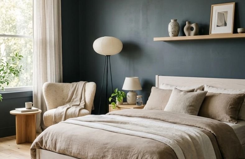
The idea that bedrooms should always be painted in light, airy colors is one decorating rule that is absolutely worth breaking.
Dark paint colors bring a level of moodiness, sophistication, and cozy intimacy to a bedroom that no pale neutral can achieve, creating a space that feels designed with genuine intention and a strong visual point of view.
When balanced with the right lighting, bedding, and furnishings, a dark bedroom wall becomes one of the most stunning backdrops imaginable for a restful, beautifully designed sleeping space.
These gorgeous dark paint colors will give you an inspiring range of options for bringing depth and drama into your bedroom this year.
Architectural and Psychological Dynamics of Dark Bedrooms
Color performance on interior walls is primarily governed by Light Reflectance Value (LRV), a standardized scale measuring the percentage of light a paint color reflects, ranging from 0% (absolute black) to 100% (pure white).
Dark bedroom paint palettes typically utilize coatings with LRVs ranging between 3 and 12.
In low-LRV environments, artificial light placement and architectural trims become critical anchor points for spatial definition.
Lighting orientation dictates how dark undertones register across a room.
North-facing bedrooms receive cool, blue-tinted natural light, which amplifies charcoal and navy undertones, shifting dark blues toward near-black tones.
Conversely, south-facing bedrooms offer warm daylight that draws out underlying green, teal, or bronze notes, enriching the paint’s chromatic complexity.
| Design Element | Technical Considerations | Architectural Impact |
|---|---|---|
| Sheen Selection | Flat/Matte vs. Velvet/Eggshell | Matte eliminates glare for a velvety look; eggshell adds wipeable durability. |
| Trims & Ceilings | High-contrast white vs. Color-drenching | White trim sharpens layout lines; color-drenching expands perceived ceiling height. |
| Artificial Lighting | 2700K Warm Kelvin vs. 3000K Neutral LED | Warm light softens dark grays; cool LED flattens deep pigments into slate. |
Benjamin Moore Hale Navy (HC-154)
Benjamin Moore Hale Navy HC-154 is widely recognized as a benchmark dark neutral in interior design.
Grounded in maritime traditions, this shade balances deeply saturated navy tones with a subtle charcoal-gray undertone.
The presence of gray softens the blue base, preventing it from leaning overly vibrant or primary.
With an LRV around 8.36, Hale Navy absorbs natural light while maintaining clear color definition.
In north-facing light, Hale Navy cools into a dramatic slate blue, whereas south-facing sunlight pulls out its rich oceanic depth.
On bedroom walls, it creates a deeply grounding backdrop that pairs seamlessly with creamy white trims like White Dove OC-17, warm brass fixtures, and natural wood tones like walnut or white oak.
Applying a matte or eggshell finish diffuses light reflection, resulting in an intimate, serene atmosphere ideal for primary suites.
Benjamin Moore Gentleman’s Gray (2062-20)
Benjamin Moore Gentleman’s Gray 2062-20 is a blackened teal-blue that exudes formal elegance and moody sophistication.
Featuring an LRV of 7.26, this shade absorbs substantial light, making it suitable for creating cozy bedroom retreats.
The complex balance between navy, charcoal gray, and subtle green-teal undertones gives this paint a dynamic quality on interior surfaces.
Under cool daylight, the smoky charcoal depth dominates.
Warm ambient or bedside lamp lighting activates its rich peacock-blue cast.
Gentleman’s Gray functions exceptionally well in tailored bedrooms, particularly when layered with cognac leather headboards, velvet drapery, brushed brass hardware, and warm greige accents.
It brings a tailored, upscale aesthetic to traditional and contemporary architectural framing alike.
Sherwin-Williams Naval (SW 6244)
Sherwin-Williams Naval SW 6244 is an inky, authoritative dark blue designed to evoke the serenity of the night sky and deep ocean waters.
Possessing an LRV of 4.46, Naval brings deep atmospheric intensity to bedroom spaces.
Unlike lighter navy options, Naval incorporates subtle cool gray-green undertones that prevent harsh visual glare.
Naval establishes a serene backdrop that encourages rest and circadian alignment.
This shade pairs naturally with tactile organic textures, such as woven rattan lighting, light ash furniture, raw linen bedding, and indoor greenery.
Framing Naval with crisp white trim like SW Pure White keeps architectural lines sharp and modern, while metallic finishes like polished brass or matte black add an elevated layer of luxury.
Sherwin-Williams Iron Ore (SW 7069)
Sherwin-Williams Iron Ore SW 7069 is a cool, deep charcoal that serves as an alternative to pure jet black.
With an LRV of 5.55, it delivers dark drama without feeling cold or sterile.
Iron Ore possesses subtle warm gray undertones that allow it to read as a soft slate shade under soft residential lighting.
This color softens wall intersections, making corners visually recede in smaller bedrooms.
Color-drenching applications, painting walls, trim, and doors in a uniform matte finish, create a sleek, cocoon-like environment.
Iron Ore pairs cleanly with exposed brickwork, light oaks, matte black fixtures, and alabaster linens, offering a sophisticated anchor for modern organic or industrial-chic bedroom designs.
Farrow & Ball Hague Blue (No. 30)
Inspired by historic Dutch woodwork, Farrow & Ball Hague Blue No. 30 is a renowned choice for moody interior color schemes.
Characterized by its deep blue hue infused with strong green undertones, this color adapts dynamically under changing light conditions.
In cool north-facing light, it deepens into an atmospheric navy, while south-facing sunlight highlights its petrol and teal notes.
With an LRV of 5.6, Hague Blue wraps bedrooms in a warm, stately finish.
It provides an ideal backdrop for warm metallic finishes like unlacquered brass, terracotta accents, dusty blush pink textiles, and rich walnut furnishings.
Applied in a flat matte emulsion, Hague Blue produces a velvety surface that softens ambient light glare.
Farrow & Ball Railings (No. 31)
Farrow & Ball Railings No. 31 is a soft alternative to pure black, distinguished by its blue and charcoal undertones.
Because it contains blue pigments, Railings shifts between an inky charcoal-navy and a midnight shade depending on natural light exposure.
Possessing an LRV of 7.0, it delivers noticeable visual depth while retaining a tactile softness.
In bedrooms, Railings serves as an anchor shade, absorbing glare and promoting relaxation.
It works well on focal accent walls behind the bed or across all four walls for an atmospheric look.
Railings pairs easily with light stone textures, pale oak furniture, brushed nickel, and off-white linens.
Behr Cracked Pepper (PPU18-01)
Cracked Pepper PPU18-01 is an adaptable soft black with balanced blue-gray undertones.
With an LRV of 8.0, it strikes a middle ground between dramatic dark neutrals and approachable charcoal shades.
The subtle blue-gray bias ensures that Cracked Pepper avoids reading as harsh or clinical, presenting instead as a warm slate under residential lighting.
In bright daylight, its cool blue notes become subtly noticeable, while warm evening lamps pull out its cozy charcoal essence.
It serves as a clear backdrop that elevates wall art, light-wood furniture, and metallic hardware.
Cracked Pepper coordinates smoothly with earth tones like terracotta, warm taupe, mustard accents, and natural blonde woods.
Benjamin Moore Salamander (2050-10)
Benjamin Moore Salamander 2050-10 is a dark hybrid shade that blends deep forest green, navy blue, and rich charcoal black.
Exhibiting an extremely low LRV around 3.5, Salamander offers rich depth, creating a moody, botanical feel suitable for sleeping quarters.
The color behaves as a chameleon: in dim lighting, it presents as a soft jet black, but direct sunlight activates its deep pine and teal undertones.
Salamander is suited for biophilic bedroom designs, pairing naturally with walnut furniture, raw leather accessories, antique brass fittings, and live indoor foliage.
Painting trim or wainscoting in Salamander adds architectural depth, making the bedroom feel cozy and restful.
Sherwin-Williams Urbane Bronze (SW 7048)
Sherwin-Williams Urbane Bronze SW 7048 is a biophilic dark neutral that merges deep bronze-brown with subtle gray-green undertones.
With an LRV of 8.0, Urbane Bronze delivers a grounded, organic warmth that bridges modern minimalism and rustic comfort.
Unlike cool grays or bluer navies, Urbane Bronze draws inspiration from raw natural elements, stone, wood, and dried foliage.
In brightly lit rooms, its olive-brown qualities come forward, whereas lower lighting renders it as a cozy taupe-black.
It pairs well with warm whites (such as SW Alabaster), unrefined linen bedding, woven rattan light shades, warm amber glass lamps, and raw wood architectural accents.
Benjamin Moore Kendall Charcoal (HC-166)
Benjamin Moore Kendall Charcoal HC-166 is a versatile dark gray that exhibits rich, warm green-brown undertones.
Possessing an LRV of 12.3, it is slightly lighter than coal blacks, making it an approachable backdrop for bedrooms seeking depth without extreme visual darkness.
Kendall Charcoal retains its warmth under both natural daylight and warm artificial lighting, avoiding the cold blue cast common in slate grays.
This shade serves as a complementary anchor for rich timber furniture, such as walnut, cherry, and natural oak, making wood grains pop.
Pairing Kendall Charcoal with clean white ceiling trim and warm textiles creates a tailored aesthetic suitable for modern or transitional master suites.
Sherwin-Williams In the Navy (SW 9178)
Sherwin-Williams In the Navy SW 9178 is a dark navy blue designed to instill a sense of permanent grounding and structure.
With an LRV around 4.0, In the Navy absorbs ambient light to create a nocturnal atmosphere that supports restful sleep.
Unlike brighter sapphire hues, it maintains a cool profile devoid of purple bias.
In low-light settings, it leans close to charcoal-black, while targeted accent lighting brings out its oceanic blue tones.
In the Navy performs well when paired with contrasting warm neutrals like dirty martini beige, crisp white trim (SW Pure White), and polished brass accents.
Dark Paint Specifications
To assist interior designers and homeowners in evaluating technical paint characteristics, the following table summarizes the key performance parameters of these eleven dark paint formulations:
| Brand | Color Name | Color Code | LRV | Primary Undertone | Visual Vibe / Mood |
|---|---|---|---|---|---|
| Benjamin Moore | Hale Navy | HC-154 | 8.36 | Gray-Blue | Classic, Maritime, Tailored |
| Benjamin Moore | Gentleman’s Gray | 2062-20 | 7.26 | Blackened Teal | Formal, Regal, Dramatic |
| Sherwin-Williams | Naval | SW 6244 | 4.46 | Cool Gray-Navy | Serene, Grounded, Oceanic |
| Sherwin-Williams | Iron Ore | SW 7069 | 5.55 | Slate Charcoal | Modern Industrial, Sleek |
| Farrow & Ball | Hague Blue | No. 30 | 5.60 | Greenish Petrol Navy | Heritage, Historic, Moody |
| Farrow & Ball | Railings | No. 31 | 7.00 | Blue-Black Charcoal | Soft Black, Enveloping |
| Behr | Cracked Pepper | PPU18-01 | 8.00 | Neutral Blue-Gray Black | Contemporary, Soft Slate |
| Benjamin Moore | Salamander | 2050-10 | ~3.50 | Botanical Forest-Teal | Biophilic, Enigmatic, Rich |
| Sherwin-Williams | Urbane Bronze | SW 7048 | 8.00 | Bronze Olive-Brown | Organic, Earthy, Grounded |
| Benjamin Moore | Kendall Charcoal | HC-166 | 12.30 | Green-Brown Charcoal | Warm Neutral, Sophisticated |
| Sherwin-Williams | In the Navy | SW 9178 | 4.00 | Cool Cobalt Navy | Stalwart, Restful, Nocturnal |
Technical Application Dynamics
Executing a dark color scheme in a residential bedroom requires careful attention to surface preparation, sheen selection, and boundary application.
Because low-LRV paints contain high concentrations of dark color pigments, application inconsistencies, such as lap marks or uneven sheen texture, can register visibly if not properly managed.
Sheen Dynamics and Surface Reflection
Selecting the appropriate finish involves balancing aesthetic expectations with practical maintenance requirements:
- Matte or Flat Finishes (0–3% Sheen): Absorbs natural and artificial light rays completely, creating a non-reflective, velvety surface. Matte finishes effectively hide minor drywall imperfections, making them an excellent choice for primary bedroom walls. However, flat formulations can be prone to burnishing if scrubbed aggressively.
- Eggshell or Velvet Finishes (10–15% Sheen): Provides a subtle luster alongside wipeable durability. This finish is recommended for high-traffic bedrooms or walls adjacent to bedside tables where routine cleaning is required.
- Satin or Semi-Gloss Finishes (25–45% Sheen): Reflects significant ambient light, creating sharp visual contrast. High-luster sheens are ideal for doors, baseboards, window casings, and custom millwork.
Color-Drenching vs. High-Contrast Trims
Applying color-drenching, painting the walls, baseboards, door casings, crown molding, and ceiling in the same low-LRV shade, removes visual breaks across the room.
This monochromatic treatment softens room corners, making ceilings feel higher and creating a cohesive, comforting enclosure.
Alternatively, pairing dark walls with bright, high-contrast trim colors (such as SW Pure White or BM White Dove) sharpens structural lines and brings classic tailored definition to the bedroom layout.
Conclusion
Dark paint colors transform residential bedrooms into quiet, restful sanctuaries by manipulating visual perception, controlling light reflection, and adding color depth.
Whether utilizing slate navy hues like Benjamin Moore Hale Navy, soft black charcoals like Behr Cracked Pepper, or organic tones like Sherwin-Williams Urbane Bronze, selecting the ideal paint requires balancing Light Reflectance Values with room lighting and architectural detailing.
By evaluating undertones, sheen levels, and complementary trim options, designers can create sophisticated bedroom spaces tailored for deep rest and circadian alignment.