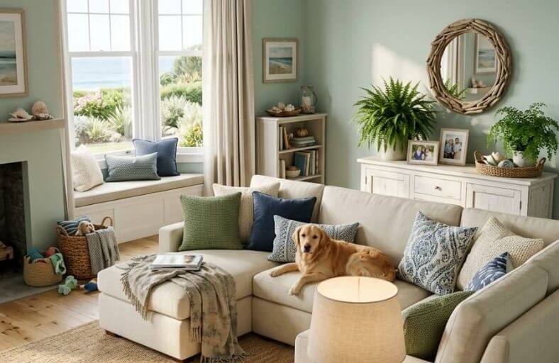
There is something universally appealing about the way a coastal-inspired living room feels, light, relaxed, visually open, and completely free of the heaviness that darker or more saturated color palettes can sometimes create.
Achieving that feeling starts with choosing the right paint color, since the wall color sets the atmospheric tone for everything else in the room.
Coastal paint shades tend to sit in the soft, muted range of blues, greens, and sandy neutrals that evoke sea, sky, and shore without resorting to overly literal or themed interpretations of the style.
These perfect coastal paint colors represent the most beautiful and livable options for giving your living room a genuinely fresh, seaside-inspired atmosphere.
Technical Profile Summary of Leading Coastal Paint Colors
The table below outlines the color metrics, exact hexadecimal references, Light Reflectance Values, and primary undertones for the selected coastal palette.
| Manufacturer | Paint Name | Color ID / SKU | LRV | Primary Undertones | Decor Density Profile |
|---|---|---|---|---|---|
| Sherwin-Williams | Sea Salt | SW 6204 | 63.0 | Muted Gray-Green, Cool Blue | Minimalist / Sparse |
| Benjamin Moore | Palladian Blue | HC-144 | 60.4 | Soft Blue-Green, Pearl Warmth | Balanced / Moderate |
| Benjamin Moore | Hale Navy | HC-154 | 8.36 | Deep Naval Blue, Charcoal Gray | Dense / Highly Layered |
| Sherwin-Williams | Rainwashed | SW 6211 | 59.0 | Cool Bluish-Green, Soft Slate | Simple / Organic Minimal |
| Behr | Breezeway | MQ3-21 | 66.0 | Sea-Glass Green, Silvery Gray | Medium-Dense Casual |
| Farrow & Ball | Borrowed Light | No. 235 | 70.0 | Luminous Pale Sky Blue, Neutral Gray | Ultra-Sparse Nordic |
| Sherwin-Williams | Naval | SW 6244 | 4.0 | Midnight Indigo, Gray-Green | Richly Layered Luxe |
| Benjamin Moore | Simply White | OC-117 | 89.52 | Crisp Warm Off-White, Subtle Yellow | High-Density Eclectic |
| Benjamin Moore | Beach Glass | 1564 | 49.55 | Slate Blue-Green, Medium Gray | Moderate Contemporary |
| Sherwin-Williams | Topsail | SW 6217 | 75.0 | Aquamarine Tinted White, Cool Gray | Low-Density Modern |
| Benjamin Moore | Woodlawn Blue | HC-147 | 60.3 | Classic Sky Blue, Soft Muted Gray | Medium-High Traditional |
| Sherwin-Williams | Oyster Bay | SW 6206 | 44.0 | Deep Muted Sage-Slate, Cool Blue | High-Density Organic Modern |
Sherwin-Williams Sea Salt (SW 6204)
Sherwin-Williams Sea Salt (SW 6204) stands as a chameleon shade within coastal design schemes.
Registering an LRV of 63, this gray-green formulation adapts dynamically to room orientation and light quality.
In north-facing living rooms or under overcast skies, its cool blue undertones come forward, producing a crisp blue-gray cast.
Conversely, abundant south-facing sunlight accentuates its soft green undertones, infusing the space with an organic warmth reminiscent of coastal dune grasses.
Because of its balanced saturation, Sea Salt visually expands living room perimeters while offering more character than a standard neutral off-white.
It coordinates effortlessly with clean white trims, such as Sherwin-Williams Pure White, and light-to-medium natural wood elements, including white oak and bleached ash.
The color provides a tranquil canvas that reflects natural light without creating harsh glare, making it a reliable foundation for coastal interior architecture.
Benjamin Moore Palladian Blue (HC-144)
Part of Benjamin Moore’s Historical Collection, Palladian Blue (HC-144) offers an airy blue-green shade that evokes clear sky and shallow water tones.
With an LRV of 60.4, it balances light distribution with distinct color identity.
Unlike flat sky-blue shades, Palladian Blue contains subtle warm undertones that prevent it from feeling clinical or stark in large living spaces.
Palladian Blue provides an inviting backdrop for transitional and coastal living rooms.
It pairs cleanly with stark white millwork, dark brown mahogany accents, and natural fiber floor coverings like jute and sisal.
Under warm artificial lighting, the green tones subtly deepen, whereas bright morning sunlight brings its soft blue foundation to the forefront.
The color works particularly well in rooms designed for daytime socializing, where its gentle color intensity creates a fresh atmosphere.
Benjamin Moore Hale Navy (HC-154)
Benjamin Moore Hale Navy (HC-154) is a dark navy blue with an LRV of 8.36.
Formulated with gray and charcoal undertones, it delivers a muted finish that resists oversaturation.
In living room design, Hale Navy functions as an anchor color, perfect for feature accent walls, built-in library cabinetry, or comprehensive color-drenched applications designed to create an inviting aesthetic.
The presence of gray softens the deep blue base, allowing Hale Navy to coordinate seamlessly with crisp white trims, warm polished brass hardware, and caramel leather accents.
Bright natural daylight reveals its blue notes, while lower evening light shifts the color toward a rich, velvety dark slate.
This depth makes it an excellent selection for formal living spaces or media rooms requiring a cozy feel.
Sherwin-Williams Rainwashed (SW 6211)
Sherwin-Williams Rainwashed (SW 6211) brings a muted, atmospheric freshness to living room spaces.
Sitting in the blue-green color family with an LRV of 59, it is slightly more pigmented and cool-toned than Sea Salt.
The inclusion of gray undertones calms its vibrant base, giving the color a soft, rain-touched appearance.
In living rooms with extensive south or west sunlight, Rainwashed maintains a steady, tranquil demeanor without washing out.
It pairs exceptionally well with weathered wood finishes, brushed nickel hardware, and soft white drapery, making it a reliable selection for modern coastal design themes.
Rainwashed creates an open environment that links indoor living areas with natural outdoor landscapes.
Behr Breezeway (MQ3-21)
Selected as Behr’s Color of the Year 2022, Breezeway (MQ3-21) is a light blue-green hue inspired by sea glass.
Featuring an LRV of 66, it reflects light across the room, expanding visual spatial boundaries.
Breezeway combines soft green-blue notes with a pale gray core, providing a versatile backdrop for living spaces.
Breezeway coordinates with dark slate accents, light natural woods, and off-white fabrics.
It performs exceptionally well in open-plan living rooms, where its high reflectivity keeps connected spaces feeling unified and bright.
The subtle silvery tone within Breezeway prevents it from reading overly bright, ensuring a balanced aesthetic under artificial warm-white LED lighting.
Farrow & Ball Borrowed Light (No. 235)
Farrow & Ball Borrowed Light (No. 235) is a pale blue formulation designed to reflect subtle ambient light.
Named after the light cast through fanlights and transom windows, this paint carries an LRV of 70.
Its soft profile creates an open atmospheric look, making it ideal for low-light living spaces.
The soft gray undertones in Borrowed Light prevent the hue from feeling overly sweet or powdery.
It serves as an elegant canvas for Scandinavian and Nordic-coastal interior styles, pairing with light birch furniture, chalky white trims, and charcoal architectural accents.
In dimly lit living rooms, Borrowed Light maintains its color identity without dropping into a dull gray shade.
Sherwin-Williams Naval (SW 6244)
Sherwin-Williams Naval (SW 6244) is a rich midnight blue that was designated as Color of the Year 2020.
With an LRV of 4.0, it absorbs light to establish a grounded focal point.
Naval incorporates cool gray-green undertones that soften its dark body, providing a tailored appearance under both natural and artificial light sources.
In living rooms, Naval works well on feature walls, surrounding fireplaces, or as an all-over wall color in formal entertaining spaces.
It contrasts sharply with stark white millwork, warm metallic gold or brass fixtures, and natural leather seating.
Naval establishes a cozy mood, anchoring large open floor plans when used on primary accent surfaces.
Benjamin Moore Simply White (OC-117)
Benjamin Moore Simply White (OC-117) is an off-white formulation with an LRV of 89.52.
It contains a hint of yellow warmth that prevents it from feeling cold or sterile, making it a reliable foundation color for coastal gallery-style living rooms.
Simply White reflects natural daylight across the room, highlighting texture and organic decor details.
It serves as a crisp foundation for layered coastal schemes featuring driftwood tones, navy textiles, woven grasses, and vibrant ocean artwork.
The subtle warmth ensures that the living space remains inviting even during overcast winter months.
Benjamin Moore Beach Glass (1564)
Benjamin Moore Beach Glass (1564) is a mid-tone slate blue-green hue with an LRV of 49.55.
Lower in reflectivity than pale pastel options, Beach Glass introduces depth while keeping a space feeling grounded.
Its slate gray undertone controls color saturation, ensuring the room remains serene.
Beach Glass performs well in living rooms with medium-to-high natural light levels, where its gray-blue body adds structure without darkening the room.
It pairs effortlessly with off-white trim, quartz or stone finishes, and medium-toned wood furniture.
The color provides an ideal mid-point for homeowners who want clear color definition without committing to dark navy shades.
Sherwin-Williams Topsail (SW 6217)
Sherwin-Williams Topsail (SW 6217) is an ultra-light aquamarine tint with an LRV of 75.
Formulated on a white base with faint blue-green and gray undertones, Topsail offers a subtle kiss of color.
It provides an ideal solution for living spaces where a standard white feels too plain, but a true blue or green might feel visually heavy.
Topsail expands dark living areas, bouncing daylight deep into interior floor plans.
It pairs cleanly with white painted wood trims, light grey upholstery, and bleached bamboo accessories.
The color keeps living rooms feeling light and airy, mimicking the open quality of a sunlit coastline.
Benjamin Moore Woodlawn Blue (HC-147)
Benjamin Moore Woodlawn Blue (HC-147) is a classic sky blue that includes subtle green and gray undertones.
With an LRV of 60.3, it offers balanced color intensity that brightens living spaces without overwhelming them.
Woodlawn Blue fits traditional and classic coastal living spaces.
It coordinates naturally with off-white millwork, classic upholstered sofas, and warm antique bronze or dark wood accents.
The soft green undertone stabilizes the blue base, ensuring the room feels comfortable across all seasons.
Sherwin-Williams Oyster Bay (SW 6206)
Sherwin-Williams Oyster Bay (SW 6206) is a dark slate-sage green with an LRV of 44.
Belonging to the same color family as Sea Salt, Oyster Bay contains higher pigment concentrations that bring a grounded feel to living rooms.
Its blue and gray undertones maintain a cool temperature, keeping the sage base sophisticated.
Oyster Bay serves as an excellent backdrop for organic modern coastal spaces.
It contrasts beautifully with light-colored furniture, woven linen upholstery, raw timber accents, and black iron hardware.
The shade adds structural definition to open-concept living rooms, establishing a clear visual identity.
Strategic Lighting and Light Reflectance Value Considerations
Selecting an architectural paint color requires analyzing how Light Reflectance Value (LRV) interacts with natural and artificial light sources.
Measured on a scale from 0 to 100, LRV dictates how much usable light a painted surface bounces back into a space.
Low LRV colors absorb light to create cozy environments, while high LRV colors reflect light to brighten up living spaces.
| Light Exposure Type | Light Quality & Characteristics | Recommended Paint Palette | Recommended Color Examples |
|---|---|---|---|
| North-Facing | Cool, diffused light with subtle blue tints; can make cool colors feel flat. | Warm off-whites, pale blue-greens with soft warm undertones. | BM Palladian Blue, BM Simply White[cite: 7, 33] |
| South-Facing | Intense, warm sunlight throughout the day; accentuates yellow/green undertones. | Cool muted gray-greens, mid-tone slate blues. | SW Sea Salt, SW Oyster Bay, BM Beach Glass[cite: 2, 9, 12] |
| East-Facing | Bright, warm morning light shifting to cooler shade in the afternoon. | Sky blues with balanced green-gray undertones. | BM Woodlawn Blue, SW Rainwashed[cite: 20, 25] |
| West-Facing | Cool morning light followed by intense golden-orange evening sunlight. | Deep navies, light aquamarine tints that absorb late glare. | SW Naval, BM Hale Navy, SW Topsail[cite: 4, 6, 36] |
In coastal living room design, spatial orientation heavily dictates how paint undertones present throughout the day.
Living rooms with northern exposure receive cool illumination that can cause blue-green paints to lean noticeably gray.
Selecting options with warm mother-of-pearl undertones like Benjamin Moore Palladian Blue prevents the room from feeling chilly.
Southern exposures amplify green undertones in chameleon paints like Sherwin-Williams Sea Salt, making them appear warmer.
Western exposures feature intense late-afternoon sunlight that can wash out pale pastel paints.
Deep blue formulations such as Sherwin-Williams Naval or Benjamin Moore Hale Navy handle this intense sunlight effectively, absorbing late glare while preserving color integrity.
Understanding these light dynamics ensures that the chosen coastal palette maintains its intended character across changing natural lighting conditions.
Architectural Implementation Guidelines
Creating a cohesive coastal living room requires balancing paint undertones, light exposure, and structural elements.
Rather than relying on bright primary blues, successful coastal design utilizes muted gray-greens, ocean-glass tones, airy aquamarines, and grounded navies to mirror natural coastal environments.
Key Design Implementation Strategies:
- Utilize Chameleon Shades for Spatial Flexibility: Formulations like Sherwin-Williams Sea Salt (SW 6204) and Behr Breezeway (MQ3-21) offer built-in flexibility, shifting subtly between blue, green, and gray as natural light changes throughout the day.
- Anchor Light Palettes with High-Contrast Accents: Pair light-to-medium wall shades with deep navy architectural anchors like Benjamin Moore Hale Navy (HC-154) or Sherwin-Williams Naval (SW 6244) on fireplace surrounds, built-ins, or doors.
- Verify Undertones via Sample Boards: Because coastal paint colors respond dynamically to artificial bulb temperatures and natural exposure, test paint swatches on large sample boards before final application.
- Balance Material Textures: Complement cool blue and green paint walls with natural organic textures, such as bleached oak flooring, raw timber furniture, jute rugs, and crisp linen fabrics, to keep the living space grounded and inviting.