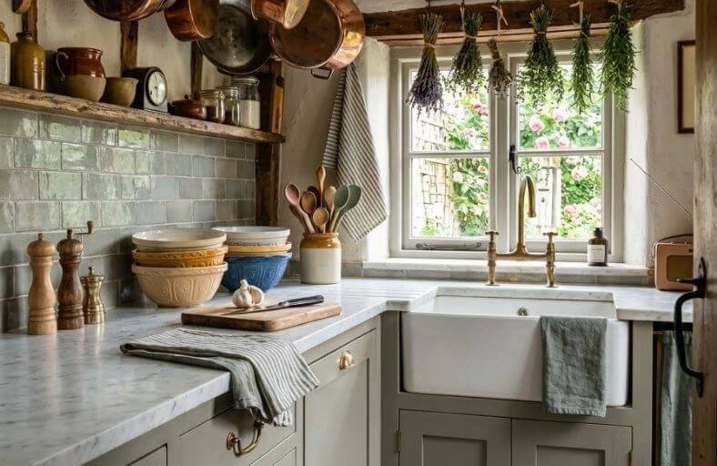
Paint color is one of the most powerful tools available for making a small kitchen feel significantly more spacious, brighter, and better organized than it actually is.
In a compact kitchen where every inch of space matters, the wall color carries an enormous amount of visual weight, influencing how open the room appears, how well the light bounces around the space, and how cohesive all the elements feel together.
The right shade can visually push walls outward, lift a low ceiling, and make the entire kitchen feel more functional and inviting to cook in.
These perfect paint colors will help you find the ideal shade for making your small kitchen feel as open and beautiful as possible.
Technical Comparison of Selected Palette Hues
| Paint Color Name | Brand | Color Code | LRV | Primary Undertone | Optimal Spatial Application |
|---|---|---|---|---|---|
| Chantilly Lace | Benjamin Moore | OC-65 | 90.04 | Neutral-Cool Gray | Full perimeter walls, trim, and handleless millwork |
| Simply White | Benjamin Moore | OC-117 | 91.70 | Soft Warm Yellow | Monochromatic wall/ceiling envelope in low-light kitchens |
| Pigeon | Farrow & Ball | No. 25 | 35.32 | Blue-Gray Green | Base cabinetry anchoring beneath light upper walls |
| Hague Blue | Farrow & Ball | No. 30 | 7.00 | Deep Green-Blue | Dark color drenching to push walls into shadow depth |
| Setting Plaster | Farrow & Ball | No. 231 | 54.00 | Earthy Ochre Blush | Enveloping wall surface for north-facing light correction |
| Hale Navy | Benjamin Moore | HC-154 | 8.36 | Maritime Slate Blue | Two-tone split base cabinets with brass hardware |
| Sea Salt | Sherwin-Williams | SW 6204 | 63.00 | Muted Slate Green | Open wall expanses paired with crisp white millwork |
| Alabaster | Sherwin-Williams | SW 7008 | 82.00 | Warm Soft Cream | Traditional and transitional full-kitchen color drenching |
| Repose Gray | Sherwin-Williams | SW 7015 | 58.00 | Balanced Greige-Taupe | Low-contrast wall backdrop in small open-concept layouts |
| Edgecomb Gray | Benjamin Moore | HC-173 | 63.88 | Creamy Organic Greige | Transitional perimeter walls paired with warm oak accents |
| Evergreen Fog | Sherwin-Williams | SW 9130 | 30.00 | Earthy Slate Sage | Low-center-of-gravity island and base cabinet applications |
| Swiss Coffee | Behr | 12 / DC-005 | 84.00 | Warm Soft Ivory | Cozy light-bouncing envelope in windowless galley layouts |
Benjamin Moore Chantilly Lace (OC-65)
Benjamin Moore Chantilly Lace (OC-65) represents a benchmark clean white in architectural color portfolios.
Boasting an Light Reflectance Value (LRV) of 90.04, this shade functions as a high-efficiency light reflector in compact culinary environments.
Free from heavy yellow or pink pigments, it carries only a subtle, cool-neutral gray base that prevents small galley kitchens from feeling dingy under artificial LED illumination.
When applied across walls and perimeter millwork, Chantilly Lace visually dissolves spatial boundaries by removing stark visual breaks between vertical planes and ceiling structures.
In cool northern exposure, it maintains a crisp, contemporary edge without turning clinical; in warm southern sunlight, its bright profile shifts into an open expanse.
Benjamin Moore Simply White (OC-117)
Benjamin Moore Simply White (OC-117) provides exceptional luminosity, supported by an LRV of 91.70.
Infused with a subtle warm yellow undertone, this paint brings inviting warmth to small kitchens while maintaining high light reflection.
In low-square-footage spaces lacking abundant windows, Simply White neutralizes cool corner shadows, turning dimly lit alcoves into bright prep zones.
Architects frequently specify this hue for full-room monochromatic schemes, coating walls, doors, and Shaker millwork in matching tones across varied sheen levels, to eliminate visual clutter and expand perceived space.
It harmonizes with butcher block counters and brushed brass fittings, softening sharp architectural lines.
Farrow & Ball Pigeon (No. 25)
Farrow & Ball Pigeon (No. 25) brings grounding character to compact kitchens through a blended composition of gray, blue, and green earth pigments.
Rated at an LRV of 35.32, this mid-tone neutral refutes the idea that small spaces require stark white walls.
When applied to base cabinetry beneath off-white upper walls, Pigeon establishes a solid visual foundation that anchors the room, drawing the eye down and making low ceilings feel higher.
Under changing daylight, it transforms dynamically: reading as a soft gray-green in shaded morning hours and displaying cool slate blue notes under direct afternoon sun.
Its organic depth pairs well with marble veining, soapstone counters, and unlacquered brass hardware.
Farrow & Ball Hague Blue (No. 30)
For small kitchens designed with dramatic flair, Farrow & Ball Hague Blue (No. 30) leverages high color saturation to manipulate spatial depth.
Featuring a low LRV of 7.00, this deep blue contains green undertones that absorb light and blur sharp corner intersections.
Rather than making a small space feel constrained, Hague Blue creates an optical illusion where wall surfaces appear to recede into shadow.
In narrow galley kitchens or windowless interior spaces, coating both walls and cabinetry in Hague Blue creates a continuous, high-impact look.
Paired with polished brass accents, white marble counters, and focused task lighting, it creates an atmosphere reminiscent of an upscale jewel box.
Farrow & Ball Setting Plaster (No. 231)
Inspired by the soft, blushing tone of freshly mixed plaster, Farrow & Ball Setting Plaster (No. 231) is an architectural pink grounded by yellow ochre pigments.
Carrying an LRV of 54.00, this shade serves as an unexpected warm neutral, avoiding sugary pastel tones while giving small kitchens a welcoming feel.
Setting Plaster reflects light with a soft glow that tones down harsh artificial lighting and visually opens up small spaces.
In compact kitchens with northern light exposure, its yellow undertones balance out cold daylight, preventing dull gray casts.
Designers frequently pair Setting Plaster on walls with dark walnut millwork or deep green cabinetry to achieve a sophisticated, Mediterranean-inspired kitchen.
Benjamin Moore Hale Navy (HC-154)
Benjamin Moore Hale Navy (HC-154) is a classic maritime blue that brings clean architectural structure to small kitchens.
With an LRV of 8.36, Hale Navy is a deep neutral balanced by gray undertones, keeping it from appearing overly bright or primary.
In small kitchen layouts, Hale Navy excels in two-tone split color schemes, anchoring lower cabinets while upper walls stay bright white.
This contrast anchors the lower half of the room while keeping upper sightlines open and airy.
In natural daylight, its soft slate undertones come forward, while warm evening interior light turns it into a rich backdrop that pairs naturally with stainless steel appliances and nickel hardware.
Sherwin-Williams Sea Salt (SW 6204)
Sherwin-Williams Sea Salt (SW 6204) is a soft, light-reflecting gray-green that helps expand the visual boundaries of small culinary spaces.
With an LRV of 63.00, Sea Salt balances cool green, slate gray, and muted blue tones.
In compact kitchens, its reflective quality scatters light effectively, softening wall edges and creating an airy, open feel.
Under cool northern light, its gray-blue tones lean crisp and fresh; in warm afternoon light, its gentle green base becomes more prominent.
Sea Salt works exceptionally well on small kitchen walls surrounded by white cabinetry, or applied directly to cabinet runs complemented by light natural wood shelving and chrome hardware.
Sherwin-Williams Alabaster (SW 7008)
Sherwin-Williams Alabaster (SW 7008) brings soft, comfortable warmth to small kitchens without feeling heavy.
Featuring an LRV of 82.00, Alabaster strikes a balance between crisp white brightness and a gentle beige undertone.
In small kitchens where cool whites might feel harsh under bright task lighting, Alabaster provides a smooth, luminous backdrop.
It works across both modern and traditional interiors, reflecting daylight across small floor plans while creating an easygoing contrast against dark hardware or natural wood finishes.
Painting walls and cabinetry in Alabaster produces an uninterrupted monochromatic backdrop that makes tight layouts feel cohesive and uncluttered.
Sherwin-Williams Repose Gray (SW 7015)
Sherwin-Williams Repose Gray (SW 7015) is a versatile greige formulated to bring balanced neutrality to tight architectural spaces.
With an LRV of 58.00, Repose Gray combines cool gray with subtle taupe undertones.
Unlike cold grays that can make small kitchens feel shaded or dark, Repose Gray retains a soft light quality that provides subtle depth.
It works well on wall expanses in small galley layouts, offering enough contrast to highlight white trim without introducing visual noise.
Repose Gray pairs seamlessly with stainless steel appliances, polished stone countertops, and medium-toned hardwood floors.
Benjamin Moore Edgecomb Gray (HC-173)
Benjamin Moore Edgecomb Gray (HC-173) is an organic greige that sits comfortably between warm beige and crisp gray.
Carrying an LRV of 63.88, Edgecomb Gray offers light-reflecting qualities that help small kitchens feel open yet grounded.
Its subtle cream base adjusts smoothly to changing light conditions: in bright daylight, it reads as a clean, airy neutral, while under warm evening lamps, it takes on a cozy feel.
In small kitchen configurations, Edgecomb Gray avoids the stark feeling of cool white while steering clear of heavy gray shadows.
It is an ideal wall choice paired with bright white trim or used on full-height cabinetry.
Sherwin-Williams Evergreen Fog (SW 9130)
Sherwin-Williams Evergreen Fog (SW 9130) brings a calm, nature-inspired feel to compact culinary spaces.
Featuring an LRV of 30.00, this mid-tone sage green is softened by gray and subtle blue undertones.
Rather than overwhelming a smaller footprint, Evergreen Fog provides a muted, organic anchor that draws the eye naturally.
Applied to base cabinets or a kitchen island, it visually anchors the lower portion of the room, allowing white upper walls to reflect light across the ceiling plane.
Evergreen Fog pairs beautifully with warm metal finishes like brushed brass, copper accents, and light oak woodwork.
Behr Swiss Coffee (12 / DC-005)
Behr Swiss Coffee (12) is a classic warm ivory designed to bring soft illumination into small kitchens.
With a high LRV of 84.00, Swiss Coffee includes faint yellow and beige undertones that eliminate coldness without appearing overly creamy.
In small kitchens with limited access to natural light, Swiss Coffee brightens the space by bouncing warm light across wall planes.
It works effectively when applied in a continuous, all-over paint scheme across walls, trim, and cabinetry in varying sheens.
This approach softens visual transitions, making compact kitchen boundaries feel cohesive, gentle, and uncluttered.
Advanced Chromatic Strategies for Low-Square-Footage Kitchens
Monochromatic Color Drenching versus Bi-Tonal Partitioning
Selecting a paint strategy for a small kitchen requires choosing between two primary spatial frameworks: monochromatic color drenching and bi-tonal vertical partitioning.
Monochromatic color drenching involves applying a single hue across walls, baseboards, doors, cabinetry, and ceilings.
By maintaining color continuity while shifting only sheen levels for functional durability, structural breaks disappear.
This continuous color flow prevents the eye from stopping at casing lines, effectively expanding perceived room volume.
Conversely, bi-tonal vertical partitioning uses directional contrast to reshape room proportions.
Applying deeper tones to lower cabinetry anchors the lower third of the space, establishing a grounded visual base.
Pairing this with light, high-reflectance tones on upper cabinets and ceiling surfaces visually lifts the top half of the room, counteracting low ceiling heights.
| Strategy Framework | Mechanism of Action | Visual Effect on Small Kitchen Footprints | Ideal Palette Combinations |
|---|---|---|---|
| Monochromatic Color Drenching | Paints walls, ceilings, doors, and millwork in a uniform hue across subtle sheen shifts. | Eliminates visual contrast at edges, causing room boundaries to visually recede and expanding perceived volume. | High LRV whites (Chantilly Lace, Simply White) or deep jewel tones (Hague Blue). |
| Bi-Tonal Partitioning | Applies darker, grounding shades on lower cabinets while keeping upper surfaces light. | Lowers the visual center of gravity and draws the eye upward to simulate higher ceilings. | Dark lower bases (Hale Navy, Pigeon) paired with crisp white uppers (Simply White). |
Paint Sheen Selection for Compact Spaces
The sheen level of a paint alters light reflection, color intensity, and surface durability.
In small kitchens where moisture, grease, and frequent cleaning are factors, selecting the right sheen balances light diffusion with practical maintenance.
| Sheen Level | Gloss % | Reflective Behavior | Ideal Small Kitchen Placement | Cleaning & Maintenance |
|---|---|---|---|---|
| Flat / Dead Flat | 0% – 2% | Completely absorbs specular light; hides plaster imperfections and creates rich depth. | Low-touch ceilings and accent walls in dark color-drenched schemes. | Low wipeability; best reserved for surfaces out of splash zones. |
| Eggshell | 10% – 25% | Soft, low-luster reflection; bounces ambient light without glare. | Main kitchen walls away from direct cooking splash zones. | Washable with a soft damp cloth; moderate scuff resistance. |
| Satin | 25% – 35% | Smooth, subtle sheen; reflects light while bringing out rich undertones. | High-use cabinet runs, kitchen doors, and window trim. | Highly washable and resistant to water drips and grease buildup. |
| Semi-Gloss | 35% – 60% | Crisp, highly reflective surface; bounces task lighting back into the room. | Baseboards, door frames, and high-moisture cabinet areas. | Highly durable; easily withstands frequent scrub cleaning. |
Conclusion
Maximizing a small kitchen’s potential relies on a thoughtful application of light dynamics, undertones, and structural finish selections.
High-LRV whites like Benjamin Moore Chantilly Lace and Simply White bounce ambient light across compact floor plans to maintain an open, airy feel.
Muted organic mid-tones like Farrow & Ball Pigeon or Sherwin-Williams Sea Salt introduce calm, grounded character without closing in wall surfaces.
Deep shades like Farrow & Ball Hague Blue utilize shadow depth to blur visual edges and expand spatial perception.
Aligning specific paint selections, and appropriate sheen levels allows small kitchens to achieve an optimal balance of functional performance and visual spaciousness.