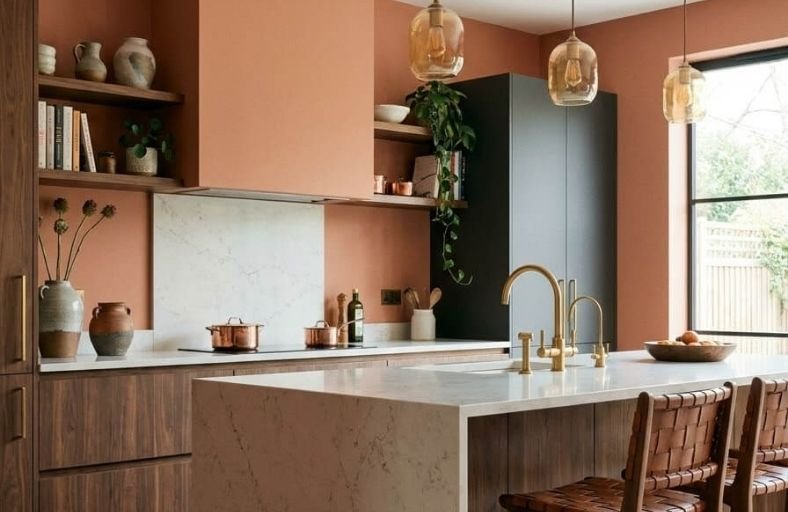
Orange kitchen paint colors have enjoyed a significant resurgence in interior design in recent years, driven by a broader appreciation for warm, earthy tones that make a home feel more connected to the natural world and more emotionally alive.
In a kitchen specifically, orange’s inherent warmth and energy work exceptionally well, creating an atmosphere that feels both stimulating during busy cooking sessions and comfortably warm during quieter morning coffee moments.
The range within the orange family is broad enough to suit every kitchen style, from subtle terracotta tones that complement natural wood cabinetry to rich, saturated burnt oranges that pair dramatically with dark countertops and matte black hardware.
These stunning orange paint colors will help you find the perfect energizing shade for your kitchen walls.
Comprehensive Orange Paint Technical Profile
The table below outlines eleven paint formulations from leading manufacturers, detailing technical metrics, color DNA, and optimal kitchen applications.
| Brand | Paint Name & SKU | LRV (%) | Primary Undertones | Recommended Kitchen Application |
|---|---|---|---|---|
| Benjamin Moore | Pumpkin Spice 126 | 31.59 | Nutmeg Brown, Warm Cinnamon | Perimeter Cabinetry, Traditional Prep Walls |
| Benjamin Moore | Soft Pumpkin 2166-40 | 41.77 | Creamy Apricot, Yellow-Peach | Open-Concept Walls, Low-Light Kitchens |
| Benjamin Moore | Etruscan AF-355 | 25.04 | Golden Caramel, Burnt Amber | Kitchen Islands, Rustic Accent Walls |
| Sherwin-Williams | Persimmon SW 6339 | 39.00 | Soft Terracotta, Warm Apricot | Modern Farmhouse Walls, Upper Cabinetry |
| Sherwin-Williams | Cavern Clay SW 7701 | 20.00 | Muddy Rust, Earthy Brown | Mid-Century Modern Cabinets, Accent Walls |
| Sherwin-Williams | Spiced Cider SW 7702 | 23.44 | Rusted Terracotta, Spice Brown | Lower Cabinetry, Pantry Built-Ins |
| Sherwin-Williams | Rejuvenate SW 6620 | 30.73 | Coral-Pink, Warm Zest Orange | Breakfast Nooks, Contemporary Feature Walls |
| Behr | Terra Cotta Urn PPU2-12 | 22.00 | Desert Clay, Muted Red-Brown | Mediterranean Range Hoods, Island Bases |
| Behr | Cheerful Tangerine P210-5 | 47.87 | Bright Citrus, Golden Yellow | Modern Open Shelving Nooks, Pantry Interiors |
| Farrow & Ball | Red Earth 64 | 27.03 | Sun-Baked Terracotta, Red-Yellow Clay | Historic Kitchen Walls, Color-Drenched Trim |
| Farrow & Ball | Charlotte’s Locks 268 | 21.29 | Flame Red-Orange, Saturated Copper | High-Gloss Focal Cabinets, Contemporary Trim |
Benjamin Moore Pumpkin Spice 126
Benjamin Moore Pumpkin Spice 126 is a balanced orange infused with cinnamon and nutmeg undertones.
Boasting an LRV of 31.59%, this medium-depth shade creates a grounded atmosphere without overwhelming the visual field.
The color relies on brown grounding pigments that suppress garish brightness, yielding an inviting backdrop suitable for traditional or craftsman kitchens.
When applied to kitchen cabinetry or main accent walls, Pumpkin Spice 126 pairs effortlessly with warm off-whites like Benjamin Moore Ballet White OC-9, polished brass hardware, and soapstone countertops.
It reacts dynamically to warm natural daylight, bringing forth its spiced undertones while maintaining stability under 3000K LED lighting.
Benjamin Moore Soft Pumpkin 2166-40
Benjamin Moore Soft Pumpkin 2166-40 represents a luminous, cream-infused medium orange with an LRV of 41.77%.
Drawing inspiration from ripe apricots, this hue reflects light effectively, making it an excellent candidate for smaller kitchens or spaces with limited natural light exposure.
The high reflectivity prevents visual clutter, allowing the space to feel open and airy.
Designers frequently utilize Soft Pumpkin 2166-40 on upper wall sections, pairing it with cool light gray wainscoting or lower cabinets in Benjamin Moore Wickham Gray HC-171 to establish a balanced warm-cool contrast.
The color complements light oak floorings, white quartz countertops, and brushed nickel fixtures.
Benjamin Moore Etruscan AF-355
Benjamin Moore Etruscan AF-355 is an amber-infused caramel orange with deep golden-yellow undertones and an LRV of 25.04%.
Part of the Affinity Collection, it brings an old-world elegance reminiscent of burnt sugar and handcrafted clay.
Due to its low LRV, Etruscan AF-355 absorbs light, rendering it ideal for rich kitchen islands or rustic accent walls.
The heavy yellow-brown undertone stabilizes the orange, preventing it from appearing overly bright in cold lighting.
It aligns with warm walnut cabinetry, tumbled limestone floor tiles, and oil-rubbed bronze hardware.
Sherwin-Williams Persimmon SW 6339
Sherwin-Williams Persimmon SW 6339 is an approachable terracotta-apricot hybrid with an LRV of 39.0%.
Designed to bridge the gap between energetic orange and calming neutral beige, Persimmon incorporates pastel undertones that soften its visual intensity.
It performs exceptionally well in modern farmhouse or boho-chic kitchens where natural warmth is desired without overwhelming architectural features.
Persimmon pairs seamlessly with warm off-whites such as Sherwin-Williams Casa Blanca HGSW7571, woven rattan pendant lights, honed butcher block islands, and matte black plumbing fixtures.
Sherwin-Williams Cavern Clay SW 7701
Sherwin-Williams Cavern Clay SW 7701 is an earthy, sun-baked terracotta hue characterized by heavy rust and brown undertones with an LRV of 20.0%.
Sitting at a hue angle of 16 degrees, this color delivers a grounded aesthetic tailored for mid-century modern or Southwestern kitchen designs.
Because it absorbs up to 80% of visible light, Cavern Clay demands calculated placement, ideally in south-facing rooms where warm daylight amplifies its rich rust tones.
In north-facing light, its brown undertones surface, requiring 2700K artificial bulbs to maintain warmth.
It pairs naturally with cream trim, dark slate floor tiles, raw timber, and brushed brass details.
Sherwin-Williams Spiced Cider SW 7702
Sherwin-Williams Spiced Cider SW 7702 is a medium-deep orange-brown leaning toward aged cinnamon, featuring an LRV of 23.44%.
Sitting between true orange and warm leather brown, this color injects warmth into kitchen cabinetry, pantry doors, or perimeter trim work.
The muted structure of Spiced Cider SW 7702 provides strong pigment density that forgives surface wear while establishing an inviting culinary atmosphere.
It harmonizes with creamy cabinet whites such as Benjamin Moore Chantilly Lace 2121-70, white oak flooring, and antiqued brass fixtures.
Sherwin-Williams Rejuvenate SW 6620
Sherwin-Williams Rejuvenate SW 6620 is an energetic, coral-infused orange hue with an LRV of 30.73%.
Blending lively orange with pink-coral pigments, Rejuvenate creates a stimulating atmosphere suited for breakfast nooks, kitchen prep zones, or contemporary feature walls.
Its high chroma ensures the color remains vibrant under both natural daylight and artificial lighting sources.
To avoid overstimulation, designers pair Rejuvenate SW 6620 with grounding neutrals like Sherwin-Williams Dovetail SW 7018 or crisp white subway tile backsplashes and chrome hardware.
Behr Terra Cotta Urn PPU2-12
Behr Terra Cotta Urn PPU2-12 is an earthy, desert-inspired red-brown orange with an LRV of 22.0%.
Formulated to mirror natural clay vessels, this color brings stability and rustic warmth to kitchen interiors.
Its muted red-orange base prevents it from appearing neon, allowing it to function as a warm, statement neutral.
Terra Cotta Urn excels when applied to kitchen island bases, full-height pantry built-ins, or plastered accent hood surrounds.
It coordinates with warm beige tones like Behr Almond Wisp, sage greens, and natural linen textiles.
Behr Cheerful Tangerine P210-5
Behr Cheerful Tangerine P210-5 is a high-energy citrus orange with an LRV of 47.87%.
Designed to evoke vitality, this vibrant shade incorporates yellow-citrus undertones that reflect light and expand spatial boundaries.
Because of its high saturation, Cheerful Tangerine is best deployed strategically, such as inside open shelving units, on kitchen pantry interiors, or as a focal accent wall in modern kitchen layouts.
Pairing it with ultra-clean white cabinetry, concrete countertops, and minimal stainless steel detailing tempers its vivid nature.
Farrow & Ball Red Earth 64
Farrow & Ball Red Earth 64 is a sun-baked terracotta red-orange formulation leveraging a blend of natural red and yellow pigments with an LRV of 27.03%.
Named after terrestrial red clay, this color demonstrates light sensitivity, deepening into a cozy hue as daylight shifts to evening lamplight.
Red Earth 64 brings historic sophistication to both period homes and modern kitchens.
Designers often execute a color-drenching technique with Red Earth, painting walls, baseboards, and window trim in Modern Emulsion or Dead Flat finishes, and pairing the color with honed Carrara marble and dark green accents.
Farrow & Ball Charlotte’s Locks 268
Farrow & Ball Charlotte’s Locks 268 is a dramatic, flame red-orange inspired by vivid auburn hair, featuring an LRV of 21.29%.
Bold and expressive, this vibrant hue embodies a late-1970s playful aesthetic that demands architectural confidence.
It excels in smaller kitchen spaces, bar nooks, or high-gloss island applications where sharp visual contrast is created against deep tones like Farrow & Ball Black Blue 95 or crisp Farrow & Ball All White 2005.
Executing Charlotte’s Locks in a Full Gloss finish reflects surrounding light sources, transforming ordinary cabinetry into a striking focal point.
Technical Interior Design Principles for Orange Kitchens
Successful integration of orange paint formulations within kitchen architecture relies on proper surface prep, finish selections, lighting variables, and material pairings.
Surface Preparation and Primer Selection
Orange pigments, particularly those with low LRVs and deep rust or red undertones (e.g., Cavern Clay SW 7701 or Charlotte’s Locks 268), contain high tint concentrations that require specific substrate priming.
Applying deep orange paint over bare white walls without proper preparation can result in streaking or patchy light reflection.
Deep rust and terracotta hues require a red- or warm-gray-tinted primer to build a uniform base coat.
Tinted primers prevent white substrate show-through and reduce the required topcoats from four down to two.
When painting cabinetry or high-touch kitchen surfaces, thorough sanding, degreasing, and application of a bonding primer ensure adequate adhesion for acrylic-alkyd or waterborne enamel paints.
Paint Sheen Matrix for Kitchen Environments
Selecting the appropriate sheen level directly impacts cleanability, light reflection, and visual color depth.
Higher sheens intensify warm red and yellow undertones, whereas ultra-flat sheens soften visual saturation.
Flat and matte finishes (0–5% sheen) absorb light, yielding maximum visual depth for clay hues like Behr Terra Cotta Urn.
However, washable mattes (such as Farrow & Ball Modern Emulsion or Benjamin Moore Regal Select Matte) must be specified for kitchen walls to allow light cleaning without burnishing the finish.
Eggshell and velvet sheens (10–25% sheen) serve as the standard for kitchen perimeter walls, providing a soft glow that balances washability with smooth light dispersion.
Satin and pearl sheens (25–35% sheen) are recommended for cabinetry, window casings, baseboards, and prep areas, offering a non-porous, scrubbable surface.
Semi-gloss to full gloss finishes (50–95% sheen) suit focal cabinetry or island units, amplifying visual saturation and reflecting light dynamically across saturated orange hues.
Lighting and Temperature Calibration
Lighting variables significantly alter the visual expression of orange kitchen paints.
South-facing windows amplify yellow and red pigments, making colors like Persimmon SW 6339 glow pleasantly.
North-facing exposure casts cool blue light that flattens orange chroma, pulling brown undertones forward.
To counteract northern light, orange paints with strong golden or peach bases, such as Soft Pumpkin 2166-40, are preferred.
Artificial kitchen light fixtures should be calibrated between 2700K and 3000K.
Warm LED illumination preserves intended cinnamon, amber, and terracotta notes.
Cool LED lamps (4000K or higher) strip warmth out of orange pigments, making warm clays appear dull or muted.
Architectural Material and Color Pairings
Pairing orange kitchen paints with complementary finishes balances visual warmth against cool architectural elements.
Opposite orange on the color wheel, muted navy tones (such as Benjamin Moore Hale Navy HC-154), blue-grays, and desaturated sage greens (such as Farrow & Ball Green Smoke) generate sophisticated contrast against terracotta and rust walls.
Light white oak floors and open shelving visually soften saturated citrus oranges, while dark walnut cabinetry provides a grounding contrast for amber and copper paint colors.
Warm oranges harmonize naturally with unlacquered brass, brushed copper, and oil-rubbed bronze hardware.
Countertop materials such as white Carrara marble, soapstone, concrete, and butcher block provide natural textures that ground orange pigments effectively.
Strategic Design Conclusions
Selecting an orange paint color for a kitchen project requires balancing personal aesthetic goals, architectural lighting, and spatial function.
Mid-to-high LRV shades like Benjamin Moore Soft Pumpkin 2166-40 (LRV 41.77%) and Sherwin-Williams Persimmon SW 6339 (LRV 39.0%) offer approachable solutions that introduce warmth while maintaining light reflectivity in compact or low-light spaces.
For spaces seeking grounded, earthy aesthetics, deep clay and rust formulations such as Sherwin-Williams Cavern Clay SW 7701 (LRV 20.0%), Behr Terra Cotta Urn PPU2-12 (LRV 22.0%), and Farrow & Ball Red Earth 64 (LRV 27.03%) establish historic, organic atmospheres.
When introducing high-chroma orange pigments like Farrow & Ball Charlotte’s Locks 268 or Behr Cheerful Tangerine P210-5, strategic placement on kitchen islands, pantry interiors, or focal cabinetry prevents visual fatigue while creating distinct design statements.
By coordinating color selection with proper surface preparation, 2700K–3000K lighting, appropriate paint sheens, and complementary material finishes, an orange kitchen palette transforms into a refined, architectural element.