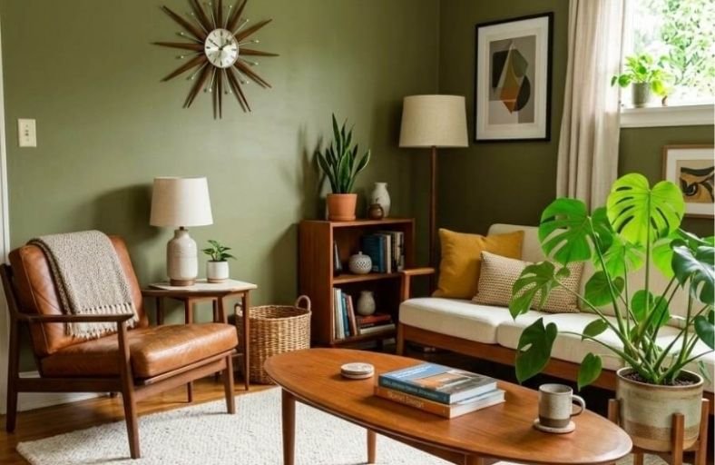
Mid century modern paint colors bring a distinctive combination of warmth, optimism, and graphic clarity to a living room that no other design era quite replicates.
Rooted in the bold, nature-inspired palette of the 1950s and 1960s, these colors celebrate avocado greens, warm mustard yellows, burnt oranges, rich teals, and earthy browns that feel simultaneously retro and surprisingly current in today’s interior design landscape.
The mid century color palette works beautifully alongside the clean lines, organic forms, and natural wood tones that define this beloved aesthetic.
These perfect paint colors will help you capture the authentic spirit of mid century modern design in your living room in the most beautiful and confident way possible.
| Paint Brand | Color Name | Color Code | LRV | Primary Undertones | Recommended Wood & Material Pairing |
|---|---|---|---|---|---|
| Benjamin Moore | Wythe Blue | HC-143 | 48.11 | Subtle gray-green blue | Honey teak, oiled walnut, light leather |
| Benjamin Moore | Terra Cotta Tile | 2090-30 | 14.14 | Calibrated rustic red-orange | Dark walnut, raw iron, off-white plaster |
| Sherwin-Williams | Cavern Clay | SW 7701 | 20.00 | Warm terracotta pink-orange | Blonde oak, birch, brass, woven jute |
| Farrow & Ball | India Yellow | No. 66 | 36.00 | Deep mustard ochre brown | Medium teak, aged walnut, black metal |
| Sherwin-Williams | Avocado | SW 2861 | 13.00 | Olive-yellow vintage green | Warm cedar, exposed brick, beige wool |
| Benjamin Moore | Incense Stick | 2115-20 | 8.19 | Smoky brown-violet | Light oak, satin brass, off-white boucle |
| Sherwin-Williams | Oceanside | SW 6496 | 8.00 | Deep peacock teal blue-green | Danish teak, polished brass, white marble |
| Farrow & Ball | Calke Green | No. 34 | 22.00 | Deep sage forest green | Natural walnut, saddle leather, antique brass |
| Behr | Canyon Dusk | S210-4 | 37.00 | Dusty rose-terracotta | Rattan, whitewashed oak, brushed nickel |
| Benjamin Moore | Simply White | OC-117 | 88.88 | Warm soft yellow-white | All mid-century timbers, stone fireplaces |
| Benjamin Moore | Woodstock Tan | HC-20 | 28.50 | Earthy golden-brown ochre | Medium teak millwork, brass, textured ceramics |
Benjamin Moore Wythe Blue (HC-143)
Benjamin Moore Wythe Blue (HC-143) represents a classic blue-green shade imbued with a subtle gray cast, making it a foundational hue within mid-century architectural restoration.
Registering a light reflectance value (LRV) of 48.11, Wythe Blue sits precisely in the mid-tone spectrum, enabling it to reflect natural light without producing harsh glare.
In a living room setting, this hue shifts fluidly across the day: cool morning light brings out its soft teal quality, whereas warm afternoon sun activates its muted sage undertones.
Wythe Blue serves as an ideal backdrop for classic Danish modern furniture crafted from oiled teak or warm birch.
The gray-green element balances the orange and red notes inherent in honeyed wood finishes, preventing the room from feeling monochromatic.
When applied to living room walls, Wythe Blue creates a serene atmosphere while offering sufficient chroma to contrast sharply against clean off-white trims and black metal structural elements.
Benjamin Moore Terra Cotta Tile (2090-30)
Benjamin Moore Terra Cotta Tile (2090-30) captures the vivid graphic energy of 1950s modernist design through a calibrated mix of rust red and warm clay.
Possessing an LRV of 14.14, this dark, saturated shade absorbs light to create an intimate, grounded architectural focus.
Rather than coating an entire open-plan space, Terra Cotta Tile functions best on living room feature walls, masonry fireplace surrounds, or targeted accent niches.
The burnt orange-red pigmentation creates a striking visual frame for mid-century seating featuring dark walnut legs or tubular steel frames.
It activates the warmth in dark timber millwork and acts as a natural complement to warm cream upholstery.
Under warm 2700K lamp lighting, Terra Cotta Tile produces an inviting glow, reinforcing the handcrafted, artisanal ethos central to mid-century modern living room design.
Sherwin-Williams Cavern Clay (SW 7701)
Sherwin-Williams Cavern Clay (SW 7701) offers an earthy terracotta tone that infuses desert modern aesthetics into interior living spaces.
With an LRV of 20.00, this shade features warm pink and soft orange undertones that shift dynamically across varying lighting conditions.
Morning sun elevates its lighter clay notes, whereas artificial evening light reveals deeper, earth-bound undertones.
This hue pairs naturally with blonde woods such as ash, birch, and light oak, creating an airy contrast.
Cavern Clay acts as a bridge between structural architectural elements and organic indoor materials.
Living rooms painted in Cavern Clay benefit from pairings with woven jute rugs, matte black hardware, raw brass lighting fixtures, and deep navy or olive green upholstery.
It delivers warmth to north-facing rooms that lack direct sunlight, softening hard structural angles.
Farrow & Ball India Yellow (No. 66)
Farrow & Ball India Yellow (No. 66) is a deep, moody mustard ochre anchored by strong earthy brown undertones.
Exhibiting an LRV of 36.00, this color avoids the harsh brightness of primary yellows, delivering a mature ochre shade that absorbs light to create an enveloping atmosphere.
In mid-century modern living rooms, India Yellow references the period’s signature mustard accents while retaining historic sophistication.
The deep brown base in India Yellow harmonizes with aged walnut cabinetry and dark-stained teak.
When applied to living room walls or wainscoting, it forms a backdrop for charcoal gray, deep teal, or dark green furniture.
India Yellow responds dramatically to directional lighting, developing rich amber shadows in corners while reflecting soft golden hues under direct sunlight.
Sherwin-Williams Avocado (SW 2861)
Sherwin-Williams Avocado (SW 2861) captures the nostalgic green palette popular in late 1950s and 1960s residential architecture.
With a low LRV of 13.00, this dark olive green contains yellow undertones that prevent it from appearing cold or overly slate-like.
It grounds living spaces by connecting interior views directly to exterior foliage, a key spatial principle of mid-century post-and-beam architecture.
Avocado performs exceptionally well when applied to full walls or low-slung accent partition walls within open-plan layouts.
It creates an earthy contrast when paired with natural stone hearths, exposed cedar ceiling beams, and off-white plaster trims.
Living room furniture in cognac leather, mustard yellow wool, or natural linen stands out clearly against Avocado walls, creating a balanced palette.
Benjamin Moore Incense Stick (2115-20)
Benjamin Moore Incense Stick (2115-20) is a dark brown hue infused with smoky violet undertones.
Registering a low LRV of 8.19, this saturated brown provides dramatic contrast, absorbing light to add architectural depth to living room spaces.
Incense Stick illustrates how dark brown shades served as sophisticated structural foundations in mid-century executive interiors.
When painted on a main living room wall, Incense Stick enhances the silhouettes of sculptural mid-century seating, such as Saarinen Womb chairs or Eames lounge chairs.
The violet-gray undertone prevents the color from feeling heavy or flat.
It pairs with light-toned oak floors, satin brass floor lamps, off-white upholstery, and light gray architectural accents, making it a powerful choice for cozy, nocturnal living areas.
Sherwin-Williams Oceanside (SW 6496)
Sherwin-Williams Oceanside (SW 6496) is a peacock teal that combines rich blue with jewel-toned green.
With a low LRV of 8.00, this saturated shade brings vivid graphic contrast to living room walls.
Oceanside exemplifies the vibrant branch of mid-century modern color design, where bold jewel tones were utilized to energize structural planes and frame outdoor views.
Because Oceanside balances cool blue and warm green notes, it shifts noticeably under different light sources: cool morning light emphasizes its deep blue tones, whereas warm evening lamp light brings out its green undertones.
Oceanside provides a backdrop for warm Danish teak credenzas, polished brass fixtures, and crisp white architectural wainscoting.
It works as an accent wall color or in color-drenched living rooms designed for entertaining.
Farrow & Ball Calke Green (No. 34)
Farrow & Ball Calke Green (No. 34) is a traditional sage green derived from historic interior palettes.
Featuring an LRV of 22.00, Calke Green presents a deep organic tone that retains visual clarity without turning muddy.
In living room environments, Calke Green offers an understated backdrop that reinforces biophilic connections while honoring traditional mid-century craftsmanship.
Calke Green pairs naturally with oiled walnut furniture, saddle leather seating, and warm off-white trims.
Its sage notes absorb excess ambient glare in brightly lit south-facing living rooms, establishing visual balance.
When combined with dark neutral woods and brushed metallic accents, Calke Green yields a calm, grounded space suitable for reading areas and main conversation zones.
Behr Canyon Dusk (S210-4)
Behr Canyon Dusk (S210-4) is a muted terracotta hue that blends earthy pink and warm sandy brown notes.
Possessing an LRV of 37.00, this mid-tone color offers a lighter, softer alternative to saturated clay shades while providing gentle warmth.
Canyon Dusk captures the laid-back, sun-baked quality of California mid-century modern homes.
This shade harmonizes with light wood finishes, rattan furniture, woven cane screens, and neutral linen textiles.
In living rooms, Canyon Dusk softens hard architectural edges and complements natural stone floor tiles or exposed brickwork.
Its rosy undertones introduce a welcoming ambience into living spaces, serving as a versatile backdrop that pairs equally well with muted sage accents and dark charcoal furniture.
Benjamin Moore Simply White (OC-117)
Benjamin Moore Simply White (OC-117) is a warm, bright off-white shade featuring a soft yellow undertone.
Boasting a high LRV of 88.88, Simply White serves as a primary neutral canvas within mid-century modern architecture.
It reflects natural light throughout open-plan spaces while avoiding the sterile, cold appearance of untinted pure whites.
In mid-century living rooms, Simply White allows dark timber beams, floor-to-ceiling glass frames, and rich architectural woodwork to remain visual focal points.
It provides maximum spatial flexibility, enabling vibrant accents, such as orange art pieces, teal chairs, or olive rugs, to stand out clearly.
Simply White unifies open layouts, maintaining light continuity across adjacent living, dining, and entryway zones.
Benjamin Moore Woodstock Tan (HC-20)
Benjamin Moore Woodstock Tan (HC-20) is a golden-brown ochre neutral drawn from historic interior palettes.
Exhibiting an LRV of 28.50, Woodstock Tan offers a mid-weight earth tone that reflects the handcrafted, organic character of 1950s interior design.
It acts as a bridge between light off-white background walls and dark accent features.
In living room applications, Woodstock Tan works effectively on full walls or structural partition panels.
Its warm ochre undertone reinforces the grain of medium teak and walnut furniture while pairing smoothly with brass hardware, ceramic lamps, and wool textiles.
Woodstock Tan provides a cozy backdrop that anchors living room conversation areas, making it a dependable neutral for mid-century design schemes.
Palette Synthesis and Spatial Application Framework
Successfully integrating mid-century modern paint colors into a living room requires balancing wall colors, architectural woodwork, structural lighting, and secondary textiles.
Designers frequently employ proportional color allocation to maintain visual order across open-plan interiors.
The structural arrangement of an authentic palette divides roles into background neutrals, structural mid-tones, and high-chroma accent spikes.
| Palette Level | Target Percentage | Primary Architectural Function | Recommended Color Selections |
|---|---|---|---|
| Background Canvas | 60% | Dominant perimeter walls, open-plan hallways, and ceilings that reflect light and expand space. | Simply White (OC-117), Wythe Blue (HC-143) |
| Structural Mid-Tone | 30% | Secondary walls, built-in cabinetry, millwork, large upholstered sofas, and primary rugs. | Woodstock Tan (HC-20), Calke Green (No. 34), Avocado (SW 2861) |
| Accent Spike | 10% | Feature fireplace walls, alcoves, entry doors, accent armchairs, and art objects. | Terra Cotta Tile (2090-30), Oceanside (SW 6496), India Yellow (No. 66) |
Natural light direction heavily dictates how paint undertones behave across the room throughout the day.
North-facing living rooms receive a cool, bluish natural light that can cause low-chroma grays or muted blues to appear cold or washed out.
These spaces require warm-based earth tones such as Sherwin-Williams Cavern Clay (SW 7701), Farrow & Ball India Yellow (No. 66), or Behr Canyon Dusk (S210-4) to introduce warmth and visual balance.
Conversely, south-facing living rooms receive intense, warm light all day, which heightens red, orange, and yellow undertones.
South-facing layouts accommodate cool-spectrum shades and deep greens like Sherwin-Williams Oceanside (SW 6496), Farrow & Ball Calke Green (No. 34), or Benjamin Moore Wythe Blue (HC-143), which absorb excess glare while preserving atmospheric tranquility.
Conclusion
Restoring or styling a mid-century modern living room requires an appreciation for how color, light, and natural materials interact.
By moving beyond simple neutral schemes and thoughtfully incorporating period-accurate shades, ranging from organic olive greens and ochres to graphic terracottas and peacock teals, one can establish a living space that feels both historically authentic and modern.
Utilizing exact color codes, understanding light reflectance values, and applying disciplined decor scaling ensures a visually balanced, cohesive mid-century modern interior.