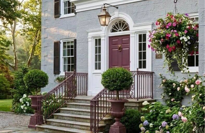
A well-chosen front door color on a grey house does something remarkable.
It transforms the entire exterior from simply attractive to genuinely memorable, giving the home a clear sense of personality and curb appeal that makes it stand out beautifully on any street.
Grey’s inherent versatility as an exterior color means it works equally well as a backdrop for bold, high-contrast front door choices and for more subtle, tonal combinations that create an atmosphere of quiet sophistication.
Understanding whether your grey exterior leans warm or cool is the key to identifying which front door colors will create the most harmonious and visually pleasing result.
These gorgeous front door paint colors will give you a rich and inspiring palette to consider for your grey house.
Comprehensive Paint Color Matrix
The following matrix synthesizes technical specifications, light reflectance values, primary undertones, and optimal siding matches across eleven leading paint colors from premier manufacturers.
| Paint Brand | Official Color Name | Color Number / SKU | LRV | Primary Undertones | Optimal Grey Siding Match |
|---|---|---|---|---|---|
| Benjamin Moore | Hale Navy | HC-154 | 8.36 | Deep Purple-Blue / Maritime | Light to Mid-Tone Cool Slate Grey |
| Sherwin-Williams | Tricorn Black | SW 6258 | 2.85 | Neutral Black / Purple-Blue Base | Pale Cool Grey or Warm Greige |
| Benjamin Moore | Caliente | AF-290 | 9.83 | Warm Crimson / Subtle Brown | Charcoal Grey or Mid-Tone Neutral Grey |
| Sherwin-Williams | Naval | SW 6244 | 4.46 | Cool Gray-Green / Navy | Warm Light Greige or Classic Silver Grey |
| Sherwin-Williams | Urbane Bronze | SW 7048 | 8.00 | Deep Greige / Brown-Green | Warm Stone Grey or Taupe-Grey |
| Farrow & Ball | Studio Green | No. 93 | 7.09 | Blackened Forest / Olive Shadow | Weathered Cedar Grey or Light Cool Grey |
| Behr | Cracked Pepper | PPU18-01 | 8.00 | Soft Charcoal / Cool Gray-Black | Off-White Grey or Mid-Tone Greige |
| Benjamin Moore | Wythe Blue | HC-143 | 48.11 | Blue-Green / Subtle Slate Gray | Dark Charcoal Siding or Deep Slate |
| Benjamin Moore | Simply White | OC-117 | 89.52 | Warm Off-White / Yellow Glow | Deep Charcoal or Dark Blue-Grey |
| Sherwin-Williams | Cavern Clay | SW 7701 | 20.00 | Terracotta / Warm Earthy Orange | Cool Mid-Tone Grey or Slate Blue-Grey |
| Farrow & Ball | Preference Red | No. 297 | 8.00 | Deep Baroque Crimson / Dark Red | Light French Grey or Medium Neutral Grey |
Benjamin Moore Hale Navy (HC-154)
Benjamin Moore Hale Navy HC-154 stands as an industry benchmark for maritime navy coatings.
Categorized within the purple-blue hue family, Hale Navy possesses an LRV of 8.36, giving it significant light-absorbing capabilities that ground an entry facade.
When deployed against cool slate grey or crisp silver cladding, this color accentuates blue undertones within the grey siding, establishing a formal yet inviting aesthetic.
The color stability of Hale Navy prevents it from washing out under intense afternoon sunlight, while in indirect northern exposures, it reads as a rich, velvety near-black infused with indigo depth.
Architectural designers frequently specify Hale Navy for traditional, coastal, and transitional structures due to its ability to establish clear focal priority without visually overwhelming secondary building elements.
Paired with bright white exterior trim and warm brass or brushed nickel door hardware, it offers a sophisticated contrast that bridges historic craftsmanship with modern residential design standards.
Sherwin-Williams Tricorn Black (SW 6258)
Sherwin-Williams Tricorn Black SW 6258 represents one of the purest, most neutral dark pigments in residential architecture.
Formulated on a purple-blue base, Tricorn Black exhibits no noticeable warm or cool undertone bias, rendering it universally compatible with both blue-toned slate greys and yellow-tinged warm greiges.
Featuring a remarkably low Light Reflectance Value of 2.85, Tricorn Black absorbs visible light almost entirely, providing maximum contrast against lighter exterior claddings.
On grey residences, a Tricorn Black entry door anchors the architectural elevation, defining the front entryway with crisp, graphic clarity.
It functions exceptionally well in high-gloss or satin sheens, reflecting direct light along door panel moulding while maintaining deep shadow lines in recessed panels.
Whether paired with modern minimalist facades or classic Colonial trim packages, Tricorn Black delivers a timeless anchor that elevates curb appeal.
Benjamin Moore Caliente (AF-290)
Benjamin Moore Caliente AF-290 delivers an energetic crimson focal point balanced by subtle warm brown undertones.
Registering an LRV of 9.83, Caliente occupies a sophisticated sweet spot among red coatings: it is sufficiently saturated to generate strong visual warmth against cold grey exteriors without appearing harsh under direct sunlight.
When paired with charcoal, graphite, or deep slate siding, Caliente creates a high-contrast warm-versus-cool dynamic that immediately draws visitors toward the threshold.
The brown undertones within Caliente harmonize effectively with natural exterior materials such as cedar porch posts, copper lighting fixtures, and stone walkways.
In residential environments where grey siding can occasionally read as flat or clinical, Caliente injects necessary vitality and curb appeal.
It performs admirably across mid-century modern, Craftsman, and contemporary architectural styles, offering a memorable, welcoming signature.
Sherwin-Williams Naval (SW 6244)
Sherwin-Williams Naval SW 6244 is a deeply saturated, opulent blue infused with subtle gray-green undertones.
With an LRV of 4.46, Naval is noticeably darker than conventional naval blues, approaching an inky charcoal hue in low-light environments.
On light grey or warm greige facades, Naval introduces an authoritative, meditative focal anchor that feels grounded and serene.
The subtle green-gray undertones embedded within Naval allow it to pair seamlessly with surrounding landscape foliage, stone pavers, and natural slate entryway steps.
Under southern or western exposures, natural sunlight brings out the blue chroma, preventing the door from flattening into shadow.
Architectural colorists frequently recommend Naval for homeowners seeking the dramatic contrast of a dark entryway alongside the understated elegance of an organic blue palette.
Sherwin-Williams Urbane Bronze (SW 7048)
Sherwin-Williams Urbane Bronze SW 7048 is a nuanced, deeply muted neutral that combines gray, brown, and subtle green pigments.
Operating at an LRV of 8.00, Urbane Bronze provides an earthy alternative to black, delivering substantial visual weight while imbuing the facade with organic warmth.
It is particularly effective when applied to homes clad in warm stone grey, taupe, or weathered cedar siding.
The brown and green undertones within Urbane Bronze interact harmoniously with natural landscape elements, stone veneer bases, and stained wooden porch ceilings.
Unlike colder dark shades, Urbane Bronze softens the line between built architecture and the surrounding environment.
On contemporary, Craftsman, or modern farmhouse exteriors, an Urbane Bronze front door conveys a grounded, sophisticated tranquility that enhances the home’s connection to nature.
Farrow & Ball Studio Green (No. 93)
Farrow & Ball Studio Green No. 93 is a dark, atmospheric green formulated with a heavy black base pigment.
With a low Light Reflectance Value of 7.09, Studio Green reads as a velvety soft black under indirect lighting or overcast skies.
However, when illuminated by direct natural sunlight, the rich forest green pigments emerge, revealing a deeply complex olive-tinted hue.
When applied to the front door of a home with light slate grey, weathered cedar, or cool greige siding, Studio Green establishes a seamless visual bridge between the architectural facade and surrounding garden foliage.
The depth of its dark pigments ensures that the color maintains an elegant, historic gravitas, making it a favorite for traditional, heritage, or modern rustic residential properties.
Behr Cracked Pepper (PPU18-01)
Behr Cracked Pepper PPU18-01 is a versatile soft charcoal black that bridges the spectrum between graphite grey and true black.
Carrying an LRV of 8.00, Cracked Pepper imparts significant depth and architectural weight without the starkness associated with neutral black paints.
Its cool gray-black character pairs exceptionally well with off-white siding, light greys, and warm greiges alike.
On a grey house, a Cracked Pepper front door provides a modern, anchored focal point that emphasizes structural lines and framing.
It functions particularly well in satin or urethane alkyd finishes, resisting exterior wear while highlighting panel details.
Ideal for industrial, modern farmhouse, and contemporary elevations, Cracked Pepper offers an approachable yet striking dark entryway solution.
Benjamin Moore Wythe Blue (HC-143)
Benjamin Moore Wythe Blue HC-143 is an approachable, genteel blue-green softened by a gentle slate grey undertone.
Registering a mid-tone Light Reflectance Value of 48.11, Wythe Blue reflects ample natural light, making it a cheerful yet composed choice for dark charcoal or deep slate grey exteriors.
The slate grey cast within Wythe Blue ensures visual cohesion with grey siding, while its green-blue saturation introduces a welcoming splash of color.
This shade is especially effective on coastal cottages, Craftsman bungalows, and classic Colonial homes where an approachable contrast is preferred over high-contrast dark tones.
In bright sunlight, Wythe Blue radiates a refreshing vitality, while in shaded entries, its grey undertone keeps it grounded and sophisticated.
Benjamin Moore Simply White (OC-117)
Benjamin Moore Simply White OC-117 is a clean, multi-purpose off-white enhanced by a faint yellow undertone that provides a soft, inviting glow.
Boasting a high Light Reflectance Value of 89.52, Simply White reflects maximum visible light, rendering the entryway bright, airy, and highly visible.
When paired with dark charcoal, graphite, or blue-grey siding, a Simply White front door creates a striking inverted-contrast effect that illuminates recessed or shadowed entry stoops.
The subtle warmth within Simply White prevents the door from reading as cold or clinical under cool northern sunlight, maintaining a gentle residential warmth.
It serves as a crisp focal point for modern farmhouses, traditional residences, and contemporary grey exteriors alike.
Sherwin-Williams Cavern Clay (SW 7701)
Sherwin-Williams Cavern Clay SW 7701 is a rich, warm terracotta hue that evokes natural clay and Southwestern earth tones.
Carrying an LRV of 20.00, Cavern Clay provides a grounded, warm mid-tone presence that contrasts dynamically against cool grey and slate blue-grey siding.
On the color wheel, terracotta orange serves as a direct complementary contrast to blue-grey hues, bringing visual vibrancy to otherwise muted exterior facades.
The organic warmth of Cavern Clay harmonizes effortlessly with natural wood porch ceilings, copper gutters, and stone masonry.
On mid-century modern, Craftsman, or contemporary residential designs, a Cavern Clay front door introduces a welcoming, tactile energy that enhances curb appeal and enlivens cool grey cladding.
Farrow & Ball Preference Red (No. 297)
Farrow & Ball Preference Red No. 297 is a deep, historic crimson red that exudes baroque richness and understated luxury.
Operating at a low Light Reflectance Value of 8.00, Preference Red contains deep warm undertones that absorb light, preventing the paint from shifting toward bright or pink hues in direct daylight.
When applied to a front door on a light French grey or medium neutral grey facade, Preference Red generates a classic, sophisticated entry statement.
Its deep pigment structure creates rich shadow details along door mouldings and paneling.
Paired with aged brass or iron hardware and traditional stone steps, Preference Red delivers a timeless architectural anchor that enhances historic, Colonial, and Tudor-style grey homes.
Spatial Analysis of Entryway Decor Density
When evaluating front door color selections, architectural designers examine how decor density, the concentration, volume, and visual complexity of surrounding accent items, interacts with paint chroma and Light Reflectance Value (LRV).
Modulating decor density alters the light entering the entryway, shifting how paint colors are perceived against grey siding.
| Decor Density Level | Typical Elements Included | Visual Impact on Paint Color | Recommended Color Types |
|---|---|---|---|
| Minimalist (Low) | Single sconce, flush mat, modern lever hardware | Maximizes exposed door surface; maximizes color purity and sharp contrast | High-contrast shades (Simply White, Tricorn Black) |
| Tailored (Low-Medium) | Symmetrical sconces, paired boxwood planters | Frame-in-frame composition; provides clean structural alignment | Classic dark tones (Hale Navy, Cracked Pepper) |
| Balanced (Medium) | Layered mats, copper lanterns, potted saplings | Harmonizes warmth and foliage; tempers mid-tone chroma | Earthy & chromatic hues (Caliente, Cavern Clay) |
| Layered (Medium-High) | Baskets, kickplates, door wreaths, dual sconces | Introduces varied material textures and subtle ambient shadows | Inky navies & rich greens (Naval, Studio Green) |
| Lush / Dense (High) | Clustered terracotta pots, wooden benches, trailing greenery | High visual texture; creates organic, biophilic framing | Deep organic neutrals (Urbane Bronze, Studio Green) |
| Seasonal (Ultra-Dense) | Garlands, clustered pumpkins, stacked planters, rugs | Creates rich environmental shadows and high visual complexity | Deep grounding darks (Cracked Pepper, Preference Red) |
Lower decor densities expose the full painted panel surface to direct natural light.
Under these conditions, the paint’s intrinsic undertones and LRV operate without obstruction, making crisp colors like Benjamin Moore Simply White (LRV 89.52) or Sherwin-Williams Tricorn Black (LRV 2.85) dominant.
Higher decor densities introduce complex foreground shadows and organic textures.
Dense foliage, terracotta pottery, and layered textiles cast micro-shadows across the door frame.
Deep, low-LRV colors like Sherwin-Williams Urbane Bronze (LRV 8.00), Farrow & Ball Studio Green (LRV 7.09), and Behr Cracked Pepper (LRV 8.00) absorb these varying light levels smoothly, maintaining a rich, cohesive background anchor behind decorative elements.
Synthesis and Architectural Recommendations
Achieving an optimal entry design for a grey residence depends on maintaining balance between fixed structural materials, siding undertones, and natural lighting exposures.
Cladding undertones must be identified prior to selecting a paint finish: cool slate greys harmonize naturally with maritime navies such as Benjamin Moore Hale Navy or Sherwin-Williams Naval, pure darks like Sherwin-Williams Tricorn Black, or soft blue-greens like Benjamin Moore Wythe Blue.
Warm greiges and stone greys benefit from organic dark neutrals like Sherwin-Williams Urbane Bronze, blackened forest greens like Farrow & Ball Studio Green, or warm earth tones like Sherwin-Williams Cavern Clay.
In all exterior paint applications, physical liquid samples should be applied directly to the door surface in a satin or semi-gloss finish to evaluate performance across morning, midday, and evening light.
By balancing LRV contrast ratios, undertone relationships, and spatial decor density, homeowners and architectural designers can establish a compelling, tailored entryway that enhances curb appeal and complements the residence’s overall design structure.