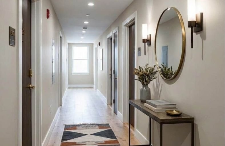
Low-ceiling spaces, typically defined as interior rooms with overhead clearances under eight feet, present distinct spatial challenges in contemporary and historical residential design.
The physical enclosure of a lowered ceiling plane creates an environment susceptible to visual compression, shadows, and reduced light distribution.
Architectural color theory provides precise optical mechanisms to expand perceived vertical volume without requiring costly structural modifications.
By systematically manipulating Light Reflectance Value (LRV), chromatic undertones, surface luster, and boundary line strategies, you can visually elevate the overhead plane and rebalance interior room proportions.
The Architectural and Optical Mechanics of Vertical Perception
The human visual system calculates room height by detecting contrast boundaries, shadow lines, and light distribution across intersecting architectural planes.
Standard wall-to-ceiling transitions created by contrasting paint colors establish sharp horizontal sightlines.
These sightlines signal to the brain exactly where vertical walls terminate, emphasizing spatial compression.
To counteract spatial compression, architectural color strategies leverage three primary optical mechanisms:
- Light Reflectance Value (LRV) Optimization: LRV measures the percentage of light a paint color reflects on a scale from 0 (absolute black) to 100 (pure white). High-LRV paints bounce natural and artificial light off wall surfaces onto the ceiling plane, effectively illuminating dark upper corners and softening boundary shadows.
- Vertical Sheen Gradients: Applying flat or ultra-matte finishes to ceilings absorbs direct light glare to hide plaster flaws, while applying satin or eggshell finishes to vertical walls produces a subtle upward glare gradient. This sheen variation guides eye movement upward along the wall plane toward the ceiling.
- Boundary Dissolution via Color Drenching: Painting walls, crown moldings, baseboards, and ceilings in a single paint color eliminates horizontal breaks. Without contrast at the trim line, the eye fails to register a hard boundary, perceiving the enclosure as continuous and expansive.
Benjamin Moore Chantilly Lace (OC-65 / 2121-70)
Chantilly Lace is one of the purest white formulations available, engineered with virtually no warm or cool undertones.
In low-ceiling environments, its exceptionally high Light Reflectance Value of 90.04 acts as an efficient reflector that distributes ambient illumination across vertical and horizontal planes.
By eliminating heavy color pigments, Chantilly Lace prevents the upper perimeter of a room from accumulating dark corner shadows, establishing an uninterrupted visual field.
This shade is particularly effective in low-ceiling interiors with limited natural daylight, such as basement living areas or north-facing bedrooms, where yellow or gray undertones can appear muddy.
When applied to walls in an eggshell finish alongside an ultra-flat ceiling finish, Chantilly Lace establishes a seamless reflective envelope that obscures plane transitions and visually lifts the overhead space.
Benjamin Moore Simply White (OC-117 / 2143-70)
Simply White incorporates a subtle warm yellow undertone while maintaining a remarkably high Light Reflectance Value of 89.52.
Low-ceiling spaces often suffer from gloomy overhead shadows at the wall-ceiling junction; Simply White counteracts these shadowy boundaries by scattering a warm, crisp radiance throughout ambient light zones.
In architectural rooms featuring exposed wooden beams, low framing, or historical joists, painting structural elements in Simply White reduces their visual weight.
When deployed in a monochromatic envelope across walls, baseboards, and ceiling planes, the gentle warmth prevents the interior from feeling clinical while maximizing light scatter to push room perimeters outward and upward.
Benjamin Moore Cloud White (OC-130 / 967)
Cloud White is a soft, balanced off-white characterized by delicate taupe and cream undertones, registering an LRV of 85.05.
Low ceilings in traditional or transitional residential spaces can feel harsh or stark when painted in vivid pure whites; Cloud White offers an elegant alternative that preserves light-reflecting capabilities.
When applied continuously across walls and ceiling planes, Cloud White eliminates hard visual stops, allowing the human eye to move effortlessly across room transitions.
Interior designers frequently specify Cloud White for low spaces featuring dark hardwood flooring, as its warm taupe undertone bridges the visual contrast between dark floors and light walls, maintaining an airy, buoyed overhead structure.
Benjamin Moore Pale Oak (OC-20 / 858)
Pale Oak is a sophisticated greige balancing warm beige and cool gray undertones, featuring an LRV of 68.64.
While high-LRV whites are standard selections for spatial expansion, Pale Oak demonstrates how controlled mid-tone neutrals stretch vertical dimension through subtle tonal depth.
When applied to walls in a low-ceiling room alongside a higher-LRV bright white ceiling, Pale Oak creates a subtle horizontal contrast that grounds lower walls while projecting the lighter ceiling plane upward.
In rooms with abundant natural light, painting both walls and ceiling in Pale Oak blurs perimeter corners, transforming low basement rooms or compact sitting areas into expansive architectural environments.
Benjamin Moore Hale Navy (HC-154)
Hale Navy challenges conventional wisdom that low-ceiling rooms must rely exclusively on pale paint shades.
With an LRV of 8.36, this deeply saturated maritime blue with charcoal undertones utilizes dark color drenching to dissolve spatial boundaries.
When applied in a flat finish across walls, trim, doors, and ceilings, Hale Navy erases physical corners and junction lines.
Because the human eye cannot easily process where vertical walls terminate and the ceiling begins, the overhead space feels infinite, resembling a deep nocturnal sky.
This strategy excels in compact home offices, dens, and media rooms with low ceiling clearance.
Sherwin-Williams Pure White (SW 7005)
Pure White by Sherwin-Williams is a highly adaptable off-white with an LRV of 84, formulated with a touch of black pigment to soften blinding glare.
This balanced composition prevents the color from leaning excessively cool blue or warm yellow under shifting color temperatures.
In low-ceiling residential interiors, Pure White serves as an expansive neutral shell that optimizes daylight bounce.
Applying Pure White continuously across walls, window trim, and ceilings removes horizontal breaks, allowing light to glide seamlessly across upper wall perimeters.
Its clean profile makes it ideal for open-plan low-ceiling interiors, reflecting ambient illumination without starkness.
Sherwin-Williams Alabaster (SW 7008)
Alabaster is a warm off-white featuring soft beige undertones and an LRV of 82.
Low ceilings in historical structures or basement conversions can feel cold or restrictive when finished in stark whites; Alabaster counteracts this by providing a cozy, luminous backdrop while maintaining high light reflectivity.
When specified for both walls and ceilings, Alabaster creates a continuous warm shell that visually elevates overhead space.
The subtle beige undertone pairs naturally with warm hardwood floors, stone fireplaces, and warm metals, softening corner shadows without adding heavy chromatic weight.
Sherwin-Williams Repose Gray (SW 7015)
Repose Gray is a versatile gray neutral with soft taupe undertones and an LRV of 58.
While higher-LRV whites bounce raw light, Repose Gray utilizes controlled tonal depth to structure space in low-ceiling interiors.
When painted on walls in a low-ceiling room paired with a crisp, high-LRV white ceiling, Repose Gray establishes a horizontal value contrast that accentuates the brightness and perceived height of the overhead ceiling plane.
The taupe-gray composition absorbs harsh side-wall glare, providing a balanced backdrop that pushes low ceilings visually higher through vertical tonal contrast.
Farrow & Ball Pointing (No. 2003)
Pointing is Farrow & Ball’s signature warm white, named after the color of lime mortar used in traditional masonry.
Registering an LRV of 86 with soft warm cream undertones, Pointing excels at softening low-ceiling spaces in historic homes, cottages, and period properties.
Low ceilings in older homes often feature irregular plaster; Pointing’s rich pigment formulation responds dynamically to changing daylight, casting gentle illumination across surfaces rather than harsh shadows.
Applied across walls and ceilings, Pointing forms a unified, velvety light envelope that blurs structural angles and visually lifts overhead clearance.
Farrow & Ball Borrowed Light (No. 235)
Borrowed Light is a pale, illuminating sky blue engineered to evoke the open atmospheric quality of natural daylight.
With an LRV of 75, this hue leverages color psychology to alter spatial height perception.
Human vision naturally associates soft pale blue with an open sky; painting a low ceiling in Borrowed Light while keeping vertical walls in an off-white tricks the eye into perceiving the ceiling as open atmosphere rather than a solid barrier.
Alternatively, painting both walls and ceiling in Borrowed Light creates a tranquil, weightless sanctuary in low-ceiling bathrooms and bedrooms.
Farrow & Ball Hague Blue (No. 30)
Hague Blue is an iconic deep navy infused with rich green undertones, registering a low LRV of 7.
While standard guidelines often advise against dark paints in low rooms, Hague Blue provides a dramatic spatial solution through complete color drenching.
By painting walls, trim, doors, and ceilings in a flat matte finish, physical room boundaries vanish into deep shadow.
The green-blue undertones absorb glare, creating a cozy depth where wall-to-ceiling corners become invisible.
In low dining rooms, libraries, or powder rooms, Hague Blue transforms low headroom into a memorable architectural statement.
Paint Color Specifications and Spatial Dynamics Matrix
| Brand | Paint Color Name | Color Code | LRV | Primary Undertone | Recommended Sheen Combination | Primary Optical Mechanism |
|---|---|---|---|---|---|---|
| Benjamin Moore | Chantilly Lace | OC-65 / 2121-70 | 90.04 | Neutral Pure White | Eggshell (Walls) / Flat (Ceiling) | High light bounce; eradicates perimeter shadows. |
| Benjamin Moore | Simply White | OC-117 / 2143-70 | 89.52 | Warm Yellow | Satin (Trim) / Eggshell / Flat | Reflects warm ambient light; unifies structural elements. |
| Benjamin Moore | Cloud White | OC-130 / 967 | 85.05 | Soft Cream / Taupe | Eggshell (Walls) / Flat (Ceiling) | Softens harsh boundary stops; bridges dark floors. |
| Benjamin Moore | Pale Oak | OC-20 / 858 | 68.64 | Warm Greige / Taupe | Matte (Walls) / Flat (Ceiling) | Establishes soft vertical value contrast. |
| Benjamin Moore | Hale Navy | HC-154 | 8.36 | Maritime Navy / Charcoal | Flat / Dead Flat (All Planes) | Complete boundary drenching; obscures corners. |
| Sherwin-Williams | Pure White | SW 7005 | 84 | Neutral / Slight Black | Satin (Trim) / Flat (Ceiling) | Maximizes daylight diffusion without high glare. |
| Sherwin-Williams | Alabaster | SW 7008 | 82 | Warm Beige | Eggshell (Walls) / Flat (Ceiling) | Creates a luminous, warm architectural shell. |
| Sherwin-Williams | Repose Gray | SW 7015 | 58 | Taupe / Cool Gray | Matte (Walls) / Flat (Ceiling) | Draws visual focus upward to a lighter ceiling plane. |
| Farrow & Ball | Pointing | No. 2003 | 86 | Warm Lime / Yellow | Estate Emulsion / Dead Flat | Softens irregular historic plaster work. |
| Farrow & Ball | Borrowed Light | No. 235 | 75 | Atmospheric Sky Blue | Modern Emulsion / Estate Flat | Mimics open atmospheric sky overhead. |
| Farrow & Ball | Hague Blue | No. 30 | 7 | Green-Navy Teal | Dead Flat (Walls & Ceiling) | Infinite depth drenching; absorbs perimeter glare. |
Strategic Application Protocols for Low-Ceiling Interiors
Sheen Selection and Optical Sheer Gradients
The sheen level of a paint finish fundamentally alters how light interacts with room dimensions.
In low-ceiling interiors, sheen selection is just as critical as pigment choice.
Applying an ultra-flat or dead-flat finish to the ceiling plane absorbs direct reflection, concealing surface imperfections, plaster seams, and shadow lines.
Flat finishes scatter incoming light evenly in all directions rather than creating harsh specular highlights.
Conversely, specifying an eggshell or satin finish on vertical walls introduces a subtle upward glare gradient.
This vertical sheen transition catches ambient light from floor lamps and windows, drawing visual tracking smoothly upward toward the ceiling plane.
In high-humidity areas like low bathrooms or kitchens, durable washable sheens maintain light bounce while protecting wall surfaces from wear.
Color Boundary Configurations and Structural Integration
Achieving perceived spatial height requires careful management of architectural transitions:
- Monochromatic Color Drenching: Painting walls, baseboards, window casings, crown moldings, and the ceiling in a single paint color dissolves structural breaks. By eliminating high-contrast trim lines, the eye moves continuously from floor to ceiling, extending perceived vertical proportions.
- The Atmospheric Ceiling Contrast: Painting vertical walls in a warm light neutral while finishing the ceiling plane in a higher-LRV white or pale sky-blue tint creates an open overhead illusion. This technique establishes a visual gradient where the ceiling plane appears to recede upward into atmospheric space.
- Elimination of High-Contrast Moldings: High-contrast white crown molding installed against mid-tone or dark walls creates a strong horizontal band. This horizontal line stops upward visual movement several inches short of the true ceiling height. Matching molding color directly to wall color extends vertical sightlines all the way to the top wall boundary.
Complementary Architectural and Furnishing Strategies
To reinforce the spatial benefits established by strategic paint color selection, interior architectural elements should support vertical visual flow:
- Vertical Line Orientation: Install vertical wall paneling, full-height beadboard, or tall vertical millwork. These vertical lines guide the viewer’s gaze upward, reinforcing the optical effects of the paint palette.
- Elevated Drapery Placement: Position curtain rods immediately below the ceiling plane or crown molding rather than directly above window frames. Floor-to-ceiling drapery panels draw long vertical lines across walls, visually stretching room height.
- Low-Profile Furniture Proportioning: Select low-slung seating, low platform beds, and streamlined credenzas. Lowering the overall furniture horizontal plane increases clear overhead vertical volume, amplifying the room’s open feel.
Spatial Takeaways and Architectural Recommendations
Visual expansion in low-ceiling spaces depends on precise chromatic and optical management rather than physical remodeling.
High-LRV whites such as Benjamin Moore Chantilly Lace and Sherwin-Williams Pure White maximize ambient light bounce to eliminate dark corner shadows.
Warm off-whites including Simply White, Cloud White, Alabaster, and Pointing provide an inviting architectural shell while preserving overhead openness.
Mid-tone neutrals like Pale Oak and Repose Gray introduce vertical tonal contrast.
Atmospheric pale blues like Borrowed Light create the illusion of an open sky, whereas deep dark hues like Hale Navy and Hague Blue leverage flat color drenching to obscure physical room limits entirely.
Coordinating color selection, sheen gradients, and monochromatic application methods transforms compressed room heights into open, balanced, and sophisticated living environments.