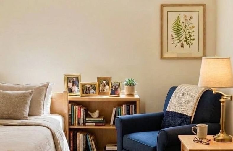
Paint color plays a particularly meaningful role in the homes of older adults, influencing not just the visual appeal of a space but also its safety, navigability, and emotional comfort on a daily basis.
Seniors often experience changes in color perception, contrast sensitivity, and light adaptation that make certain paint colors significantly more practical and comfortable than others.
Understanding these factors helps family members and homeowners make informed, genuinely supportive color choices that improve quality of life without sacrificing the beauty and personality of the home.
These beautiful paint colors represent the most thoughtful and effective options for creating senior living spaces that feel warm, safe, and genuinely welcoming every single day.
Technical Summary of Senior-Friendly Paint Solutions
| Brand | Paint Color Name | Color Code | LRV | Recommended Senior Space | Primary Optical & Psychological Benefit |
|---|---|---|---|---|---|
| Benjamin Moore | Palladian Blue | HC-144 | 60.4 | Bedrooms, Bathrooms | Soothing biophilic hue that supports relaxation and reduces physiological stress. |
| Sherwin-Williams | Sea Salt | SW 6204 | 63.0 | Living Rooms, Bathrooms | Soft green-gray that balances calm energy with natural light reflection. |
| Sherwin-Williams | Agreeable Gray | SW 7029 | 60.0 | Open Floor Plans, Corridors | Versatile warm greige providing high-contrast framing for door casings. |
| Sherwin-Williams | Accessible Beige | SW 7036 | 58.0 | Dining Areas, Entryways | Cozy taupe undertones compensate for yellowing vision without looking muddy. |
| Sherwin-Williams | Alabaster | SW 7008 | 82.0 | Common Rooms, Kitchens | Creamy off-white boosting ambient light reflection without harsh specular glare. |
| Behr | Blank Canvas | DC-003 | 84.0 | Assisted Living Suites | Warm, welcoming background supporting circadian rhythms and personalization. |
| Benjamin Moore | Revere Pewter | HC-172 | 55.0 | Dining Rooms, Transition Walls | Grounded mid-tone depth assisting spatial boundaries and depth perception. |
| Benjamin Moore | Healing Aloe | 1562 | 68.0 | Memory Care, Meditation Nooks | Restorative pale green reducing anxiety and cognitive overstimulation. |
| Sherwin-Williams | Pure White | SW 7005 | 84.0 | Doors, Trim, Window Frames | Muted neutral white creating crisp structural definition against wall hues. |
| Benjamin Moore | Simply White | OC-117 | 89.5 | Ceilings, Upper Moldings | High-reflectance white bouncing light deep into interior corridors. |
| Benjamin Moore | Quiet Moments | 1563 | 60.7 | Restorative Lounges, Bedrooms | Spa-like slate blue-green that tempers evening agitation and sundowning. |
Benjamin Moore Palladian Blue (HC-144)
Benjamin Moore Palladian Blue (HC-144) is an airy blue-green hybrid with a soft gray cast.
Featuring a Light Reflectance Value of 60.4, it reflects a comfortable amount of ambient light while retaining enough pigment depth to prevent spaces from feeling cold or clinical.
Older adults frequently experience elevated anxiety and sleep disruption; Palladian Blue leverages biophilic design principles to evoke the restorative qualities of clear skies and tranquil waters.
The subtle green undertone compensates for the natural yellowing of the eye’s crystalline lens, ensuring the color reads as a gentle, true pale blue-green rather than an unpleasant muddy tone under warm 2700K LED lighting.
It is particularly effective on primary bedroom walls and bathroom vanities, where its soothing wavelength helps lower heart rate and promote restfulness.
When paired with clean off-white trim, it provides sufficient visual contrast to aid seniors in recognizing room boundaries and spatial transitions.
Sherwin-Williams Sea Salt (SW 6204)
Sherwin-Williams Sea Salt (SW 6204) is a muted gray-green pastel with an LRV of 63.
Highly favored in gerontological design, Sea Salt adapts fluidly to shifting natural daylight, transitioning smoothly between soft green, cool gray, and faint blue throughout the day.
Because aging visual systems suffer from glare sensitivity and eye fatigue, Sea Salt provides a low-chroma background that absorbs harsh light reflection while preserving an airy, expansive atmosphere.
In living rooms and sunrooms, it establishes a serene connection to nature, helping to reduce stress and promote cognitive focus.
The balancing gray undertone prevents the green hue from appearing overly intense or distracting, accommodating eyes impacted by nuclear sclerosis.
Furthermore, its light-reflecting qualities visually enlarge compact living spaces, imparting a feeling of openness for residents utilizing mobility aids.
Sherwin-Williams Agreeable Gray (SW 7029)
Sherwin-Williams Agreeable Gray (SW 7029) is a warm greige featuring an LRV of 60.
As a widely specified neutral shade, it bridges the gap between cool gray and warm beige.
Cold, flat grays can evoke institutional feelings and decrease mood in seniors, whereas warm greiges offer a comforting, grounded atmosphere.
Agreeable Gray contains soft yellow-red undertones that preserve environmental warmth under artificial lighting while avoiding outdated yellow casts.
It serves as an exceptional color foundation for open-concept layouts, hallways, and main corridors.
Sitting solidly in the mid-light reflectance range, Agreeable Gray forms an effective background contrast when paired with bright white door casings, enabling seniors with reduced visual acuity to identify doorways and transition between rooms with confidence.
Sherwin-Williams Accessible Beige (SW 7036)
Sherwin-Williams Accessible Beige (SW 7036) is a taupe-tinted beige with an LRV of 58.
Aging visual systems require warm color bases to maintain visual comfort, as cool light wavelengths scatter more readily inside the eye, creating intraocular haze.
Accessible Beige incorporates subtle gray undertones that temper its brown base, preventing it from leaning overly dark or orange under residential lighting.
This versatile shade excels in dining areas, foyer entrances, and living rooms where an inviting environment is essential.
Its medium reflectivity absorbs excess glare in south-facing rooms while supplying enough visual warmth to keep north-facing spaces from feeling drab.
Accessible Beige pairs seamlessly with natural wood furniture, brushed brass fixtures, and dark metal door handles, facilitating clear tactile and visual object identification.
Sherwin-Williams Alabaster (SW 7008)
Sherwin-Williams Alabaster (SW 7008) is a creamy off-white boasting an LRV of 82.
Highly reflective, stark white paints can produce severe glare that causes eye strain and visual discomfort for seniors with cataracts or age-related macular degeneration.
Alabaster bypasses this issue by infusing soft beige and yellow undertones, yielding bright light diffusion without glare.
It is an ideal wall color for kitchens, communal activity rooms, and interior hallways lacking direct windows.
By scattering light evenly, it increases ambient illuminance without requiring excessively bright light fixtures, a critical design factor given that an 80-year-old eye requires nearly three times the light level of a 20-year-old eye to process visual details comfortably.
Alabaster creates an uplifting backdrop that encourages social interaction.
Behr Blank Canvas (DC-003)
Behr Blank Canvas (DC-003) is a warm off-white featuring a high Light Reflectance Value of 84.
Formulated specifically to foster a relaxing environment, Blank Canvas blends warm yellow-pink undertones to create a welcoming interior space.
In assisted living suites and care units, residents benefit from a neutral background that feels home-like rather than institutional.
Blank Canvas reflects daylight efficiently, supporting healthy circadian rhythms by encouraging daytime wakefulness and night-time rest.
Its warm undertones ensure that under overcast skies or cool LED bulbs, the walls retain a soft, comfortable appearance rather than shifting blue.
It serves as a gentle canvas for displaying personal family photographs, framed artwork, and colorful furnishings, empowering seniors to personalize their living quarters effortlessly.
Benjamin Moore Revere Pewter (HC-172)
Benjamin Moore Revere Pewter (HC-172) is a mid-tone greige with an LRV of 55.
Sitting at the boundary between light neutrals and deeper mid-tones, Revere Pewter offers a sense of architectural grounding.
In senior interior design, mid-tone colors prevent spatial disorientation.
When walls, floors, and ceilings are painted in uniform, low-contrast off-whites, aging adults can lose spatial depth perception, increasing fall risks.
Revere Pewter provides sufficient color depth to clearly demarcate vertical walls from light ceilings and floors.
It is well suited for TV lounges, dining areas, and transitional rooms where a cozy environment reduces restlessness.
Its warm undertones harmonize beautifully with natural stone fireplaces, warm wood millwork, and traditional furnishings.
Benjamin Moore Healing Aloe (1562)
Benjamin Moore Healing Aloe (1562) is a delicate pale green with soft gray undertones, featuring an LRV of 68.
Green is processed by the human eye at wavelengths requiring minimal ocular muscle accommodation, making it an optically soothing color family.
Healing Aloe utilizes this characteristic to construct a serene environment that encourages physical relaxation and mental restoration.
This color is tailored for memory care facilities, quiet reading rooms, and wellness spaces where residents may experience sensory overload or heightened anxiety.
The gray undertones mute the green pigment, ensuring it reads as a subtle neutral pastel rather than an overly bright green.
Combined with natural wood trim and indirect warm lighting, Healing Aloe fosters a therapeutic environment that reduces stress.
Sherwin-Williams Pure White (SW 7005)
Sherwin-Williams Pure White (SW 7005) is a clean, muted neutral white with an LRV of 84.
Unlike stark whites, Pure White contains a subtle touch of warm black and raw umber pigment, softening its appearance while preserving high reflectivity.
In senior living applications, this color is specified primarily for architectural trim, doors, window casings, and baseboards.
Using Pure White on door frames against mid-tone walls like Agreeable Gray or Revere Pewter creates distinct visual boundaries.
Seniors with low vision or cognitive decline rely on these high-contrast visual cues to identify doorways, grab bars, and room transitions effortlessly.
Applying a satin finish to Pure White trim surfaces ensures durability and cleanability without creating distracting glare hot spots.
Benjamin Moore Simply White (OC-117)
Benjamin Moore Simply White (OC-117) is a warm, crisp off-white featuring an LRV of 89.5.
Infused with a hint of warm yellow pigment, it reflects light cleanly without appearing sterile.
For aging adults, ceiling surfaces painted in flat Simply White help distribute ambient lighting uniformly throughout a room, eliminating dark shadow pockets in upper corners that could be misperceived as structural hazards.
Simply White is ideal for ceiling planes, crown moldings, and upper window trims.
By bouncing natural daylight and artificial light downward, it elevates illuminance across the space, helping seniors read and engage in hobbies with reduced eye strain.
Its subtle warmth ensures harmony with both biophilic wall colors and warm neutrals.
Benjamin Moore Quiet Moments (1563)
Benjamin Moore Quiet Moments (1563) is a gentle blend of blue, green, and gray with an LRV of 60.7.
This shade sits at the intersection of biophilic color theory and environmental psychology, offering a spa-like tranquility.
In senior memory care environments, late-afternoon agitation, commonly known as “sundowning”, presents a significant challenge.
Quiet Moments provides a calming visual backdrop that tempers environmental stress as daylight fades.
Its gray undertones soften the color intensity, ensuring older eyes perceive the blue-green tone as soothing rather than visually harsh.
It is well suited for bedrooms, rest lounges, and spa bathrooms, where its tranquil hue encourages muscle relaxation and emotional composure.
Paired with light wood finishes and soft textiles, it creates a peaceful sanctuary.
Technical Considerations for Senior Environmental Painting
Light Reflectance Value and Illuminance Calibration
Designing paint schemes for aging eyes requires balancing Light Reflectance Value (LRV) with glare control.
While high LRV paints reflect light effectively, values exceeding 85 on expansive wall surfaces can create specular reflection, causing glare that dazzles sensitive retinas.
Targeting a wall LRV range between 55 and 70 achieves an optimal balance, bouncing ambient light while keeping visual contrast comfortable.
Ceilings should utilize higher LRV whites (85–90) in flat sheens to distribute indirect light downward uniformly.
Color Contrast and Fall Prevention Standards
Accidental falls represent a major safety risk for older adults.
Inadequate visual contrast between horizontal and vertical surfaces frequently contributes to depth perception errors.
Paint selection must establish clear boundaries across architectural elements:
| Architectural Surface Pair | Recommended Contrast Strategy | Design Mechanism & Safety Benefit |
|---|---|---|
| Wall vs. Floor | High Contrast (e.g., LRV 60 Wall paired with LRV 25 Floor) | Establishes a distinct perimeter boundary, preventing spatial disorientation and trip hazards. |
| Door Frame vs. Wall | High Contrast (e.g., LRV 84 Trim on LRV 55 Wall) | Visually highlights entryways and exits for seniors with low vision or cognitive impairment. |
| Wall vs. Switch Plates / Grab Bars | High Contrast (e.g., Dark Hardware on LRV 60+ Wall) | Facilitates rapid tactile and visual identification of safety fixtures and lighting controls. |
| Wall vs. Ceiling | Moderate Contrast (e.g., LRV 60 Wall paired with LRV 89 Ceiling) | Defines vertical room height clearly, helping residents judge spatial proportions comfortably. |
Sheen Selection and Glare Reduction
The surface sheen of paint directly affects visual comfort.
Glossy finishes reflect overhead lighting as concentrated hotspots, creating glare that causes eye fatigue and spatial confusion for individuals with cataracts.
- Walls: Eggshell or Matte finishes are recommended for residential rooms and corridors. They scatter light softly, minimizing glare while remaining wipeable.
- Ceilings: Flat finish paints eliminate ceiling hotspots and maximize indirect light diffusion.
- Trim and Doors: Satin or Low-Lustre finishes offer durability and scrubbability for high-touch surfaces without generating distracting reflections.
Conclusion
Developing optimal paint palettes for senior environments requires balancing optical science, spatial safety, and psychological well-being.
By specifying paint hues within appropriate Light Reflectance Value ranges (LRV 55–84), designers can optimize ambient brightness while preventing harmful glare.
Incorporating restorative biophilic tones like Benjamin Moore Palladian Blue or Sherwin-Williams Sea Salt helps reduce anxiety, while warm greiges such as Sherwin-Williams Agreeable Gray establish clear structural contrast along corridors and doorways.
When applied with appropriate sheens and contrast strategies, these color solutions cultivate safe, therapeutic, and beautiful spaces that support independence and dignity for aging adults.