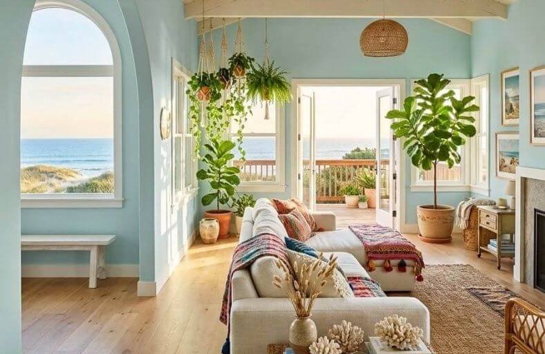
Beach home paint colors carry a responsibility that interior paint colors in other settings rarely face.
They need to honor the extraordinary natural environment just outside the window while creating an interior that feels genuinely comfortable, livable, and connected to the coastal landscape surrounding it.
The most successful beach home palettes draw directly from nature, borrowing the soft whites of sea foam, the warm tans of sun-bleached sand, the layered blues of ocean water, and the gentle greens of coastal vegetation.
These beautiful paint colors have been chosen specifically for their ability to complement the light, openness, and natural beauty that define the very best beach home interiors.
Technical Comparison of Beachy Paint Finishes
| Brand | Color Name & SKU | LRV | Dominant Undertone | Recommended Interior/Exterior Application |
|---|---|---|---|---|
| Benjamin Moore | Hale Navy (HC-154) | 8.36 | Deep Maritime Blue / Slate Gray | Kitchen Islands, Millwork, Accent Walls, Shutters |
| Sherwin-Williams | Sea Salt (SW 6204) | 63.04 | Green-Gray with Cool Blue Notes | Primary Bathrooms, Bedrooms, Open Kitchens |
| Benjamin Moore | Palladian Blue (HC-144) | 60.4 | Soft Aqua Blue-Green / Gray | Sunrooms, Guest Rooms, Foyers, Front Doors |
| Sherwin-Williams | Alabaster (SW 7008) | 82.79 | Warm Creamy White / Soft Beige | Great Rooms, Cathedral Ceilings, Shiplap, Trim |
| Farrow & Ball | Borrowed Light (No. 235) | 70.01 | Pale Sky Blue / Cool Slate | Powder Rooms, Ceilings, Panel Board, Bedrooms |
| Farrow & Ball | Lulworth Blue (No. 89) | 48.0 | Regency Mid-Blue / Muted Slate | Kitchen Cabinets, Dining Wainscoting, Offices |
| Behr | Breezeway (MQ3-21) | 66.0 | Silvery Sea-Glass Green / Blue | Mudrooms, Sunrooms, Corridors, Kitchens |
| Benjamin Moore | Edgecomb Gray (HC-173) | 63.09 | Organic Greige / Warm Taupe | Open Floor Plans, Hallways, Exterior Trim |
| Sherwin-Williams | Naval (SW 6244) | 4.0 | Deep Midnight Navy / Indigo | Accent Walls, Studies, Powder Baths, Entry Doors |
| Sherwin-Williams | Rainwashed (SW 6211) | 59.0 | Muted Blue-Green / Slate Gray | Bedrooms, Porch Ceilings, Spa Bathrooms |
| Benjamin Moore | Chantilly Lace (OC-65) | 90.0 | Pure Neutral White | Whole-Home Trim, Cabinets, Ceilings, Shiplap |
| Farrow & Ball | Green Blue (No. 84) | 52.0 | Historic Green-Blue / Weathered Gray | Historic Libraries, Pantries, Built-in Furniture |
Benjamin Moore Hale Navy (HC-154)
Benjamin Moore Hale Navy is a classic maritime blue that anchors coastal residential interiors.
With an LRV of 8.36, this shade absorbs ambient light, providing structural contrast against bright ocean light.
Its slate-gray base prevents it from shifting into overly saturated primary blue territory, giving it a velvety texture on interior millwork and exterior accents.
In high-exposure southern light, Hale Navy softens slightly to reveal subtle charcoal notes while maintaining its depth.
Designers specify Hale Navy for kitchen islands, built-in library cabinetry, bedroom accent walls, and exterior entry doors.
Paired with bright white trim, honed marble, and aged brass fixtures, Hale Navy creates a grounded maritime aesthetic.
Sherwin-Williams Sea Salt (SW 6204)
Sherwin-Williams Sea Salt is a versatile chameleon shade within coastal interior design.
Sitting at a light-reflective LRV of 63.04, Sea Salt reflects daylight throughout living spaces while imparting a peaceful atmosphere.
Sea Salt adapts dynamically to its environment: in bright southern daylight, its green pigments surface to create a fresh sea-glass finish.
In cool northern light or under evening artificial lighting, its gray and subtle blue tones emerge, transforming the space into a quiet sanctuary.
It performs exceptionally well in primary bathrooms, open-concept kitchens, laundry rooms, and coastal bedrooms.
Sea Salt pairs effortlessly with off-white trims, light oak flooring, natural jute rugs, and matte black hardware.
Benjamin Moore Palladian Blue (HC-144)
Benjamin Moore Palladian Blue is a soft, airy blue-green that captures the atmosphere of clear skies and coastal waters.
With a mid-range LRV of 60.4, it balances vibrant color expression with daylight reflection.
Unlike bright sky blues, Palladian Blue features a soft gray cast that tempers its green-blue saturation, keeping it calm and understated.
In south-facing rooms flooded with warm sunlight, its green undertones step forward to create an organic, tropical ambiance.
Cool northern exposures bring out its blue-gray nature. Palladian Blue is a prime choice for coastal sunrooms, guest bedrooms, entry foyers, and front doors.
It harmonizes with warm cream trim, whitewashed oak, and woven rattan furnishings.
Sherwin-Williams Alabaster (SW 7008)
Sherwin-Williams Alabaster is a warm off-white ideal for oceanfront living spaces.
Boasting a high LRV of 82.79, Alabaster reflects light efficiently, illuminating interiors while eliminating the harsh glare associated with stark white finishes.
Its soft beige undertone provides gentle warmth, preventing rooms exposed to cool marine light from feeling clinical.
Alabaster serves as an exceptional baseline shade for open-plan great rooms, vaulted cathedral ceilings, exterior shiplap, and trim packages.
It establishes a welcoming foundation that pairs effortlessly with dark navy accents, warm wood flooring, greige stone countertops, and natural linen textiles.
Farrow & Ball Borrowed Light (No. 235)
Farrow & Ball Borrowed Light is a pale, luminous blue named after the soft daylight that filters through skylights and fanlight windows.
With a high LRV of 70.01, it brings light into enclosed or window-deprived spaces while maintaining an open feel.
The color contains complex gray undertones that prevent it from reading like a bright pastel, yielding a mature blue-gray cast in low-light environments.
In direct daylight, it softens to an almost weightless sky blue.
Borrowed Light is frequently applied to bedroom ceilings, compact coastal powder rooms, utility spaces, and beadboard paneling.
When paired with crisp white trim, polished chrome fixtures, and pale driftwoods, it creates a spacious ambiance.
Farrow & Ball Lulworth Blue (No. 89)
- Manufacturer: Farrow & Ball
- Color Code / SKU: No. 89
- HEX Code:
#9EB6C8[cite: 30] - Light Reflectance Value (LRV): 48.0
- Dominant Undertones: Clear Regency Mid-Blue with Muted Slate Base
Farrow & Ball Lulworth Blue derives its name from the coastal waters of Lulworth Cove in Dorset.
It is a fresh, mid-tone blue defined by an unpretentious clarity that avoids coldness.
With an LRV around 48.0, Lulworth Blue possesses enough pigment saturation to bring grounding character to living spaces without overwhelming natural light.
Its balanced formulation sits comfortably between light aqua and deep navy, presenting a formal Regency blue quality that pairs nicely with clean whites and soft grays.
Designers specify Lulworth Blue for kitchen cabinetry, dining room accent paneling, coastal home offices, and exterior shutters.
It pairs beautifully with dark mahogany antiques, light oak flooring, and polished brass accents.
Behr Breezeway (MQ3-21)
Behr Breezeway is an airy, pale green-blue shade inspired by sea glass polished by ocean waves.
Positioned at an LRV of 66.0, Breezeway excels at reflecting daylight across interiors while instilling a cool, grounded feeling.
Its silver-gray base stabilizes the soft green pigments, ensuring walls do not appear overly intense under bright sunlight.
In direct daylight, Breezeway reads as a clean aqua; under indirect or cool light, its gray notes emerge, producing a subdued, contemporary look.
Breezeway is well-suited for mudrooms, sunrooms, breezy corridors, coastal kitchens, and exterior accents.
It pairs seamlessly with brushed matte black metal, white quartz, and natural rattan furniture.
Benjamin Moore Edgecomb Gray (HC-173)
Benjamin Moore Edgecomb Gray is an essential neutral in coastal residential design.
Positioned as a versatile greige with an LRV of 63.09, it bridges the gap between cold gray and heavy warm beige.
In coastal settings, where pure gray can read as dreary during overcast weather, Edgecomb Gray maintains an organic warmth without looking yellow.
In cool northern light, its stone-gray base provides structure; in warm southern sunlight, its gentle beige undertones come forward, creating an inviting backdrop.
Edgecomb Gray is ideal for open-concept living rooms, hallways, staircases, and exterior trim packages.
It complements warm oak floors, travertine tile, navy textiles, and clean white trim.
Sherwin-Williams Naval (SW 6244)
Sherwin-Williams Naval is a dramatic navy blue that anchors coastal living environments.
Boasting an LRV of 4.0, it absorbs light, bringing depth to architectural features.
Naval blends deep indigo with a subtle slate undertone, ensuring it stays true navy under strong sunlight without shifting purple.
It delivers striking contrast when paired with crisp white trim, warm brass fixtures, and natural wood tones.
Designers specify Naval for moody powder rooms, coastal home offices, kitchen islands, and exterior front doors.
Its deep tone brings sophistication to coastal architecture, grounding light, airy spaces.
Sherwin-Williams Rainwashed (SW 6211)
Sherwin-Williams Rainwashed is a serene blue-green that captures the atmosphere of coastal air after a squall.
With an LRV of 59.0, it strikes a balance between reflecting light and offering rich color saturation.
Rainwashed incorporates gray undertones that mute its green and blue pigments, preventing it from appearing overly bright in high-exposure waterfront spaces.
In morning light, its blue character shows clearly; as the day progresses and sunlight warms, its green notes come forward.
Rainwashed is a favorite for primary bedroom suites, covered porch ceilings, and spa-style bathrooms.
It pairs naturally with clean white trims, weathered gray teak, polished nickel, and natural seagrass flooring.
Benjamin Moore Chantilly Lace (OC-65)
Benjamin Moore Chantilly Lace is a clear, neutral white widely used in modern coastal architecture.
Boasting an LRV of 90.0, it reflects maximum light, brightening interiors and framing ocean views.
Chantilly Lace stays neutral under changing light, avoiding warm yellow or cool blue shifts.
It serves as a crisp canvas for shiplap walls, baseboards, crown molding, kitchen cabinets, and interior doors.
Paired with deep navies, soft sea-glass greens, or warm greiges, Chantilly Lace provides clean structural contrast that elevates surrounding colors.
Farrow & Ball Green Blue (No. 84)
Farrow & Ball Green Blue is a historic shade containing balanced proportions of green, blue, and gray pigments.
With an LRV of 52.0, this color shifts visually as lighting conditions change throughout the day.
In warm afternoon light, the green undertones become dominant, creating an inviting atmosphere.
In cool morning or artificial light, the gray-blue notes emerge, delivering a quiet, historic feel.
Green Blue is well-suited for coastal libraries, pantries, kitchen islands, and historic wainscoting.
It pairs smoothly with off-white trim, aged brass hardware, warm walnut, and slate tile floors.
Strategic Implementation and Surface Engineering
Translating paint choices into a cohesive interior design requires coordinating sheen levels with surface conditions and ambient exposure.
Selecting the appropriate finish supports long-term durability while controlling how light reflects throughout the home.
Flat or matte finishes, featuring a 0% to 5% sheen, absorb light completely and conceal drywall imperfections, making them suitable for low-traffic ceilings and accent walls where deep color absorption is desired.
Eggshell finishes, offering a 10% to 25% sheen, represent the standard choice for coastal interior walls due to their soft luster and wipeable durability in living rooms, bedrooms, and dining spaces.
Satin finishes provide a smooth, pearl-like luster with 25% to 35% sheen, offering moisture and mildew resistance essential for high-humidity coastal zones like primary bathrooms, kitchens, mudrooms, and laundry spaces.
Semi-gloss finishes, featuring 35% to 60% sheen, highlight architectural detail while providing scrubbability on baseboards, crown molding, door frames, window casings, and custom cabinetry.
Layering paint colors across adjacent spaces establishes spatial continuity.
Designers frequently specify high-LRV whites like Benjamin Moore Chantilly Lace or Sherwin-Williams Alabaster on ceilings and trims to visually unify soft wall tones such as SW Sea Salt or BM Palladian Blue.
Applying deeper accent shades like SW Naval or BM Hale Navy on kitchen islands or built-in millwork grounds open-concept layouts without compromising natural light reflectivity.
Visual Dynamics and Architectural Light in Coastal Settings
Designing for coastal residential structures demands a careful evaluation of how atmospheric haze and intense sunlight interact with painted surfaces.
Light Reflectance Value (LRV) measures the percentage of visible light a paint color reflects on a scale from 0% (absolute absorption) to 100% (pure reflection).
In high-exposure coastal regions, selecting paints with appropriate LRVs prevents visual fatigue caused by glare while avoiding shadow pockets in shaded corridors.
Building orientation dictates undertone behavior across coastal floor plans. North-facing spaces receive diffuse, cool light with a subtle blue-gray cast.
Cool grays or blues applied in these rooms can read as icy or flat, making warm greiges or blue-greens with soft yellow undertones necessary to neutralize the cool exposure.
South-facing rooms experience warm, intense solar exposure throughout the day, which amplifies yellow undertones and causes creamy off-whites to appear overly warm.
Cool slate blues, watery greens, and clean neutral whites balance this southern solar radiation.
East-facing rooms transition from warm golden light in the morning to cool shadows by afternoon, benefiting from mid-tone organic blues that adapt seamlessly to shifting color temperatures.
West-facing exposures receive clear morning light followed by warm late-afternoon radiation, which pairs best with deep navies and grounded neutrals that balance golden-hour heat.
Synthesis and Architectural Recommendations
Designing a coastal paint scheme requires balancing environmental conditions with architectural intent.
Intense marine sunlight demands paint formulas with carefully calibrated Light Reflectance Values and undertones that resist washing out under bright glare.
Incorporating versatile colors like Sherwin-Williams Sea Salt, Benjamin Moore Palladian Blue, and Benjamin Moore Edgecomb Gray allows interior spaces to shift naturally between bright daytime sunlight and cozy evening settings.
Strategic application of deep architectural accents, such as Sherwin-Williams Naval or Benjamin Moore Hale Navy, anchors open floor plans, bringing visual contrast and structure to bright coastal interiors.
By aligning paint selections with room orientations, functional requirements, and sheen profiles, designers can curate coastal homes that feel balanced, durable, and deeply connected to their waterfront surroundings.