Selecting an interior paint palette requires balancing color theory, spatial volume, and lighting conditions.
Within the Sherwin-Williams neutral spectrum, Accessible Beige (SW 7036) and Moth Wing (SW 9174) represent two distinct approaches to warm organic design.
While both reside within the broader warm neutral family, their technical specifications, light reflection values, and atmospheric effects serve different architectural purposes.
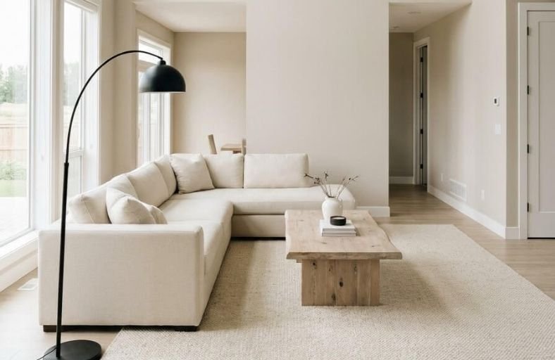
Accessible Beige functions as a bright, adaptable greige designed to serve as an expansive background shade across connected floor plans.
Moth Wing, by contrast, is a deeper, mineral-toned taupe-brown engineered to introduce structural grounding, dramatic visual weight, and cozy focal contrast.
Evaluating these two colors through technical metrics, undertone shifts, and practical application provides a clear framework for selecting the right shade.
1. Quick Technical Comparison
Comparing technical color metrics provides an objective baseline for predicting how a paint color will perform across different room dimensions and lighting environments.
Light Reflectance Value (LRV) measures the percentage of light a paint color reflects on a scale from 0 (pure black) to 100 (pure white).
Red, Green, and Blue (RGB) values and Hexadecimal (HEX) codes supply exact digital color compositions.
| Technical Specification | Accessible Beige (SW 7036) | Moth Wing (SW 9174) |
| Color Classification | Warm Greige / Light Neutral Beige | Taupe / Mineral Earth Brown |
| Light Reflectance Value (LRV) | 58 (Mid-Light Depth) | 29 (Mid-Tone Depth) |
| HEX Color Code | #D1C7B8 | #A0907F |
| RGB Composition | 209 / 199 / 184 | 161 / 144 / 127 |
| Primary Undertones | Creamy Tan with Gray Backbone | Muted Taupe with Mineral Gray-Green Cast |
| Primary Architectural Function | Continuous Main Wall / Field Color | Structural Accent / Millwork / Cabinetry |
The 29-point difference in LRV between Accessible Beige (LRV 58) and Moth Wing (LRV 29) creates a distinct functional split.
Sitting above the reflection midpoint, Accessible Beige bounces light throughout a space, preserving spatial openness without washing out into an off-white.
Moth Wing drops into the lower mid-tone range, absorbing over 70% of incoming visible light.
This absorption creates visual anchor points, drawing the eye to specific architectural features or focal walls.
2. Undertone Architecture and Natural Light Behavior
The real-world appearance of neutral paint relies on undertone composition and incoming light quality.
Neither Accessible Beige nor Moth Wing is a single-pigment neutral; both rely on gray undertones to balance their warmth and prevent unwanted color shifts.
Accessible Beige (SW 7036) Undertone & Light Shifts
Accessible Beige is formulated as a warm tan anchored by a gray backbone. Traditional beiges often contained heavy yellow-orange pigments that turned gold under artificial lighting.
The gray core in Accessible Beige neutralizes those yellow tones, keeping the shade contemporary and muted.
- North-Facing Light (Cool/Blue Daylight): The cool daylight suppresses the warm tan, causing Accessible Beige to lean grayer. In overcast conditions, it reads as a soft, neutral greige rather than a warm tan.
- South-Facing Light (Warm/Gold Sunlight): Abundant warmth highlights the tan base, turning Accessible Beige into a soft, creamy sand tone that feels inviting without leaning orange.
- East/West Exposure: Morning east light highlights its warm creaminess, while cool afternoon shade shifts it toward greige. West light pulls forward its warmest, glowing tan tones in the late afternoon.
- Artificial Lighting: Standard 2700K warm incandescent or LED bulbs enhance its cozy tan core. Cool artificial lighting above 4000K-5000K strips its warmth, pushing the paint toward a flatter gray.
Moth Wing (SW 9174) Undertone & Light Shifts
Moth Wing is a mid-tone taupe-brown tempered by gray and subtle mineral-green undertones.
Unlike rich chocolate browns, its gray backdrop softens the color, giving it a muted quality.
- North-Facing Light: Rather than looking muddy, Moth Wing adapts to cool light by revealing its passive, mineral-taupe side. It introduces depth and warmth to low-light rooms without overheating.
- South-Facing Light: Direct warm sunlight activates its muted brown pigments, making it look like a rich, grounded chestnut.
- East/West Exposure: In eastern morning light, its subtle gray-green undertones stabilize the color. In late western sunlight, it warms up naturally without looking overly red or yellow.
- Artificial Lighting: Under 2700K-3000K warm residential light, Moth Wing gains visual depth, making it suitable for intimate spaces like bedrooms or dens. High-kelvin daylight bulbs emphasize its cool mineral-gray structure.
3. Spatial Applications and Room-by-Room Recommendations
Selecting between Accessible Beige and Moth Wing depends on room volume, functional purpose, and decor density.
Accessible Beige: The Whole-House Field Color
Accessible Beige excels when applied as a continuous backdrop throughout connected spaces. Its LRV of 58 allows light to reflect between walls, maintaining airiness while providing more depth than white.
- Open-Concept Living Areas: Connects dining, seating, and kitchen zones seamlessly.
- Hallways, Stairwells, and Foyers: Maintains light levels in windowless transition spaces.
- Compact Bedrooms & Offices: Expands visual boundaries while offering a soft, warm environment.
Moth Wing: The Architectural Anchor
Moth Wing works best where visual contrast, warmth, and structural focus are desired. Its lower reflection value absorbs light, making objects placed against it stand out.
- Kitchen Cabinetry & Islands: Creates grounded lower cabinets or kitchen islands, especially when paired with warm white perimeter walls.
- Primary Accent Walls: Ideal for bedroom headboard walls or living room fireplace surrounds.
- Intimate Spaces (Dens & Libraries): Coating all four walls in a small den creates a cozy, enveloping environment.
- Trim, Doors, and Built-ins: Highlights interior doors or custom millwork against lighter walls.
4. Coordinating Trim Colors and Interior Materials
Paint colors react directly with surrounding building materials, textiles, and trim shades.
Establishing a balanced palette requires selecting complementary trim whites, wood species, and metal accents.
Trim Paint Pairings
- Sherwin-Williams Pure White (SW 7005 | LRV 84): A versatile trim option. Containing a small amount of warmth, Pure White creates a crisp contrast against Accessible Beige and Moth Wing without feeling cold.
- Sherwin-Williams Alabaster (SW 7008 | LRV 82): A warm, soft off-white. When paired with Accessible Beige, Alabaster creates a gentle, low-contrast transition. When combined with Moth Wing, it introduces a warm, traditional trim frame.
Materiality & Texture Pairings
Accessible Beige pairs well with light-to-medium natural materials, including bleached white oak, natural rattan, travertine stone, matte black hardware, and cream linen fabrics.
Its subtle gray foundation bridges the gap between warm wood tones and cool stone elements.
Moth Wing complements deeper materials, including dark walnut, honey-toned oak, cognac leather, brushed brass or champagne bronze hardware, and deep green or slate textiles.
It also works on residential exteriors, pairing naturally with natural stone and red brick masonry.
| Color/Material Role | Shade / Material Name | Color Code / Metric | Design Function | Pairing Compatibility |
| Main Wall Base | Accessible Beige (SW 7036) | HEX #D1C7B8 / LRV 58 | Luminous main backdrop | Whole-house walls |
| Focal Accent | Moth Wing (SW 9174) | HEX #A0907F / LRV 29 | Grounded structural accent | Cabinets, trim, accent walls |
| Crisp Trim White | Pure White (SW 7005) | HEX #EDECE6 / LRV 84 | Clean, defined trim frame | Pairs with both SW 7036 & SW 9174 |
| Warm Trim White | Alabaster (SW 7008) | HEX #EDEAE0 / LRV 82 | Soft, creamy transition | Pairs with both SW 7036 & SW 9174 |
| Deep Accent | Urbane Bronze (SW 7048) | HEX #54504A / LRV 8 | High-contrast trim/doors | Pairs with both SW 7036 & SW 9174 |
| Complementary Earth | Pewter Green (SW 6208) | HEX #5E655B / LRV 12 | Botanical earthy accent | Pairs with Moth Wing (SW 9174) |
| Primary Wood Species | White Oak / Dark Walnut | Natural Grain | Texture & organic warmth | Hardwood flooring & furniture |
| Hardware Metals | Brushed Brass / Black Steel | Metallic | Modern or transitional accent | Cabinet pulls & lighting fixtures |
5. Conclusion and Selection Framework
Choosing between Accessible Beige and Moth Wing depends on whether a project requires spatial light reflection or rich visual weight.
Decision Guidelines
- Select Accessible Beige (SW 7036) if:
- The priority is a bright, adaptable neutral wall color for an entire home or connected living floor plan.
- The space has moderate daylight and needs a paint shade that reflects light without appearing sterile.
- The home is being prepared for sale or rental, requiring an appealing, versatile backdrop.
- The interior features a mix of cool stone tiles and warm wood flooring that require a unifying bridge color.
- Select Moth Wing (SW 9174) if:
- The goal is to introduce cozy, grounded color to an accent wall, kitchen island, or vanity.
- The space is a private bedroom, study, or den designed for an intimate, enveloping mood.
- A contrasting taupe-brown accent color is needed to anchor walls painted in Accessible Beige or off-white.
- The room receives strong south-facing sunlight that can comfortably support a mid-tone, light-absorbing paint shade.
Combining both colors creates a cohesive interior scheme. Using Accessible Beige for expansive main walls and Moth Wing for cabinetry, doors, or accent surfaces establishes an intentional design narrative grounded in natural light and warm organic tones.