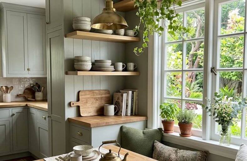
The shift toward earthy, nature-inspired paint colors has been building steadily over the past few years, and in 2026 it shows no signs of slowing down.
From warm sandy beiges and sun-baked terracottas to deep forest greens and rich ochre yellows, the earthy color palette offers something for every room, every style, and every light condition.
These tones bring a sense of quiet sophistication to interiors that cooler, more neutral shades simply cannot achieve, creating spaces that feel simultaneously current and timeless.
Trending Earthy Paints
| Paint Brand | Color Name & SKU | LRV | Dominant Undertone | Primary Architectural Application |
|---|---|---|---|---|
| Sherwin-Williams | Redend Point (SW 9081) | 30.00 | Blush Sand & Warm Clay | Living Rooms, Primary Bedrooms, Accent Millwork |
| Benjamin Moore | October Mist (1495) | 46.54 | Silvery Sage & Gray-Green | Open-Concept Kitchens, Home Offices, Hallways |
| Sherwin-Williams | Urbane Bronze (SW 7048) | 8.12 | Dark Charcoal, Bronze & Olive | Exterior Siding, Kitchen Cabinets, Accent Walls |
| Sherwin-Williams | Evergreen Fog (SW 9130) | 30.00 | Muted Slate & Moss Green | Bathrooms, Dining Spaces, Millwork Color-Drenching |
| Farrow & Ball | Setting Plaster (No. 231) | 54.00 | Dusty Rose & Golden Yellow | Historic Dining Rooms, Powder Rooms, Ceilings |
| Behr | Rumors (MQ1-15) | 8.00 | Deep Crimson & Terracotta | Formal Parlors, Library Nooks, Front Entry Doors |
| PPG | Limitless (PPG1091-3) | 73.11 | Honey Beige & Warm Butter | Sunrooms, Low-Light Spaces, Ceiling Surfaces |
| Farrow & Ball | Bancha (No. 298) | 13.84 | Olive Tea & Warm Ochre | Mid-Century Lounges, Study Cabinets, Trim |
| Benjamin Moore | Swiss Coffee (OC-45) | 81.91 | Creamy Yellow & Soft Greige | Main Siding, Whole-House Walls, Trim Contrast |
| Benjamin Moore | Cinnamon Slate (2113-40) | 19.13 | Muted Violet & Slate Heather | Primary Suite Sanctuaries, Cozy Sitting Rooms |
| Benjamin Moore | Wenge (AF-180) | 2.98 | Deep Espresso & Crimson-Black | Architectural Trim, Custom Built-ins, Feature Walls |
| Farrow & Ball | Dead Salmon (No. 28) | 35.00 | Tawny Buff & Aged Mushroom | Historical Foyers, Sculleries, Traditional Cabinetry |
Sherwin-Williams Redend Point (SW 9081)
Redend Point SW 9081 represents a sophisticated bridge between mid-tone beige and organic terracotta.
With a Light Reflectance Value of 30.00, this rosy-brown shade absorbs sufficient ambient light to instill an immediate sense of warmth and intimacy without visually closing in spatial boundaries.
Its technical profile balances pink, red, and beige pigments, creating a chameleon-like quality that adapts gracefully to changing directional daylight.
In north-facing rooms, cool natural light tempers its undertones into a subtle, dusty mauve-beige, whereas south-facing sunlight highlights its rich clay characteristics.
Architectural applications favor Redend Point across full-room wall installations, interior door treatments, and custom living room cabinetry.
It integrates seamlessly alongside warm natural oak flooring, travertine stone, matte black iron hardware, and bouclé upholstery textiles, making it a foundational hue for organic modern design schemes.
Benjamin Moore October Mist (1495)
October Mist 1495 functions as a gently shaded sage green anchored by quiet gray-silver undertones.
Holding an LRV of 46.54, this mid-tone botanical neutral acts as an atmospheric background shade that reflects light predictably while maintaining distinct organic warmth.
The inclusion of subtle silver pigments prevents the color from appearing overly yellow or vivid, rendering it exceptionally versatile across both contemporary and traditional architectural frameworks.
October Mist operates as a unifying hue in open-concept floor plans, working harmoniously when applied to hallway transitions, kitchen perimeters, and sunlit home offices.
Designers frequently pair this color with crisp alabaster trim, white marble counter surfaces, light ash millwork, and brushed nickel hardware.
Its soothing wavelength reduces visual fatigue, making it an ideal choice for productivity and wellness-focused environments.
Sherwin-Williams Urbane Bronze (SW 7048)
Urbane Bronze SW 7048 is a deep, architectural brownish-gray that brings grounding weight and structural clarity to interior spaces.
Registers at a low LRV of 8.12, making it a powerful dark anchor that absorbs light to create drama and depth.
The color’s complex undertone profile blends charcoal gray, rich brown, and a faint whisper of forest olive, ensuring it reads as warm and organic rather than cold or stark.
Urbane Bronze excels in high-contrast applications, such as painted kitchen island bases, interior window mullions, full-height library paneling, and dramatic exterior siding accents.
When paired with creamy off-whites, warm brass lighting fixtures, honed soapstone, and dark walnut flooring, Urbane Bronze establishes a refined, tactile aesthetic rooted in elevated biophilic luxury.
Sherwin-Williams Evergreen Fog (SW 9130)
Evergreen Fog SW 9130 is a versatile, muted gray-green with subtle slate blue and warm gold-yellow underpinnings.
Featuring an LRV of 30.00, it sits squarely in the medium depth range, bringing tranquil botanical balance to interior environments.
The balanced presence of gray dampens the green chroma, transforming the shade into an adaptable neutral that avoids looking overly saturated under bright artificial or natural lighting.
Evergreen Fog is widely utilized in color-drenched master bath suites, kitchen perimeter cabinetry, and formal dining areas seeking an atmospheric connection to nature.
It pairs effortlessly with unlacquered brass hardware, white oak paneling, warm terracotta floor tiles, and woven rattan accents, creating a soothing sanctuary space.
Farrow & Ball Setting Plaster (No. 231)
Setting Plaster No. 231 draws inspiration from the glowing, earthy tones of newly rendered plaster walls.
Exhibiting an LRV of 54.00, this historic dusty pink contains a distinct concentration of yellow pigment that grounds its red base, preventing it from reading as a sugary pastel.
It acts as a sophisticated, architectural neutral that adds glowing warmth to spaces lacking strong natural daylight, such as north-facing bedrooms and enclosed sculleries.
When implemented in a flat estate emulsion finish, Setting Plaster recreates the chalky softness of historic European manors.
It creates an exceptional background when juxtaposed against rich mahogany furniture, blackened iron accents, off-white trim, or deep botanical greens.
Behr Rumors (MQ1-15)
Rumors MQ1-15 is a saturated, moody ruby red infused with deep terracotta and warm brown undertones.
Possessing a low LRV of 8.00, this dramatic statement hue absorbs ambient light to evoke feelings of warmth, mystery, and historic grandeur.
The subtle inclusion of earthy brown pigments stabilizes the intense red base, ensuring that the color reads as sophisticated and grounded rather than overly vibrant or aggressive.
Rumors is engineered for high-impact visual zones, including cozy library nooks, dramatic powder rooms, formal parlors, and focal front entrance doors.
It establishes a striking aesthetic when combined with warm vintage gold leaf framing, rich walnut woodwork, dark charcoal accents, and plush velvet textiles.
PPG Limitless (PPG1091-3)
Limitless PPG1091-3 is a fresh, luminous honey-beige that blends the warmth of primary yellow with the softness of a neutral cream.
Holding an LRV of 73.11, this bright shade reflects light effectively, serving as an artificial sunlight simulator in spaces with limited natural window exposure.
Limitless breaks away from cool-toned whites, offering a cozy optimism that enlivens residential spaces without visually overpowering adjacent decor.
It functions exceedingly well as an expansive wall color in sunrooms, open kitchens, and low-light entry foyers, as well as an unexpected warm ceiling color.
Designers frequently pair Limitless with sage greens, warm terracotta accents, natural rattan furniture, and brushed bronze fixtures.
Farrow & Ball Bancha (No. 298)
Bancha No. 298 is a rich olive green inspired by the natural tones of Japanese tea leaves.
Registered at an LRV of 13.84, this mid-century modern green provides a protective atmosphere that induces a calm, grounded emotional response.
Bancha features strong yellow-green base undertones that retain its vivid color profile even under subdued interior lighting conditions.
It is highly effective when applied to executive study cabinets, architectural trim detailing, mid-century lounge spaces, and exterior doors.
When paired with soft dusty pinks, warm ochre accents, walnut joinery, and exposed brickwork, Bancha establishes a confident biophilic anchor within modern homes.
Benjamin Moore Swiss Coffee (OC-45)
Swiss Coffee OC-45 is an essential off-white celebrated for its classic warmth and softness.
Boasting an LRV of 81.91, this highly reflective white infuses spaces with light while avoiding the cold appearance of stark whites.
Its delicate balance of warm yellow and soft greige undertones allows it to serve as a versatile foundation for full interior wall layouts, ceilings, and exterior siding applications.
Swiss Coffee adapts smoothly to changing architectural styles, acting as a background for warm wood ceiling beams, natural stone fireplaces, white oak flooring, and brushed brass fixtures.
Benjamin Moore Cinnamon Slate (2113-40)
Cinnamon Slate 2113-40 is a nuanced violet-heather shade that merges muted brown, slate gray, and soft plum tones.
With a low-mid LRV of 19.13, this shade provides a subdued, velvety atmosphere that feels restful and sophisticated.
The balanced addition of slate gray prevents the purple base from reading as overly saturated, creating a dusty color profile.
Cinnamon Slate is well suited for color-drenched primary bedrooms, intimate sitting rooms, and moody dining rooms.
It pairs harmoniously with brushed antique brass lighting, rich taupe velvet upholstery, warm walnut furniture, and creamy off-white trims.
Benjamin Moore Wenge (AF-180)
Wenge AF-180 is a deep brown that approaches near-black with rich red-crimson undertones.
Operating at an LRV of 2.98, this shade absorbs light to deliver maximum visual impact.
The low chroma prevents it from reading as harsh, providing a dark brown finish that serves as an alternative to black.
Wenge is engineered for accent applications, including custom kitchen island cabinetry, interior door casings, fireplace surrounds, and architectural millwork.
When paired with warm plaster whites, brushed copper accents, honey-toned oak flooring, and cognac leather, Wenge adds weight and refinement to contemporary interior spaces.
Farrow & Ball Dead Salmon (No. 28)
Dead Salmon No. 28 is an aged pink-buff shade that captures the subtle patina of historic painted surfaces.
Possessing an LRV of 35.00, this mid-tone earth shade shifts between tawny mushroom, warm terracotta, and muted pink depending on lighting conditions.
Its amber-yellow pigments give it a soft quality that flatters adjacent natural materials, particularly dark woods and historic stones.
Dead Salmon is often selected for historic entryways, dining rooms, custom pantry cabinets, and powder rooms.
It coordinates naturally with rich mahogany, hand-forged iron hardware, warm lime-wash finishes, and soft stone tiles.
Architectural Lighting, Sheen Matrices, and Color Drenching Applications
The successful integration of earthy paint colors requires an understanding of natural daylight orientation.
North-facing rooms receive cool, blue-tinted natural light that intensifies cold undertones while dampening warmth.
Consequently, low-to-mid LRV shades with golden, yellow, or pink underpinnings, such as Setting Plaster No. 231 or Redend Point SW 9081, are recommended to balance cool northern exposure.
Conversely, south-facing spaces are bathed in intense, warm yellow daylight throughout the day, which can amplify warm red or yellow pigments.
In these spaces, muted slate greens like Evergreen Fog SW 9130 or grayed sage hues like October Mist 1495 perform reliably, absorbing excess glare while retaining their true chromatic identity.
| Surface Type | Recommended Sheen | Practical Benefit | Visual Impact |
|---|---|---|---|
| Ceilings | Flat / Dead Matt | Hides imperfections | Absorbs light glare |
| Living Room Walls | Flat / Matte | Soft, rich finish | Enhances undertones |
| High-Traffic Walls | Eggshell | Scrubbable surface | Subtle sheen |
| Millwork & Doors | Satin / Semi-Gloss | Stain-resistant | Highlights details |
Sheen selection directly governs both color perception and surface performance.
Matte and dead-flat sheens, such as Farrow & Ball Estate Emulsion (2% sheen level), absorb ambient light completely, creating a soft finish that enhances dark earth tones like Urbane Bronze SW 7048 and Rumors MQ1-15.
These low-luster finishes minimize surface flaws on expansive wall planes.
Eggshell sheens (10–25% sheen level) balance light diffusion with cleanability, making them suitable for active family rooms and residential hallways.
Satin and semi-gloss finishes reflect light, making them the standard choice for architectural millwork, door frames, and kitchen cabinetry, where film build and scrub resistance are primary requirements.
Color drenching has emerged as a key application technique for earthy paint schemes.
By coating walls, baseboards, door casings, window trim, and ceiling planes in a single color finish, visual boundaries are eliminated.
This monolithic application softens sharp architectural transitions, making modest rooms feel visually expanded while instilling a cozy, cocooning atmosphere in larger spaces.
When executing a color-drenched space, designers vary sheens while keeping the hue constant, utilizing flat paint across the ceiling, matte across the main walls, and satin across high-use doors and millwork, to introduce subtle textural contrast while preserving monochrome harmony.
Strategic Synthesis for Residential Designers
The trending earthy paint palette of 2026 marks a structural return to biophilic warmth, architectural weight, and tactile color choices.
By stepping away from stark grays and clinical whites, these 12 curated shades allow designers to craft interior environments that feel connected to the natural world.
Achieving optimal results with these complex earth tones requires balancing technical color profiles, room lighting dynamics, and appropriate sheen selections.
When building a cohesive residential palette, designers often select a high-reflectance neutral, such as Benjamin Moore Swiss Coffee OC-45, as a foundational background color.
Mid-tone earth shades, such as October Mist 1495 or Redend Point SW 9081, can then be introduced to define secondary spaces and bedrooms.
Finally, low-LRV dark anchors like Urbane Bronze SW 7048 or Wenge AF-180 provide grounding weight across cabinetry, trim, and architectural focal points.
Through careful evaluation of Light Reflectance Values, pigment compositions, and light behavior, these earthy hues transform standard interiors into warm, enduring architectural sanctuaries.