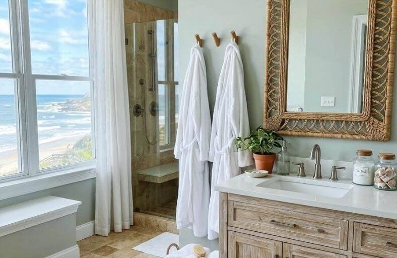
Beige bathroom tiles have a reputation for being difficult to work with, largely because homeowners often default to paint colors that unintentionally amplify the tile’s dated quality rather than finding shades that make it look warm, current, and deliberately chosen.
The truth is that beige tile’s neutral warmth makes it a genuinely flexible foundation for a wide variety of wall color directions.
The key lies in understanding which undertones in the tile to draw out and which wall colors will create a harmonious relationship rather than a visual clash.
These perfect paint colors will guide you toward the most beautiful and effective wall color choices for bathrooms with beige tile, helping you love your existing tile all over again.
Technical Specifications of Recommended Paint Colors
The table below summarizes the technical colorimetric data for selected paint colors designed to complement beige tile installations across varied lighting environments and design aesthetics.
| Paint Color Name | Brand & SKU | LRV | Primary Undertone | Aesthetic Interaction with Beige Tile |
|---|---|---|---|---|
| Simply White | Benjamin Moore OC-117 | 89.52 | Warm Soft Yellow | Luminous, clean contrast that brightens warmer beige tiles without harshness. |
| Swiss Coffee | Benjamin Moore OC-45 | 81.91 | Creamy Yellow-Green | Seamless, soft monochromatic flow; ideal for traditional and warm stone tiles. |
| Hale Navy | Benjamin Moore HC-154 | 8.36 | Charcoal Blue | Dramatic complementary contrast that emphasizes warm stone highlights. |
| Alabaster | Sherwin-Williams SW 7008 | 82.00 | Soft Beige-Cream | Gentle transition white that bridges golden tile notes and cool fixtures. |
| Revere Pewter | Benjamin Moore HC-172 | 55.05 | Warm Taupe-Greige | Balanced bridge neutral that stabilizes heavy yellow or pink beige tiles. |
| Edgecomb Gray | Benjamin Moore HC-173 | 63.09 | Soft Creamy Greige | Organic tone-on-tone feel that expands compact powder rooms. |
| Repose Gray | Sherwin-Williams SW 7015 | 58.00 | Cool Greige / Blue-Violet | Cool accent tone that tempers intense golden or orange beige undertones. |
| Sea Salt | Sherwin-Williams SW 6204 | 63.00 | Muted Blue-Green Gray | Soothing spa aesthetic; complementary contrast to warm sandy beige. |
| Naval | Sherwin-Williams SW 6244 | 4.00 | Deep Midnight Navy | High-chroma jewel-box contrast that elevates beige travertine and limestone. |
| Chantilly Lace | Benjamin Moore OC-65 | 90.04 | Ultra-Pure Neutral White | Crisp, architectural framing that modernizes traditional beige tilework. |
| Skylight | Farrow & Ball No. 205 | 61.00 | Pale Sky Blue-Gray | Cool airy contrast that softens heavy, warm earthy stone tiles. |
| Silver Drop | Behr 790C-2 | 64.00 | Warm Slate Greige | Subtle, contemporary neutral that tones down golden-yellow floor tiles. |
| Railings | Farrow & Ball No. 31 | 6.00 | Blue-Black Charcoal | Industrial, high-contrast anchor that turns warm tile into an intentional feature. |
Benjamin Moore Simply White (OC-117)
Benjamin Moore Simply White is a warm, luminous off-white featuring a Light Reflectance Value of 89.52 and a subtle yellow undertone.
When applied to bathroom walls surrounded by beige ceramic or travertine tile, Simply White serves as a gentle brightening agent.
It reflects light efficiently without generating the cold, clinical glare associated with un-tinted whites.
Its soft yellow base aligns with the natural warmth of sandy, honey, or cream-toned beige tiles, creating a cohesive visual link rather than a sharp color break.
In north-facing bathrooms with cool daylight, the faint yellow undertone in Simply White neutralizes chilly ambient casts, preventing the wall from appearing dingy or gray. Under 3000K warm LED illumination, the shade takes on a soft creaminess that highlights stone textures.
Matte wall finishes are recommended to soften glare, while satin sheens on trim offer subtle architectural depth.
Benjamin Moore Swiss Coffee (OC-45)
Swiss Coffee by Benjamin Moore is a rich, creamy off-white with an LRV of 81.91.
Formulated with complex undertones of yellow-cream, subtle gray, and a faint wink of green, it functions as an ideal transitional bridge shade.
In bathrooms with heavy beige, almond, or Tuscan travertine tile, Swiss Coffee prevents the environment from feeling outdated by softly blurring the boundaries between wall and tile.
The yellow-green undertone acts as an anchor, calming the golden hues in beige tile while supplying sufficient pigment depth to hold up in low-light powder rooms.
When paired with 2700K warm white lighting, Swiss Coffee exudes a soft, inviting atmosphere.
In higher color temperature environments (3500K-4000K), its gray component emerges, helping the space feel fresh and contemporary.
It pairs exceptionally well with brushed brass and warm bronze fixtures.
Benjamin Moore Hale Navy (HC-154)
With a low Light Reflectance Value of 8.36, Benjamin Moore Hale Navy is a classic, deeply saturated blue with gray and charcoal undertones.
Rather than attempting to blend with beige tile, Hale Navy creates a bold complementary contrast.
Blue and orange-yellow occupy opposite positions on the color wheel; thus, Hale Navy brings out the warm, golden highlights of beige tile, making stone or ceramic feel intentional and high-end.
Due to its charcoal-gray base, Hale Navy avoids looking overly vibrant or primary under artificial bath lighting. In low-light powder rooms, it turns the space into an intimate, jewel-box accent environment.
Pairing Hale Navy with warm white trim prevents the dark blue from feeling heavy, while unlacquered brass hardware provides a refined metallic accent.
Sherwin-Williams Alabaster (SW 7008)
Sherwin-Williams Alabaster is a popular soft, warm white with an LRV of 82.0.
It features a balanced creamy-yellow undertone calmed by a slight gray base note.
This formulation prevents Alabaster from swinging too far into bright yellow while ensuring it never feels sterile or cold.
Against beige bathroom tiles, Alabaster provides a tranquil, grounded backdrop that softens visual transitions between tile, drywall, and cabinetry.
Alabaster maintains chromatic stability across varying light conditions. In south-facing daylight, it reads as a clean, soft white without intense glare.
In windowless bathrooms illuminated by standard 3000K fixtures, its soft creaminess creates a cozy atmosphere without making beige tile look dirty.
It is particularly effective in transitional and Modern Farmhouse bath designs paired with matte black hardware or warm wood tones.
Benjamin Moore Revere Pewter (HC-172)
Benjamin Moore Revere Pewter is an iconic greige neutral with an LRV of 55.05.
Positioned precisely between warm beige and cool gray, Revere Pewter contains soft taupe and earthy undertones.
When installed alongside beige bathroom tiles, especially tiles with strong yellow, orange, or pink undertones, Revere Pewter serves as a stabilizing, unifying neutral.
It tones down unwanted vibrancy in the tile by introducing a grounding, sophisticated shadow value.
Because Revere Pewter sits in the mid-tone reflectance range, it provides sufficient depth to establish contrast against lighter beige floor tiles or vanity tops.
In rooms with mixed natural and artificial lighting, its greige profile adapts smoothly, leaning warmer under warm incandescent light and cooler under natural daylight.
Benjamin Moore Edgecomb Gray (HC-173)
Edgecomb Gray by Benjamin Moore is a light, airy greige with an LRV of 63.09.
Softer and lighter than Revere Pewter, Edgecomb Gray possesses creamy taupe undertones that align effortlessly with natural stone tiles like travertine, limestone, and beige marble.
It creates a smooth tone-on-tone effect that visually expands smaller bath layouts by eliminating high-contrast visual breaks between the walls and tiled surfaces.
In small bathrooms with limited natural light, Edgecomb Gray prevents the walls from washing out while maintaining an organic warmth.
When paired with bright white sanitaryware and polished chrome or nickel fixtures, it delivers a clean, spa-like environment that feels modern yet comfortably grounded.
Sherwin-Williams Repose Gray (SW 7015)
Sherwin-Williams Repose Gray is a versatile gray paint with an LRV of 58.0 and subtle greige, blue, and violet undertones.
While it is fundamentally a gray hue, its underlying warmth keeps it from feeling overly cold or industrial.
When applied to walls in a bathroom dominated by warm beige tile, Repose Gray introduces a cool counterpoint that tempers heavy golden, tan, or yellow undertones in the tilework.
The slight blue-violet note in Repose Gray interacts dynamically with natural daylight, creating a sophisticated gray cast that softens beige tile without creating an unpleasant clash.
It functions exceptionally well in contemporary or transitional spaces featuring chrome, polished nickel, or black iron hardware.
Sherwin-Williams Sea Salt (SW 6204)
Sherwin-Williams Sea Salt is a soft, muted blue-green gray with an LRV of 63.0.
This dynamic, atmospheric shade shifts significantly based on surrounding lighting conditions and adjacencies.
Against beige bathroom tile, Sea Salt creates a refreshing coastal aesthetic.
The cool blue-green undertones offer a complementary contrast to warm sandy beige tiles, balancing the warmth of the tile with a calming, watery hue.
In bathrooms with abundant natural daylight, the green-blue undertones step forward, creating an airy spa environment.
In lower light or under warm artificial light, the gray base stabilizes the color, preventing it from appearing overly bright.
Sea Salt pairs beautifully with light wood finishes, white quartz, and satin nickel plumbing.
Sherwin-Williams Naval (SW 6244)
Sherwin-Williams Naval is an ultra-deep, moody midnight navy blue with an LRV of 4.0. This high-chroma shade absorbs light, creating a dramatic visual backdrop.
When paired with beige tile, particularly polished travertine, beige marble, or light tan ceramic, Naval establishes a high-contrast palette that emphasizes the warm golden veins and rich stone textures of the tile.
Naval is ideal for powder rooms, accent walls, or full master bath applications where a cozy, luxurious mood is desired.
To balance its low light reflectance, pair Naval with ambient vanity sconces, unlacquered brass or gold fixtures, and bright white ceiling plane paint to maintain adequate vertical illumination.
Benjamin Moore Chantilly Lace (OC-65)
Benjamin Moore Chantilly Lace is an ultra-clean, crisp bright white with an LRV of 90.04.
Formulated with almost no visible yellow, green, or blue undertones, Chantilly Lace is often regarded as one of the purest white paint formulations available.
When applied alongside beige tile, Chantilly Lace creates a sharp, architectural border that modernizes traditional tilework.
Unlike warm whites that blend with beige tile, Chantilly Lace highlights the boundary between wall and floor.
This visual separation works well in contemporary or modern spaces where clean lines, chrome hardware, and stark geometry are emphasized. It thrives in light-filled rooms with 3500K-4000K lighting setups.
Farrow & Ball Skylight (No. 205)
Farrow & Ball Skylight is a pale, atmospheric blue-gray with an LRV of 61.0.
Inspired by the soft light passing through traditional English sky-lights, this color reads as a pale gray in dimly lit spaces and opens into a clear blue in bright light.
Against warm beige tiles, Skylight provides a subtle cooling effect that softens the tile’s earthiness without creating an overly stark contrast.
Its rich pigment formulation offers a matte finish that absorbs glare, making it well-suited for bathrooms with large windows or heavy overhead lighting.
Skylight complements traditional porcelain fixtures, warm cream trim, and dark antique bronze hardware.
Behr Silver Drop (790C-2)
Behr Silver Drop is a soft, warm gray with an LRV of 64.0.
Containing subtle greige and warm slate undertones, Silver Drop occupies a middle ground between cool gray and warm off-white.
It effectively tempers golden-yellow beige tiles while preserving a cozy, welcoming atmosphere.
Silver Drop provides a reliable background neutral that adapts well to changing daylight.
In morning natural light, its cool slate undertones clean up the room’s visuals; under evening artificial light, its warm base aligns with beige tile tones.
It is an excellent whole-room option for master suites and family bathrooms alike.
Farrow & Ball Railings (No. 31)
Farrow & Ball Railings is a dark charcoal with strong navy blue undertones and an LRV of 6.0.
Softer than true jet black, Railings creates a dramatic, high-contrast frame when paired with beige tile.
The blue-charcoal undertone brings out the warm, sandy characteristics of beige stone, turning standard beige tile into a focal design feature.
In full-bathroom applications, Railings introduces an industrial, loft-like aesthetic.
It pairs effectively with exposed pipe plumbing, raw wood elements, matte black framing, and warm filament lighting that highlights the wall surface depth.
Strategic Design Principles for Beige Tile Integration
A systematic approach to color selection requires matching the specific undertone family of the installed beige tile with a corresponding paint strategy.
The table below outlines how different tile undertones guide paint color pairing and fixture choices.
| Tile Undertone Profile | Primary Characteristics | Recommended Paint Strategy | Ideal Fixture & Hardware Pairings |
|---|---|---|---|
| Golden / Yellow-Beige | Warm honey tones, rich gold veining, polished finish. | Cool Greiges (Repose Gray) or High-Contrast Navys (Hale Navy, Naval). | Brushed Nickel, Matte Black, Polished Chrome. |
| Pink / Taupe-Beige | Rosy undertones, soft limestone appearance, matte finish. | Warm Greiges (Revere Pewter) or Soft Off-Whites (Alabaster). | Unlacquered Brass, Oil-Rubbed Bronze, Satin Brass. |
| Sandy / Tan-Beige | Neutral earthy brown base, travertine texture, medium depth. | Creamy Off-Whites (Swiss Coffee) or Muted Aqua/Blue (Sea Salt, Skylight). | Polished Nickel, Brushed Brass, Warm Teak Wood. |
| Muted Green / Khaki-Beige | Olive or grayish undertones, slate or river stone texture. | Warm Bright Whites (Simply White) or Soft Charcoal (Railings). | Matte Black, Antique Copper, Polished Chrome. |
Metallic Finish Coordination
Warm paint tones (such as Swiss Coffee, Alabaster, and Revere Pewter) pair naturally with unlacquered brass, soft brushed bronze, and antique copper finishes.
These warm metals reinforce the organic creaminess of beige tile.
Conversely, when dark contrast paint colors like Hale Navy, Naval, or Railings are selected, polished nickel, chrome, or matte black fixtures are recommended to provide clean visual anchors.
Lighting Temperature Impact
The color appearance of paint and beige tile shifts significantly under different correlated color temperatures (CCT):
- 2700K (Warm White): Enhances yellow and golden undertones in beige tile and soft whites like Simply White. It can cause cool grays to look slightly muddy.
- 3000K (Soft White – Recommended): Provides an ideal balance for beige tile bathrooms. It retains paint warmth while rendering cool undertones accurately.
- 4000K (Cool White/Daylight): Emphasizes cool gray, blue, and green paint undertones (e.g., Sea Salt, Repose Gray, Chantilly Lace), but can make warm beige tile appear flat or slightly orange by comparison.
Grout Line Dynamics
Grout color plays an important role in overall color harmony.
Light cream or beige grout lines create a continuous surface effect that works best with soft, monochromatic wall colors like Edgecomb Gray or Alabaster.
Darker or contrasting grout lines create visual grid patterns; pairing these with dark accent paints like Hale Navy or Railings helps tie the room together visually.
Conclusion
Successfully integrating paint colors with beige bathroom tile relies on strategic undertone management.
Homeowners and interior professionals can either embrace the tile’s natural warmth using soft off-whites and greiges (such as Simply White, Swiss Coffee, Alabaster, and Edgecomb Gray) or establish visual interest using cool accents and dark contrast shades (such as Hale Navy, Sea Salt, Repose Gray, and Railings).
By testing physical paint swatches against existing tile under both daylight and night-time lighting conditions, design practitioners can ensure a balanced, enduring, and harmonious bathroom environment.