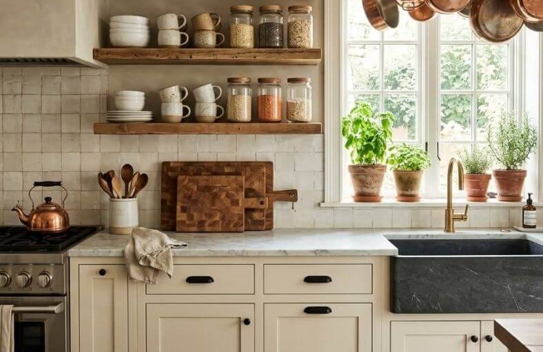
Painting a kitchen in a contemporary color is one of the fastest and most cost-effective ways to give the entire room a genuinely updated feel without touching the cabinets, countertops, or appliances.
Contemporary kitchen colors have evolved significantly in recent years, moving away from purely cool, clinical tones toward warmer, more characterful shades that make a kitchen feel both modern and welcoming at the same time.
The best contemporary kitchen paint colors manage to feel fresh and current while also working harmoniously with the natural materials and mixed finishes that define today’s kitchen design.
These beautiful paint colors will help you choose a contemporary kitchen shade that suits your space and elevates your entire room.
Technical Specifications and Performance Profiles
The table below synthesizes the physical and behavioral attributes of the selected paint formulations, serving as a baseline comparison for architectural integration and lighting analysis.
| Brand | Paint Color & Code | LRV (Light Reflectance Value) | Primary Undertones | Regional Dominance & Architectural Fit |
|---|---|---|---|---|
| Benjamin Moore | Hale Navy HC-154 | 6.00 to 8.36 | Warm gray, slate blue-black | Northeast Coast; Coastal, Cape Cod, Modern Farmhouse |
| Benjamin Moore | Revere Pewter HC-172 | 55.51 | Warm beige-gray, olive-green | New England & Mid-Atlantic; Colonial Revival, Cape Cod |
| Benjamin Moore | Chantilly Lace OC-65 | 90.04 | Crisp, pure neutral white | National; Modern Minimalist, High-Contrast Trim |
| Sherwin-Williams | Alabaster SW 7008 | 82.00 | Creamy beige, soft warm off-white | National; Modern Farmhouse, Warm Minimalist |
| Sherwin-Williams | Evergreen Fog SW 9130 | 30.00 to 40.00 | Sage green, neutral gray, blue | Northwest & West Coast; Biophilic, Craftsman, Modern Organic |
| Sherwin-Williams | Urbane Bronze SW 7048 | 8.00 to 9.00 | Deep warm brown-bronze, taupe | Mountain West; Mountain Modern, Warm Farmhouse |
| Farrow & Ball | Hague Blue No. 30 | 5.60 to 7.00 | Blackened blue-green, rich teal | National Metro; Bespoke Butler’s Pantries, Contemporary Bars |
| Benjamin Moore | Boothbay Gray HC-165 | 43.26 | Cool blue-gray, subtle green | Coastal Regions; Transitional, Coastal-Modern |
| Sherwin-Williams | Iron Ore SW 7069 | 6.00 | Deep charcoal, warm gray, green | National Metro; Modern Industrial, Flat-Panel Contemporary |
| Farrow & Ball | Green Smoke No. 47 | 15.00 to 20.00 | Deep sage, smoky blue-gray, forest | Northeast & Mid-Atlantic; Country Modern, Transitional |
| Benjamin Moore | Swiss Coffee OC-45 | 81.91 to 82.56 | Creamy yellow, soft green-beige warmth | West Coast & Southwest; Warm Mediterranean, Cozy Contemporary |
| Behr | Cracked Pepper PPU18-01 | 8.00 | Soft charcoal-black, cool blue-gray | National; High-Contrast Minimalist, Monochromatic |
Benjamin Moore Hale Navy HC-154
Benjamin Moore Hale Navy HC-154 is a highly popular deep blue-black navy that serves as an anchoring presence in contemporary American kitchens.
Possessing a low Light Reflectance Value of approximately 6 to 8, this formulation retains a full-bodied character without flattening into true black.
Its complex undertone features warm gray and subtle slate elements, making it ideal for coastal, modern farmhouse, and transitional cabinetry.
Under cool northern or early morning light, Hale Navy exhibits its coolest slate characteristics, while southern afternoon exposure pulls out its deep, majestic blue notes.
To prevent visual stagnation in a kitchen environment, design professionals frequently pair Hale Navy on lower cabinets with highly reflective crisp whites on the upper trim and backsplashes, supported by unlacquered brass or natural-bronze hardware.
Benjamin Moore Revere Pewter HC-172
Benjamin Moore Revere Pewter HC-172 is a classic warm greige that bridges the gap between traditional beige and contemporary gray.
Featuring an LRV of 55.51, this versatile mid-tone functions beautifully as a transitional neutral for extensive kitchen wall surfaces and perimeter cabinetry.
It carries a soft beige-gray profile with a subtle olive-green undertone that reacts dynamically to geographical light shifts.
In New England, it stands as a premier design selection, reading as a clean, warm gray on overcast days, but shifting to a soft, cream-beige in intense southern sunlight.
Revere Pewter is highly effective when paired with crisp white trim, such as Simply White or White Dove, and grounded by matte black iron fixtures or deep forest green cabinetry accents.
Benjamin Moore Chantilly Lace OC-65
Benjamin Moore Chantilly Lace OC-65 is a highly sought-after, crisp off-white paint color celebrated for its exceptionally clean and pure white characteristics.
Boasting a high Light Reflectance Value of 90.04, it behaves as a pure reflector that maximizes natural light without leaning noticeably yellow or blue.
In contemporary kitchens, Chantilly Lace delivers a highly minimalist, gallery-like canvas that frames modern architectural lines.
However, its high reflectivity can read cold if paired with icy white trim or cool-toned marble; therefore, designers recommend layering it against warm wood surfaces like white oak or natural walnut.
Applying this shade across walls and ceilings in varying sheens, such as eggshell on walls and ultra-flat on ceilings, creates subtle, sophisticated visual zoning.
Sherwin-Williams Alabaster SW 7008
Sherwin-Williams Alabaster SW 7008 is a renowned, balanced off-white that brings serene warmth and modern simplicity to high-traffic kitchens.
With an LRV of 82, it reflects ample light to make spaces feel open and airy, while its soft, warm undertone leans gently toward a creamy beige.
This subtle warmth prevents it from appearing clinical, even in shaded north-facing orientations.
Alabaster works beautifully as a primary body color for perimeter cabinets and shiplap ceilings in modern farmhouse or warm minimalist interiors.
Designers frequently pair it with deep, contrasting darks like Iron Ore or Urbane Bronze on central islands, creating a sophisticated visual balance that grounds the lighter surrounding surfaces.
Sherwin-Williams Evergreen Fog SW 9130
Sherwin-Williams Evergreen Fog SW 9130 is an elegant sage-green gray that introduces a calming, organic presence into the contemporary culinary environment.
This complex, chameleon-like hue features a delicate balance of gray and green, rounded out with a quiet blue undertone.
It shifts dynamically throughout the day, leaning into its cool gray-blue side in soft morning light and warming into a soft, biophilic sage under afternoon sun.
Evergreen Fog is heavily used on kitchen islands and accent cabinetry runs to establish a natural focal point.
It coordinates seamlessly with warm, natural materials such as unlacquered brass hardware, copper light fixtures, and raw stone surfaces, providing an earthy and sophisticated foundation.
Sherwin-Williams Urbane Bronze SW 7048
Sherwin-Williams Urbane Bronze SW 7048 is a deeply saturated, warm dark color that infuses contemporary kitchens with moody modernity.
Carrying an LRV of 8, its rich, near-black charcoal profile is distinguished by an unmistakable brown-bronze undertone that keeps the space feeling grounded and serene.
Unlike flat blacks, Urbane Bronze harmonizes beautifully with organic building materials, including ash wood, cedar accents, travertine, and copper elements.
It behaves as an elegant neutral, making it ideal for large-scale pantry walls, dramatic islands, or accent doors.
Under direct light, the soft taupe and bronze undertones soften the edges, creating a luxurious alternative to harsh, green-leaning charcoals or true blacks.
Farrow & Ball Hague Blue No. 30
Farrow & Ball Hague Blue No. 30 is a highly dramatic and sophisticated deep blue-green that behaves as an elegant architectural element in custom kitchens.
Possessing an LRV of approximately 7, this blackened blue is infused with rich teal and forest green undertones.
In cool northern exposures, it reads as a stately, historic navy, but under direct southern sun, it flashes with a vibrant, jewel-toned depth.
Hague Blue is a premium choice for custom cabinetry, kitchen islands, and full butler’s pantries.
It performs best alongside highly reflective accents, such as unlacquered brass hardware, polished marble countertops, and warm wood tones like walnut or white oak, which draw out its hidden color complexity.
Benjamin Moore Boothbay Gray HC-165
Benjamin Moore Boothbay Gray HC-165 is a historic, mid-tone blue-gray with an LRV of 43.26, striking a perfect balance between cool color and neutral gray.
It features subtle green undertones that soften its blue base, preventing the color from appearing cold or clinical.
In morning light, Boothbay Gray presents a cool, coastal character, while artificial lighting and evening shadows pull it toward a deeper, more neutral gray-blue.
It is highly recommended for perimeter cabinets, islands, or main walls in transitional and coastal schemes.
Boothbay Gray serves as an exceptional backdrop for natural elements, coordinating beautifully with white quartz countertops, white marble, matte black, and warm brushed brass hardware.
Sherwin-Williams Iron Ore SW 7069
Sherwin-Williams Iron Ore SW 7069 is a premium, deep charcoal-black that provides a strong architectural backbone to modern kitchens.
With an LRV of 6, it absorbs a substantial amount of light, yet its soft gray and green undertones prevent it from reading as harsh or flat.
In natural afternoon light, Iron Ore relaxes into a rich smoky charcoal, while low-light settings pull it toward an elegant, true black.
It is heavily utilized on handleless flat-panel cabinetry, accent trim, or entire kitchen islands to establish dramatic, high-contrast focal points.
Iron Ore coordinates exceptionally well with warm wood species like ash and maple, as well as highly reflective metal accents like gold, brass, or copper.
Farrow & Ball Green Smoke No. 47
Farrow & Ball Green Smoke No. 47 is an incredibly calming and serene deep sage green that infuses contemporary kitchens with botanical healing.
Boasting deep sage and forest green pigments with smoky blue-gray undertones, this color creates an organic sense of rest and tranquility.
It sits within a restrained, low-saturation range that prevents it from appearing overly bright or juvenile, acting instead as a sophisticated, muddy neutral.
Green Smoke is popular for both rustic and modern kitchens, particularly on lower cabinetry runs, islands, and accent walls.
It creates an elegant, layered atmosphere when paired with warm terracotta tiles, unlacquered brass fixtures, and natural wood elements like oak, leather, and woven linen.
Benjamin Moore Swiss Coffee OC-45
Benjamin Moore Swiss Coffee OC-45 is a legendary warm off-white that delivers cozy elegance to contemporary kitchens.
Boasting an LRV of 81.91, it brightens interior spaces while remaining incredibly soft and inviting.
Swiss Coffee is characterized by its complex blend of yellow, green, and gray undertones, giving it a creamy, sun-filtered texture.
It is highly sensitive to lighting shifts; south-facing rooms bring out its richest, golden-cream characteristics, whereas north-facing light can coax out its subtle green-gray undertone.
It works beautifully on full kitchen cabinet runs, trim, and ceilings, pairing perfectly with warm wood floors, natural stone, and contrasting accents in deep navy, charcoal, or warm black.
Behr Cracked Pepper PPU18-01
Behr Cracked Pepper PPU18-01 is a modern soft black that provides an intimate and cozy canvas for contemporary kitchens.
Featuring an LRV of 8, this versatile neutral is enriched by cool blue-gray undertones that prevent it from appearing flat or clinical.
In bright natural light, its blue-gray characteristics are heightened, creating a refined charcoal-like appearance, while low-light settings pull it into a dramatic, velvety soft black.
Cracked Pepper is heavily utilized on kitchen cabinetry, window trim, and kitchen islands to establish clean, graphic visual structures.
It pairs exceptionally well with highly contrasting materials, such as bright white walls, light maple or ash wood tones, and matte black or brushed gold fixtures.
Lighting Dynamics and Chromatic Shifts
Architectural color performance in the kitchen is directly governed by lighting orientation. Each of these complex pigments shifts depending on the quality of natural light entering the space.
North-Facing Kitchens
North-facing light is cool, indirect, and often has a blue or gray cast. This lighting tends to drain warmth from paints and amplify cool undertones.
- Nuanced Off-Whites & Greiges: Swiss Coffee or Alabaster are highly recommended here; their yellow and beige-green undertones counteract the cool northern light to prevent the space from looking dingy.
- Darks & Greens: Colors like Hale Navy and Iron Ore will look darker and cooler, reading almost like flat, heavy blacks unless balanced by warm timber and artificial light.
South-Facing Kitchens
South-facing light is warm, golden, and intense throughout the day. It amplifies yellow and orange pigments, which can make creamy paints look overly warm.
- Nuanced Off-Whites & Greiges: Pure, clean whites like Chantilly Lace or balanced greiges like Revere Pewter maintain their neutrality under this intense warm light. Swiss Coffee may read as a warm, buttery cream.
- Darks & Greens: Green Smoke and Evergreen Fog reveal their rich, natural green qualities under south-facing light, making them feel lively and organic rather than muted.
East and West-Facing Kitchens
These exposures present a split lighting profile. East-facing kitchens receive cool, bright light in the morning and shaded, neutral light in the afternoon.
West-facing kitchens are cool and shadowed in the morning, then flooded with intense, warm golden-orange light in the late afternoon.
- Chameleon Effects: Boothbay Gray will read as a fresh, cool blue-green in the morning and deepen into a quiet gray-blue by late afternoon. Revere Pewter shifts from a neutral warm gray in the morning to a soft, rich beige in the evening, requiring careful planning around peak cooking hours.
Accent Coordination and Material Pairing
To establish a cohesive contemporary kitchen, the selected paint colors must work in harmony with the room’s main surfaces, hardware, and raw materials.
Cool and Dark Color Palettes
- Hardware and Fixtures: Polished gold, unlacquered brass, and warm copper hardware provide an elegant contrast against low-LRV paints like Hale Navy, Hague Blue, or Iron Ore. The metallic warmth breaks up the absorbing quality of these dark shades.
- Timber and Stones: Light wood tones, such as ash, maple, or white oak, help balance dark cabinets. These pair beautifully with clean white marble or quartzite countertops to keep the kitchen feeling bright and open.
Warm and Light Color Palettes
- Hardware and Fixtures: Matte black, oil-rubbed bronze, and brushed nickel hardware help ground light off-whites and greiges like Alabaster, Swiss Coffee, or Revere Pewter. This dark hardware provides crisp, modern detail against the warm cabinetry.
- Timber and Stones: Mid-to-dark woods, such as walnut, reclaimed oak, or cedar, draw out the creamy warmth of off-white paints without clashing. Deeply veined soapstone, dark granite, or travertine countertops pair excellently here, establishing a grounded and tactile organic modern style.