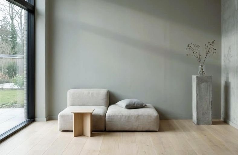
Choosing a living room paint color in 2026 means stepping into one of the most exciting and varied design moments the color world has seen in years.
This year’s most celebrated living room palettes move confidently away from the predictable and toward the genuinely expressive, celebrating shades that bring warmth, personality, and a sense of curated sophistication to the most important gathering space in the home.
From soft, enveloping warm whites with golden undertones to bold jewel tones and deeply grounding earth colors, the 2026 living room color landscape offers something remarkable for every style and every space.
These perfect paint colors represent the most inspiring living room color directions of the year.
Comparative Specifications of Leading Living Room Paint Solutions
The following table details twelve premier paint selections from leading manufacturers, specifying color identifiers, hexadecimal codes, light reflectance values, and primary undertones to assist in spatial design and visualization.
| Manufacturer | Color Name | Identifier / SKU | Light Reflectance Value (LRV) | Primary Undertone Family |
|---|---|---|---|---|
| Benjamin Moore | Cinnamon Slate | 2113-40 | 19.71 | Heathered Plum / Velvety Brown |
| Sherwin-Williams | Evergreen Fog | SW 9130 | 30.40 | Muted Sage / Slate Gray |
| Sherwin-Williams | Urbane Bronze | SW 7048 | 8.00 | Deep Bronze / Warm Greige |
| Behr | Rumors | MQ1-15 | 8.00 | Deep Crimson / Warm Plum |
| Sherwin-Williams | Alabaster | SW 7008 | 82.00 | Creamy Off-White |
| Sherwin-Williams | Sea Salt | SW 6204 | 63.00 | Soft Blue-Green Gray |
| Benjamin Moore | Hale Navy | HC-154 | 8.30 | Classic Deep Navy |
| Benjamin Moore | Revere Pewter | HC-172 | 55.50 | Warm Greige / Umber |
| Benjamin Moore | Simply White | OC-117 | 89.50 | Luminous Warm White |
| Sherwin-Williams | Agreeable Gray | SW 7029 | 60.00 | Soft Warm Taupe / Greige |
| Sherwin-Williams | Iron Ore | SW 7069 | 6.00 | Soft Charcoal Black |
| Benjamin Moore | Aegean Teal | 2136-40 | 25.20 | Muted Teal Blue-Green |
Benjamin Moore Cinnamon Slate (2113-40)
Benjamin Moore Cinnamon Slate (2113-40) offers a delicate balance of heathered plum and velvety brown, establishing itself as a standout color for contemporary living spaces.
With an LRV of 19.71, this medium-deep hue absorbs light to create an intimate, cocooning atmosphere without making moderate-sized rooms feel visual restrictive.
The red-brown undertones surface under warm incandescent evening light, while cool morning daylight draws out its slate-violet tone.
This complex chromatic quality enables Cinnamon Slate to function as an inviting neutral anchor within modern living room designs.
Interior pairings excel when Cinnamon Slate is offset by cream architectural millwork, warm walnut furniture, or brushed brass fixtures.
When applied in an eggshell or matte finish, the color diffuses glares while imparting a soft, tactile texture to wall surfaces.
Sherwin-Williams Evergreen Fog (SW 9130)
Sherwin-Williams Evergreen Fog (SW 9130) provides a subtle, nature-inspired foundation designed to bring organic serenity into living environments.
Exhibiting an LRV of 30.4, this mid-tone sage green features gray and soft blue undertones that prevent it from appearing overly bright or botanical.
The color functions dynamically across lighting conditions, shifting toward a slate gray in north-facing light and revealing its gentle sage essence under south-facing sun exposure.
This adaptiveness enables Evergreen Fog to serve effectively as either an accent shade or a full-room wall envelope.
It pairs seamlessly with soft off-white trims like Sherwin-Williams Alabaster, light oak flooring, woven rattan accents, and matte black hardware.
The balanced contrast created between cool green-gray hues and natural wood finishes enhances spatial depth across modern living room layouts.
Sherwin-Williams Urbane Bronze (SW 7048)
Sherwin-Williams Urbane Bronze (SW 7048) brings grounding drama and sophisticated depth to living spaces.
With an LRV of 8.0, this deep dark bronze combines heavy charcoal gray with warm brown and subtle olive undertones.
The color creates an enclosing visual effect, establishing living rooms as cozy sanctuaries that feel separated from busy external environments.
Urbane Bronze performs exceptionally well when applied to accent walls, full-room color drenching, or fireplace surrounds.
Its rich chromatic weight anchors contemporary furniture, providing contrast against light bouclé fabrics, unrefined travertine, and pale marble surfaces.
In rooms with reduced natural light, the shade maintains its structural elegance without flattening into a cold black.
Behr Rumors (MQ1-15)
Behr Rumors (MQ1-15) is an evocative, deep ruby-red paint infused with plum and warm brown undertones.
Operating at an LRV of 8.0, Rumors delivers warmth and depth, catering to living room concepts focused on formal entertaining and evening relaxation.
The balanced red-purple formulation avoids loud scarlet notes, leaning instead into historic elegance.
This jewel tone creates a compelling background for refined metallic accents, particularly polished nickel, warm copper, and antique gold.
Living spaces painted in Rumors benefit from balance achieved through light neutral rugs, cream drapery, and crystal or glass light fixtures that refract light across saturated crimson walls.
Sherwin-Williams Alabaster (SW 7008)
Sherwin-Williams Alabaster (SW 7008) remains a celebrated warm off-white, revered for its ability to deliver luminous brightness without introducing starkness.
Rated at an LRV of 82.0, Alabaster reflects light efficiently, visually expanding smaller living rooms and maximizing ambient light in dim spaces.
Its yellow-cream undertone maintains an inviting feel, avoiding the clinical cast of pure architectural whites.
Alabaster serves as a versatile neutral foundation, coordinating smoothly with wood grain finishes, exposed brick, black metal trim, and varied textile palettes.
Whether deployed in traditional living rooms or modern environments, Alabaster provides a cohesive background that allows artwork and soft furnishings to stand out.
Sherwin-Williams Sea Salt (SW 6204)
Sherwin-Williams Sea Salt (SW 6204) is a soft blue-green gray that introduces a tranquil, coastal ambiance into living rooms.
With an LRV of 63.0, Sea Salt offers high light reflection, keeping living spaces feeling open and airy.
The color reacts dynamically to changing daylight conditions: cool morning sunlight enhances its sky-blue undertones, whereas warm afternoon light brings out a gentle sage gray.
Designers frequently specify Sea Salt in open-plan living rooms to establish a seamless transition between indoor spaces and adjacent garden views.
It pairs harmoniously with crisp white architectural trims, light woods, linen slipcovers, and pewter accents.
Benjamin Moore Hale Navy (HC-154)
Benjamin Moore Hale Navy (HC-154) is a deeply saturated classic navy blue that brings timeless structure to living rooms.
Featuring an LRV of 8.3, this dark neutral contains subtle gray undertones that temper its blue brilliance, preventing it from feeling overly primary or energetic.
Hale Navy grounds expansive living spaces, providing clear contrast when applied to accent walls, architectural library walls, or media centers.
The shade pairs exceptionally well with warm brass lighting, cognac leather seating, white marble mantelpieces, and bright white trimwork.
Under dim lighting conditions, Hale Navy recedes visually, creating an intimate, cozy living room setting.
Benjamin Moore Revere Pewter (HC-172)
Benjamin Moore Revere Pewter (HC-172) stands as an enduring transitional neutral, bridging the gap between warm beige and modern cool gray.
Holding an LRV of 55.5, this classic greige adapts effortlessly to diverse lighting conditions, offering enough depth to contrast against white trims while maintaining a spacious feeling.
Revere Pewter’s warm umber undertone prevents living rooms from feeling washed out under artificial LED light.
Its balanced tone allows Revere Pewter to complement both cool marble and warm stone fireplace surrounds, dark stained oak floors, and vibrant accent upholstery.
Living spaces painted in Revere Pewter achieve an understated sophistication that accommodates changing seasonal accent decor.
Benjamin Moore Simply White (OC-117)
Benjamin Moore Simply White (OC-117) is a warm, highly luminous white paint that infuses living rooms with clarity and subtle warmth.
With a high LRV of 89.5, Simply White reflects incoming natural light effectively, making it an ideal choice for compact living rooms or spaces with limited window exposure.
A light yellow undertone softens the color, preventing the glare associated with unpigmented whites.
This hue excels in color-drenched applications, where walls, trim, and ceilings share the same shade in varying sheens, creating a cohesive backdrop for eclectic furnishings.
Simply White pairs cleanly with bold artwork, natural timber flooring, raw iron hardware, and layered textiles.
Sherwin-Williams Agreeable Gray (SW 7029)
Sherwin-Williams Agreeable Gray (SW 7029) is a versatile warm gray paint shade designed to establish a cohesive backdrop across open-concept living rooms.
Featuring an LRV of 60.0, Agreeable Gray occupies a balanced mid-tone register that prevents living spaces from feeling either visually heavy or excessively stark.
Its subtle taupe and beige undertones maintain warmth, offsetting cool daylight.
Agreeable Gray acts as an adaptable canvas, harmonizing metallic elements like brushed steel and chrome with natural wood finishes, slate, and charcoal textiles.
Its adaptiveness across architectural styles makes it a dependable selection for living room renovations.
Sherwin-Williams Iron Ore (SW 7069)
Sherwin-Williams Iron Ore (SW 7069) offers a soft alternative to pure black, delivering dramatic architectural contrast.
With an LRV of 6.0, this deep charcoal hue contains rich slate undertones that create a cozy atmosphere when applied to living room walls or custom cabinetry.
Iron Ore recedes visually, softening room boundaries and allowing artwork or lighter furniture to take visual priority.
Designers frequently pair Iron Ore with crisp white ceilings, light natural oak floors, cognac leather seating, and warm brass lighting fixtures.
Used on built-in shelving or fireplace accent walls, Iron Ore provides clear structural definition within living spaces.
Benjamin Moore Aegean Teal (2136-40)
Benjamin Moore Aegean Teal (2136-40) combines soft blue, green, and gray undertones to deliver a balanced chromatic accent for living rooms.
Operating at an LRV of 25.2, this medium-deep teal brings depth and color without dominating interior spaces.
Its gray undertone tempers the blue-green combination, ensuring the shade remains inviting under varied artificial and natural lighting conditions.
Aegean Teal coordinates smoothly with mid-century modern walnut furniture, brass light fixtures, warm beige upholstery, and natural jute carpeting.
It functions effectively as a focal feature wall color or as a full-room envelope for living spaces focused on relaxation.
Strategic Implementation and Lighting Dynamics
Applying paint colors effectively requires evaluating light behavior across spatial orientations.
The perceived color of paint transforms depending on the directional exposure of daylight entering the living space.
| Natural Light Exposure | Light Cast Characteristics | Recommended Color Strategy | Representative Paint Solutions |
|---|---|---|---|
| North-Facing | Cool, slightly blue tint | Use warm-toned neutrals and off-whites to counter cool shadows | Sherwin-Williams Alabaster, Benjamin Moore Revere Pewter |
| South-Facing | Warm, intense golden sunlight | Utilize muted green-grays or cool teals to absorb excess warmth | Sherwin-Williams Evergreen Fog, Benjamin Moore Aegean Teal |
| East-Facing | Warm morning light, cool afternoon shadows | Select paints with balanced undertones that remain stable as light shifts | Benjamin Moore Cinnamon Slate, Sherwin-Williams Sea Salt |
| West-Facing | Cool morning light, intense warm evening glow | Apply deep dark tones or rich plum-reds that soften under golden light | Sherwin-Williams Urbane Bronze, Behr Rumors |
Light reflectance value (LRV) serves as a key quantitative metric for interior lighting design.
Colors with high LRVs (above 60) maximize available daylight, rendering small or windowless living rooms larger and brighter.
Conversely, low-LRV shades (below 20) absorb light, visually drawing walls inward to foster intimate, cozy environments suited for evening entertainment.
Paint sheen selection directly influences color perception and surface maintenance.
Flat and matte finishes absorb light completely, softening saturated dark shades like Sherwin-Williams Urbane Bronze or Behr Rumors while concealing wall surface imperfections.
Eggshell and satin sheens provide subtle light reflectivity and improved washability, making them practical choices for high-traffic living areas finished in light neutrals.
Architectural Color Selection Guidelines
The integration of paint color within residential living spaces requires balancing technical lighting parameters with material palettes.
Testing selected paint colors under real-world conditions ensures long-term visual performance.
- Evaluate Dynamic Lighting: Apply sample boards or peel-and-stick swatches across multiple walls within the room. Observe undertone shifts during morning, midday, and evening hours under both natural daylight and artificial lighting.
- Match Color Weight to Room Utility: Select low-LRV dark shades (such as Behr Rumors or Sherwin-Williams Iron Ore) for living spaces primarily utilized during evening hours to emphasize cozy intimacy. Specify high-LRV shades (such as Sherwin-Williams Alabaster or Benjamin Moore Simply White) for multi-functional family rooms requiring maximum daylight reflection.
- Harmonize Undertones with Fixed Materials: Ensure wall color undertones align with architectural finishes like flooring, stone fireplaces, and built-in millwork. Cool green-grays complement light oak and limestone, whereas heathered plums and bronze tones pair naturally with dark walnut, leather, and antique brass fittings.
- Utilize Uniform Color Application: For modern living rooms, consider painting walls, baseboards, and window trim in a unified color using varying sheens to simplify visual transitions and emphasize spatial volume.