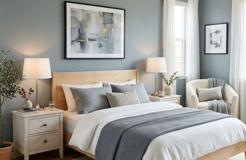
Creating a bedroom that feels truly calm and restful starts with one of the most fundamental decorating decisions you’ll make, the paint color on your walls.
Wall color sets the emotional tone of the entire room before a single piece of furniture is placed or a single light is switched on, making it the most powerful tool available for shaping how a bedroom feels to inhabit.
Certain colors have a proven ability to quiet the mind, ease tension, and make a space feel naturally conducive to rest.
These soothing paint colors have been chosen specifically for their calming qualities, giving you a beautiful and reliable starting point for designing a bedroom that genuinely supports relaxation.
Comparative Master Technical Profile of Calming Paint Colors
| Brand | Color Name | Color Code | LRV | Hue Family / Munsell Notation | Primary Behavioral Characteristics |
|---|---|---|---|---|---|
| Sherwin-Williams | Sea Salt | SW 6204 | 63 | Cool Gray-Green / HSL 97°, 8%, 81% | Shifts between sage green and cool blue-gray depending on lighting. |
| Benjamin Moore | Pale Oak | OC-20 | 69 | Warm Greige-Taupe / 10 YR 8.8/1.8 | Offers a warm, grounded feel with low chroma to prevent yellowing. |
| Farrow & Ball | Borrowed Light | No. 235 | 67 | Pale Luminous Blue | Evokes summer skies; reflects light gently to brighten dim rooms. |
| Sherwin-Williams | Alabaster | SW 7008 | 82 | Warm Off-White / 5.3Y 9.2/0.8 | Provides brightness without glare; coordinates well with wood and brass. |
| Benjamin Moore | Boothbay Gray | HC-165 | 43.26 | Blue-Gray with Green / Historic | Adapts to daylight shifts, deepening to a quiet gray at night. |
| Sherwin-Williams | Agreeable Gray | SW 7029 | 60 | Balanced Greige / 2.3 Y 8/0.74 | The benchmark warm gray; can shift purple in cool or unbalanced light. |
| Benjamin Moore | Swiss Coffee | OC-45 | 82 | Creamy Off-White | Delivers warmth via yellow-cream undertones; reduces starkness. |
| Farrow & Ball | Pink Ground | No. 202 | 64 | Dusty Blush Pink | Formulated with yellow pigments to avoid a sugary, cool finish. |
| Behr | Silver Drop | 790C-2 | 69 | Pale Silver-Gray / Hue Angle 95.64° | A crisp, quiet neutral that behaves like a warm off-white in bright light. |
| Farrow & Ball | French Gray | No. 18 | 44 | Warm Green-Gray / Historic | Inspired by 19th-century French decor; reads as an organic sage-khaki. |
| Benjamin Moore | Hale Navy | HC-154 | 8.36 | Deep Saturated Navy | High-contrast, sleep-friendly tone that creates a cocooning effect. |
| Sherwin-Williams | Iron Ore | SW 7069 | 6 | Soft Charcoal-Black | Deep gray base with soft brown depth; absorbs light to foster intimacy. |
Sherwin-Williams Sea Salt (SW 6204)
Sherwin-Williams Sea Salt is a highly regarded muted gray-green paint color with subtle cool blue undertones.
At a Light Reflectance Value of 63, it strikes a balance between reflecting sufficient natural light and maintaining a clear color identity.
Because of its unique chromatic makeup, Sea Salt functions as a visual chameleon, shifting its appearance based on light exposure and time of day.
Under cool morning light, the blue undertones become more prominent, evoking a refreshing coastal feel.
In warm afternoon daylight, the soft gray-green notes stabilize, grounding the bedroom with a soft, organic quality.
Technically categorized as a cool hue on the HSL color wheel, Sea Salt pairs cleanly with bright white trims, such as Sherwin-Williams Fleur de Sel or Spare White, to highlight its subtle green notes.
Layering natural wood tones and woven textures alongside this paint color helps prevent the cool undertones from reading as sterile.
Benjamin Moore Pale Oak (OC-20)
Benjamin Moore Pale Oak is a sophisticated greige paint color that sits within the warm yellow-red hue family, bordering on a soft taupe.
With an LRV of 69, it provides an elegant brightness that opens up smaller bedrooms while maintaining a warm, comforting presence.
Its low-chroma profile (Chroma of 1.8) makes it highly stable under changing daylight conditions, preventing it from shifting into overly yellow or muddy tones.
When evaluated against warmer, more saturated greiges like Edgecomb Gray, Pale Oak remains more balanced and atmospheric, making it a reliable neutral backdrop.
This color coordinates beautifully with deep, contrasting woodwork or furniture painted in rich chocolate browns, such as Benjamin Moore Sienna or Black Bean Soup, creating a structured and comforting bedroom environment.
Farrow & Ball Borrowed Light (No. 235)
Farrow & Ball Borrowed Light is a wonderfully pale, luminous blue named after the soft daylight that filters through traditional small windows and fanlights.
With a light reflectance value of 67, this color brings a quiet, reflective quality to bedrooms, performing well in both bright sunrooms and low-light spaces.
The inclusion of soft gray pigments prevents the blue from reading as too vibrant or childish, anchoring it instead as a sophisticated, mature choice.
Often selected by designers to visually expand a bedroom ceiling, Borrowed Light functions as a subtle sky-like canopy.
When applied to walls, it pairs exceptionally well with deep indigo accents or rich woodwork painted in Farrow & Ball Stiffkey Blue, which highlights its delicate, airy quality.
Sherwin-Williams Alabaster (SW 7008)
Sherwin-Williams Alabaster is a popular off-white paint color that provides a bright feel without the starkness of a cool white.
With an LRV of 82, it reflects a substantial amount of daylight, making bedrooms feel open and airy.
Alabaster’s success lies in its balanced yellow-beige undertones, which give it a soft, cozy warmth.
It performs consistently across various exposures, reading as a soft, clean white in natural daylight and settling into a warm, creamy off-white under artificial interior lighting.
This paint color is highly effective in modern farmhouse, transitional, and minimalist bedrooms.
It coordinates well with aged brass fixtures, warm wood tones, and natural fibers like jute and linen, which emphasize its organic feel.
Benjamin Moore Boothbay Gray (HC-165)
Part of Benjamin Moore’s Historic Collection, Boothbay Gray is a timeless blue-gray paint color noted for its versatile character.
With a mid-tone light reflectance value of 43.26, it absorbs enough light to bring structure and comfort to a bedroom.
Its soft green undertone balances the cool blue-gray pigments, keeping the color from reading as cold.
Boothbay Gray reacts beautifully to changing light: in cool morning light, it leans towards a blue-green sage, whereas warm afternoon sun draws out its gray properties, and artificial evening light deepens it into a quiet gray.
This complex behavior makes it a sophisticated backdrop for bedrooms, coordinating well with crisp white trims, linen upholstery, and warm metal accents such as brushed brass or antique nickel.
Sherwin-Williams Agreeable Gray (SW 7029)
Sherwin-Williams Agreeable Gray is a highly popular warm gray paint color that serves as a versatile neutral.
With an LRV of 60, it balances on the line between a light neutral and a medium-toned paint, absorbing and reflecting light in equal measure.
This balance is achieved by pairing its cool gray base with cozy beige undertones, which prevents the color from reading as sterile.
Under unbalanced or cool northern light, Agreeable Gray can shift to reveal subtle violet undertones, adding a sophisticated depth.
This chameleon quality makes it a reliable choice for bedrooms, pairing naturally with warm white trims, such as Sherwin-Williams West Highland White, or dark accents like charcoal gray, deep blue, or warm wood furniture.
Benjamin Moore Swiss Coffee (OC-45)
Benjamin Moore Swiss Coffee is a classic warm off-white paint color that brings a soft, welcoming elegance to bedroom spaces.
With a high LRV of 82, it keeps bedrooms feeling open and bright.
The color is defined by soft yellow and beige undertones, which provide a cozy warmth.
This keeps it from reading as stark. Swiss Coffee is highly reliable, performing well in rooms with limited natural light by reflecting light cleanly.
To build a sophisticated, calming palette, designers often coordinate Swiss Coffee with warm taupe, charcoal accents, or deep navy accents like Hale Navy.
When paired with warm wood finishes and brass accents, Swiss Coffee creates a restful, clean bedroom atmosphere.
Farrow & Ball Pink Ground (No. 202)
Farrow & Ball Pink Ground is a dusty blush pink that offers a soft, soothing finish.
Formulated with a generous dose of yellow pigment, this color avoids feeling overly sweet or sugary, reading instead as a warm, neutral blush.
Pink Ground is delicate and soothing, wrapping a bedroom in a comforting glow that behaves well under both morning light and artificial evening bulbs.
It is highly effective at making a room feel intimate and lived-in.
To maintain its sophisticated, soft character, designers recommend pairing it with warm, off-white trim rather than bright-white contrasts, creating a seamless and gentle visual flow.
Behr Silver Drop (790C-2)
Behr Silver Drop is a highly versatile, very light gray that features soft beige undertones.
This light greige bridges the gap between cool silver-grays and warm warm-toned neutrals, offering a calm backdrop that adapts to changing light conditions.
With an LRV of 69, it provides excellent brightness while maintaining enough depth to make the walls recede quietly.
In bright natural light, Silver Drop reads as a soft, airy off-white, while in lower light, the gray undertone deepens slightly to ground the space.
Silver Drop coordinates beautifully with textured textiles like wool, velvet, and wood furniture.
It is an exceptional choice for modern transitional and traditional spaces.
Farrow & Ball French Gray (No. 18)
Farrow & Ball French Gray is a complex green-gray that draws inspiration from nineteenth-century French decoration.
Despite its name, the color reads more green than gray, shifting between a soft sage and a muted khaki depending on the lighting conditions.
With a mid-tone LRV of 44, French Gray grounds a room, absorbing light rather than bouncing it around to create a soothing, cozy atmosphere.
Under cool northern exposure, it leans towards a smoky olive-gray, whereas warm southern light highlights its botanical, sage-green side.
French Gray is highly effective on woodwork and walls, pairing beautifully with deep walnuts, warm limestone tones, and soft white trims.
Benjamin Moore Hale Navy (HC-154)
Benjamin Moore Hale Navy is a deeply saturated, classic navy blue with a strong maritime heritage.
Boasting an extremely low LRV of 8.36, this paint color is highly effective at creating a cozy, moody, and secure sleeping environment.
Rather than making a bedroom feel confined, the cool, dark blue tones recede visually, creating a cocooning effect.
Hale Navy is helpful in environmental design for reducing visual strain, making the space feel incredibly safe and quiet.
This deep color performs beautifully under both natural and artificial light, maintaining its integrity without reading as overly black.
It coordinates beautifully with contrasting crisp white trim, warm wood tones, and polished brass accents.
Sherwin-Williams Iron Ore (SW 7069)
Sherwin-Williams Iron Ore is a deep, velvety charcoal gray that borders on soft black.
At an LRV of 6, it absorbs almost all light, making it highly effective at creating a cozy sanctuary.
Rather than reading as cold, Iron Ore features warm brown and charcoal undertones that give it an elegant, comforting quality.
When used in bedrooms, it makes the walls recede visually, focusing attention inward and promoting deep, restful sleep.
Iron Ore handles various finishes and textures beautifully, making it an excellent backdrop for cozy bouclé, velvet, and natural wood furniture.
It works best when balanced with soft natural light and warm-toned metals.
Architectural Application Principles and Environmental Optimization
Applying calming paint colors within a master suite relies on evaluating room orientation, spatial dimensions, and intended texture pairings.
The interaction between daylight and a paint’s chemical profile dictates how the color behaves on the wall.
Room Orientation and Light Quality
A bedroom’s orientation relative to the sun determines the color temperature of the natural daylight entering the space.
Designers must match paint undertones to this light quality to prevent rooms from reading as overly sterile or muddy.
- North-Facing Bedrooms: These spaces receive cool, bluish daylight that can flatten colors and emphasize cool, gray undertones. To balance this cool light, warm neutrals like Benjamin Moore Pale Oak, Behr Silver Drop, and Sherwin-Williams Alabaster are highly effective. These colors contain yellow-beige pigments that add warmth and comfort, preventing the room from feeling stark or uninviting.
- South-Facing Bedrooms: These rooms receive warm, direct daylight throughout the day, which can intensify yellow pigments and cause cream colors to read as overly yellow. Utilizing cool-leaning neutrals, such as Sherwin-Williams Sea Salt or Farrow & Ball Borrowed Light, balances this warm exposure. The natural cool blue-green and gray undertones in these colors soften the intense warm light, keeping the space relaxed and serene.
- East-Facing Bedrooms: These spaces experience warm morning sun followed by cool, shadowed light in the afternoon. Adaptive mid-tones like Benjamin Moore Boothbay Gray perform consistently in these environments, presenting a fresh blue-green sage in the morning and a grounded, neutral gray as the daylight shifts.
- West-Facing Bedrooms: These rooms are illuminated by cool morning daylight, followed by rich, warm amber light in the late afternoon. This dramatic shift can be balanced by using grounding neutrals like Sherwin-Williams Agreeable Gray, which coordinates well with both cool and warm tones, or Farrow & Ball French Gray, which anchors the space under varying light temperatures.
Textures and Material Pairings
Calming bedroom paint colors perform best when integrated with a thoughtful palette of textures and materials.
The table below outlines recommended texture pairings for each of the core color families, helping designers select coordinating elements that complement the painted walls.
| Color Family | Recommended Paint Examples | Ideal Texture Partners | Metal Hardware Finishes | Grounding Elements |
|---|---|---|---|---|
| Muted Blues & Greens | SW Sea Salt, F&B Borrowed Light, BM Boothbay Gray | Heavy linen, light oak, soft cotton knits | Brushed brass, antique copper, matte black | Distressed white pine, woven seagrass baskets |
| Warm Greiges & Grays | BM Pale Oak, SW Agreeable Gray, Behr Silver Drop | Chunky wool, boucle, velvet, raw silk | Matte black, antique brass, oil-rubbed bronze | Medium-toned walnut, honed limestone |
| Soft Off-Whites | SW Alabaster, BM Swiss Coffee | Jute, shearling, waffle-weave cotton, leather | Polished nickel, brushed brass, aged iron | Reclaimed barn wood, matte ceramic planters |
| Deep & Cocooning Hues | F&B French Gray, BM Hale Navy, SW Iron Ore | Thick velvet, leather, sheepskin, mohair | Unlacquered brass, brushed bronze, polished chrome | Dark stained oak, white marble, rustic brick |
By pairing the appropriate paint color with the room’s daylight conditions and selecting complementary natural materials, designers can create a restful, cohesive sanctuary that supports comfort and well-being.