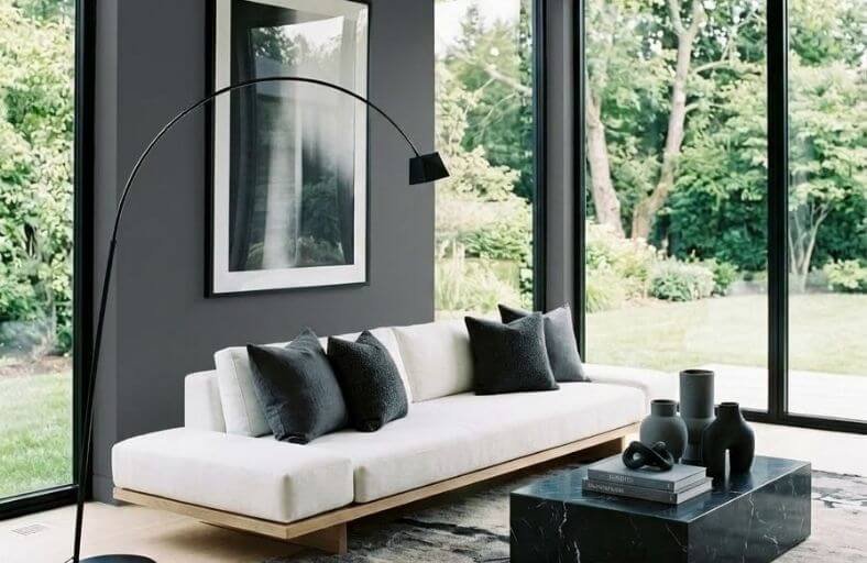
Dark paint colors in a living room have a transformative power that lighter shades simply cannot match, turning an ordinary space into something that feels genuinely dramatic, intimate, and visually rich.
Deep navy, charcoal, forest green, and warm black tones create a sense of depth and enclosure that makes a living room feel more purposeful and considered, like a space that was designed with real intention rather than simply furnished and painted.
Far from making a room feel smaller in an unwelcome way, the right dark color makes it feel cozier and more atmospheric.
These dramatic dark paint colors will inspire you to embrace depth and boldness in your living room with complete confidence.
Technical Specifications and Comparative Analysis
The following table summarizes eleven premier dark paint colors from leading manufacturers, detailing their technical codes, Light Reflectance Values, hexadecimal codes, primary undertones, and recommended visual density levels for interior styling.
| Brand | Color Name | Color Code | LRV | Dominant Undertones | Decor Density Level |
|---|---|---|---|---|---|
| Benjamin Moore | Hale Navy | HC-154 | 8.36 | Crisp Navy, Slate Gray | Medium Density Classic |
| Sherwin-Williams | Iron Ore | SW 7069 | 6.00 | Soft Charcoal, Carbon | Minimalist / Ultra-Low Density |
| Benjamin Moore | Kendall Charcoal | HC-166 | 14.61 | Warm Neutral Gray, Green-Brown | Moderately Dense |
| Benjamin Moore | Salamander | 2050-10 | 5.72 | Deep Blackened Teal Green | Maximalist / Heavy Density |
| Benjamin Moore | Soot | 2129-20 | 6.19 | Cool Blue-Black Charcoal | Minimalist-Modern |
| Sherwin-Williams | Naval | SW 6244 | 4.00 | Deep Inky Royal Navy | Medium-Heavy Classic |
| Sherwin-Williams | Urbane Bronze | SW 7048 | 8.12 | Earthy Greige Bronze | Organic Low-Medium Density |
| Behr | Cracked Pepper | PPU18-01 | 8.00 | Soft Peppered Black | Medium Density Contemporary |
| Farrow & Ball | Studio Green | No. 93 | 7.09 | Blackened Olive Green | Ultra-Dense Heritage |
| Farrow & Ball | Railings | No. 31 | 6.00 | Slate Blue-Black | Sparse Architectural Density |
| Benjamin Moore | Wrought Iron | 2124-10 | 6.00 | Cool Charcoal Slate | High-Density Eclectic |
Benjamin Moore Hale Navy (HC-154)
Benjamin Moore Hale Navy serves as an essential anchor shade in traditional and contemporary living spaces alike.
Operating with an LRV of 8.36, this deeply saturated navy blue balances classic maritime heritage with modern neutral versatility.
Its underlying gray undertones stabilize the blue hue, preventing it from appearing overly vivid under direct artificial light or overly cool in north-facing rooms.
The shade excels when executed across full-room wraps, trim, and built-in cabinetry, establishing a grounded visual backdrop that amplifies warm architectural woodwork, polished brass hardware, and crisp off-white trims such as Coventry Gray or White Dove.
Designers frequently deploy Hale Navy in formal living rooms to engender intimacy while preserving structural clarity.
Sherwin-Williams Iron Ore (SW 7069)
Sherwin-Williams Iron Ore provides an ultra-sophisticated alternative to stark blacks, functioning as a deep, muted charcoal with an LRV of 6.
Derived from a neutral base with subtle green-gray and carbon undertones, Iron Ore exhibits remarkable tranquility and softness, avoiding the harshness typically associated with true black paints.
Under bright daylight, the color manifests as a velvety graphite gray; in lower lighting conditions, it leans into a mysterious near-black without losing its underlying neutral character.
It integrates seamlessly into modern, industrial, or urban living room schemes, pairing exceptionally well with warm timber finishes, exposed masonry, brushed gold metallic accents, and stark white millwork.
Benjamin Moore Kendall Charcoal (HC-166)
Benjamin Moore Kendall Charcoal is a rich, dependable dark neutral gray characterized by an LRV of 14.61.
Containing complex, subtle green-brown undertones, Kendall Charcoal sits comfortably at the intersection of warm and cool color palettes.
This equilibrium allows the shade to provide dramatic depth without overwhelming ambient light in open-concept living rooms.
It establishes an elegant backdrop that elevates crisp white trim like Chantilly Lace or soft warm greiges, making marble hearths, raw timber beams, and textured upholstery pop vividly.
The color excels on focal feature walls, surrounding fireplaces, or full living room envelopes requiring gravitas and timeless structure.
Benjamin Moore Salamander (2050-10)
Benjamin Moore Salamander is an intriguing, chameleon-like dark green that blends deep green, dark slate blue, and charcoal black.
With a very low LRV of 5.72, Salamander absorbs the majority of light in a room, creating an opulent, mood-filled sanctuary.
In dim evening light, the shade appears virtually black, yet brighter daylight brings forward its rich forest green and blue-gray undertones.
This moody color is ideally suited for cozy living rooms, home libraries, or conversational lounges.
It pairs magnificently with cognac leather, rich mahogany wood tones, mustard velvet accents, and aged brass fixtures, delivering an unforgettably dramatic interior backdrop.
Benjamin Moore Soot (2129-20)
Benjamin Moore Soot is a saturated, polished near-black paint hue infused with subtle gray and cool blue undertones.
Featuring an LRV of 6.19, Soot offers a softer, more atmospheric alternative to absolute black, delivering a sharp and tailored aesthetic.
The underlying blue notes emerge subtly when exposed to natural light, providing visual interest and preventing walls from appearing flat or industrial.
Soot is a favored choice for modern living rooms seeking dramatic contrast against light-colored upholstery, architectural millwork, or light natural wood floors.
Its cool slate cast complements architectural black ironwork, plush gray textiles, and minimalist decor schemes effortlessly.
Sherwin-Williams Naval (SW 6244)
Sherwin-Williams Naval is an iconic, deeply grounded navy shade with an ultra-low LRV of 4.
Designed to bring a feeling of regal majesty and tranquil depth to living areas, Naval mixes rich blue pigments with a quiet dark neutral base.
Unlike lighter navies, its low light reflection retains color depth even in low-light environments, creating an intimate setting perfect for evening entertaining.
Naval functions exceptionally well alongside warm metallic accents such as champagne gold or warm bronze, rich tan leather seating, and crisp alabaster trim.
When applied to living room walls, it establishes an elevated sense of structure and timeless American sophistication.
Sherwin-Williams Urbane Bronze (SW 7048)
Sherwin-Williams Urbane Bronze is a rich, warm, grounded dark neutral that expertly bridges grey, brown, and bronze tones with an LRV of 8.12.
Rooted in natural earth materials, Urbane Bronze brings an organic serenity to living room interiors, working as an exceptional anchor color for biophilic and modern rustic aesthetics.
Its subtle warm undertones ensure that the space feels inviting and cozy, dampening ambient noise visually while echoing the texture of stone, wood, and unvarnished metals.
It harmonizes beautifully with linen drapery, raw timber beams, terracotta accents, and soft cream walls, offering a refined, down-to-earth luxury.
Behr Cracked Pepper (PPU18-01)
Behr Cracked Pepper is a versatile soft black shade featuring an LRV of 8.
Functioning as a subtle charcoal black, Cracked Pepper offers an approachable entry point for homeowners looking to introduce dark paint into their living spaces without committing to intense jet blacks.
Its balanced neutral formula adapts easily to varying lighting conditions, keeping spaces grounded while allowing surrounding colors and decor to pop with clarity.
Cracked Pepper pairs effortlessly with warm wood tones, brass hardware, light beige textiles, and vibrant accent colors, making it a reliable solution for transitional, modern farmhouse, or industrial living room layouts.
Farrow & Ball Studio Green (No. 93)
Farrow & Ball Studio Green is a dark, blackened green paint shade designed to create dramatic, mood-rich interiors.
With an LRV of 7.09, Studio Green reads as an intriguing near-black in shadowy rooms or during evening hours, only revealing its deep olive-green pigments when struck by direct illumination.
This rich, historic color adds gravitas and moody elegance to living rooms, studies, and library spaces.
It pairs superbly with antique brass, rich cognac leather, botanical wall hangings, dark walnut woodwork, and warm velvet upholstery, forming an opulent backdrop that feels both historic and contemporary.
Farrow & Ball Railings (No. 31)
Farrow & Ball Railings is a softer, more subtle blue-black paint shade that offers a gentler, more tactile alternative to pure black.
Registering an LRV around 6, Railings gains its distinctive character from underlying dark slate blue pigments, which soften its visual impact while adding depth.
When applied in an eggshell or estate emulsion finish across living room walls, it creates an architectural envelope that frames window views and structural details dramatically.
Railings blends effortlessly with modern architectural elements, crisp white trims, light timber floorboards, and sleek metallic accents, imbuing residential living rooms with quiet luxury and contemporary discipline.
Benjamin Moore Wrought Iron (2124-10)
Benjamin Moore Wrought Iron is a celebrated dark charcoal blue-black with an LRV of 6.
Known for its cool slate-blue bias, Wrought Iron provides an elegant architectural tone that avoids warm brown or green casts.
This cool neutrality makes it an exceptionally strong choice for modern-traditional, modern Tudor, or industrial living rooms.
It creates an impactful contrast when paired with crisp white trim, exposed stone, warm copper, and stained cedar or walnut furniture.
Wrought Iron’s refined depth absorbs harsh glare while grounding living areas, making art, colorful textiles, and architectural features stand out prominently.
Architectural Lighting, Sheen Dynamics, and Spatial Perception
The application of dark paint colors fundamentally alters how natural and artificial light behaves within a living room.
Because low-LRV pigments absorb radiant light, relying solely on overhead ambient lighting can result in a flat, cavernous appearance.
To unlock the richness of undertones in shades such as Salamander, Studio Green, or Hale Navy, lighting must be deployed in intentional layers combining ambient, task, and accent sources.
Color temperature plays a pivotal role in color rendering. Artificial bulbs rated between 2700K and 3000K emit warm, golden light that accentuates warm undertones in organic shades like Urbane Bronze and Kendall Charcoal.
Conversely, bulbs rated at 4000K or higher produce cool, crisp light that emphasizes the slate-blue casts in Soot, Wrought Iron, and Railings.
| Paint Color Sheen | Visual Impact | Recommended Application | Maintenance Level |
|---|---|---|---|
| Flat / Matte | Non-reflective, velvety absorption; completely hides drywall imperfections | Low-traffic living room walls, ceilings | Moderate; scuffs easily under scrubbing |
| Eggshell / Low-Lustre | Soft, subtle sheen; reflects minimal light while enhancing undertone richness | Standard living room walls | High; washable and wipeable |
| Satin | Mild reflection; adds crisp highlight lines across architectural trim | Trim, doors, wood paneling, wainscoting | High; highly durable and moisture-resistant |
| High-Gloss | Highly reflective mirror finish; amplifies light bounce dramatically | Ceilings, accent doors, millwork feature walls | Requires flawless substrate preparation |
Spatial perception in dark living rooms is dictated by surface continuity.
Painting baseboards, crown molding, and doors in the same dark hue as the walls, a technique known as “color drenching”, eliminates high-contrast visual breaks.
This unbroken field of color tricks the human eye into perceiving ceiling height as continuous, effectively expanding the felt dimensions of smaller or lower-ceilinged rooms.
Design Recommendations
Successful deployment of dark living room paint colors hinges on balancing color weight with tactile texture and decorative density.
Highly saturated hues benefit from contrasting material elements: light-toned woods (such as white oak or bleached birch), reflective metals (polished brass, warm copper), and rich woven textiles (bouclé, velvet, linen) prevent dark envelopes from feeling visually heavy.
When selecting among charcoal blacks, deep navies, and blackened greens, the orientation of natural light windows should serve as the primary guide.
North-facing living rooms receive cool, indirect light that accentuates blue undertones, making warm dark hues like Urbane Bronze or Kendall Charcoal ideal for restoring warmth.
South-facing rooms benefit from intense natural sunlight, which reveals the complex secondary pigments in hues like Salamander, Soot, or Iron Ore.
By aligning exact technical paint specifications with light exposure and interior density, dark color palettes yield living spaces of unmatched elegance, depth, and enduring comfort.