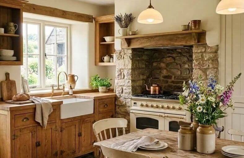
The modern farmhouse kitchen represents a deliberate convergence of rustic durability and contemporary refinement.
Central to this aesthetic is the architectural treatment of cabinetry, where natural oak, ranging from golden honey tones to muted white oak, serves as the organic foundation.
Historically, golden oak was dismissed as an outdated relic of late-twentieth-century design; however, contemporary color theory has re-contextualized these wood finishes as warm, organic assets.
The primary challenge for designers lies in mitigating the intense yellow and orange undertones inherent in golden oak without stripping the material of its organic character.
By employing advanced color strategies, specifically leveraging complementary contrast to neutralize undertones or warm harmonic blending to integrate them, it is possible to transform oak cabinetry into a sophisticated focal point.
Specifications for Oak-Compatible Farmhouse Palettes
The table below provides a precise colorimetric profile of eleven paint colors selected from premier manufacturers to coordinate with oak cabinetry in farmhouse environments.
| Manufacturer | Paint Name | Color Code | LRV | Core Undertones | Primary Design Strategy |
|---|---|---|---|---|---|
| Sherwin-Williams | Sea Salt | SW 6204 | 63% | Blue-Green-Gray | Complementary Neutralizing |
| Benjamin Moore | White Dove | OC-17 | 83% | Warm Greige-White | Soft Luminous Backdropping |
| Sherwin-Williams | Alabaster | SW 7008 | 82% | Yellow-Cream | Luminous Harmonizing |
| Sherwin-Williams | Accessible Beige | SW 7036 | 58% | Muted Gray-Beige | Transitional Softening |
| Benjamin Moore | Revere Pewter | HC-172 | 55% | Olive-Greige | Grounding Earthy Balancing |
| Sherwin-Williams | Rosemary | SW 6187 | 14% | Cool Gray-Green | Deep Forest Accentuation |
| Benjamin Moore | Hale Navy | HC-154 | 8% | Maritime Charcoal-Navy | High-Contrast Focal Pointing |
| Benjamin Moore | Edgecomb Gray | HC-173 | 63% | Sandy Yellow-Beige | Soft Low-Contrast Unifying |
| Sherwin-Williams | Repose Gray | SW 7015 | 58% | Violet-Brown Greige | Cool-Neutral Bridging |
| Benjamin Moore | Swiss Coffee | OC-45 | 82% | Creamy Warm Off-White | Traditional Country Luminous |
| Benjamin Moore | Saybrook Sage | HC-114 | 45% | Silvery Muted Sage | Soft Organic Contrast |
Sherwin-Williams Sea Salt (SW 6204)
Sherwin-Williams Sea Salt is an exceptionally mutable blue-green-gray that serves as a highly effective neutralizing agent for warm golden oak cabinetry.
Grounded in the mechanics of complementary color theory, the subtle blue-green undertones in Sea Salt balance the orange cast of the wood, softening the yellow-orange warmth of the oak into a balanced, natural look.
With a Light Reflectance Value (LRV) of 63%, Sea Salt functions as an open, airy neutral that retains a distinct personality.
Depending on the lighting conditions, this chameleon-like shade can lean toward a fresh green or a soft, moody gray-blue.
This ever-changing quality makes it ideal for farmhouse kitchens with changing natural light throughout the day.
It pairs beautifully with cool soapstone countertops and warm metal accents.
Benjamin Moore White Dove (OC-17)
Benjamin Moore White Dove is a classic, warm off-white featuring a delicate greige undertone.
This subtle tint of gray and beige is crucial for farmhouse spaces, as it prevents the color from appearing clinical or cold when positioned beside golden or red oak woodwork.
White Dove’s high Light Reflectance Value of 83% makes it highly effective at bouncing light throughout the room, helping a compact kitchen layout feel more spacious.
It acts as a soft, neutral backdrop that highlights the warm texture of the oak without drawing focus away from the cabinetry.
It coordinates effortlessly with clean white surfaces and weathered wood beams.
Sherwin-Williams Alabaster (SW 7008)
Sherwin-Williams Alabaster is a well-known, warm off-white defined by its creamy yellow-cream base.
This color is highly valued in farmhouse interiors for its soft, calming presence.
Sitting in the yellow hue family on the Munsell color scale, Alabaster’s warm base coordinates naturally with the golden tones of oak cabinetry.
Rather than creating high-contrast boundaries, it blends with the wood to create a soft, inviting atmosphere.
This color is ideal for whole-home paint schemes and works beautifully with natural stone foundations, rustic brick elements, and aged brass fixtures.
Sherwin-Williams Accessible Beige (SW 7036)
Sherwin-Williams Accessible Beige is a popular greige neutral that features subtle gray undertones over a warm beige base.
Unlike traditional yellow-based beiges, which can make golden oak cabinets look overly orange, the gray undertone in Accessible Beige acts as a neutralizing element.
With an LRV of 58, it provides a gentle, medium-toned contrast that grounds the kitchen, allowing the natural grain of the wood to stand out without competing for attention.
It is highly recommended for transitional farmhouse spaces that incorporate both stone and wood textures.
Benjamin Moore Revere Pewter (HC-172)
Benjamin Moore Revere Pewter is widely recognized as a premier greige, balancing a warm gray base with a soft, earthy green-beige undertone.
The green-beige undertone is highly effective in oak-heavy kitchens.
Because green and orange sit in harmony on organic color palettes, Revere Pewter stabilizes the warmth of the oak while offering a soft, stone-like contrast.
It coordinates exceptionally well with white trim and natural stone, reading as a sophisticated, historic stone gray in north-facing light.
Sherwin-Williams Rosemary (SW 6187)
Sherwin-Williams Rosemary is a deep, organic forest green saturated with a cool gray undertone.
This color is designed for the bold modern farmhouse aesthetic, working exceptionally well as an accent wall, on a kitchen island, or as a deep perimeter backdrop.
The dark gray-green base acts as a dramatic, moody foil to golden or white oak cabinets.
Because of its low LRV of approximately 14%, Rosemary absorbs light to create a cozy, intimate environment that emphasizes the rich warmth and texture of the adjacent oak woodwork.
Benjamin Moore Hale Navy (HC-154)
Benjamin Moore Hale Navy is a classic, deeply saturated maritime navy blue anchored by a strong charcoal-gray base.
Navy blue sits directly opposite orange on the color wheel, making Hale Navy a powerful visual counterweight to warm honey oak cabinetry.
This high-contrast pairing creates a sophisticated, dramatic energy.
Because of its low reflectance, Hale Navy should be paired with crisp white trim and ample natural light to ensure the kitchen retains its open, airy farmhouse feel.
Benjamin Moore Edgecomb Gray (HC-173)
Benjamin Moore Edgecomb Gray is an earthy, organic neutral that sits on the light end of the greige spectrum.
It is characterized by soft, sandy beige undertones that prevent it from appearing cold or clinical.
Edgecomb Gray is an ideal choice for creating a tranquil, low-contrast farmhouse kitchen.
Instead of emphasizing the oak cabinets with high contrast, it acts as a gentle, unifying backdrop that allows the natural beauty of the wood to blend seamlessly into the surrounding walls.
Sherwin-Williams Repose Gray (SW 7015)
Sherwin-Williams Repose Gray is a highly versatile, warm light gray with a complex undertone profile of violet and brown.
This slight touch of violet is highly effective in neutralizing yellow and orange tones in oak wood.
Repose Gray is a reliable neutral gray that coordinates with both cool metal finishes and warm wood grains.
It provides a modern, clean look that bridges traditional farmhouse charm with contemporary kitchen styling.
Benjamin Moore Swiss Coffee (OC-45)
Benjamin Moore Swiss Coffee is a rich, warm off-white with creamy, golden undertones.
It is an exceptional choice for traditional and country farmhouse kitchens because it avoids the cold, clinical feel of pure whites.
Swiss Coffee works in harmony with the natural warmth of oak cabinets, wrapping the kitchen in a cozy, inviting glow.
It is best paired with warm metal finishes like aged brass and unlacquered copper to highlight its rich, classic character.
Benjamin Moore Saybrook Sage (HC-114)
Benjamin Moore Saybrook Sage is a soft, historically derived sage green with a muted, gray-leaning profile.
This color belongs to the historic color collection and brings a sense of timeless elegance to farmhouse kitchens.
The silvery-gray undertone in Saybrook Sage acts as a calming agent, softening the warmth of golden oak while introducing a gentle, natural color that references the outdoors.
It functions as a soft neutral green that adds subtle character without overwhelming the room.
Synthesis of Auxiliary Design Components
Achieving a professional-grade farmhouse kitchen requires careful coordination of paint finishes, metal hardware, and artificial lighting to ensure the selected colors and oak cabinets perform at their best.
The table below outlines how these elements should be coordinated based on the selected color families.
| Paint Color Family | Recommended Wall Sheen | Ideal Hardware Metals | Lighting Temperature (Kelvin) | Best Countertop Pairing |
|---|---|---|---|---|
| Warm Whites & Creams (e.g., Alabaster, Swiss Coffee) | Eggshell | Unlacquered Brass, Oil-Rubbed Bronze | 3000K (Neutral-Warm) | Light Granite, Creamy Quartz |
| Muted Cool Neutrals (e.g., Sea Salt, Saybrook Sage) | Matte or Satin | Satin Nickel, Antique Pewter | 3000K (Balanced Light) | White Quartz, Light Gray Marble |
| Grounded Greiges (e.g., Accessible Beige, Revere Pewter) | Eggshell | Matte Black, Antique Bronze | 3000K to 3500K | Soapstone, Dark Gray Slabs |
| Deep Contrast Tones (e.g., Rosemary, Hale Navy) | Satin | Warm Brass, Copper, Matte Black | 3000K (Clear Halogen-Warm) | Bright White Quartzite |
Paint Sheen Selection
The choice of paint sheen directly impacts how color is perceived and how well it stands up to kitchen use.
Flat and matte finishes excel at absorbing light and hiding plaster imperfections, but they are generally less cleanable.
Consequently, designers recommend an eggshell sheen for primary kitchen walls.
Eggshell provides a soft, low-luster finish that gently diffuses light without creating harsh glare, while offering the washability needed around cooking and prep areas.
For high-moisture trim work, ceiling panels, and baseboards, a satin or semi-gloss sheen ensures long-term durability and easy maintenance.
Metal and Hardware Coordination
Hardware finishes serve as critical accents that can either emphasize or soften the warmth of oak cabinets.
- Warm Metals: Unlacquered brass, copper, and oil-rubbed bronze naturally complement the warm undertones of golden oak. These finishes develop a classic patina that enhances the rustic feel of the kitchen. They pair beautifully with warm off-whites like Alabaster or Swiss Coffee, creating an integrated look.
- Cool & Dark Metals: Matte black iron and pewter provide a clean, graphic contrast against the wood grain. They help anchor the space when paired with light gray or green tones like Sea Salt or Repose Gray, adding a touch of modern farmhouse structure.
Lighting Considerations
Artificial lighting can significantly alter the appearance of paint colors and wood tones.
- Warm Light (2700K to 3000K): Warm light sources intensify the orange and yellow tones in oak cabinets, which can make creamy paints look yellow.
- Cool Light (4000K to 5000K): Cool light sources can make warm wood look dull and shift neutral grays toward a stark, clinical cast.
- Optimal Balance (3000K): For a balanced farmhouse kitchen, designers recommend using neutral-warm LED bulbs (3000K). This color temperature keeps warm whites and grays looking crisp and natural, while showcasing the authentic warmth and grain of the oak cabinetry without over-emphasizing its amber undertones.