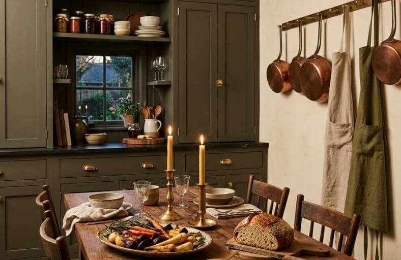
Green kitchen cabinets have emerged as one of the most exciting and enduring color trends in contemporary kitchen design, offering a warmth and organic richness that white and gray cabinets simply cannot replicate.
From soft, muted sage tones that feel quietly sophisticated to deep, saturated forest greens that make a genuinely dramatic statement, the green family covers an impressive range of moods and aesthetics.
Green’s natural affinity with wood tones, brass hardware, and stone countertops makes it one of the most harmonious cabinet colors available to homeowners today.
These beautiful green paint colors will inspire you to find the perfect shade for transforming your kitchen cabinets into something truly special.
Technical Comparison
The following structured matrix compares twelve industry-leading green paint formulas across top manufacturers, detailing their exact identification codes, light reflectance metrics, and optimal environmental exposures.
| Brand | Paint Color Name | Color ID / SKU | LRV | Primary Undertones | Optimal Light Exposure |
|---|---|---|---|---|---|
| Sherwin-Williams | Evergreen Fog | SW 9130 | 30 | Slate-Gray, Soft Blue | South, West, Warm Artificial |
| Sherwin-Williams | Pewter Green | SW 6208 | 12 | Pewter Gray, Pine, Olive | South, East, Balanced Daylight |
| Sherwin-Williams | Sea Salt | SW 6204 | 63 | Cool Blue, Soft Gray | North, East, Small Spaces |
| Sherwin-Williams | Rosemary | SW 6187 | 14 | Deep Slate-Gray, Cool Sage | South, Direct Natural Light |
| Sherwin-Williams | Secret Garden | SW 6181 | 8 | Bronze, Khaki, Warm Yellow | South, East, High Natural Light |
| Benjamin Moore | October Mist | 1495 | 46.54 | Silvery-Blue, Light Gray | North, South, Universal |
| Benjamin Moore | Cushing Green | HC-125 | 18 | Neutral Blue, Historic Slate | Low Light, Enclosed Spaces |
| Benjamin Moore | Mohegan Sage | 2138-30 | 12.37 | Heavy Bronze, Warm Olive | South, East, Warm Artificial |
| Farrow & Ball | Green Smoke | No. 47 | 19 | Slate-Blue, Charcoal Gray | South, West, Bright Overhead |
| Farrow & Ball | French Gray | No. 18 | 43 | Khaki-Yellow, Soft Sage | South, West, Natural Daylight |
| Behr | Boreal | N420-5 | 20 | Slate-Blue, Moss Gray | South, West, Task Lighting |
| Behr | Back to Nature | S340-4 | ~48 | Golden-Yellow, Olive | East, South, Diffused Light |
Sherwin-Williams Evergreen Fog (SW 9130)
Sherwin-Williams Evergreen Fog represents a refined balance between soft sage and calming gray-green.
Declared a former Color of the Year, this mid-tone color features an LRV of 30, absorbing enough light to create spatial grounding without overwhelming smaller kitchen layouts.
Its chromatic profile is infused with subtle blue undertones, which actively cool the primary green hue and prevent it from appearing overly brassy or grassy.
In south-facing kitchens illuminated by warm sunlight, the underlying botanical green notes bloom vibrantly, producing an inviting, life-affirming ambience.
Conversely, in north-facing spaces with indirect light, the slate-gray base steps forward, offering a muted, sophisticated aesthetic.
Designers frequently pair Evergreen Fog cabinetry with warm white architectural trim, brushed champagne gold hardware, light oak flooring, and white quartz countertops featuring delicate gray veining.
Sherwin-Williams Pewter Green (SW 6208)
Sherwin-Williams Pewter Green is a dark, atmospheric gray-green engineered for high-impact contrast.
With a Light Reflectance Value of 12, this shade anchors millwork by absorbing light, behaving as a dark organic neutral.
The formula integrates pine green tones with a metallic pewter gray base and subtle olive nuances.
Under southern exposures, the warm olive undertones become prominent, whereas eastern or western light reveals a balanced, formal dark gray-green structure.
Pewter Green is particularly suited for kitchen islands, lower perimeter cabinets, or full-height pantry built-ins in craftsman and transitional homes.
It creates a striking contrast when combined with bright white marble tiles, black metal accents, and warm wood open shelving.
Sherwin-Williams Sea Salt (SW 6204)
Sherwin-Williams Sea Salt is a light, airy gray-green characterized by a high LRV of 63, allowing it to bounce abundant natural light across kitchen spaces.
The pigment formula blends pastel green and muted gray with refreshing blue undertones.
This light-reflecting property makes Sea Salt an exceptional choice for small kitchens, coastal cottage designs, or Scandinavian-inspired cabinetry where spatial expansion is desired.
Under cool natural daylight, the blue-gray undertones emerge, imparting a fresh, tranquil appearance.
Under warm incandescent task lighting, subtle yellow nuances activate the green base, creating a cozy atmosphere.
It harmonizes effectively with honey-toned wood finishes, polished chrome fixtures, and off-white trim colors.
Sherwin-Williams Rosemary (SW 6187)
Sherwin-Williams Rosemary is a deep, cool sage green defined by heavy gray undertones that lend it a crisp, modern character.
Featuring an LRV of 14, Rosemary provides significant visual depth while remaining noticeably more green-forward than lighter sage variants like Evergreen Fog.
Its desaturated herbal profile eliminates harsh yellow reflections, resulting in an elegant, grounded finish suitable for full kitchen cabinetry suites or focal islands.
When exposed to direct natural sunlight, Rosemary maintains its true desaturated botanical tone without washing out.
Design strategies often pair this color with rich walnut flooring, unlacquered brass hardware, crisp white upper cabinets, and honed soapstone or dark granite counter surfaces.
Sherwin-Williams Secret Garden (SW 6181)
Sherwin-Williams Secret Garden is an enveloping, ultra-dark olive green formulated with bronze micro-nuances and khaki undertones.
With an LRV of 8, it sits near the dark end of the reflective spectrum, absorbing maximum light to forge an intimate, botanical environment.
Under warm artificial illumination (2700K), the khaki and bronze components move forward, softening the primary green hue into a rustic, earthy shade.
In bright southern exposures, its deep organic green character becomes pronounced.
Secret Garden is ideal for large kitchen islands, butler’s pantries, or modern flat-panel cabinetry setups seeking structural weight.
It coordinates exceptionally with warm brass hardware, rich butcher block counter inserts, and dark slate floor tiles.
Benjamin Moore October Mist (1495)
Benjamin Moore October Mist is a gently shaded sage green designed to function as an organic neutral.
Holding an LRV of 46.54, this mid-tone color reflects almost half of incoming light, making it adaptable to both sunlit and shadowed kitchen environments.
The color formulation pairs a primary sage green hue with subtle silver-blue and gray undertones, mimicking the soft color of plant stems.
In south-facing spaces, October Mist maintains its true botanical green hue.
In dimmer, north-facing lighting, it grays out gracefully, producing calming visual shadows without appearing murky.
It is frequently specified for transitional kitchen perimeter cabinets, complementing marble countertops, warm greige wall tones, and terracotta floor tiles.
Benjamin Moore Cushing Green (HC-125)
Benjamin Moore Cushing Green is a historic, deep gray-green engineered with neutral blue pigmentation.
Derived from Benjamin Moore’s Historical Collection, this shade provides timeless architectural grounding with an LRV of 18.
Unlike softer sage tones that desaturate under dim lighting, Cushing Green retains its chromatic green identity in shadows, resisting excessive graying.
This property renders it highly effective for traditional inset cabinetry, rustic kitchen designs, or enclosed butler’s pantries where low natural light is present.
Design pairings typically feature warm soapstone or butcher block counters, greige wall finishes, and antique brass cabinet latches.
Benjamin Moore Mohegan Sage (2138-30)
Benjamin Moore Mohegan Sage is a deeply desaturated dark green-gray saturated with warm olive and bronze undertones.
With a low Light Reflectance Value of 12.37, this dark neutral formula grounds cabinetry in biophilic depth.
The underlying color chemistry relies on a dark green-gray base mixed with heavy bronze pigments.
Under artificial warm light (2700K to 3000K), the bronze undertones shift forward, imparting a rich, cozy atmosphere.
In direct daylight, the green-gray structure provides clean architectural lines.
Mohegan Sage excels when applied to full-height kitchen cabinetry or large kitchen islands paired with warm beige surrounding walls, cognac leather seating, and raw brass millwork hardware.
Farrow & Ball Green Smoke (No. 47)
Farrow & Ball Green Smoke No. 47 is a historic, deeply atmospheric green characterized by dense slate-blue and charcoal gray undertones.
Holding an LRV of 19, this pigment absorbs light, establishing immediate architectural weight and intimacy within a kitchen layout.
The color exhibits dynamic lighting shifts: in direct warm southern sunlight, the slate-gray softens to reveal a rich teal-green; in cool northern light, the slate base dominates, producing a muted gray-green appearance.
Applied in Farrow & Ball’s signature low-sheen satin finish, Green Smoke is ideal for lower cabinetry, perimeter millwork, or mudroom built-ins.
It pairs seamlessly with heavily veined Arabescato marble, terracotta tile floors, and unlacquered brass fittings.
Farrow & Ball French Gray (No. 18)
Farrow & Ball French Gray No. 18 is a muted green-gray inspired by 19th-century French architectural paint schemes.
Despite its name, the formula leans heavily into a soft, weathered sage green anchored by a warm khaki-yellow undertone.
With an LRV of 43, French Gray balances light absorption and reflection, functioning as a soothing botanical foundation for kitchen cabinetry.
In south-facing kitchens, sunlight draws out its relaxed sage green quality, while cooler lighting conditions accentuate its neutral khaki-gray depth.
It is a favored choice for French Country, English Cottage, or soft transitional kitchen concepts, harmonizing effortlessly with honed white marble, warm oak furniture, and brushed nickel hardware.
Behr Boreal (N420-5)
Behr Boreal is a muted mossy green-gray engineered with a distinct slate-blue undertone.
With a Light Reflectance Value of 20, Boreal offers a grounded structural presence that suits contemporary biophilic kitchen designs.
The inclusion of slate-blue pigments actively cools the dominant moss green base, ensuring the paint maintains a crisp, modern edge without shifting yellow under artificial light.
In shadowy or windowless spaces, Boreal grays out slightly while preserving its structural depth.
It performs exceptionally well on lower kitchen cabinets, kitchen islands, or built-in mudroom cabinetry.
Designers recommend combining Boreal millwork with light white oak accents, warm white trim, and matte black or satin brass hardware.
Behr Back to Nature (S340-4)
Behr Back to Nature is a restorative, meadow-inspired green infused with soft golden-yellow and olive undertones.
Formulated to capture the essence of natural foliage, this mid-tone color creates a warm, cheerful atmosphere on kitchen cabinetry.
Its yellow-olive undertones capture daylight effectively, making it an excellent candidate for Japandi, Boho, or Mid-Century Modern kitchen spaces.
Unlike cooler slate-greens, Back to Nature introduces organic warmth that connects indoor millwork with exterior garden views.
When applied across perimeter upper and lower cabinets, it establishes a soft biophilic boundary.
It pairs harmoniously with light ash or white oak cabinetry accents, travertine tile backsplashes, and warm champagne bronze hardware.
Architectural Conclusions and Implementation Guidance
The strategic selection of green cabinetry paint requires balancing spatial geometry, lighting exposure, and material pairings.
Low-LRV, dark green pigments like Sherwin-Williams Secret Garden and Pewter Green anchor expansive kitchens or focal islands, providing dramatic contrast against light marble and metallic accents.
Conversely, high-LRV and mid-tone options such as Sherwin-Williams Sea Salt and Benjamin Moore October Mist expand compact floor plans, bouncing natural daylight while maintaining an organic botanical presence.
To achieve professional longevity, painted kitchen millwork requires high-durability enamel formulations, such as urethane acrylic satin or semi-gloss finishes, that withstand daily thermal expansion, moisture exposure, and cleaning friction.
Testing large poster-board paint swatches across multiple wall orientations over several days remains essential to evaluate how evolving natural sunlight and artificial bulb temperatures alter micro-undertones in real-time.