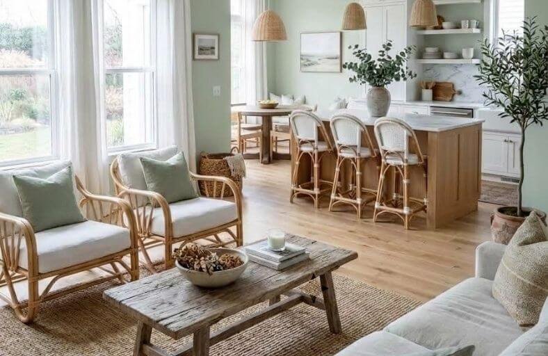
An open concept kitchen and living room presents a unique color challenge that enclosed rooms simply don’t share.
Every color choice is viewed simultaneously alongside every other, meaning nothing can be selected in isolation without considering how it reads as part of the whole.
The most successful open plan color schemes use a carefully considered palette of two or three complementary shades that create a sense of visual flow from one zone to the next while still allowing each area to feel purposefully defined.
Getting this balance right produces spaces that feel both expansive and cohesive.
These beautiful paint colors represent the most effective and visually harmonious options for open concept kitchen and living room spaces across every decorating style.
Technical Comparison of Elite Open-Concept Paint Hues
The following table synthesizes the technical parameters, undertones, and primary functional roles of twelve industry-standard paint colors engineered for open-concept residential applications.
| Brand | Color Name | Color Code / SKU | LRV (%) | Primary Undertone | Optimal Open-Concept Application |
|---|---|---|---|---|---|
| Benjamin Moore | Simply White | OC-117 | 89.5 | Subtle Warm Yellow | Continuous perimeter walls, bright open spaces |
| Sherwin-Williams | Agreeable Gray | SW 7029 | 60.0 | Soft Greige / Beige | Whole-home transitional wall anchor |
| Benjamin Moore | Chantilly Lace | OC-65 | 90.0 | Neutral Off-White | Modern monochromatic wall/trim drenching |
| Sherwin-Williams | Repose Gray | SW 7015 | 58.0 | Cool Greige / Purple | Grounding backdrop for high-glare environments |
| Sherwin-Williams | Alabaster | SW 7008 | 82.0 | Soft Creamy White | Warm modern farmhouse perimeter walls |
| Benjamin Moore | Revere Pewter | HC-172 | 55.6 | Balanced Taupe-Greige | Cozy open great rooms with high ceilings |
| Benjamin Moore | Hale Navy | HC-154 | 8.4 | Deep Maritime Blue | Focal kitchen islands and built-in media walls |
| Farrow & Ball | Green Smoke | No. 47 | 19.0 | Smoked Slate Green | Architectural cabinetry and focal accent zones |
| Behr | Blank Canvas | DC-003 | 84.0 | Soft Warm White | Organic, tranquil background for varied decor |
| Sherwin-Williams | Sea Salt | SW 6204 | 63.0 | Muted Blue-Green Gray | Zoned transition areas and coastal accents |
| Benjamin Moore | Edgecomb Gray | HC-173 | 63.0 | Almond Greige | Adaptable neutral across varying light exposures |
| Sherwin-Williams | Urbane Bronze | SW 7048 | 8.0 | Deep Bronze Brown | Grounding structural accents and fireplace surrounds |
Benjamin Moore Simply White (OC-117)
Benjamin Moore Simply White OC-117 serves as an exceptional warm off-white anchor for open-concept architecture.
Boasting a Light Reflectance Value (LRV) of 89.5, it maximizes ambient light distribution, allowing connected kitchen and living spaces to feel airy and expansive.
Its architectural utility stems from a subtle yellow undertone that introduces necessary warmth without appearing overly creamy or dated.
In open floor plans, Simply White resolves lighting discrepancies along continuous perimeter walls, preventing northern shadow zones from feeling chilly while keeping southern exposures crisp and soft.
It builds a cohesive canvas that bridges natural oak flooring, white quartzite countertops, and warm living room upholstery.
Sherwin-Williams Agreeable Gray (SW 7029)
Sherwin-Williams Agreeable Gray SW 7029 is a widely specified neutral hue in residential architecture.
Featuring an LRV of 60.0, it strikes a mid-tone balance that provides structural grounding without darkening large open volumes.
Its greige formulation, blending soft gray with warm beige, prevents sterile reads, making it ideal for continuous wall planes in open-concept layouts.
In open kitchens and adjoining Great Rooms, Agreeable Gray unifies visual transitions between dark stained cabinetry, stainless steel appliances, and upholstered living room furniture.
It adapts reliably across changing daylight cycles, maintaining a calm, cohesive backdrop throughout the day.
Benjamin Moore Chantilly Lace (OC-65)
Benjamin Moore Chantilly Lace OC-65 is a high-reflectance white valued for its exceptionally clean chromatic profile.
With an LRV of 90.04, it behaves nearly as a pure white, bouncing visible light across wide open floor plans.
Because it lacks strong green, blue, or yellow undertones, Chantilly Lace is favored in modern, Scandinavian, or contemporary layouts where clean color rendering and spatial clarity are critical.
When applied uniformly across walls, ceilings, and kitchen cabinetry, it eliminates visual breaks, expanding perceived room boundaries.
It pairs seamlessly with light ash flooring, black iron window frames, and vibrant accent artwork.
Sherwin-Williams Repose Gray (SW 7015)
Sherwin-Williams Repose Gray SW 7015 delivers a refined, quiet background tailored for contemporary open-concept homes.
Holding an LRV of 58.0, it is slightly cooler and deeper than Agreeable Gray, incorporating subtle purple and brown undertones that guard against flat or muddy appearances.
In open floor plans subject to strong natural light glare, Repose Gray tempers harsh reflections while establishing crisp contrast against bright white trim.
It excels when wrapped around living room walls that border painted kitchen islands, maintaining spatial flow while allowing darker accent colors to stand out.
Sherwin-Williams Alabaster (SW 7008)
Sherwin-Williams Alabaster SW 7008 is a widely specified warm off-white that balances cozy warmth with architectural sophistication.
Its 82.0 LRV reflects substantial ambient light without generating blinding glare, making it well-suited for high-ceilinged open-concept Great Rooms.
Alabaster carries a soft, creamy undertone that relaxes hard interior surfaces such as porcelain tile, quartz, and metal fixtures.
In open spaces designed around transitional or modern farmhouse aesthetics, Alabaster provides a calming background that visually ties together exposed timber beams, black metal hardware, and slipcovered furniture.
Benjamin Moore Revere Pewter (HC-172)
Benjamin Moore Revere Pewter HC-172 is a classic transitional greige designed to provide visual grounding across large open spaces.
With an LRV of 55.65, it sits in a comfortable medium-light range, making it effective for adding intimacy to wide or cavernous open floor plans.
Its balanced taupe-greige undertone adapts flexibly to both warm organic wood tones and cool natural stone.
Applied across connected living rooms and kitchens, Revere Pewter frames perimeter walls elegantly, framing light off-white cabinetry, dark wood flooring, and warm bronze architectural accents.
Benjamin Moore Hale Navy (HC-154)
Benjamin Moore Hale Navy HC-154 is a saturated maritime blue engineered for architectural contrast and spatial zoning.
Featuring an LRV of 8.36, its deep value absorbs light, creating striking focal points within open-concept layouts.
Rather than coating an entire open volume, designers specify Hale Navy for kitchen islands, built-in living room media centers, or accent walls.
This approach anchors specific functional zones within an open floor plan, establishing clear visual hierarchy against lighter surrounding walls while preserving an expansive feel throughout the space.
Farrow & Ball Green Smoke (No. 47)
Farrow & Ball Green Smoke No. 47 is a deeply atmospheric, smoked slate green that brings organic character into interior spaces.
With an LRV of 19.0, its gray-green pigment shifts character dynamically between daylight and evening light sources.
In an open-concept floor plan, Green Smoke functions exceptionally well on custom kitchen cabinetry, pantry doors, or living room accent features.
It creates an inviting anchor that visually connects indoor living zones to outdoor landscaping, pairing naturally with honed soapstone, warm butcher block, and unlacquered brass fittings.
Behr Blank Canvas (DC-003)
Behr Blank Canvas DC-003 is a soft warm white designed to build a serene atmosphere.
Its LRV of 84.0 provides excellent light bounce while its balanced warm undertone prevents harsh, sterile visual reads.
In open-concept spaces, Blank Canvas acts as a harmonizing neutral, softening hard architectural angles and unifying disparate design elements.
It functions effectively across connected living rooms and kitchens, serving as a flexible backdrop that accommodates evolving furniture and decor styles over time.
Sherwin-Williams Sea Salt (SW 6204)
Sherwin-Williams Sea Salt SW 6204 is a muted blue-green gray with an LRV of 63.0.
Renowned for its chameleon qualities, Sea Salt alternates between a subtle green and a soft gray-blue depending on light orientation and nearby materials.
In open-concept layouts, it offers a gentle method for introducing subtle color into living zones while maintaining harmony with neutral kitchen surfaces.
When specified for living room feature walls or kitchen splash zones, it delivers a coastal-inspired calm that complements white trim, marble counters, and light oak floors.
Benjamin Moore Edgecomb Gray (HC-173)
Benjamin Moore Edgecomb Gray HC-173 is an almond-greige that sits comfortably between soft beige and light gray.
Featuring an LRV of 63.0, it provides an ideal ratio of light reflection to subtle color depth.
In open-concept homes, Edgecomb Gray helps prevent large rooms from feeling washed out under intense direct sunshine, while maintaining cozy warmth during evening hours.
It bridges light kitchen cabinets with deeper living room textiles, establishing a smooth visual transition across shared open walls.
Sherwin-Williams Urbane Bronze (SW 7048)
Sherwin-Williams Urbane Bronze SW 7048 is a deep gray-brown with warm, grounded undertones.
Holding an LRV of 8.0, it acts as a bold structural accent in open-concept floor plans.
When specified for kitchen islands, trim framing, or living room fireplace surrounds, Urbane Bronze adds depth and focal weight, balancing lighter surrounding walls.
Its organic composure pairs naturally with raw wood beams, exposed stone, and metallic finishes, helping define functional zones within expansive interiors.
Strategic Spatial Zoning Matrix
The following matrix outlines color zoning recommendations and styling approaches across various open-concept architectural styles.
| Design Style | Primary Wall Anchor (High LRV) | Secondary Zone / Cabinet Color | Accent / Focal Feature | Recommended Decor Density |
|---|---|---|---|---|
| Modern Scandinavian | Chantilly Lace (OC-65) | Edgecomb Gray (HC-173) | Sea Salt (SW 6204) | Minimalist / Sparse: Clean lines, low-profile furniture, floating shelves. |
| Transitional American | Agreeable Gray (SW 7029) | Simply White (OC-117) | Hale Navy (HC-154) | Moderate / Layered: Tailored sofas, gallery walls, textured rugs. |
| Modern Farmhouse | Alabaster (SW 7008) | Repose Gray (SW 7015) | Urbane Bronze (SW 7048) | Dense / Rustic: Exposed wood, stone hearths, layered textiles. |
| Organic Contemporary | Blank Canvas (DC-003) | Revere Pewter (HC-172) | Green Smoke (No. 47) | High / Maximalist: Indoor plants, pottery collections, mixed metals. |
Technical Execution and Specification Guidelines
Executing a paint scheme across an open-concept layout requires managing technical variables that do not typically apply to enclosed, single-purpose rooms.
Because natural light moves across expansive open areas while artificial fixtures operate at varying color temperatures, specifications must account for sheen transitions, illumination sources, and physical color sampling.
Sheen Selection and Transition Management
In open-concept floor plans, functional requirements vary significantly between kitchen prep zones and living lounge areas.
Paint sheens must be selected to balance durability with visual consistency across continuous sightlines:
- Continuous Wall Surfaces: Specify Eggshell or Low-Lustre Velvet finishes for continuous perimeter walls spanning both kitchen and living zones. These sheens offer basic wipeability for kitchen splatters while minimizing surface glare across long living room walls.
- High-Impact Accent Zones: Utilize Satin or Semi-Gloss sheens exclusively on kitchen cabinetry, islands, trim, and built-in millwork. The higher resin content provides enhanced moisture and grease resistance while introducing subtle sheen contrast against matte perimeter walls.
- Ceiling Applications: Apply Flat / Dead Matte paint to ceilings across the entire open area. Flat paint absorbs overhead light bounce, masking drywall seams and preventing unwanted reflections from recessed kitchen downlights.
Lighting Harmonization and Physical Testing Protocols
Natural light orientation plays a pivotal role in color selection across sprawling floor plans.
North-facing windows admit cool, bluish daylight that can cause pale whites to look shadow-damp, making warmer hues such as Simply White OC-117 or Alabaster SW 7008 beneficial. South-facing exposures provide warm sunlight throughout the day, allowing cooler neutrals like Repose Gray SW 7015 or Chantilly Lace OC-65 to shine without reading cold.
Artificial color temperature integration requires careful planning where kitchen task lighting meets living room ambient lighting.
Cool-toned LED task lights (3500K–4000K) over kitchen counters brighten high-LRV surfaces, whereas warm living room lamps (2700K) pull out warm yellow or beige undertones.
Evaluating paint samples across both lighting conditions ensures the selected hue remains balanced day and night.
Architects and color consultants should mandate physical on-site testing before final paint application.
Applying large peel-and-stick samples (minimum 12″x12″) to multiple wall sections across kitchen and living zones allows designers to observe shifting undertones under dynamic daylight conditions.
Conclusion
Designing a successful color scheme for an open-concept kitchen and living room requires balancing reflective performance, chromatic undertones, and functional zoning.
High-LRV wall colors like Simply White, Alabaster, and Chantilly Lace establish bright perimeter foundations, while mid-tone greiges like Agreeable Gray and Revere Pewter bring unifying warmth across shared open spaces.
Introducing grounding accents like Hale Navy, Green Smoke, or Urbane Bronze on millwork and islands defines functional areas without interrupting visual flow.
By coordinating paint choices with natural lighting and sheen specifications, designers can transform open floor plans into cohesive, well-defined living environments.