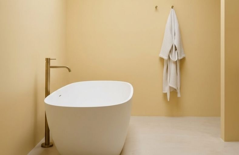
Choosing yellow for a bathroom is a decorating decision that rewards boldness, consistently delivering a space that feels more energetic, more personal, and more memorable than safer neutral alternatives.
Yellow has a unique ability to mimic the warming effect of natural sunlight, making it especially valuable in bathrooms that lack windows or receive limited daylight throughout the day.
The key to getting yellow right in a bathroom lies in identifying the specific tone that suits your space, warm golden yellows feel rich and grounding, while lighter lemon and cream shades keep the room feeling fresh and airy.
These perfect yellow paint colors will guide you toward the ideal shade for your bathroom’s unique character and lighting conditions.
Detailed Color Catalog and Structural Performance Metrics
To select the appropriate yellow formulation, you must analyze the physical properties of each pigment.
| Brand | Paint Color | Color Code | LRV | Primary Undertones | Recommended Design Style | Target Prompt Density |
|---|---|---|---|---|---|---|
| Benjamin Moore | Hawthorne Yellow | HC-4 | 71.33% | Soft gold, subtle gray | Classical, Historic | Minimalist & Simple |
| Benjamin Moore | Windham Cream | HC-6 | 79.78% | Cream, whisper of peach | Cottage, Farmhouse | Moderate & Balanced |
| Benjamin Moore | Soleil | AF-330 | 79.40% | Golden-white, soft beige | Transitional, Modern | Heavy & Layered |
| Sherwin-Williams | Butter Up | SW 6681 | 74.00% | Pure cream, soft gold | Contemporary, Warm | Low & Uncluttered |
| Sherwin-Williams | Friendly Yellow | SW 6680 | 76.00% | Pale yellow, mild gray | Clean Spa, Zen | Ultra-Minimalist |
| Sherwin-Williams | Morning Sun | SW 6672 | 80.25% | Light yellow, subtle gold | Traditional, Transitional | Extremely Heavy |
| Farrow & Ball | Babouche | No. 223 | 58.47% | Marigold, warm mustard | Bohemian, Bold Modern | Moderate & Graphic |
| Farrow & Ball | Dayroom Yellow | No. 233 | 75.00% | Soft gold, refreshing citrus | English Country | High & Dense |
| Farrow & Ball | Sudbury Yellow | No. 51 | 51.00% | Muted mustard, green | Rustic, Traditional | Heavy & Maximalist |
| Behr | Upbeat | P300-5 | 80.00% | Golden-peach, sun-yellow | Scandinavian, Coastal | Low & Functional |
| Behr | Bicycle Yellow | 370A-3 | 81.04% | Pure yellow, golden cast | Playful, Mid-Century | Moderate & Bright |
| Behr | Charismatic | PPU6-14 | 57.45% | Golden-beige, amber | Mediterranean, Earthy | High & Organic |
Benjamin Moore Hawthorne Yellow HC-4
The selection of Benjamin Moore’s Hawthorne Yellow HC-4 is highly celebrated for its exceptional color balance, making it a staple of traditional architectural restorations.
Possessing an LRV of 71.33, this shade strikes an ideal midpoint between high light reflectance and atmospheric color saturation.
Its distinguishing technical feature is a subtle gray undertone that suppresses any potential neon or acidic tendencies, anchoring the color in a mature, traditional context.
In residential bathroom design, Hawthorne Yellow provides a sunny yet sophisticated aura.
It performs exceptionally well in formal powder rooms or guest bathrooms with extensive millwork, where it contrasts elegantly against crisp white trim and polished brass fixtures.
It is highly stable under direct natural light, which coaxes out its rich golden base, and retains a comforting, non-aggressive presence under artificial warm LED illumination.
Benjamin Moore Windham Cream HC-6
For bathrooms requiring a delicate touch of light rather than an overt yellow statement, Benjamin Moore’s Windham Cream HC-6 serves as an exceptional architectural solution.
This shade is classified as a luscious, sunlit cream that carries a distinct whisper of peach and a soft yellow-beige undertone.
With a high LRV of 79.78, it operates primarily as a warm, cozy neutral rather than a saturated yellow, reading as highly muted and gentle.
This structural composition makes it highly effective in compact guest bathrooms or alcoves where a standard stark white would feel clinical and cold.
The subtle peach and gold undertones are highly flattering to human skin tones when reflected in mirrors.
It pairs beautifully with natural oak elements, oil-rubbed bronze plumbing, and warm off-white trim.
Benjamin Moore Soleil AF-330
Part of the sophisticated Affinity Collection, Benjamin Moore’s Soleil AF-330 is specifically formulated to paint a picture of gentle, golden light filtering through soft, low-contrast clouds.
Its high LRV of 79.40 ensures that it acts as a massive spatial amplifier, drawing light deep into tight corners without ever appearing stark.
Soleil exhibits a highly refined, low-chroma yellow-beige base that reads as a tranquil, warm cream under cool daylight conditions.
This makes it an ideal choice for compact ensuite bathrooms, where it can easily interface with cool Carrara marble surfaces, polished nickel, or warm off-white accents such as Mascarpone.
Its ability to maintain its soft, golden character without shifting into an acidic or green-leaning hue makes it highly reliable in spaces utilizing both natural window light and warm artificial fixtures.
Sherwin-Williams Butter Up SW 6681
Sherwin-Williams’ Butter Up SW 6681 is a pure, creamy yellow that immediately warms a space, designed to introduce a cheerful, inviting energy without overshooting the runway in saturation.
Exhibiting an LRV of 74, this shade possesses outstanding light-reflecting capabilities that actively work to brighten dimly lit or windowless bathroom interiors.
Butter Up avoids the cold, sharp quality of lemon-based paints, leaning instead into a soft, golden-cream spectrum that provides a cozy, wrapped feeling.
In bathroom applications, this color performs exceptionally well when contrasted against cool, crisp gray tile floors or modern black steel hardware.
This juxtaposition balances the visual temperature of the room, preventing the yellow from becoming too sweet or cloying, while maintaining a luminous and open atmosphere.
Sherwin-Williams Friendly Yellow SW 6680
Sherwin-Williams’ Friendly Yellow SW 6680 is a soft, interior-only paint color formulated to deliver a gentle drop of sunshine with a high degree of sophisticated restraint.
Featuring an LRV of 76, it operates on the lighter end of the yellow spectrum, utilizing mild gray undertones to systematically mute its vibrancy.
This gray integration prevents the yellow from becoming garish or overly intense, ensuring it behaves in a friendly, approachable manner even when applied across all four walls.
Under intense daylight, Friendly Yellow softens further, shifting into a highly luminous, warm pastel cream.
In residential bathroom design, this color provides a serene, spa-like backdrop that pairs elegantly with soft gray stone, natural white oak cabinets, and brushed brass fixtures.
Sherwin-Williams Morning Sun SW 6672
Sherwin-Williams’ Morning Sun SW 6672 is a highly reflective, airy yellow designed to mimic the gentle, lighthearted illumination of a soft sunrise.
Boasting an LRV of 80.25, it sits in the upper tier of light-reflectance values, functioning almost as a warm, luminous off-white with a soft gold core.
The color is built with a slight gray undertone that prevents it from looking overly bold or saturated, resulting in a calm, soothing ambiance.
In bathroom environments, Morning Sun is highly effective at neutralizing shadows and giving windowless spaces a bright, airy feeling.
It coordinates gracefully with classic warm white trim, marble details, and brushed nickel hardware, offering a highly versatile neutral-adjacent base that elevates both traditional and modern designs.
Farrow & Ball Babouche No. 223
Named after the iconic leather slippers worn by men in Morocco, Farrow & Ball’s Babouche No. 223 is an exotic, bohemian yellow that delivers a joyful yet highly dignified aesthetic.
With an LRV of 58.47, it represents a rich mid-tone yellow packed with dense, high-quality pigments that react spectacularly to changing natural and artificial light.
Babouche avoids the harsh, synthetic quality of modern bright yellows, offering instead a sumptuous, deep golden warmth that makes a room feel instantly spacious and illuminated.
In master bathroom designs, Babouche is beautifully deployed on accent features, such as custom vanity cabinetry or framed partition walls, especially when paired with a deep graphite black like Railings.
This contrast creates a highly curated, opulent environment that is both modern and timeless.
Farrow & Ball Dayroom Yellow No. 233
Farrow & Ball’s Dayroom Yellow No. 233 is a classic, uncomplicated bright yellow designed to channel the invigorating warmth of a sun-drenched day.
A delicate, soft gold undertone provides a subtle summer glow that illuminates bathroom walls without the risk of looking overly sharp or clinical.
With an LRV of approximately 75, it functions as a highly effective light-reflecting agent, making it ideal for morning ensuite bathrooms where an energizing, hopeful environment is desired.
Dayroom Yellow is highly stimulating, actively revitalizing dark, shadowed spaces.
To ground its optimistic energy, architectural designers recommend pairing it alongside crisp, clean white wainscoting and polished chrome fixtures, which balance the warmth with a touch of cool, modern structure.
Farrow & Ball Sudbury Yellow No. 51
Farrow & Ball’s Sudbury Yellow No. 51 is a muted, sophisticated mid-yellow named after the historic staircase at Sudbury Hall, where it was famously applied to create a highly refined, established feel.
Possessing an LRV of 51, this shade is built with a distinct underlying green pigment that strips away any raw brightness, leaving a soft, earthy ochre cast.
Sudbury Yellow is exceptionally responsive to light shifts, appearing as a clean, cheery yellow in bright, sun-flooded bathrooms and settling into a quiet, warm mustard in dimly lit half-baths.
This chameleon-like behavior makes it an excellent choice for rustic or historically restored bathrooms, pairing beautifully with natural terracotta tiles, unlacquered brass, and muted off-white trim.
Behr Upbeat P300-5
Behr’s Upbeat P300-5 is a highly luminous, unapologetically cheerful yellow designed to act as an instant dose of visual energy for quiet, dark floor plans.
Boasting a remarkably high LRV of 80, this paint behaves as an aggressive spatial amplifier, bouncing natural and artificial light from wall to wall to make compact bathrooms feel airy and expansive.
Structurally, Upbeat features a hidden golden-peach micro-nuance beneath its surface, which acts as a protective buffer to prevent the color from reading as a harsh, synthetic neon.
In residential bathrooms, it functions beautifully to counteract cool, indirect light in north-facing rooms.
When paired with clean white trim, light oak wood elements, and brushed nickel hardware, it forms a radiant, highly inviting environment.
Behr Bicycle Yellow 370A-3
Behr’s Bicycle Yellow 370A-3 is a light, warm yellow that exhibits an open, sun-filled golden cast and a high degree of clear chroma.
With an LRV of 81.04, it sits at the absolute pinnacle of light-reflecting capability, ensuring a clean, vibrant appearance on finished bathroom walls.
Unlike some yellows that can shift toward a muddy or green cast in cool light, Bicycle Yellow maintains its pure, joyful character across various lighting conditions.
This clarity makes it highly recommended for cheerful children’s bathrooms or relaxed, coastal-inspired powder rooms.
When paired with stark white subway tile, maritime blue accents, and simple light-toned wooden storage, it creates an atmosphere that feels incredibly fresh, clean, and filled with natural light.
Behr Charismatic PPU6-14
Behr’s Charismatic PPU6-14 is a highly refined golden-beige that operates on the softer, more comforting side of the yellow spectrum.
With an LRV of 57.45, it functions as a grounded, mid-depth neutral that replaces the sharp energy of bright yellows with a warm, amber-toned glow.
Its color structure relies heavily on a soft beige-tan foundation, ensuring it reads like natural sandstone or aged plaster on bathroom walls.
This makes Charismatic an exceptional choice for modern master bathrooms, where it coordinates beautifully with textured linen fabrics, dark walnut vanities, and unlacquered brass hardware.
It wraps the bathroom in an enveloping, spa-like warmth that is highly stable under both natural daylight and warm artificial illumination.
Spatial and Chromatic Dynamics of Yellow in Wet Spaces
Implementing yellow paint in a bathroom requires an understanding of how light interacts with pigment chemistry.
Bathrooms are unique because they contain a high density of non-porous, reflective surfaces.
The physical performance of these paints can be modeled by the simplified light distribution equation, illustrating how high-LRV pigments amplify ambient light:
Reflected = Incident × LRV
Under this mechanism, a paint with an LRV of 80 (such as Behr Upbeat) will reflect 80% of the incident light, aggressively bouncing it across reflective porcelain and glass to make a compact layout feel substantially larger.
Conversely, a lower-LRV paint like Sudbury Yellow (LRV 51) absorbs more light, drawing the walls inward to cultivate a cozy, historic intimacy.
The color’s performance is heavily influenced by the spatial orientation of the room and the character of the incoming light:
- North-Facing Bathrooms: These spaces receive cool, blue-tinted, indirect daylight throughout the day. Under these conditions, cooler or green-based yellows can appear dull, muddy, or slightly green. To counteract this effect, architects should specify yellows with strong orange, peach, or golden undertones, such as Behr Upbeat or Benjamin Moore Windham Cream, which inject synthetic warmth and balance the cool light.
- South-Facing Bathrooms: These rooms are flooded with warm, direct, golden midday sun. This intense light acts as a magnifying glass for yellow pigments, often causing soft yellows to read as highly saturated and intense. In south-facing baths, a highly saturated paint can quickly become visually exhausting. Designers should opt for muted, gray-stabilized yellows like Benjamin Moore Hawthorne Yellow or Sherwin-Williams Friendly Yellow, which utilize cool undertones to temper the natural golden glare.
- East-Facing Bathrooms: These spaces experience bright, warm light in the early morning and cool shadow in the afternoon. A balanced yellow like Sherwin-Williams Morning Sun is ideal here, as its subtle gold core shines beautifully during morning grooming routines and settles into a calm, soft off-white as the room transitions to shadow later in the day.
- West-Facing Bathrooms: These interiors receive cool, indirect light in the morning and intense, fiery orange-gold light at sunset. A highly saturated yellow will appear incredibly intense during the late afternoon. To maintain a peaceful environment, soft cream-yellows or golden-beiges like Behr Charismatic or Benjamin Moore Windham Cream are highly recommended.
Architectural Implementation and Lighting Considerations
Beyond natural light, the selection of artificial light fixtures and surrounding materials dictates whether a yellow bathroom reads as a high-end designer space or a dated interior. The Correlated Color Temperature (CCT) of bathroom light bulbs is critical:
- Cool White LED Bulbs (4000K+): These light sources emit a crisp, blue-leaning spectrum that flattens the natural warmth of yellow paint, often forcing complex ochres and golds to shift toward a harsh, clinical, or green-leaning lemon hue.
- Warm White Bulbs (2700K – 3000K): These bulbs emit a rich, red-yellow spectrum that aligns with the warm undertones of the paint, bringing out golden-peach and amber micro-nuances to create a comforting, candle-lit glow after sunset. Architects should specify high Color Rendering Index (CRI) bulbs (≥90) to ensure the yellow pigments retain their true, complex color profiles under artificial illumination.
The choice of trim paint and hard finishes is the final, decisive factor in balancing a yellow color scheme.
Placing a bright, cool, blue-white trim paint next to a warm yellow wall creates a jarring contrast that can make the yellow look dirty or dated.
Instead, designers should specify warm, creamy off-whites, such as Benjamin Moore White Dove or Farrow & Ball New White, to achieve a soft, sophisticated transition.
For hard finishes, warm yellows are beautifully grounded by natural white oak, walnut, or unlacquered brass hardware, which complement the paint’s golden undertones.
To balance the visual temperature in rooms painted in highly saturated shades like Farrow & Ball Babouche, introducing cool, highly textured materials, such as matte charcoal concrete tiles, slate countertops, or matte-black plumbing fixtures, provides structural contrast, ensuring the final design feels balanced, intentional, and highly refined.