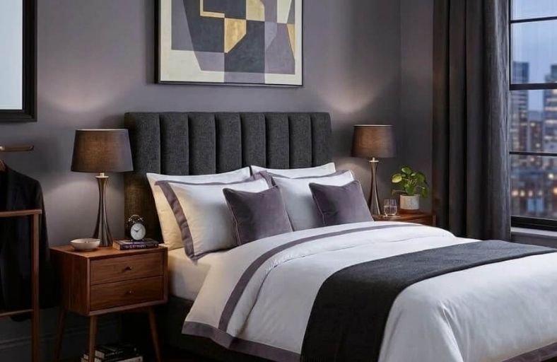
Purple bedroom paint colors occupy a uniquely magical position on the color spectrum, blending the calming qualities of blue with the warmth, and energy of red to produce shades that feel simultaneously soothing and visually rich.
From the softest barely-there lavenders that bring a dreamy, ethereal quality to a bedroom to deep, saturated plums and eggplant tones that wrap the space in luxurious, enveloping warmth, the purple family offers an extraordinary range of moods and aesthetics for bedroom decorating.
Purple also has a well-documented association with relaxation and creativity, making it a genuinely inspired choice for a sleeping space.
These beautiful purple paint colors will help you find the perfect shade for your bedroom transformation.
| Paint Brand | Exact Paint Name & Number | LRV | Primary Undertone | Recommended Spatial Application |
|---|---|---|---|---|
| Benjamin Moore | Shadow (2117-30) | 9.30 – 9.85 | Charcoal Amethyst | Moody primary suites; South or West exposures |
| Benjamin Moore | Victorian Purple (1370) | 35.00 | Warm Rose-Violet | Transitional guest rooms; East or South light |
| Benjamin Moore | Spring Purple (2070-40) | 26.00 | Periwinkle Violet | Restful bedrooms; High natural light spaces |
| Benjamin Moore | Dark Purple (2073-10) | 6.30 | Blackened Aubergine | High-contrast accent walls; Low-light suites |
| Benjamin Moore | Purple Haze (1413) | 23.46 | Smoky Gray-Plum | Tailored contemporary bedrooms; Any orientation |
| Sherwin-Williams | Thistle (SW 6283) | 30.18 | Dusty Rose-Mauve | Airy traditional bedrooms; North or East exposures |
| Sherwin-Williams | Exclusive Plum (SW 6263) | 16.00 – 16.37 | Cool Gray-Violet | Refined modern sanctuaries; Warm lighting schemes |
| Sherwin-Williams | Blackberry (SW 7577) | 4.81 | Deep Berry-Burgundy | Dramatic dark-themed bedrooms; Evening spaces |
| Sherwin-Williams | Poised Taupe (SW 6039) | 21.96 | Earthen Clay-Violet | Organic Japandi or neutral bedrooms; Any lighting |
| Farrow & Ball | Brassica (No. 271) | ~18.00 | Blackened Lavender-Grey | Demure heritage spaces; North-facing rooms |
| Farrow & Ball | Pelt (No. 254) | ~5.00 | Saturated Dark Plum | Dramatic theatrical primary suites; Evening rooms |
| Farrow & Ball | Brinjal (No. 222) | 5.84 | Warm Eggplant Red-Violet | Historic luxury suites; Cozy reading bedrooms |
Benjamin Moore Shadow (2117-30)
Benjamin Moore Shadow (2117-30) is a complex, low-LRV purple measuring between 9.30 and 9.85 that absorbs substantial light to foster a moody, enveloping environment.
Its rich amethyst base incorporates underlying charcoal pigments, allowing the paint to transition smoothly between deep violet and soft graphite depending on illumination angles.
Shadow performs best on full primary bedroom walls or as an accent wall behind an upholstered bed, pairing seamlessly with polished brass hardware, natural walnut cabinetry, and warm off-white trim.
Benjamin Moore Victorian Purple (1370)
Registering an LRV of 35.00, Benjamin Moore Victorian Purple (1370) is a bright mid-tone paint with a distinctive rose-violet character.
The warmth of its red undertones prevents the space from feeling sterile, making it a fitting choice for transitional or vintage-inspired guest bedrooms.
Victorian Purple maintains visual clarity under natural sunlight while coordinating harmoniously with creamy trim colors, floral linen drapery, and warm honey-toned oak flooring.
Benjamin Moore Spring Purple (2070-40)
Benjamin Moore Spring Purple (2070-40) possesses an LRV of 26.00 and leans toward cool blue and periwinkle undertones.
This cooler formulation exerts a soothing optical effect, making it exceptionally effective for south-facing bedrooms where intense midday sun can overheat redder pigments.
Its balanced saturation expands smaller spaces visually without sacrificing cozy atmospheric depth.
Benjamin Moore Dark Purple (2073-10)
With a very low Light Reflectance Value of 6.30, Benjamin Moore Dark Purple (2073-10) is a dense, near-black aubergine.
Its heavy pigment load and muted plum bias create an intimate, sanctuary-like quality in low-light environments.
Because deep saturated paints emphasize wall surface imperfections, applying Dark Purple in a flat or matte sheen ensures an even visual finish free of specular glare.
Benjamin Moore Purple Haze (1413)
Benjamin Moore Purple Haze (1413) is a smoky, slate-infused purple with an LRV of 23.46.
Its heavy gray wash neutralizes visual intensity, rendering it a versatile neutral alternative for homeowners seeking understated color.
Purple Haze responds dynamically to lighting variations, appearing refined and gray-dominant under cool lighting while uncovering soft plum nuances under warm incandescent light.
Sherwin-Williams Thistle (SW 6283)
Sherwin-Williams Thistle (SW 6283) is a charming, dusty rose-mauve with an LRV of 30.18.
Its balanced mix of red, violet, and gray yields an uplifting backdrop suitable for traditional or cottagecore bedroom concepts.
Thistle pairs exceptionally well with charcoal accents like SW Inkwell or crisp white architectural trims, establishing a grounded contrast that highlights its soft luminescence.
Sherwin-Williams Exclusive Plum (SW 6263)
Sherwin-Williams Exclusive Plum (SW 6263) is a cool, gray-violet hue with an LRV of 16.00 to 16.37.
Formulated with subtle reddish-gray undertones, Exclusive Plum offers a sophisticated, spa-like atmosphere suitable for modern primary bedrooms.
It balances masculine gray tones with feminine violet depth, matching seamlessly with matte black fixtures, warm leather upholstery, and brushed metallic elements.
Sherwin-Williams Blackberry (SW 7577)
Sherwin-Williams Blackberry (SW 7577) is a deep, saturated berry-burgundy shade featuring an ultra-low LRV of 4.81.
Rich in crimson and violet pigments, Blackberry delivers intense cocooning warmth in nocturnal bedroom settings.
When combined with heavy velvet textiles, brass lighting, and warm ivory trim like SW Vanillin, it creates a luxurious, high-contrast environment.
Sherwin-Williams Poised Taupe (SW 6039)
Sherwin-Williams Poised Taupe (SW 6039) bridges the gap between earthen brown and conservative gray, supported by a distinct violet undertone and an LRV of 21.96.
This hybrid color acts as an organic anchor for Japandi or transitional design aesthetics.
The purple undertone subtly emerges in warm daylight, providing an intriguing depth that standard greige paints cannot achieve.
Farrow & Ball Brassica (No. 271)
Farrow & Ball Brassica (No. 271) is a sophisticated lavender-grey formulated with underlying black pigments.
In brightly lit spaces, Brassica reveals a soft, feminine lavender appearance, whereas in dimmer lighting or North-facing bedrooms, the black pigment asserts itself, shifting the color into a demure, moody slate-plum.
It integrates seamlessly with chalky off-whites like F&B Skimming Stone.
Farrow & Ball Pelt (No. 254)
Farrow & Ball Pelt (No. 254) is a deeply saturated dark aubergine with an ultra-low Light Reflectance Value (~5.00) that absorbs light aggressively.
This pigment-rich paint reads almost as a shadowy black with rich violet highlights when direct light strikes its surface.
Pelt is ideal for high-end theatrical bedroom suites, creating an opulent atmosphere when paired with glossy trim or high-contrast marble accents.
Farrow & Ball Brinjal (No. 222)
Inspired by the glossy skin of ripe eggplants, Farrow & Ball Brinjal (No. 222) is a warm aubergine with an LRV of 5.84.
Rich in red undertones, Brinjal brings physical warmth and architectural weight to a room.
Applying Brinjal in Full Gloss on woodwork alongside Dead Flat walls yields an elevated tonal sheen contrast that enhances standard bedroom geometry.
Environmental Lighting Dynamics and Color Performance
The visual success of a purple paint formulation depends on natural solar orientation, artificial lighting color temperatures, and sheen selection.
Because purple spans both cool (blue) and warm (red) spectral bands, shifts in ambient light alter the perceived color balance dramatically.
In cool, indirect North-facing light, purple paints lose visual warmth and lean heavily into their blue and gray bases.
Under these conditions, low-chroma lavenders can look cold or washed out.
To offset cool northern light, selecting red-based purples like Benjamin Moore Victorian Purple or Farrow & Ball Brinjal restores visual balance.
Conversely, warm South-facing daylight amplifies yellow and red wavelengths, bringing out the vibrant violet tones in deeper shades like Benjamin Moore Shadow and Sherwin-Williams Exclusive Plum.
Artificial lighting schemes must be planned carefully alongside paint selection.
Incandescent bulbs and warm LEDs (2700K) draw out red-violet pigments, enhancing the cozy, enveloping qualities of dark aubergines.
Neutral daylight LEDs (3000K to 3500K) render purple formulations most accurately, maintaining the intended balance between red and blue components.
Cool daylight bulbs (4000K and above) exaggerate blue and charcoal grounds, which can flatten warm purples into dull grays.
Surface sheen also governs color depth and light interaction.
Low sheen finishes like flat and matte absorb light evenly across the surface, concealing drywall imperfections and creating a smooth, velvety finish ideal for low-LRV shades.
Higher sheens like eggshell and satin reflect light, making them suitable for mid-tone lavenders in high-use rooms where washability is required.
Architectural Implementation Guidelines
Executing a purple bedroom color scheme requires adjusting paint choices to match spatial proportions and lighting conditions.
In compact bedrooms with limited window area, applying lighter, high-LRV shades such as Sherwin-Williams Thistle or Benjamin Moore Spring Purple preserves room brightness while adding soft, restful color.
Alternatively, designers can embrace compact room boundaries by applying saturated low-LRV purples like Sherwin-Williams Blackberry or Benjamin Moore Dark Purple across all walls, trims, and ceilings.
This monochrome technique blurs spatial corners, creating an intentionally cozy, dark sanctuary.
For expansive primary suites featuring generous natural light, mid-to-dark tones such as Benjamin Moore Shadow or Sherwin-Williams Exclusive Plum establish refined elegance.
Pairing these rich hues with crisp white trim colors like Benjamin Moore Chantilly Lace OC-65 or Sherwin-Williams Pure White SW 7005 frames the wall color cleanly, resulting in a balanced bedroom environment conducive to rest.