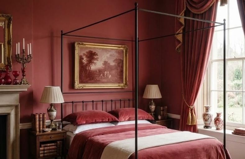
Choosing red for a bedroom paint color is a decision that demands a little courage but delivers results that are consistently stunning and deeply personal.
Red has a long history of association with warmth, passion, and intimacy, qualities that translate beautifully into a bedroom environment when the right shade and tone are selected carefully.
The red family spans an impressive range from soft, dusty rose-reds and warm terracottas to rich crimson and deep burgundy tones that wrap a bedroom in a sense of enveloping warmth.
These beautiful red paint colors will help you navigate the full spectrum of red bedroom options and find the shade that suits your space and personal style perfectly.
Technical Specifications and Chromatic Profiles
Evaluating the technical characteristics of premium red paint options is essential for anticipating their behavior on vertical drywall, plaster, and decorative woodwork.
Light Reflectance Value measures the percentage of visible light reflected by a painted surface on a scale from 0% (absolute black) to 100% (pure white).
Reds generally fall between an LRV of 5 and 20, designating them as light-absorbing, atmospheric colors that draw walls inward to foster warmth and comfort.
| Brand Name | Paint Color & Code | LRV | Dominant Undertone | Recommended Orientation |
|---|---|---|---|---|
| Benjamin Moore | Caliente AF-290 | 8.82 | Warm Brown / Crimson | North-facing & Low Light |
| Benjamin Moore | Dinner Party AF-300 | 8.43 | Deep Wine / Black | East / South-facing |
| Benjamin Moore | Heritage Red HC-181 | 10.26 | True Ruby / Crimson | Universal / Accent Walls |
| Sherwin-Williams | Red Barn SW 7591 | 9.00 | Brown / Earthy Rust | South-facing & Bright Light |
| Sherwin-Williams | Rookwood Red SW 2802 | 6.50 | Deep Maroon / Charcoal | Evening / Dim Lighting |
| Sherwin-Williams | Cayenne SW 6881 | 19.56 | Saturated Red-Orange | West-facing & Compact Spaces |
| Farrow & Ball | Rectory Red No. 217 | 11.50 | Black Pigment / Damson | Transitional / Multi-Light |
| Farrow & Ball | Eating Room Red No. 43 | 10.00 | Muted Burgundy / Violet | North / Evening Accent |
| Farrow & Ball | Preference Red No. 297 | 8.00 | Dark Magenta / Plum | Color-Drenched Suites |
| Behr | Red Pepper PPU2-02 | 7.50 | Saturated Ruby / Dark Red | Modern Accent Walls |
| Valspar | Cut Ruby 1009-4 | 6.18 | Deep Ruby / Yellow-Brown | Low-Light Sanctuary Suites |
Benjamin Moore Caliente AF-290
Benjamin Moore Caliente AF-290 stands as a vibrant, charismatic red defined by subtle warm brown and crimson undertones.
Celebrated for its dynamic energy, Caliente provides an invigorating yet surprisingly livable atmosphere in residential sleeping spaces.
In primary bedrooms, this shade adds confidence and warmth, performing exceptionally well in rooms exposed to cool northern daylight where its warm base counters dreary undertones.
The subtle brown undertone anchors the fiery surface hue, preventing visual fatigue while creating an enveloping backdrop during evening hours.
When paired with crisp alabaster moldings or soft greige textiles such as Benjamin Moore Wish AF-680, Caliente strikes a harmonious balance between classical elegance and modern vitality.
The resulting environment feels elevated and cozy, making it a staple selection for high-end residential interiors seeking atmospheric distinction.
Benjamin Moore Dinner Party AF-300
Benjamin Moore Dinner Party AF-300 represents a deep, understated red infused with sophisticated black and wine undertones.
Formulated to generate an intimate, moody ambience, this shade absorbs excess ambient light, making it suited for turning large bedrooms into tranquil sanctuaries.
With a low Light Reflectance Value of 8.43, Dinner Party serves as an ideal backdrop for dark walnut furniture, muted brass sconces, and plush velvet drapery.
Under low-kelvin incandescent lighting, its rich wine notes surface, giving the room a cocoon-like quality.
Interior designers specify Dinner Party alongside soft neutral trims such as Benjamin Moore Steam AF-15 to maintain gentle architectural definition without disrupting the room’s cohesive depth.
Its refined balance of warmth and darkness ensures the bedroom remains conducive to deep rest.
Benjamin Moore Heritage Red HC-181
Benjamin Moore Heritage Red HC-181, an anchor of the brand’s Historical Color collection, offers a classic ruby shade balanced by crimson undertones.
Possessing an LRV of 10.26, it reflects slightly more light than deeper maroons, allowing architectural millwork, picture rails, and crown moldings to retain clear definition.
Heritage Red excels in traditional homes where period woodwork demands historical authenticity.
The color responds fluidly to transitions in natural daylight, exhibiting a vibrant ruby clarity in morning sun before settling into a grounded crimson under lamplight.
When combined with vintage gilded accents, warm wood finishes, or muted grey-green trims like Benjamin Moore Ashley Gray HC-87, Heritage Red provides a sophisticated visual anchor that elevates primary suites into regal retreats.
Sherwin-Williams Red Barn SW 7591
Sherwin-Williams Red Barn SW 7591 is an earthy, grounded red characterized by strong brown and rust undertones.
Drawing inspiration from traditional American architectural heritage, this hue translates into bedroom interiors as a warm, comforting shade devoid of harsh brightness.
Its lower LRV of 9.0 and muted chroma allow it to absorb strong south-facing natural light without washing out or glaring.
Red Barn harmonizes effortlessly with organic materials including raw oak furniture, unbleached linen textiles, jute floor coverings, and matte black iron accents.
The color brings an authentic rustic charm to modern farmhouses and mountain retreats alike, creating an inviting sanctuary that feels deeply rooted in nature.
Sherwin-Williams Rookwood Red SW 2802
Sherwin-Williams Rookwood Red SW 2802 is an opulent, historic dark red originating from early 20th-century Arts and Crafts design palettes.
Grounded by dark maroon and charcoal undertones, this shade features a low LRV of 6.50, placing it among the most light-absorptive interior reds available.
In primary suites, Rookwood Red builds an enveloping environment that highlights dark cherry, mahogany, and stained oak millwork.
When applied in a color-drenched style across walls, trim, and doors in a uniform low-sheen finish, Rookwood Red blurs spatial boundaries to foster a serene, cocooning sleeping atmosphere.
Paired with aged brass hardware and woven tapestry accents, this shade delivers an atmosphere of timeless craftsman luxury.
Sherwin-Williams Cayenne SW 6881
Sherwin-Williams Cayenne SW 6881 is a warm, high-chroma orange-red that infuses bedrooms with Mediterranean warmth and vitality.
Featuring an LRV of 19.56, Cayenne reflects considerably more ambient light than deeper burgundy shades, making it an excellent choice for compact bedrooms or spaces with limited daylight exposure.
Its terracotta-leaning undertones prevent the shade from feeling cold or aggressive, establishing an inviting ambient glow as daylight shifts throughout the day.
Cayenne pairs seamlessly with woven rattan headboards, clay ceramics, warm brass fixtures, and soft off-white trim shades like Sherwin-Williams Naturel SW 7542.
This shade adds a playful yet refined energy that breathes life into contemporary and bohemian spaces.
Farrow & Ball Rectory Red No. 217
Farrow & Ball Rectory Red No. 217 is a theatrical, velvet-like red formulated with a dark pigment base that creates remarkable visual depth.
The color responds dynamically to changing light conditions, appearing as a vibrant classic red under direct daylight before shifting into a rich damson under evening lamps.
Designed to make a sophisticated architectural statement, Rectory Red is particularly well suited for historic or high-ceilinged bedrooms adorned with intricate plasterwork.
When contrasted against chalky white trims like Farrow & Ball Wimborne White or soft plaster pinks, Rectory Red delivers a striking balance of drama and classic refinement.
Its rich pigment load ensures an extraordinary finish in ultra-matte formulations.
Farrow & Ball Eating Room Red No. 43
Farrow & Ball Eating Room Red No. 43 is a historic, muted burgundy with subtle violet and terracotta undertones.
Formulated to replicate aging historic pigments, this shade reads almost as a warm, rich neutral in dim lighting, making it a peaceful selection for bedroom walls.
Its muted character eliminates harsh visual glare, allowing it to integrate smoothly with aged pine furniture, dusty rose velvet bedding, and soft grey-tinted trim colors.
Eating Room Red excels in north-facing sleeping quarters where its underlying red warmth counteracts cool, blue natural light.
The result is an understated, sophisticated retreat that feels both historic and timelessly elegant.
Farrow & Ball Preference Red No. 297
Farrow & Ball Preference Red No. 297 stands as the deepest, richest red in the manufacturer’s palette, defined by strong dark magenta and plum undertones.
Engineered for maximum visual saturation, Preference Red creates an enveloping cocooning effect when used across all four walls and woodwork in a primary bedroom.
It absorbs ambient light readily, making it an outstanding option for evening-focused bedrooms that prioritize rest and intimacy.
Combined with dark charcoal architectural accents, aged brass hardware, and heavy velvet drapery, Preference Red delivers an atmosphere of uncompromised luxury.
Its complex undertones shift beautifully under lamplight, fostering an inviting night-time sanctuary.
Behr Red Pepper PPU2-02
Behr Red Pepper PPU2-02 is a deep, saturated ruby red formulated for strong coverage and intense color expression.
Combining rich crimson hues with subtle dark undertones, Red Pepper makes a confident architectural statement in contemporary residential spaces.
In modern bedrooms, it functions exceptionally well as a focal accent wall behind a low-profile headboard, delivering dramatic impact without visual clutter.
When paired with smooth concrete textures, alabaster trims, and matte black metal fixtures, Red Pepper introduces controlled modern energy.
Its high-opacity formula ensures smooth color application, making it a versatile paint selection for defining structural features within master suites.
Valspar Cut Ruby 1009-4
Valspar Cut Ruby 1009-4 is a dark, jewel-toned ruby red featuring subtle yellow-brown undertones that soften its overall intensity.
Possessing an LRV of 6.18, Cut Ruby absorbs ambient illumination to form a quiet, enclosed sanctuary ideal for nighttime rest.
Its balanced pigment composition prevents it from leaning excessively purple or pink, ensuring a rich, pure ruby presence on vertical surfaces.
Cut Ruby coordinates beautifully with warm off-white trims such as Valspar Cream Delight 7002-14, cognac leather lounge seating, and polished gold architectural fittings.
This shade provides a sophisticated option for homeowners seeking a traditional jewel-box bedroom experience.
Architectural Trim and Material Selection Matrix
Achieving visual harmony with red bedroom walls requires pairing paint selections with complementary millwork finishes, flooring materials, hardware metals, and textile tones.
Warm rust and terracotta reds blend naturally with organic woods and matte finishes, whereas cool crimson and ruby shades perform best alongside polished metals, marble, and crisp architectural whites.
| Wall Paint Selection | Recommended Trim Match | Secondary Palette Accents | Hardware & Metal Finishes | Wood Tone Compatibility |
|---|---|---|---|---|
| BM Caliente AF-290 | BM Frostine AF-5 | Charcoal, Greige, Warm Stone | Matte Black, Antique Brass | Light Ash, Natural Oak |
| BM Dinner Party AF-300 | BM Steam AF-15 | Sag Harbor Gray, Warm Taupe | Muted Satin Brass, Bronze | Dark Walnut, Espresso |
| BM Heritage Red HC-181 | BM Ashley Gray HC-87 | Soft Fossil, Cream White | Gilded Gold, Polished Brass | Carved Mahogany, Cherry |
| SW Red Barn SW 7591 | SW Sashay Sand SW 6051 | Reddened Earth, Muted Sage | Blackened Steel, Cast Iron | Raw Edge Oak, Reclaimed Pine |
| SW Rookwood Red SW 2802 | SW Renwick Beige SW 2805 | Downing Straw, Shutter Green | Aged Pewter, Oil-Rubbed Bronze | Stained Dark Oak, Teak |
| SW Cayenne SW 6881 | SW Naturel SW 7542 | Blushing Peach, Jade Green | Warm Polished Brass, Copper | Honey Teak, Woven Rattan |
| F&B Rectory Red No. 217 | F&B Wimborne White No. 239 | Middleton Pink, Lulworth Blue | Polished Chrome, Slender Gold | Ebonized Wood, Painted Pine |
| F&B Eating Room Red No. 43 | F&B Dimity No. 2008 | Pink Ground, Muted Olive | Antique Brass, Brushed Nickel | Aged Pine, Mid-Tone Walnut |
| F&B Preference Red No. 297 | F&B Paean Black No. 294 | Deep Damson, Velvet Charcoal | Aged Brass, Dark Bronze | Polished Mahogany, Dark Ash |
| Behr Red Pepper PPU2-02 | Behr Silky White PPU7-12 | Slate Grey, Cool Alabaster | Matte Black Steel, Satin Chrome | Light Blond Oak, Bleached Maple |
| Valspar Cut Ruby 1009-4 | Valspar Cream Delight 7002-14 | Rosetti Pink, Red Henna | Polished Gold, Brushed Brass | Cherrywood, Dark Chestnut |
Surface Preparation, Sheen Dynamics, and Application Guidelines
The selection of paint sheen alters how red pigments interact with light on bedroom walls.
Because red pigments possess high chroma, glossy or reflective sheens bounce light sharply, which can create unwanted visual glare and accentuate substrate imperfections.
Matte and flat finishes absorb ambient light, smoothing out surface irregularities and deepening color perception to produce a velvety, luxurious finish.
For primary bedroom walls requiring occasional cleaning, extra-matte or eggshell formulations provide washability while preserving visual depth.
Satin or semi-gloss finishes should be reserved for door trim, baseboards, and architectural crown moldings to establish subtle sheen contrast against flat walls.
Applying deep red paint successfully requires systematic substrate preparation.
Due to the translucency of organic red pigments, applying red paint directly over white drywall or standard light primer often results in patchy coverage requiring four or five coats.
To achieve uniform color saturation and depth in fewer applications, professional painters utilize a tinted grey undercoat (typically a P-level grey primer calibrated to the specific paint brand).
This neutral base anchors the red pigments, ensuring consistent opacity, rich color fidelity, and long-term durability across all vertical surfaces.
Atmospheric Conclusions and Strategic Recommendations
Integrating red paint into bedroom design requires balancing technical pigment characteristics with spatial lighting dynamics.
Rather than viewing red as an aggressive color choice, interior designers treat it as an atmospheric tool capable of transforming sleeping quarters into intimate, comforting retreats.
Selecting shades with lower LRVs and muted undertones, such as Benjamin Moore Dinner Party AF-300 or Farrow & Ball Preference Red No. 297, ensures that the room remains restful during evening hours while delivering dramatic elegance throughout the day.
Successful application relies on holistic palette coordination.
Pairing saturated red walls with complementary trim shades, organic wood textures, and low-glare matte finishes prevents visual fatigue and reinforces spatial cohesion.
Whether executed as a single architectural feature wall or an all-encompassing color-drenched suite, red paint remains one of the most sophisticated and enduring choices for elevated residential interior design.