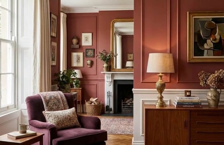
Red is one of the most emotionally powerful paint colors you can bring into a living room, and when used thoughtfully, it produces a space that feels genuinely alive, warm, and unforgettable.
Few colors command attention and create atmosphere as effectively as red, which has a long and celebrated history in interior design as a shade associated with warmth, energy, and convivial gatherings.
From deep burgundy and classic crimson to warm brick red and rich terracotta, the red family offers a surprisingly nuanced range of options that suit very different living room styles and lighting conditions.
These bold red paint colors will inspire you to bring the warmth and drama of red into your living room with complete confidence.
Comprehensive Designer Specification Matrix
The following specification table details eleven industry-leading red paint formulations, documenting their architectural SKUs, Light Reflectance Values, and underlying chromatic profiles for interior visualizers and design professionals.
| Brand | Paint Color Name | SKU / Color ID | LRV | Chromatic Profile & Primary Undertones |
|---|---|---|---|---|
| Benjamin Moore | Caliente | AF-290 | 8.82 | Warm chili crimson with a yellow-brown stabilizing base |
| Benjamin Moore | Heritage Red | HC-181 | 8.36 | Classic historic ruby red balanced with muted pink-gray notes |
| Benjamin Moore | Dinner Party | AF-300 | 6.36 | Deep black-cherry burgundy with pronounced violet undertones |
| Farrow & Ball | Rectory Red | No. 217 | 11.86 | Aged vermilion red softened with subtle black pigmentation |
| Farrow & Ball | Preference Red | No. 297 | 6.00 | Deep baroque crimson with intense dark pigmentation |
| Farrow & Ball | Eating Room Red | No. 43 | 8.00 | Historical damask burgundy with rich purple-black undertones |
| Behr | Rumors | MQ1-15 | 7.77 | Muted ruby brown with warm, grounded earthiness |
| Valspar | Cut Ruby | 1009-4 | 8.88 | Saturated jewel-toned ruby with neutral-cool undertones |
| Sherwin-Williams | Show Stopper | SW 7588 | 10.21 | Energetic dramatic red with subtle rust-orange warmth |
| Sherwin-Williams | Heartthrob | SW 6866 | 10.55 | Saturated vibrant red anchored by a red-brown base |
| Sherwin-Williams | Red Barn | SW 7591 | 8.85 | Earthy American heritage red with strong brown brick undertones |
Benjamin Moore Caliente AF-290
Benjamin Moore Caliente AF-290 stands out as an exceptionally charismatic shade engineered with an LRV of 8.82.
Engineered as part of the Affinity Collection, this radiant crimson carries a yellow-brown base that neutralizes harsh primary red flashes, preventing it from appearing overly orange or glaringly bright.
In south and west-facing living rooms, warm afternoon sunlight activates its vibrant red pigments, filling the space with an inviting warmth without oversaturating the eye.
Conversely, cool northern exposures bring out its earthy brown undertones, turning the finish moodier and more grounded.
When applied in living areas, Caliente pairs seamlessly with natural wood grains like dark walnut, cane dining elements, travertine stone surfaces, and soft greige contrast shades like Edgecomb Gray HC-173.
Benjamin Moore Heritage Red HC-181
Unveiled as part of the Historic Color collection to commemorate the US bicentennial, Benjamin Moore Heritage Red HC-181 offers a time-honored, classic red with an LRV of 8.36.
Formulated as a balanced blend of ruby red and rich crimson, it incorporates subtle gray and dark pink notes that soften the hue’s overall intensity, giving it a sophisticated, aged feel.
Heritage Red is particularly suited for formal living rooms or traditional spaces featuring prominent architectural molding, wainscoting, and mantelpieces.
Daylight causes the color to radiate confidence and strength, while evening artificial lighting highlights its cozy brown undertones, creating a deeply welcoming social atmosphere.
Benjamin Moore Dinner Party AF-300
Benjamin Moore Dinner Party AF-300 is a dark, dramatic red with an LRV of 6.36, placing it firmly on the deeper end of the value scale.
Defined by its rich black-cherry profile and pronounced purple-plum undertones, this color creates a sophisticated, cocooning effect in living rooms intended for evening leisure and formal entertaining.
The low light reflectance value enables the walls to absorb visual boundaries, making conversational seating arrangements feel intimate and grand.
Dinner Party pairs exceptionally well with dark soapstone surfaces, unlacquered brass light fixtures, rich walnut cabinetry, and deep navy or charcoal upholstery.
Farrow & Ball Rectory Red No. 217
Farrow & Ball Rectory Red No. 217 is an iconic, blackened vermilion red with an LRV of 11.86.
Named after traditional English clergy houses, it represents an aged, sophisticated adaptation of brighter scarlet shades like Blazer.
The addition of dark pigment softens the overall vibrancy, yielding a weathered finish that feels right at home in both historic properties and clean modern interiors.
When specified in Farrow & Ball’s signature Estate Emulsion finish, its high chalk content absorbs light, creating a velvety surface.
It coordinates beautifully with warm, red-based neutrals like Joa’s White No. 226 or muted limestone trims.
Farrow & Ball Preference Red No. 297
Preference Red No. 297 is the deepest and richest red in Farrow & Ball’s core palette, engineered with an LRV of approximately 6.00.
Named in honor of the company’s original trading name, Preference Paints, this Baroque-inspired color contains significant dark pigmentation that gives it an opulent, dramatic presence.
In living spaces with low natural light, Preference Red creates an atmospheric backdrop that makes artwork and furniture pop.
It provides a striking contrast when paired with deep contrast tones like Paean Black or softer dusty pinks like Sulking Room Pink, making it a favorite for modern color-drenched rooms.
Farrow & Ball Eating Room Red No. 43
Inspired by the opulent red damask wall coverings popular in 19th-century dining rooms, Farrow & Ball Eating Room Red No. 43 is a deep burgundy infused with heavy black pigmentation.
This dark base gives the color an aged, historical character that softens light across the room.
Under cool light conditions or when placed adjacent to brighter reds like Incarnadine No. 248, Eating Room Red subtly shifts toward a rich, saturated purple.
In flat, low-sheen finishes, it effectively hides minor wall imperfections, making it an excellent candidate for historic homes or textured drywall applications.
Behr Rumors MQ1-15
Recognized as Behr’s 2025 Color of the Year, Rumors MQ1-15 is an earthy ruby red featuring an LRV of 7.77.
Designed to balance bold energy with grounded allure, Rumors features brownish undertones that temper its intensity, making it far more versatile for residential living spaces than standard primary reds.
Its warmth brings a luxurious hospitality aesthetic to living rooms, evoking the sophisticated atmosphere of a boutique hotel lounge.
Rumors pairs effortlessly with peachy off-whites, champagne bronze hardware, mid-tone warm woods, and dark navy accents.
Valspar Cut Ruby 1009-4
Valspar Cut Ruby 1009-4 is a jewel-toned crimson red formulated with an LRV of 8.88.
Characterized by its clear red pigmentation, Cut Ruby avoids heavy brown or muddy gray casts while retaining enough depth to prevent a stark, harsh visual read.
It provides an energetic focal point in living rooms with contemporary architecture, sharp white millwork, or minimalist modern furniture compositions.
Under cool daylight or modern 3000K LED illumination, Cut Ruby maintains its crisp clarity, making it a great option for brightly lit open-concept living zones.
Sherwin-Williams Show Stopper SW 7588
Sherwin-Williams Show Stopper SW 7588 is a rich, energetic red paint with an LRV of 10.21.
Featuring subtle rust-orange undertones, Show Stopper delivers high visual impact while maintaining a warm visual anchor.
This orange leaning prevents the color from feeling cold or synthetic under strong daylight, making it well-suited for living rooms that receive plentiful natural light.
It coordinates naturally with warm neutral trims like SW Roman Column, muted clay secondary accents, brushed gold fixtures, and warm oak flooring.
Sherwin-Williams Heartthrob SW 6866
Sherwin-Williams Heartthrob SW 6866 is a saturated red featuring an LRV of 10.55.
Formulated on a grounded red-brown foundation, Heartthrob balances energetic vibrancy with stability, ensuring it does not flash pink or neon across broad wall expanses.
It serves as a brilliant accent choice for transitional living rooms that require a uplifting focal wall behind a sofa or media display.
Heartthrob pairs cleanly with crisp white casings like SW Windfresh White, charcoal upholstery, polished nickel floor lamps, and cool gray stone accents.
Sherwin-Williams Red Barn SW 7591
Sherwin-Williams Red Barn SW 7591 is an earthy, heritage red paint engineered with an LRV of 8.85.
Infused with heavy brown and terracotta brick undertones, Red Barn mimics the natural warmth of oxide pigments and classic rustic architecture.
In living room applications, it creates a grounded atmosphere that pairs seamlessly with raw materials such as exposed timber beams, distressed leather seating, stone hearths, and wrought iron fixtures.
Its muted saturation makes it an excellent choice for rustic, farmhouse, or craftsman living room styles.
Technical Application and Architectural Execution
Achieving full visual saturation with red paint requires specific surface prep and application techniques.
Because organic red pigments naturally possess lower hide capability than earth-toned neutrals, applying red paint directly over white or uneven drywall often results in streaking and color shifting.
Paint contractors and interior designers should always specify a gray-tinted primer (such as a shade P-6 gray primer) rather than a standard white primer.
The dark gray primer base anchors the red topcoat, enabling complete color depth and coverage in two coats.
Sheen selection also impacts how color is perceived and maintained in a living space.
Flat and matte finishes absorb light, effectively minimizing wall imperfections while yielding a velvety, ultra-deep color appearance, making them ideal for living room walls and ceilings.
For higher traffic family rooms or areas requiring regular cleaning, an eggshell or satin finish offers enhanced durability and wipeability with a subtle sheen.
To create subtle architectural interest within a single monochromatic palette, designers can paint the walls in a matte finish while coating doors, window frames, and baseboards in a semi-gloss or full-gloss finish of the exact same red hue.
Conclusion
Incorporating red paint into a living room design is an effective way to introduce architectural drama, warmth, and personality into a home.
By carefully evaluating undertones, light reflectance values, and exposure to natural daylight, homeowners and designers can choose a shade that enhances the room’s proportions and complements existing furnishings.
Whether choosing a deep black-cherry tone like Benjamin Moore Dinner Party for an intimate lounge or an earthy oxide like Sherwin-Williams Red Barn for a rustic focal point, utilizing exact paint specifications ensures predictable, high-end results.