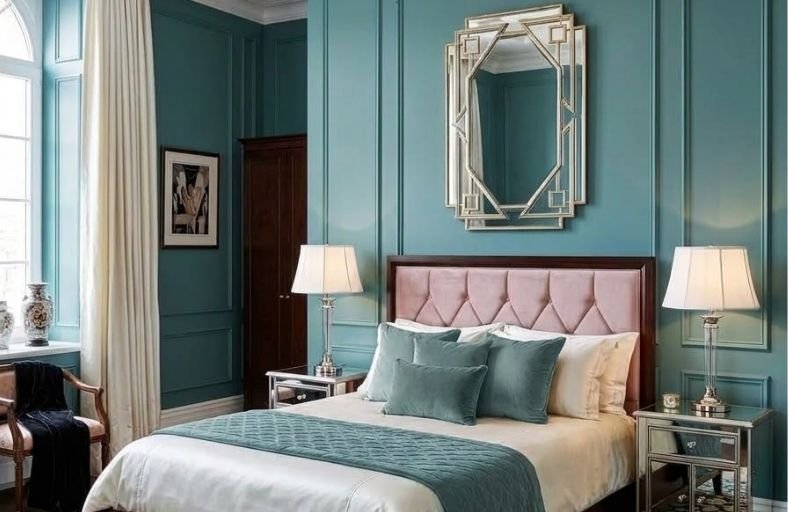
Teal paint has earned an enthusiastic following among bedroom decorators for its remarkable ability to create spaces that feel simultaneously modern and timeless, energetic and calming, visually bold and deeply restful.
This unique combination of qualities makes teal one of the most versatile and rewarding bedroom color choices available, capable of anchoring a coastal-inspired retreat just as effectively as it grounds a maximalist, globally influenced sleeping space.
The variety within the teal family itself is broad enough to suit every bedroom style and every personal preference, from the palest barely-there aqua to the richest, most deeply saturated peacock blue-green.
These gorgeous teal paint colors will help you find the perfect shade for your own bedroom beautifully.
Technical Specifications and Comparative Analysis
Evaluating paint performance across premier manufacturers highlights distinct chromatic profiles, underlying tint formulations, and optimal room exposures.
The structured overview below summarizes key technical parameters for eleven curated architectural teal colors.
| Manufacturer | Paint Color Name | Color Code / SKU | LRV (%) | Primary Undertone Profile | Recommended Lighting / Exposure |
|---|---|---|---|---|---|
| Benjamin Moore | Aegean Teal | 2136-40 | 25.13 | Balanced blue-green with slate gray | All exposures; excels in east/west light |
| Benjamin Moore | Teal Ocean | 2049-30 | 15.76 | Deep oceanic turquoise with cool blue | South or east exposures; warm 2700K lighting |
| Sherwin-Williams | Oceanside | SW 6496 | 8.25 | Saturated jewel-toned blue-green | Well-lit rooms; strong natural daylight |
| Sherwin-Williams | Deep Sea Dive | SW 7618 | 10.27 | Muted slate teal with cool charcoal | South-facing rooms or layered artificial lighting |
| Farrow & Ball | Vardo | No. 288 | 15.34 | Vibrant Mediterranean teal with clay gray | South and west light; dynamic day-to-night shift |
| Farrow & Ball | Inchyra Blue | No. 289 | 12.50 | Stormy blue-grey with subtle green | North light for drama; south light for warmth |
| PPG Paints | Vining Ivy | PPG1148-6 | 15.15 | Deep Caribbean aqua with emerald tint | Multi-directional daylight; pairs with brass accents |
| Behr | Undersea | S470-7 | 8.00 | Dark petrol blue-teal with muted slate | Abundant natural light; ambient warm lamps |
| Behr | Dragonfly | PPU12-03 | 25.00 | Soft sage-teal with muted blue | North or east light; small-to-midsize rooms |
| Valspar | Villa Blue | 5002-4B | 24.00 | Silvered midtone teal with grey haze | Transitional lighting; pairs with crisp white trim |
| Clare Paint | Current Mood | N/A | 16.00 | Earthy dark green-teal with forest undertone | Moody spaces; artificial accent spotlighting |
Benjamin Moore Aegean Teal (2136-40)
Selected as a benchmark midtone teal, Benjamin Moore’s Aegean Teal (2136-40) strikes a harmonious balance between blue-green chroma and a stabilizing gray undertone.
Boasting a Light Reflectance Value of 25.13, it reflects sufficient natural light to keep moderate-sized bedrooms from feeling visually compressed, while retaining enough depth to create an atmosphere of quiet reflection.
The presence of gray softens the hue’s saturation, preventing the daylight glare that often afflicts brighter turquoises.
In north-facing exposures, cool ambient skylight coaxes out its slate-blue foundation, making it feel crisp and calm.
Conversely, warm south-facing sunlight accentuates its organic green pigments.
This color coordinates effortlessly with soft whites like Chantilly Lace or White Dove, unlacquered brass hardware, and pale ash or light oak floorings.
Benjamin Moore Teal Ocean (2049-30)
Capturing the saturated mystery of deep maritime waters, Benjamin Moore’s Teal Ocean (2049-30) is a bold blue-green engineered for architectural drama.
Belonging to the Color Preview collection, its LRV of 15.76 establishes it firmly in the light-absorbing category, creating an intimate, cozy bedroom environment.
The color maintains strong chroma without appearing unrefined or overly bright, rendering it particularly suited for dead-flat or matte finishes where glare is minimized.
In dim lighting conditions, Teal Ocean shifts toward a deep petrol shade, while warm artificial illumination highlights its turquoise undertones.
Architectural pairing recommendations include stark white trims like Simply White (OC-117), rich walnut wood paneling, honed warm white marble accents, and polished chrome or stainless steel hardware to contrast its deep cool saturation.
Sherwin-Williams Oceanside (SW 6496)
Sherwin-Williams Oceanside (SW 6496) is an opulent jewel-tone paint that merges saturated ocean blue with dark emerald green undertones.
With a low Light Reflectance Value of 8.25, Oceanside absorbs substantial light, pulling vertical planes inward to generate an enveloping visual enclosure.
This color requires thoughtful lighting design; in sun-drenched bedrooms with expansive southern or western windows, natural daylight illuminates its rich turquoise undertones.
In evening lighting, it transitions into a dark peacock shade.
Designers frequently utilize Oceanside for color-drenching strategies, painting walls, baseboards, door casings, and ceilings in a single sheen, or as a headboard focal wall.
It pairs effectively with cognac leather, velvet upholstery, warm taupe drapery, and antiqued brass fixtures.
Sherwin-Williams Deep Sea Dive (SW 7618)
Sherwin-Williams Deep Sea Dive (SW 7618) presents a restrained, slate-infused teal that brings sophisticated grounding to modern bedroom interiors.
Carrying an LRV of 10.27, this shade absorbs ambient light while avoiding vivid jewel-tone intensity due to its heavy gray-charcoal undertones.
The charcoal infusion stabilizes the color, preventing it from shifting too blue or green under varying light sources.
In shadowed corners, Deep Sea Dive dips into near-black territory, whereas direct natural illumination reveals a cool, stormy teal.
It serves as an ideal backdrop for industrial-modern, mid-century, or masculine design aesthetics.
Pairing options include blackened steel fixtures, exposed brickwork, raw concrete accents, and warm oak or walnut millwork.
Farrow & Ball Vardo (No. 288)
Inspired by the vibrant decorative paintwork of 19th-century Romany wagons, Farrow & Ball Vardo (No. 288) is a flamboyant yet historically grounded teal.
Operating at an LRV of 15.34, Vardo rests centrally on the blue-green spectrum, anchored by Farrow & Ball’s signature clay-gray pigment foundation.
This clay base prevents the vibrant hue from reading as harsh or synthetic, giving it a rich matte depth when applied in Estate Emulsion or Dead Flat finishes.
South-facing daylight brings out its warm emerald and yellow undertones, while northern light highlights its cool teal core.
Vardo pairs exceptionally well with stony neutrals like Farrow & Ball Ammonite, unlacquered English brass, dark mahogany furniture, and rich terracotta or plum velvet accents.
Farrow & Ball Inchyra Blue (No. 289)
Formulated to reflect the stormy skies of Perthshire, Farrow & Ball Inchyra Blue (No. 289) is an aged blue-gray-green hybrid.
Registering an LRV of 12.50, this chameleon shade provides a dark alternative to conventional charcoal or navy.
Depending on the direction of natural light and light temperature, Inchyra Blue shifts fluidly between deep slate gray, cool navy, and muted dark teal.
In rooms with indirect northern exposure, its gray foundation dominates, fostering a moody atmosphere.
In well-lit spaces, its green undertones emerge to add subtle warmth.
Recommended architectural pairings include warm off-whites like Drop Cloth (No. 283), aged bronze hardware, bouclé textiles, and reclaimed timber flooring.
PPG Paints Vining Ivy (PPG1148-6)
Selected as a major Color of the Year by PPG and Glidden, Vining Ivy (PPG1148-6) is an adaptable Caribbean aqua featuring a deep turquoise undertone.
With an LRV of 15.15, Vining Ivy strikes a precise balance between calming depth and energizing clarity.
The color intertwines jewel-toned blue with botanical green, allowing it to adapt effortlessly across traditional, transitional, and contemporary bedroom designs.
It acts as a grounding wall color when paired with crisp off-white moldings, while glowing under warm 2700K lighting.
Vining Ivy transitions into an opulent focal point when combined with golden hardware, polished marble, honey-toned oak furniture, and woven rattan details.
Behr Undersea (S470-7)
Behr’s Undersea (S470-7) is a dark, grayed petrol blue-teal engineered for deep visual rest.
Operating at a low LRV of 8.00, Undersea absorbs ambient illumination, reading as a dark slate shade in shadowed areas and near-black in unlit corners.
Positioned at 200 degrees on the color wheel, its hue leans heavily toward blue, while an underlying gray saturation stops it from feeling electric or overtly nautical.
Undersea provides an effective anchor when contrasted with cream linens, bleached oak floors, and warm brass fixtures.
It is ideally suited for bedrooms intended strictly for night-time rest, especially when illuminated by low-Kelvin warm lamplight that draws out its muted blue-green complexity.
Behr Dragonfly (PPU12-03)
Behr Dragonfly (PPU12-03) is a midtone teal that leans toward green, softened by light slate undertones.
Carrying an LRV of 25.00, Dragonfly reflects enough ambient daylight to suit smaller or mid-sized bedrooms without imposing optical weight.
Its green-forward base establishes an organic, nature-inspired setting that promotes restfulness and eye comfort.
Dragonfly functions well in south-facing or east-facing exposures, where morning sun brings out its fresh sage-teal character.
It pairs effortlessly with natural materials such as light birch or maple furniture, white linen bedding, potted indoor foliage, and woven jute rugs, making it a reliable pick for Scandinavian or biophilic bedrooms.
Valspar Villa Blue (5002-4B)
Valspar Villa Blue (5002-4B) is a silvery, muted teal designed for spaces requiring soft color presence.
Possessing an LRV of 24.00, Villa Blue resides comfortably in the midtone range, reflecting enough ambient light to maintain clarity while providing a calm blue-green anchor.
Its pronounced gray undertone tempers the blue-green pigment, creating a sophisticated slate-pastel effect that shifts smoothly across daylight hours.
Villa Blue is well-suited for transitional bedrooms, offering a subtle backdrop that pairs with polished nickel hardware, white architectural trim, dark mahogany furniture, and soft blush or coral textile accents.
Clare Paint Current Mood
Clare Paint’s Current Mood is a dark green-teal designed to bring grounded drama into residential bedrooms.
With an LRV of 16.00, this shade leans into dark forest green undertones while maintaining a distinct teal hue.
Current Mood thrives in intimate spaces, absorbing natural light glare and creating a cozy, cocooning effect.
It acts as a strong anchor for tactile materials like velvet, leather, and dark wood finishes, while pairing cleanly with bright ivory linens and warm brass fixtures.
In evening lighting, its deep green undertones become more prominent, providing a restful backdrop for sleep.
Strategic Implementation and Design Synthesis
Successfully integrating teal paint colors into bedroom design requires matching the paint’s technical specs with the room’s architecture.
Lower LRV teals (such as Sherwin-Williams Oceanside at LRV 8.25 or Behr Undersea at LRV 8.00) perform best in spaces where intimacy and psychological enclosure are prioritized.
Applying low-LRV shades across both walls and trim creates a seamless look that visually blurs structural boundaries, making smaller rooms feel expansive and cozy.
Midtone options (such as Benjamin Moore Aegean Teal at LRV 25.13 or Valspar Villa Blue at LRV 24.00) offer flexibility across diverse room layouts.
These midtones pair well with crisp white or cream trim, establishing a balanced contrast that frames wall surfaces while highlighting architectural millwork, wainscoting, and window trim.
To ensure a cohesive interior scheme, select complementary materials that balance teal’s cool blue-green base.
Warm metallic accents like unlacquered brass, antique copper, or brushed gold introduce visual warmth against dark teal walls.
Similarly, organic textiles, including washed linen, wool, and velvet, alongside warm wood tones like white oak, walnut, or mahogany prevent dark paint colors from feeling cold or flat.
By aligning paint selection with light exposures, sheen levels, and tactile decor, teal paint transforms bedroom spaces into quiet, sophisticated retreats.