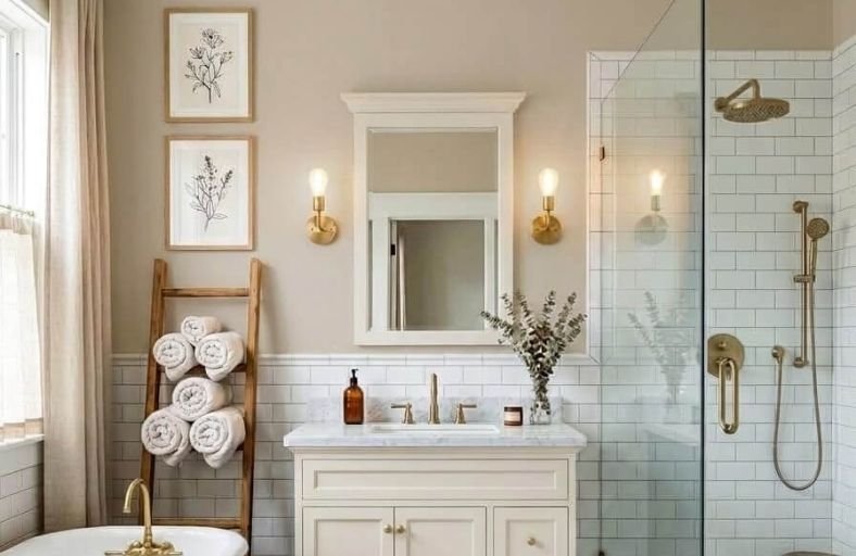
Warm paint colors have a remarkable ability to turn a bathroom from a purely functional space into something that feels genuinely cozy, indulgent, and spa-like.
Where cool whites and pale blues can sometimes make a bathroom feel clinical and cold, warm shades of terracotta, peach, soft amber, creamy ivory, and warm taupe wrap the space in a flattering, welcoming glow that makes every visit feel a little more luxurious.
Warm colors also interact beautifully with the natural materials most commonly found in bathrooms, wood, stone, and brass, creating a sense of cohesion and richness that cooler palettes rarely achieve.
These beautiful warm paint colors will inspire you to bring genuine warmth and comfort into your bathroom.
Architectural Color Comparison Matrix
The table below synthesizes the key technical properties, color families, Light Reflectance Values, and recommended interior aesthetic styles for each warm bathroom paint selection.
| Brand | Paint Color Name | Color SKU / Code | LRV | Primary Undertone | Optimal Design Aesthetic |
|---|---|---|---|---|---|
| Benjamin Moore | Swiss Coffee | OC-45 | 81.91 | Warm Cream / Soft Yellow | Neoclassical / Transitional |
| Sherwin-Williams | Alabaster | SW 7008 | 82.00 | Creamy Beige / Soft Gold | Modern Farmhouse / Organic Neutral |
| Benjamin Moore | Pale Oak | OC-20 | 67.53 | Warm Gray / Taupe-Beige | Modern Coastal / Contemporary |
| Benjamin Moore | Navajo White | OC-95 | 79.48 | Muted Yellow-Beige | Traditional / Rustic Warmth |
| Sherwin-Williams | Shoji White | SW 7042 | 74.00 | Warm Soft Beige / Red Cast | Japandi / Minimalist Warmth |
| Sherwin-Williams | Accessible Beige | SW 7036 | 58.00 | Balanced Greige / Earthy Tan | Craftsman / Transitional Luxury |
| Behr | Blank Canvas | DC-003 | 81.67 | Subtle Warm Cream | Zen / Scandinavian Minimal |
| Benjamin Moore | Manchester Tan | HC-81 | 61.73 | Sand Beige / Golden Buff | Classic Traditional / Historic |
| Farrow & Ball | Setting Plaster | No. 231 | 54.00 | Dusty Plaster Pink / Yellow | Mediterranean / Historic Revival |
| Sherwin-Williams | Cavern Clay | SW 7701 | 20.00 | Warm Terracotta / Red-Orange | Desert Modern / Moody Accent |
| Farrow & Ball | Dead Salmon | No. 28 | 35.00 | Buff Mushroom / Rose-Brown | Candlelit Luxury / Atmospheric Spa |
| Behr | Whisper White | HDC-MD-08 | 89.00 | Gentle Creamy Gray | Airy Transitional / Cottage |
Benjamin Moore Swiss Coffee (OC-45)
Benjamin Moore Swiss Coffee OC-45 remains one of the most versatile warm off-whites in residential design, distinguished by its delicate cream and soft yellow undertones.
Possessing a Light Reflectance Value of 81.91, this shade sits at the ideal intersection between bright architectural white and soft cream, allowing it to reflect substantial light without producing an icy glare.
In bathroom environments featuring hard tile surfaces and polished porcelain fixtures, Swiss Coffee counteracts potential clinical atmosphere by infusing subtle, welcoming warmth.
It performs exceptionally well under 3000K warm LED lighting, which activates its creamy base without making the walls read as overly saturated or yellow.
When paired with unlacquered brass hardware, natural white oak vanities, or honed Carrara marble, Swiss Coffee establishes a refined, neoclassical aesthetic.
In rooms with north-facing natural exposure, its warm yellow undertones effectively neutralize cool blue daylight casts, preserving a balanced, inviting ambiance throughout the day.
Sherwin-Williams Alabaster (SW 7008)
Sherwin-Williams Alabaster SW 7008 is a widely specified creamy white that delivers organic warmth without sacrificing lightness.
Featuring an Light Reflectance Value of 82, Alabaster reflects light broadly while maintaining a soft, enveloping presence.
Its primary undertone consists of a soft yellow-beige cast that eliminates cold undertones, making it a premier solution for primary bathroom suites.
When applied alongside crisp white trim, Alabaster creates an intentional, subtle contrast that highlights architectural details.
The shade bridges modern organic aesthetics with traditional style, pairing effortlessly with polished nickel fixtures, white oak cabinetry, and light natural stone tiles.
In spaces with abundant natural sunlight, Alabaster maintains its structural warmth without washing out, ensuring the space feels serene and grounded.
Its balanced formulation makes it equally effective across full wall applications, beaded paneling, and moisture-resistant ceiling surfaces.
Benjamin Moore Pale Oak (OC-20)
Benjamin Moore Pale Oak OC-20 is a sophisticated warm greige that adapts fluidly to shifting daylight conditions throughout the space.
Holding a Light Reflectance Value of 67.53, Pale Oak offers noticeable depth compared to traditional off-whites while remaining sufficiently airy for compact bathroom envelopes.
Its complex undertone structure synthesizes gray and beige with faint taupe undertones.
Under cool morning light, Pale Oak registers as a crisp, calming neutral gray, whereas warm evening lighting brings out its rich, earthy beige characteristics.
This chromatic chameleon quality makes Pale Oak an exceptional selection for homeowners seeking a peaceful sanctuary atmosphere.
It harmonizes beautifully with dark walnut cabinetry, matte black metal accents, and Carrera marble countertops.
In low-light powder rooms or interior bathrooms lacking windows, Pale Oak provides a grounded backdrop that feels inherently cozy rather than dark or restrictive.
Benjamin Moore Navajo White (OC-95)
Benjamin Moore Navajo White OC-95 is a traditional, deeply comforting off-white that infuses spaces with unmistakable vintage warmth.
With a Light Reflectance Value of 79.48, Navajo White resides in the upper light-reflection range while delivering a distinct cream-beige saturation.
Its muted chroma prevents it from reading as harsh yellow, creating an inviting, antique plaster feel.
In powder rooms or small guest bathrooms, Navajo White neutralizes cool corner shadows and pairs effortlessly with dark stained trims, aged copper fixtures, and warm granite surfaces.
It creates a soft, ambient glow that flatters natural skin tones in vanity mirrors. Under warm incandescent or 2700K LED vanity lighting, the shade deepens into a rich cream backdrop that enhances traditional architectural millwork.
It is particularly effective in homes seeking a cozy, historic charm without sacrificing light illumination.
Sherwin-Williams Shoji White (SW 7042)
Sherwin-Williams Shoji White SW 7042 is a creamy, warm off-white neutral featuring a Light Reflectance Value of 74.
Straddling the boundary between an off-white and a soft, pale beige, Shoji White carries subtle red and beige undertones that introduce an organic, calming ambiance.
It excels in Japandi, Scandinavian, and minimalist modern bathroom designs where natural wood tones, limestone tiles, and unlacquered brass fixtures are highlighted.
In low-light bathroom environments, Shoji White holds its warmth reliably without shifting toward a dull or cold gray tone.
The color’s slight pink-beige undertone enhances the warmth of natural daylight filtering through frosted glass windows.
When combined with dark contrasting elements like oil-rubbed bronze hardware or slate tile flooring, Shoji White creates a balanced, serene atmosphere that supports daily wellness routines.
Sherwin-Williams Accessible Beige (SW 7036)
Sherwin-Williams Accessible Beige SW 7036 is a celebrated mid-tone greige paint color featuring a Light Reflectance Value of 58.
Unlike colder grays, Accessible Beige contains warm taupe and soft golden undertones that establish structural depth in primary bathroom suites.
It provides an elegant level of contrast against white porcelain bathtubs, bright trim moldings, and light quartzite vanity tops.
Accessible Beige harmonizes seamlessly with natural oak, slate flooring, and matte black plumbing hardware, creating a contemporary yet grounded backdrop.
In bathrooms with expansive natural light, the shade maintains its cozy richness without reading as overly dark or heavy.
Its balanced formulation makes it equally successful when applied across full wall surfaces or paired with beadboard panelling in transitional spa spaces.
Behr Blank Canvas (DC-003)
Behr Blank Canvas DC-003 is a light, clean off-white with a gentle warm cream-beige undertone designed to foster restorative indoor environments.
Holding a Light Reflectance Value of 81.67, this color reflects significant light while softening intense reflections from mirrors and polished tiles.
In urban apartment bathrooms or compact powder rooms, Blank Canvas expands visual boundaries while delivering a serene, inviting atmosphere.
It acts as a highly flexible neutral canvas that supports both brushed brass vanity hardware and natural teak wooden accessories.
The low-chroma composition ensures that the warm undertone remains subdued, preventing the walls from appearing overly yellow under artificial lighting.
When paired with neutral stone tiles and crisp white fixtures, Blank Canvas delivers a clean, modern aesthetic that feels effortlessly cozy and modern.
Benjamin Moore Manchester Tan (HC-81)
Benjamin Moore Manchester Tan HC-81 is a classic, sand-inspired neutral with a Light Reflectance Value of 61.73.
Originating from Benjamin Moore’s renowned Historical Collection, this shade brings a refined architectural warmth reminiscent of natural linen and warm beach sands.
Its golden-beige undertones provide consistent warmth without veering into orange or green territory.
Manchester Tan serves as an ideal mid-tone backdrop in bathrooms adorned with classic architectural millwork, dark bronze fixtures, and warm terracotta tile flooring.
In rooms illuminated by warm halogen or 2700K lighting, its golden tones intensify to create an intimate, spa-like sanctuary.
It pairs exceptionally well with rich mahogany vanities and antique brass accents, making it a favorite choice for traditional residential renovations.
Farrow & Ball Setting Plaster (No. 231)
Farrow & Ball Setting Plaster No. 231 is a celebrated dusty pink shade named after the translucent tone of newly applied, drying plaster.
Boasting a Light Reflectance Value of 54, Setting Plaster is formulated with a heavy yellow pigment base that anchors the pink, transforming it into an earthy, sophisticated neutral.
In bathroom interiors, Setting Plaster casts an exceptionally flattering light, imparting a soft, rosy glow onto skin tones reflected in vanity mirrors.
It pairs dramatically with dark walnut cabinetry, oil-rubbed bronze hardware, and deep green trim shades like Farrow & Ball Card Room Green.
In north-facing bathrooms where daylight is cool and blue-tinted, the yellow and red pigments in Setting Plaster neutralize shadow casts, enveloping the room in historic warmth.
Sherwin-Williams Cavern Clay (SW 7701)
Sherwin-Williams Cavern Clay SW 7701 is a rich, sun-baked terracotta shade featuring a low Light Reflectance Value of 20.
Drawing inspiration from Southwestern landscapes and mid-century modern design, this warm rust-orange color brings profound architectural grounding to bathroom spaces.
While too intense for small, windowless bathrooms as a full wall paint, Cavern Clay excels on accent walls, vanity backdrops, or full powder room enclosures.
It pairs naturally with creamy off-white trims like Sherwin-Williams Alabaster, matte black fixtures, exposed wooden beams, and lush indoor greenery.
In candlelit or dim evening lighting, Cavern Clay transforms the bathroom into a deeply relaxing, cocooning retreat.
Its rich earthy pigments absorb harsh reflections, creating a quiet, tactile atmosphere.
Farrow & Ball Dead Salmon (No. 28)
Farrow & Ball Dead Salmon No. 28 is an enigmatic, historic mushroom tone with deep pink and buff-brown undertones.
With a Light Reflectance Value of approximately 35, the term “Dead” refers to the paint’s signature chalky flat finish, while “Salmon” describes its underlying warmth.
In bathroom settings, Dead Salmon creates an intimate, candlelight-ready environment that feels deeply serene and protective.
It is ideally suited for powder rooms or primary bath suites where a moody, cocooning warmth is desired.
It pairs luxuriously with unlacquered brass hardware, dark espresso wooden vanities, and warm limestone floor tiles.
Under low evening lighting, Dead Salmon shifts subtly between warm terracotta-brown and soft muted rose, offering an atmospheric backcloth for luxury bathing rituals.
Behr Whisper White (HDC-MD-08)
Behr Whisper White HDC-MD-08 is a bright, luminous off-white paint featuring delicate warm gray and soft cream undertones.
Possessing an exceptionally high Light Reflectance Value of 89, Whisper White maximizes light reflection around compact or windowless bathrooms without introducing stark optical glare.
Its subtle gray influence maintains a clean, architectural backdrop, while the underlying creaminess prevents the room from feeling clinical or cold.
Whisper White is an ideal selection for coastal, cottage, or contemporary bathrooms featuring white beadboard wainscoting, polished chrome fixtures, and glass shower enclosures.
It bounces natural morning sunlight across marble and glass surfaces, creating an airy, peaceful morning sanctuary.
Architectural Application Guidelines for Warm Bathroom Palettes
Selecting a warm paint color for a bathroom involves technical considerations beyond color aesthetic preference.
Light temperature, humidity management, and skin rendition require specific application strategies.
Artificial illumination significantly impacts how warm paint pigments display in enclosed bathrooms.
Standard bathroom vanity lights should utilize LED bulbs calibrated between 2700K and 3000K (Warm White to Soft White).
Lighting above 4000K (Cool Daylight) introduces strong blue wavelengths that clash with yellow, beige, and pink undertones, making warm colors appear dull or muddy.
Conversely, overly warm lighting (below 2500K) can cause cream colors like Benjamin Moore Swiss Coffee or Sherwin-Williams Alabaster to look overly yellow.
Warm paint tones with subtle cream, peach, or pink undertones, such as Farrow & Ball Setting Plaster or Benjamin Moore Navajo White, enhance skin appearance in vanity mirrors.
Cool grays and greens reflect greenish-blue light cast back onto the face, emphasizing under-eye shadows.
Warm paint tones absorb cool wavelengths and bounce soft, flattering light onto occupants during daily grooming routines.
Bathrooms represent high-humidity microclimates requiring specialized paint sheen selections.
Matte and flat finishes absorb light beautifully but can trap moisture and harbor mildew unless specially formulated (such as Benjamin Moore Aura Bath & Spa).
For standard paint lines, Satin or Semi-Gloss sheens are recommended for bathroom walls.
These sheens create a moisture-resistant barrier that allows water droplets to bead up and wipe away easily, preserving the integrity and depth of warm undertones over time.
Strategic Paint Selection Recommendations
Homeowners and design professionals selecting paint colors should base final choices on space dimensions, light availability, and intended aesthetic atmosphere:
- Small or Windowless Bathrooms: High-LRV warm off-whites such as Behr Whisper White (LRV 89) or Benjamin Moore Swiss Coffee (LRV 81.91) maximize reflected artificial light while eliminating cold shadows.
- North-Facing Bathrooms: Cool, blue-tinted natural daylight in north-facing rooms can make neutrals look cold. Mid-tone warm shades like Benjamin Moore Pale Oak (LRV 67.53) or Farrow & Ball Setting Plaster (LRV 54) successfully counterbalance cool light.
- Powder Rooms and Moody Sanctuaries: Lower-LRV warm shades such as Sherwin-Williams Cavern Clay (LRV 20) or Farrow & Ball Dead Salmon (LRV ~35) create dramatic, intimate, candlelit atmospheres that transform compact spaces into memorable design statements.